What do sketches of “Gibson Girls,” with their sumptuous bouffants, have in common with the abstract covers of The Craftsman magazine or the stark, black-and-white woodblock prints in early graphic novels? They all represent American modernity at the start of the 20th century, illustrated through innovations in print culture.
This past spring, four graduate students enrolled in the art history seminar “American Modernisms,” taught by University Professor of Art Elizabeth Turner, delved through the Albert and Shirley Small Special Collections Library as part of their coursework. They found and analyzed early 20th-century advertisements, playbills, wordless (graphic) novels, magazines, and cartoons. The students, along with Turner, curated their findings, turning their work into the latest first-floor exhibition in Special Collections: “Issuing Modernisms: Modern Stories, Types, & Aesthetics.”
In Turner’s class, students learned about the rapid innovations in chromolithography (a way to make multi-colored prints) and photomechanical reproduction in the post-Civil War period. Graduate students Matias Hendi, Andi Laska, Emmy Monaghan, and Leo Palma explored Special Collections archives to find printed materials that, as Turner wrote in the exhibition text, represent the “fast-paced realities of mass production and marketing … as well as aspirations for new ways to live, work, and prosper in the modern world.”
The four graduate students frequently reserved the Special Collections Map Room to spread out and examine potential artifacts for the exhibition. “My favorite part of the process was the time spent as group in the basement level of Special Collections,” said Laska, a master of architectural history candidate. “You could always see the excitement in everyone as we each uncovered items from the archives throughout the weeks. I couldn’t believe I was handling original copies of The Craftsman dating as far back as 1904 – the feeling of the paper, the smell, the binding, the printing quality. The entire process was like nothing I had ever worked on before.”
We spoke to the students and Professor Turner, who curated the exhibition together, about their favorite items on display. Take a look at their picks below, and join them for a gallery talk in conjunction with the opening of UVA Library’s next major exhibition. Their talk will take place on Oct. 22 at 6:45 p.m. in the First Floor Gallery of Special Collections.
The wordless novel
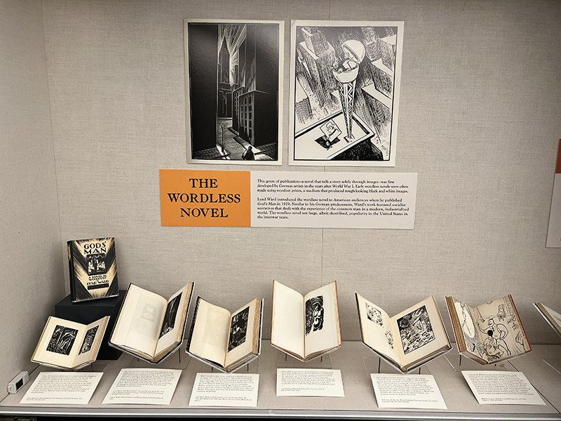
“My favorite object in the exhibition is Lynd Ward’s wordless novel ‘Gods’ Man’ (1929),” said Monaghan, a Ph.D. student in art & architectural history. “I can’t remember exactly how I stumbled upon his work, but I found out that he’s actually from my hometown (Oak Park, Illinois) so it felt like fate. ‘Gods’ Man’ is Lynd Ward’s first wordless novel, a book that is composed of 139 captionless woodblock prints. As a precursor to the modern graphic novel, Ward was inspired by the ways that silent film told stories completely through visual elements and chose to translate those techniques into printed material.
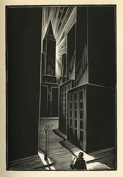
“I loved this object because it’s something that seems so mundane now (basically a picture book for adults), but when ‘Gods’ Man’ was released in 1929, it was a completely novel object that captivated American audiences,” Monaghan said. “Ward was able to convey really complex scenes and emotions through very simple shapes and lines. When I became interested in the topic of the wordless novel, I was shocked that Special Collections owned so many of the seminal works in that genre. I hope visitors to our exhibition can see how these new forms of the printed image contributed to the construction of the modern American identity.”
The Craftsman magazine
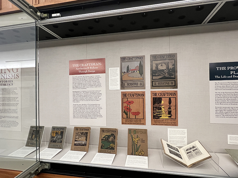
“My favorite item from the exhibition is The Craftsman magazine from January 1904,” said Laska. “With just one glimpse at the cover itself, one gets a sense of everything The Craftsman was all about: A magazine that featured articles on art, architecture, landscape design, crafts, and education, with a goal of educating the masses on modern living aesthetics. Using mass printing and modern artistic techniques like abstraction, the magazine promoted modernism through vibrant, striking covers.
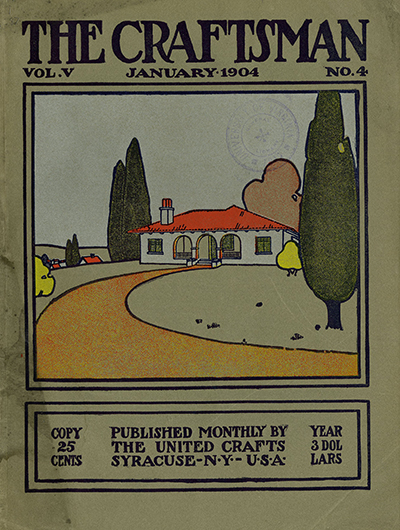
“This issue features a cover illustrating a bungalow home and garden using abstraction and bold colors influenced by Japanese art, reflecting America’s modern art movement,” Laska said. “Though the magazine celebrated industrialization, it also rejected modern industrial practices of excessive consumption. This is why in this cover, we can see the promotion of a simple, handcrafted home and garden aesthetic. The Craftsman promoted the craftsmanship home as the best option for residential architecture. The content in this issue educates readers on the blending of arts, labor, and education, with articles on manual training, silversmithing, ceramics, and mission-builders in California. Advocating the craftsman house as the true American model, it provides detailed drawings for easy construction.”
The Provincetown Players
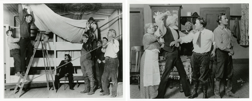
“My favorite items in the exhibit are the photos of the Provincetown Players setting up and rehearsing one- and two- act plays in very small theatres,” said Hendi, a master of architecture student. The Provincetown Players began as a small theater company in Provincetown, Massachusetts, and eventually made its way to New York City. Hendi located photographs of the company’s experimental productions starting 1916-1920 in the archives of playwrights Eugene O’Neill and Susan Glaspell. “It’s fun to try and imagine the energy of pulling together a play with all the costumes and the set design, while pushing the limit on theatrical storytelling,” Hendi said.
Gibson Girls and more

“I don’t have one favorite item,” Turner said. “Instead, it’s the range of prints, from the striking woodcut by Marguerite Zorach on the Provincetown Players program to the finely drawn features of the Charles Dana Gibson’s Gibson Girl and the streamlined chiseled physique of ideal American modern man in Joseph Leyendecker’s advertisements. All of them work together through the material genres of the Special Collections Library to bring modernism to life.
“My hope is that this show provides not only a glimpse of modernity in America at the beginning of the 20th century but that the student researchers have left open a window to glimpse the immense riches of the archives of Special Collections or left a pathway to follow to go deeper,” Turner said. “Ultimately, I hope they are left with a question about where and how these objects were fished out from storage. What else may remain to see?”
Register for the “Issuing Modernisms: Modern Stories, Types, & Aesthetics” gallery talk on Oct. 22 at 6:45 p.m. in the First Floor Gallery of Special Collections (in conjunction with the opening of the Library’s next major exhibition). “Issuing Modernisms” runs through Oct. 29.
