
Time series data can contain a lot of information. Often, it is difficult to visually detect patterns in a time series and even harder to quantify patterns. How can we analyze our time series data to understand its underlying signals and how these signals are changing through time?
Wavelet-based approaches allow us to “decompose” our time series data into their underlying signals. Time series are typically composed of several signals, often including but not limited to: a short timescale signal, a long timescale signal, and random noise. Let’s demonstrate this in an example using R. First we load three packages that we’ll use in this article. The {wsyn} package provides tools for using wavelets to analyze time series data. The {tidyverse} and {patchwork} packages provide functions we’ll use for data wrangling and visualization. These packages can be installed using the install.packages() function. For example, install.packages(“wsyn”)
library(wsyn)
library(tidyverse)
library(patchwork)
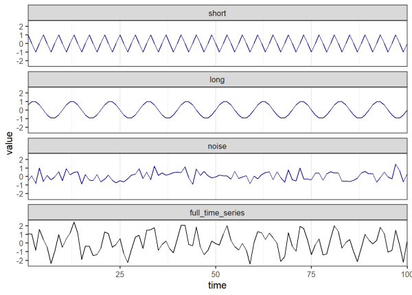
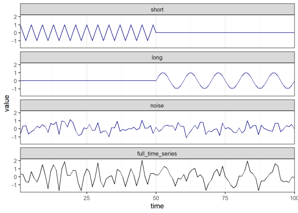
Below we generate a time series from sine wave signals, see this link for an introduction on sine waves. Sine waves are useful to represent patterns that cycle through time, such as ocean tides, the stock market, disease cases, and many other processes around us. Sine waves have a period (i.e. the time it takes to complete a full cycle) of 2π radians. We control the period of our sine wave signals in the code below by multiplying our vector of time steps by 2π (such that each time step is a cycle) and dividing by the desired period (e.g. 4 and 10 below). Here we generate two sine wave signals of varying periods along with normally distributed random noise. The resulting time series in black is simply the sum of the signals in blue.
set.seed(6789) # set seed
times <- 1:100 # number of time steps (e.g. seconds, minutes, years)
ts1_short <- sin(times*2*pi/4)   # 4 unit period
ts1_long <- sin(times*2*pi/10)   # 10 unit period
ts1_noise <- rnorm(length(times),0,0.5)   # random noise
ts1 <- ts1_short + ts1_long + ts1_noise   # full time series
# combine into a single dataframe, pivot to long format for plotting purposes
ts1_dt <- data.frame(short = ts1_short,
                     long = ts1_long,
                     noise = ts1_noise,
                     full_time_series = ts1,
                     time = times) %>%
  pivot_longer(short:full_time_series,
               names_to = 'component',
               values_to = 'value') %>%
  mutate(component = factor(component, levels = c('short', 'long',
                                                  'noise', 'full_time_series')))
# plot
ts1_dt %>%
  ggplot(aes(x = time, y = value, color = component)) +
  geom_line() +
  facet_wrap(vars(component), ncol = 1) +
  theme_bw(base_size = 12) +
  scale_x_continuous(expand = c(0,0)) +
  theme(panel.grid.major.y = element_blank(),
        panel.grid.minor.y = element_blank(),
        legend.position = 'none') +
  scale_color_manual(values = c('navy', 'navy', 'navy', 'black'))
We will perform a wavelet transformation on the time series that we just made. This allows us to decompose our time series and discover underlying signals. We know our time series is composed of two sine waves and random noise. Let’s see how wavelet transformation helps us identify those components. To do this we’ll use the wt() function from the {wsyn} package. Before doing so, we need to prepare our data by de-meaning our time series. This is necessary to carry out the analyses implemented in the {wsyn} package. De-meaning means centering the data so the mean is 0. This can be easily performed using the wsyn::cleandat() function. The clev argument controls how much cleaning is performed. clev = 1 de-means the data. See the help page for the cleandat() function to learn more about what other levels of cleaning are available, such as detrending and standardizing variance, which are likely needed for real-world data.
# prepare data for analysis, we use '$cdat' to extract the cleaned data from the
# output
ts1_cln <- cleandat(ts1, times, clev=1)$cdat
# perform wavelet transform, second argument is the vector of time step values
wt1 <- wt(ts1_cln, times)
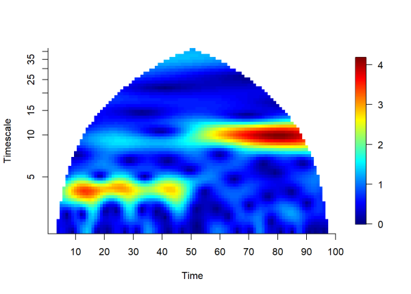
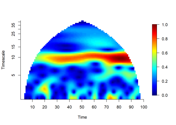
plotmag(wt1) # plot magnitude of wt
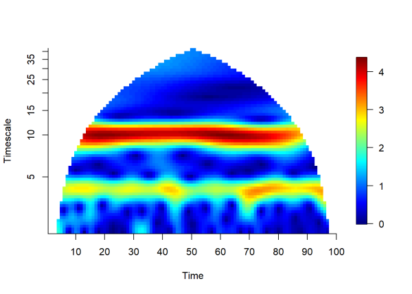
The plot above visualizes the magnitude of the wavelet transform (color scale) over time (x-axis) and timescale (y-axis). In this case, timescale is equivalent to the period (number of time units per cycle). Areas shaded in yellow to red hues indicate a strong signal at a given time and timescale. In this example we can see that a consistent signal is detected at timescales 4 and 10 for the entire duration of the time series. The lower limit of the y-axis (i.e. the minimum timescale that can be detected) is 2 units (defined as Δt/2, often called the Nyquist Frequency (McLean, 2005)). The maximum timescale that can be detected is 50 (defined as half the time series length), since longer signals can only complete one full cycle during the duration of the time series. The plot is cone-shaped to remove uncertain estimates made near the endpoints of the time series, see Torrence and Campo (1998), for more information.
The Morlet wavelet
Now that we’ve seen how wavelets can be applied, how do they work? There are many types of wavelets, however a popular choice (and used by the {wsyn} package) is the complex Morlet wavelet. A complex wavelet has a real component and an imaginary component, allowing us to separate the amplitude and the phase of a signal respectively (see below for a demonstration of phase agreement). For now, let’s plot the real part of a Morlet wavelet:
# create a function to calculate Morlet wavelet; 'a' is wavelet scale, which
# allows us to 'squeeze' and 'stretch' the wavelet, see Addison (2002) for
# technical details
morlet_wavelet <- function(t, a = 1) {
  # central frequency, controls number of 'waveforms' in the wavelet. 0.849 is
  # commonly used, which makes the two adjacent vertical peaks one half the
  # height of the central peak
  central_freq <- 0.849

  # angular frequency
  angular_freq <- 2 * pi * central_freq
  real_part <- (pi^(-1/4)) *   # normalization factor, allows wavelets
                               # of different scales to be compared
                 cos(angular_freq * t/a) *  # the 'real part' of the Morlet Wavelet,
                                            # creates the 'waves'
                                            # that we see in the plot
                 exp(-(t/a)^2 / 2)   # a Gaussian bell curve with mean = 0 and
                                     # standard dev = 1, 'confines' the waves from above

  data.frame(Time = t, Amplitude = real_part)   # save output as a data frame
}
# time vector
time <- seq(-15, 15, by = 0.01)
# set wavelet scale 'a'
wavelet_scale_1 <- 4
# compute wavelet
wavelet_1 <- morlet_wavelet(time, a = wavelet_scale_1)

p1 <- ggplot(wavelet_1, aes(x = Time, y = Amplitude)) +
  geom_line(color = "green", size = 1) +
  labs(title = paste("Morlet wavelet (Scale =", wavelet_scale_1, ")"),
       x = "Time",
       y = "Amplitude") +
  theme_bw() +
  theme(aspect.ratio = 1,
        panel.grid = element_blank())
# set larger wavelet scale (longer period)
wavelet_scale_2 <- 10
# compute wavelet
wavelet_2 <- morlet_wavelet(time, a = wavelet_scale_2)
p2 <- ggplot(wavelet_2, aes(x = Time, y = Amplitude)) +
  geom_line(color = "red", size = 1) +
  labs(title = paste("Morlet wavelet (Scale =", wavelet_scale_2, ")"),
       x = "Time",
       y = "Amplitude") +
  theme_bw() +
  theme(aspect.ratio = 1,
        panel.grid = element_blank())
# patch plots together with patchwork
p1 + p2
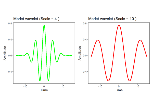
As seen above, the period of a wavelet is proportional to the scale parameter (Cazelles, 2008). Smaller scale parameters produce shorter periods, suitable for characterizing shorter timescales, while larger scale parameters produce longer periods, suitable for characterizing longer timescales. Wavelets are ‘matched’ to a signal by modifying the scale of the wavelet to match the period of the signal. For our purposes, we will demonstrate this visually, for a technical explanation, see Addison (2002).
Using our short (4 unit period) and long (10 unit period) signals from the first example, we will align the two wavelets that we made above with both signals:
# overlay wavelets on short signal, add a constant to each wavelet to align with
# signal; convert short signal to a data frame
p3 <- data.frame(value = ts1_short,
                 time = times) %>%

  # plot, scale by 0.8 for visualization purposes
  ggplot(aes(x = time, y = value*.8)) +

  # short timescale signal (4 unit period)
  geom_line(color = 'navy', size = 1.5) +

  # wavelet with smaller scale
  geom_line(data = wavelet_1, aes(x = time + 13, y = Amplitude),
            color = 'green', size = 1) +

  # wavelet with larger scale
  geom_line(data = wavelet_2, aes(x = time + 53, y = Amplitude),
            color = 'red', size = 1) +
  theme_bw(base_size = 12) +


  scale_x_continuous(expand = c(0,0)) +
  theme(panel.grid.major.y = element_blank(),
        panel.grid.minor.y = element_blank(),
        aspect.ratio = .2) +
  # crop plot for visualization purposes
  coord_cartesian(xlim = c(0,70)) +
  labs(title = 'Short timescale signal (4 unit period)',
       y = 'value')
# overlay wavelets on long signal, add a constant to each wavelet to align with
# signal; convert long signal to a data frame
p4 <- data.frame(value = ts1_long,
                 time = times) %>%
  # plot
  ggplot(aes(x = time, y = value*.8)) +

  # long timescale signal (10 unit period)
  geom_line(color = 'navy', size = 1.5) +

  # wavelet with shorter scale
  geom_line(data = wavelet_1, aes(x = time + 12.5, y = Amplitude),
            color = 'green', size = 1) +

  # wavelet with larger scale
  geom_line(data = wavelet_2, aes(x = time + 52.5, y = Amplitude),
            color = 'red', size = 1) +
  theme_bw(base_size = 12) +
  scale_x_continuous(expand = c(0,0)) +
  theme(panel.grid.major.y = element_blank(),
        panel.grid.minor.y = element_blank(),
        aspect.ratio = .2) +

  # crop plot for visualization purposes
  coord_cartesian(xlim = c(0,70)) +
  labs(title = 'Long timescale signal (10 unit period)',
      y = 'value')
# patch plots together with patchwork
p3 / p4
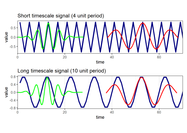
Instances above where a wavelet of a given scale aligns with the signal produce large positive values in the wavelet transform. Instances where a wavelet aligns poorly with the signal produce values near 0. We can see from the visualization above that the green wavelet (scale = 4) aligns well with the short signal (period = 4) and the red wavelet (scale = 10) aligns well with the long signal (period = 10). If we recall the plot of the wavelet transform that we produced earlier by calling plotmag(), these signals were identified by the yellow and red regions of the plot.
In practice, wavelets of increasing scales are ‘matched’ at all time locations, allowing us to detect the underlying signals of a time series and how the strength of these signals change through time. Other similar methods such as Fourier transformations cannot characterize signals whose periods change through time, making wavelets particularly useful in this scenario. Let’s try another example. Here we create a time series whose period abruptly increases halfway through:
# set seed
set.seed(456)
# number of time steps for each half of the signal (e.g. seconds, minutes,
# years)
times <- 1:100
# 4 unit period, first half of time series
ts2_short <- c(sin(times[1:49]*2*pi/4), times[50:100]*0)
# 10 unit period, second half of time series
ts2_long <- c(times[1:49]*0, sin(times[50:100]*2*pi/10))
# random noise for 100 time steps
ts2_noise <- rnorm(length(times),0,0.5)
# full time series
ts2 <- ts2_short + ts2_long + ts2_noise
# combine into a single dataframe, pivot to long format for plotting purposes
ts2_dt <- data.frame(short = ts2_short,
                     long = ts2_long,
                     noise = ts2_noise,
                     full_time_series = ts2,
                     time = times) %>%
  pivot_longer(short:full_time_series,
               names_to = 'component',
               values_to = 'value') %>%
  mutate(component = factor(component,
                            levels = c('short', 'long',
                                       'noise', 'full_time_series')))
# plot
ts2_dt %>%
  ggplot(aes(x = time, y = value, color = component)) +
  geom_line() +
  facet_wrap(vars(component), ncol = 1) +
    theme_bw(base_size = 12) +
  scale_x_continuous(expand = c(0,0)) +
  theme(panel.grid.major.y = element_blank(),
        panel.grid.minor.y = element_blank(),
        legend.position = 'none') +
  scale_color_manual(values = c('navy', 'navy', 'navy', 'black'))
Once again, we clean our data before taking the wavelet transform:
# prepare data for analysis
ts2_cln <- cleandat(ts2, times, clev=1)$cdat
# perform wavelet transform, second argument is the vector of time step values
wt2 <- wt(ts2_cln, times)
# plot magnitude of wt
plotmag(wt2)
The plot above shows the magnitude of the wavelet transform over time and timescale. It is easy to see the period of the signal increase from 4 to 10 at time = 50.
Using wavelets to measure association of multiple time series
If you have several time series measuring the same variable, you may be interested in the degree of association between them. Why might this be important? If the time series are measuring the magnitude of quantities over time, then a high degree of association among your time series will reinforce one another at the aggregate level (i.e. the sum of all components).
For example, let’s say we have a time series of the Gross Domestic Product (GDP) of Canada, the United States, and Mexico. The aggregate GDP of all three countries is simply the sum of the three countries’ individual GDP’s. We can plot an idealized example that shows what happens to the aggregate GDP when Canada, the United States, and Mexico are synchronous (high degree of association through time) or asynchronous (low degree of association through time). In other words, when all three countries are synchronous, the GDP of Canada, the United States, and Mexico will be high at the same time and low at the same time. Contrarily, when the countries are asynchronous, their highs and lows will tend to offset one another.
# First column, demonstrating synchronous conditions, all three countries share
# a short and long component; random noise is added
# number of time steps
times <- 1:30
# short component
# period for each sample
period_1 <- 2.5
ts3_short <- sin(times*2*pi/period_1)
# long component
# period for each sample
period_2 <- 10
ts3_long <- sin(times*2*pi/period_2)
# make data frame of times and time series
dt <- tibble(time = 1:length(times))
# standard deviation of noise
sig <- .5
# set the amplitude of each signal, effectively changing the size of the signal.
# Larger amplitudes deviate further from their mean
amp1 <- .7  # amplitude of signal 1
amp2 <- 1   # amplitude of signal 2
# append time series with random noise
set.seed(16271)
dt$Canada <- (rnorm(length(times),0, sig) + ts3_short*amp1 + ts3_long*amp2)
dt$United_States <- (rnorm(length(times),0, sig) + ts3_short*amp1 +
                       ts3_long*amp2)
dt$Mexico <- (rnorm(length(times),0, sig) + ts3_short*amp1 + ts3_long*amp2)
# scale aggregate for plotting purposes
dt$Total_GDP <- (dt$Canada+dt$United_States+dt$Mexico)/2
# plot 4 time series on one panel
p1 <- dt %>%
  select(time:Total_GDP) %>%
  pivot_longer(cols = c("Canada","United_States",
                        "Mexico", "Total_GDP")) %>%
  mutate(name = factor(name, levels = c("Canada","United_States",
                                        "Mexico", "Total_GDP"),
                       ordered = TRUE)) %>%
  ggplot(aes(x = time, y = value, group = name)) +
  geom_line(aes(color = name), size = 1.5) +
  facet_wrap(vars(name), ncol = 1)+
  theme_bw(base_size = 12) +
  theme(panel.grid = element_blank(),
        axis.text = element_blank(),
        axis.ticks.length=unit(-0.15, "cm"),
        strip.background = element_blank(),
        strip.text.x = element_blank(),
        legend.position = "none",
        axis.ticks.y = element_blank(),
        aspect.ratio = .3) +
  scale_color_manual(values = c("#E15759", "#4E79A7",
                                "#029414", "black")) +
  xlab("Time") +
  ylab('Gross Domestic Product') +
  ggtitle('Synchronous')+
  scale_x_continuous(limits = c(1,30),
                     breaks = c(5,10,15,20,25),
                     labels = c("","","","",""),
                     expand = c(0.01,0.01))
# Second column, demonstrating asynchronous conditions. The amplitudes of the
# shared signals are lowered to 0.1. the standard deviation of the random noise
# is increased
# number of time steps
times <- 1:30
# short component
# period for each sample
period_1 <- 2.5
ts3_short <- sin(times*2*pi/period_1)
# long component
# period for each sample
period_2 <- 10
ts3_long <- sin(times*2*pi/period_2)
# make data frame of times and time series
dt <- tibble(time = 1:length(times))
# standard deviation of noise
sig <- 1.5
# set the amplitude of each signal. We decrease these here to make the random
# noise more prominent
amp1 <- .1 # amplitude of signal 1
amp2 <- .1 # amplitude of signal 2
set.seed(-11582)
# append time series with random noise
dt$Canada <- (rnorm(length(times),0, sig) + ts3_short*amp1 + ts3_long*amp2)
dt$United_States <- (rnorm(length(times),0, sig) + ts3_short*amp1 +
                       ts3_long*amp2)
dt$Mexico <- (rnorm(length(times),0, sig) + ts3_short*amp1 + ts3_long*amp2)
# scale total for plotting purposes
dt$Total_GDP <- (dt$Canada+dt$United_States+dt$Mexico)/2
# plot 4 time series on one panel
p2 <- dt %>%
  select(time:Total_GDP) %>%
  pivot_longer(cols = c("Canada","United_States",
                        "Mexico", "Total_GDP")) %>%
  mutate(name = factor(name, levels = c("Canada","United_States",
                                        "Mexico", "Total_GDP"),
                       ordered = TRUE)) %>%
  ggplot(aes(x = time, y = value, group = name)) +
  geom_line(aes(color = name), size = 1.5) +
  facet_wrap(vars(name), ncol = 1, strip.position = 'right')+
  theme_bw(base_size = 12) +
  theme(panel.grid = element_blank(),
        axis.text = element_blank(),
        axis.ticks.length=unit(-0.15, "cm"),
        legend.position = "none",
        axis.ticks.y = element_blank(),
        aspect.ratio = .3) +
  scale_color_manual(values = c("#E15759", "#4E79A7",
                                "#029414", "black")) +
  xlab("Time") +
  ylab(element_blank()) +
  ggtitle('Asynchronous')+
  scale_x_continuous(limits = c(1,30),
                     breaks = c(5,10,15,20,25),
                     labels = c("","","","",""),
                     expand = c(0.01,0.01))
# patch together using patchwork
p1 + p2
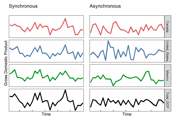
You can see above that when the different countries are synchronous, the aggregate measure (in this case GDP) is more variable through time (i.e. less stable).
Let’s try and measure the synchrony of several time series below. Here, we generate 10 time series with a shared 10 unit period signal, however the amplitude (i.e. magnitude of the oscillations) of the shared signal starts small and increases over time.
set.seed(867)
# time steps
times <- c(1:100)
# noise amplitude, constant over time
a <- seq(from = 5, to = 5, length.out = 100)
# signal amplitude, increases over time
b <- seq(from = 0, to = 3, length.out = 100)
# signal period, 10 unit period
p1 <- 10
# create 10 time series using for loop
ts4 <- matrix(nrow = 10, ncol = 100)
for (n in c(1:10)) {
  ts4[n,] <- c(a*rnorm(n = 100) +      # random noise
               b*sin(times*2*pi/p1))   # signal
}
# convert to a dataframe and plot
ts4 %>%
  t() %>%
  data.frame() %>%
  mutate(time = times) %>%
  pivot_longer(X1:X10, names_to = 'time_series', values_to = 'signal') %>%
  mutate(time_series = as.numeric(str_replace(time_series, pattern = 'X',
                                              replacement = ''))) %>%
  mutate(signal = time_series + signal/20) %>%
  ggplot(aes(x = time, y = signal, color = factor(time_series),
             group = time_series)) +
  geom_line() +
  theme_bw(base_size = 14) +
  theme(panel.grid.major.y = element_blank(),
        panel.grid.minor.y = element_blank(),
        panel.grid.minor.x = element_blank(),
        legend.position = 'none') +
  scale_y_continuous(name = 'Time series', breaks = 1:10)+
  scale_x_continuous(name = 'Time',
                     breaks = c(1,10,20,30,40,50,60,70,80,90,100),
                     expand = c(0,0))
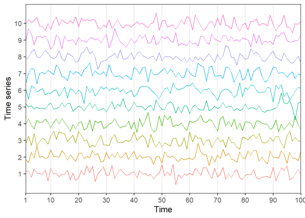
Visually assessing the plots, it’s difficult to detect any patterns. Let’s try taking the Pearson correlation between all 45 unique pairs of time series:
corr_mat <- cor(t(ts4))
pairwise_correlation <- corr_mat[upper.tri(corr_mat)]
hist(pairwise_correlation, 20,
     xlab="Pearson correlation", ylab="Count")
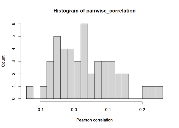
The median of the 45 pairwise Pearson correlations is 0.02. The noise added to the time series is masking the relatively long (10 unit) period that is shared among the time series. Using wavelet-based techniques, we can calculate a ‘wavelet phasor mean field’ to measure the association of all 10 time series. To carry this out we’ll use the wsyn::wpmf() function, see Sheppard (2016) for technical details.
Once again, we clean our data. Our data is formatted as a matrix where columns are time steps and rows are time series. When using wpmf() we can test for significance, which appears as the black outlines on the wavelet plot below. We will review how significance is determined in the following sections.
# prepare data for analysis
ts4_cln <- cleandat(ts4, times, clev=1)$cdat
# calculate wavelet phasor mean field
wpmf3 <- wpmf(ts4_cln, times, sigmethod = 'fft', nrand = 100)
# plot magnitude of wpmf
plotmag(wpmf3)
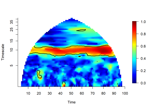
The plot above depicts the magnitude of the wavelet phasor mean field over time and timescale. Now we can see the association that the pairwise correlations failed to detect. The yellow to red hues indicate a high degree of association between the 10 time series. Association in this case is measured by phase agreement and is bounded by 0 and 1.
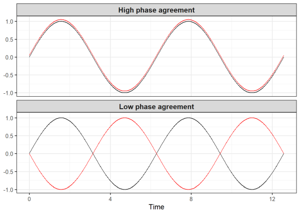
As a quick aside, we can visually demonstrate phase agreement. Below we generate two data sets each containing two time series. The two time series in the first data frame only differ by 0.05 in the vertical direction, resulting in high phase agreement. But the two time series in the second data frame differ by pi units (about 3.14), resulting in low phase agreement.
# times
ts5 <- seq(0, 4 * pi, length.out = 500)
# high phase agreement
data1 <- data.frame(
  x = ts5,
  y_1 = sin(ts5),
  y_2 = sin(ts5) + .05,
  panel = "High phase agreement")
# low phase agreement
data2 <- data.frame(
  x = ts5,
  y_1 = sin(ts5),
  y_2 = sin(ts5-pi),
  panel = "Low phase agreement")
# combine data for both panels
data <- rbind(data1, data2)
# plot
ggplot(data, aes(x = x)) +
  geom_line(aes(y = y_1), color = "black") +
  geom_line(aes(y = y_2), color = "red") +
  facet_wrap(~ panel, ncol = 1) +
    theme_bw(base_size = 12) +
  labs(x = 'Time', y = NULL) +
  theme(strip.text = element_text(size = 12, face = "bold"))
Now going back to the wavelet mean field plot above for the ts3_cln object, the black contours indicate regions of significant association among the 10 time series. Significance is tested by comparing our empirically observed wavelet mean field against the magnitudes of simulated data with the same structure of our time series, but with the association among them removed. This provides a distribution of null wavelet mean field magnitudes to compare our empirical value against (in this example we use 100 randomizations, in practice, more is preferred). The following code demonstrates this process, and is based on the source code from wpmf():
nrand <- 100
# generates surrogate data with the same structure as our time series, but with
# randomized phases
surr <- surrog(ts4_cln, nrand, "fft", syncpres = FALSE)
# create an array that is our WPMF dimensions by total
surrwpmfm <- array(NA, c(dim(wpmf3$values), nrand))
# iterate through randomizations
for (counter in 1:nrand) {

  # calculate wpmf on surrogate data
  h <- wpmf(surr[[counter]], times, sigmethod = "none")

  # append wpmf values for each iteration to array
  surrwpmfm[, , counter] <- Mod(get_values(h))
  }
# create matrix to calculate prop of times empir exceeds surr
gt <- matrix(NA, nrow(wpmf3$values), ncol(wpmf3$values))
# empirical wpmf values
mwpmfres <- Mod(wpmf3$values)
for (counter1 in 1:dim(wpmf3$values)[1]) {
  # iterate through both dimensions of the wpmf
  for (counter2 in 1:dim(wpmf3$values)[2]) {
    # sum the number of times that empir exceeds surr and divide by nrand
    gt[counter1, counter2] <- sum(surrwpmfm[counter1,counter2, ] <=
                                    mwpmfres[counter1, counter2])/nrand
    }
  }
# plot
ylocs <- pretty(wpmf3$timescales, n = 8)
xlocs <- pretty(times, n = 8)
fields::image.plot(x = times, y = log2(wpmf3$timescales),
                   z = gt, xlab = "Time",
                   ylab = "Timescale", axes = F,
                   col = c(rep('grey',95), rep('red', 5)),
                   main = 'Proportion of times empirical exceeds surrogates')
graphics::axis(1, at = xlocs, labels = xlocs)
graphics::axis(2, at = log2(ylocs), labels = ylocs)
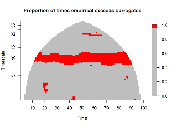
Significance is identified when the empirical magnitude exceeds 95% of the simulated magnitudes, highlighted by the red pixels above.
Incorporating oscillation magnitude to measure association of multiple time series
The wavelet phasor mean field only accounts for phase agreement when measuring the association of multiple time series. In order to take the magnitude of oscillations into account, we can calculate the ‘wavelet mean field’. To perform this calculation we use the wmf() function. The wavelet mean field considers phase agreement and oscillation magnitude, such that large oscillations that are in-phase among time series lead to higher wavelet mean field magnitudes. Wavelet mean field magnitudes can exceed 1.
# prepare to data for analysis
ts4_cln <- cleandat(ts4, times, clev=1)$cdat
# calculate wavelet mean field, notice no significance testing
wmf3 <- wmf(ts4_cln, times)
# plot magnitude of wmf
plotmag(wmf3)
The plot above visualizes the magnitude of the wavelet mean field over time and timescale. Yellow to red colors indicate a high degree of association among our time series. Note that the wavelet mean field detects that the oscillation magnitude is increasing through time, changing from about 0.5 to 1.0 moving from left to right in the plot. Also note that significance cannot be tested with the wavelet mean field. Instead, the wavelet mean field can be used in tandem with the wavelet phasor mean field. Significant regions of phase agreement can be assessed using the phasor mean field, then the wavelet mean field can measure association accounting for phase agreement and oscillation magnitude among the time series.
To learn more about the capabilities of wavelet-based techniques, see the wsyn documentation and vignette. Other features in the package allow for lagged relationships and tools for building ‘wavelet linear models’ to explain patterns in association between different variables.
R session details
The analysis was done using the R Statistical language (v4.5.1; R Core Team, 2025) on Windows 11 x64, using the packages lubridate (v1.9.4), tibble (v3.3.0), patchwork (v1.3.1), wsyn (v1.0.4), ggplot2 (v3.5.2), forcats (v1.0.0), stringr (v1.5.1), tidyverse (v2.0.0), dplyr (v1.1.4), purrr (v1.1.0), readr (v2.1.5) and tidyr (v1.3.1).
References
- Addison, P. S. (2002). The illustrated wavelet transform handbook: Introductory theory and applications in science, engineering, medicine and finance. Taylor & Francis. https://doi.org/10.1201/9781420033397
- Cazelles, B., Chavez, M., Berteaux, D., Ménard, F., Vik, J. O., Jenouvrier, S., & Stenseth, N. C. (2008). Wavelet analysis of ecological time series. Oecologia, 156(2), 287–304. https://doi.org/10.1007/s00442-008-0993-2
- Daniel C. Reuman, Thomas L. Anderson, Jonathan A. Walter, Lei Zhao and Lawrence W. Sheppard (2021). wsyn: Wavelet Approaches to Studies of Synchrony in Ecology and Other Fields. R package version 1.0.4. https://CRAN.R-project.org/package=wsyn
- McLean, R. F., Alsop, S. H., & Fleming, J. S. (2005). Nyquist—Overcoming the limitations. Journal of Sound and Vibration, 280(1), 1–20. https://doi.org/10.1016/j.jsv.2003.11.047
- R Core Team (2024). R: A Language and Environment for Statistical Computing. R Foundation for Statistical Computing, Vienna, Austria. https://www.R-project.org/. Version 4.1.0.
- Sheppard, L. W., Bell, J. R., Harrington, R., & Reuman, D. C. (2016). Changes in large-scale climate alter spatial synchrony of aphid pests. Nature Climate Change, 6(6), Article 6. https://doi.org/10.1038/nclimate2881
- Thomas Lin Pedersen (2024). patchwork: The Composer of Plots. R package version 1.2.0. https://CRAN.R-project.org/package=patchwork
- Torrence, C., & Compo, G. P. (1998). A Practical Guide to Wavelet Analysis. Bulletin of the American Meteorological Society, 79(1), 61–78. https://doi.org/10.1175/1520-0477(1998)079<0061:APGTWA>2.0.CO;2
- Wickham H, Averick M, Bryan J, Chang W, McGowan LD, François R, Grolemund G, Hayes A, Henry L, Hester J, Kuhn M, Pedersen TL, Miller E, Bache SM, Müller K, Ooms J, Robinson D, Seidel DP, Spinu V, Takahashi K, Vaughan D, Wilke C, Woo K, Yutani H (2019). “Welcome to the tidyverse.” Journal of Open Source Software, 4(43), 1686. doi: 10.21105/joss.01686 (URL: https://doi.org/10.21105/joss.01686).
Ethan Kadiyala
StatLab Associate
University of Virginia Library
January 22, 2025
For questions or clarifications regarding this article, contact statlab@virginia.edu.
View the entire collection of UVA Library StatLab articles, or learn how to cite.