Imagine you love baking cookies and invite your friends over for a cookie party. You want to know how many cookies you should make so you ask your friends about how many cookies they think they will each eat. They respond:
- Francesca: 5 cookies
- Sydney: 3 cookies
- Noelle: 1 cookie
- James: 7 cookies
- Brooke: 2 cookies
We take these numbers and add all of them together to estimate that about 18 cookies will be eaten in total at our party.
\[ 5 + 3 + 1 + 7 + 2 = 18 \text{ cookies total} \]
However, to find out how many cookies on average each person will eat (or the mean value of this data), we will add the number of cookies each person will eat and then divide by the number of people coming to our party.
To find the average number of cookies per person, we calculate:
\[ \frac{18}{5} = 4.4 \text{ cookies on average per person} \]
Our mean value takes all the data we have and summarizes it to a central point representing the typical number of cookies each person will eat. Some people will eat more and some people will eat less, but on average, it’s about 4.4 cookies per person. We can visualize this using a number line:

The mean gives us to way to think about the center value of our data. We might use it to think about the average price of a house in a given neighborhood, or the average exam score for a class, or the average amount of sleep you get in a night. The mean doesn’t give us detailed information but instead provides us a summary of the common value for data.
We can use the mean value to think about differences between groups.
One-sample t-test
Is the mean from our data statistically different from a specific value that we have?
Our cookie party was a success! We want to host another party and now invite 100 people. Again, we send out a survey to get an idea of how many cookies we should make. We think that we will need to make about 5 cookies per person since 5 cookies per person was close to how many cookies each person ate at our last party.
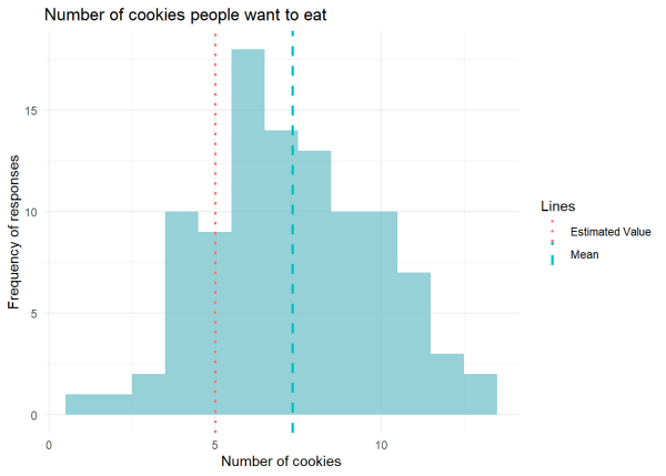
We get the data back, calculate the mean, and find that actually it’s about 7.1 cookies per person! Is a mean of 7.1 cookies for our group statistically different than our estimated value of 5? We can visualize the mean value and our estimated value using a number line:

Let’s generate data that describes how many cookies each person said they will eat from the survey with our mean value of 7.1 cookies.
First, let’s load the packages we’ll be using in this article by calling library(). If you do not have one or more of the packages, you can install it using the install.packages() function. We’ll use set.seed() to make the results reproducible.
set.seed(15) #for reproducibility
library(ggplot2) #for plots
library(dplyr) #for data wrangling
#Generate 100 observations with mean = 7.1 and standard deviation = 2.5
df1 <- tibble(NumberOfCookies = round(pmax(rnorm(100, mean = 7.1, sd = 2.5), 0)))
We can visualize our data using a histogram where we can see how often people responded with the number of cookies they would eat. In other words, we can visualize the distribution of our data. We can expect values to mostly fall around our mean value of 7.1. We are going to add our estimated value of 5 as a dotted line.
ggplot(df1, aes(x = NumberOfCookies)) +
  geom_histogram(binwidth = 1, fill = "cadetblue3", alpha = 0.8) +

  # Add vertical line at the mean with color and linetype
  geom_vline(aes(xintercept = mean(NumberOfCookies), color = "Mean"),
             linewidth = 1, linetype = "dashed") +

  # Add vertical line at estimated value of 5 with color and linetype
  geom_vline(aes(xintercept = 5, color = "Estimated Value"),
             linewidth = 1, linetype = "dotted") +

  # Add labels
  labs(title = "Number of cookies people want to eat",
       x = "Number of cookies", y = "Frequency of responses",
       color = "Lines", linetype = "Line Types") +

  #Change plot aesthetics
  theme_minimal()

Now, we are ready to run a One-Sample t-test checking if our estimated value of 5 is stastically different from our sample mean of 7.1.
#Run One-Sample t-test with our data (`df1`) and our estimated value of 5 (`mu = 5`)
one.samp.t.test <- t.test(df1, mu = 5)
#Look at results of t-test
one.samp.t.test
    One Sample t-test
data:  df1
t = 9.2503, df = 99, p-value = 4.724e-15
alternative hypothesis: true mean is not equal to 5
95 percent confidence interval:
 6.830208 7.829792
sample estimates:
mean of x
     7.33
The mean of our sample is statistically different from our estimated value of 5 (p < 0.001). This is because the p-value of our t t-test is so small that it’s practically 0 which tells us that the probability of sampling data with a mean of 7.1, assuming the population mean is 5, is highly unlikely. We reject our original estimated value of 5, and we conclude people will eat approximately 7 cookies on average.
Two-Sample t-test
Are the means of 2 groups statistically different from each other?
We have a lot of cookies to bake and decide we’ll make 2 different types: (1) chocolate chip cookies and (2) oatmeal cookies. We bake the cookies and each of our 100 participants rates the cookies from 0 to 15 with 15 being the highest score. We calculate the mean rating each cookie type received to see which one people generally rated higher. We now have 2 mean values!
We can visualize this on our number line where we have a difference of 5 between our mean ratings of 9 for chocolate chip and 4 for oatmeal.

We want to see if the means of our cookie groups (chocolate chip and oatmeal) are statistically different.
Let’s generate the data for the ratings we received for the chocolate chip and oatmeal cookies from our 100 participants.
#For reproducibility
set.seed(15)
#Generate data
chocolate <- round(pmin(pmax(rnorm(100, mean = 9, sd = 3), 0), 15))
oatmeal <- round(pmin(pmax(rnorm(100, mean = 4, sd = 2), 0), 15))
#Create a data frame combining both cookies types
df2 <- data.frame(value = c(chocolate, oatmeal),
                 group = factor(c(rep("chocolate", 100),
                                 rep("oatmeal", 100)))) %>%

  #Calculate the mean value for each cookie type
  group_by(group) %>%
    mutate(mean = mean(value)) %>%
  ungroup()
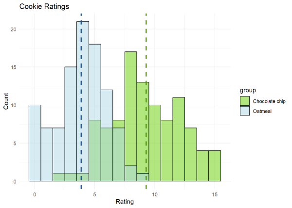
We can visualize the responses by looking at a histogram of the ratings we received with a dashed line to represent the mean value for each cookie type.
ggplot(df2, aes(x = value, fill = group)) +
  geom_histogram(binwidth = 1, position = "identity", bins = 30,
                 alpha = 0.5, color = "black") +

  #Change colors
  scale_fill_manual(values = c("chartreuse3", "lightblue"),
                    labels = c("Chocolate chip", "Oatmeal")) +

  #Add mean value as a vertical line for each cookie type
  geom_vline(aes(xintercept = mean, color = group),
             linetype = "dashed", linewidth = 1, show.legend = FALSE) +
  scale_color_manual(values = c("chartreuse4", "dodgerblue4")) +

  #Add labels
  labs(title = "Cookie Ratings", x = "Rating",y = "Count") +
  #Change aesthetics
  theme_minimal()

As reflected in our mean values, we can see that people generally rated chocolate chip cookies higher than oatmeal cookies.
We can now run our Two-Sample t-test where our ratings (value) will be explained by the cookie group (chocolate chip or oatmeal).
two.samp.ttest <- t.test(value ~ group, data = df2)
two.samp.ttest
    Welch Two Sample t-test
data:  value by group
t = 14.989, df = 181.44, p-value < 2.2e-16
alternative hypothesis: true difference in means between group chocolate and group oatmeal is not equal to 0
95 percent confidence interval:
 4.69782 6.12218
sample estimates:
mean in group chocolate   mean in group oatmeal
                   9.27                    3.86
From our results, we can see that there is a significant difference in the means between the chocolate and oatmeal groups (p < 0.001). On average, chocolate chip cookies have a higher mean (9.27) compared to our oatmeal cookies (3.86). Therefore, we can reject the null hypothesis that there is no difference between the ratings for the two groups of cookies. Rather, these findings provide strong evidence to support the conclusion that there is a significant difference between the chocolate and oatmeal groups.
Analysis of Variance (ANOVA)
Are the means of 3 or more groups statistically different from each other?
What if we want to add another cookie to our test so that we have 3 different cookies to compare. We can use the same concept of looking at our mean value to give us an idea of the representative rating for each type of cookie we make. However, to evaluate significant differences between 3 cookie groups ( (1) chocolate chip cookies, (2) oatmeal cookies, (3) sugar cookies) we will use an ANOVA (or Analysis of Variance). An ANOVA allows us to see if mean ratings between our cookie types are statistically significant, helping us understand if one cookie is really better or if the rating differences might just be due to chance.
We bake our cookies and have 100 people rate each cookie from a scale of 0 - 15, with 15 being the highest score. We then calculate the mean for each cookie type. We find that the mean rating for each cookie type is:
- Oatmeal: 3
- Chocolate chip: 9
- Sugar: 14
We can visualize these mean values with our number line. Remember, the mean value represents an average or typical response by simplifying all the answers we got into a single value.

Let’s generate the data for the ratings we received for the chocolate chip, oatmeal, and sugar cookies from our 100 participants.
#For reproducibility
set.seed(15)
#Generate ratings from 100 people with the mean rating for each cookie type
oatmeal3 <- round(pmin(pmax(rnorm(100, mean = 3, sd = 2),  0), 15))
chocolate3 <- round(pmin(pmax(rnorm(100, mean = 9, sd = 3),0), 15))
sugar3 <- round(pmin(pmax(rnorm(100, mean = 14, sd = 3.5), 0), 15))
#Create a data frame
df3 <- data.frame(value = c(chocolate3, oatmeal3, sugar3),
                 CookieType = factor(c(rep("chocolate", 100),
                                  rep("oatmeal", 100),
                                  rep("sugar", 100)))) %>%

       #Calculate the mean value of each cookie type
       group_by(CookieType) %>%
        mutate(mean = mean(value)) %>%
       ungroup() %>%

      #Rename column
      rename("rating" = "value")
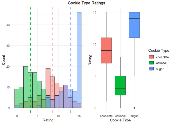
We can again visualize the the ratings for each group with a histogram to get a sense of the ratings each cookie received. In addition to the histogram, we can also use a box plot which provides a quick, visual summary of the data for us.
We will create both plots. The vertical dashed lines represents the mean value for that cookie type.
#Create histogram
df3.hist <- ggplot(df3, aes(x = rating, fill = CookieType)) +
  geom_histogram(position = "identity", bins = 15, alpha = 0.5, color = "black", show.legend = FALSE) +
  labs(x = "Rating",y = "Count") +
  geom_vline(aes(xintercept = mean, color = CookieType),
             linetype = "dashed", linewidth = 1, show.legend = FALSE) +
  theme_minimal()
#Create boxplot
df3.boxplot <- ggplot(df3, aes(x = CookieType, y = rating, fill = CookieType)) +
  geom_boxplot() +
  labs(x = "Cookie Type", y = "Rating", fill = "Cookie Type") +
  theme(axis.text.x = element_text(angle = 45, vjust = 0.5, hjust=1)) +
  theme_minimal()

We can see that most people tended to rate the sugar cookie highest, followed by the chocolate chip and oatmeal cookie.
We will now run an ANOVA to determine if there are significant differences between the means of the ratings for our 3 cookie types. Our independent variable is rating and our dependent variable is CookieType. We can think about this as the rating each cookie gets is dependent on the type of cookie it is!
#Run ANOVA with our ratings predicted by the CookieType
aov <- aov(rating ~ CookieType, data = df3)
#Get the summary of the ANOVA
summary(aov)
             Df Sum Sq Mean Sq F value Pr(>F)
CookieType    2   4642  2321.0   311.5 <2e-16 ***
Residuals   297   2213     7.5
---
Signif. codes:  0 '***' 0.001 '**' 0.01 '*' 0.05 '.' 0.1 ' ' 1
We determine that the type of cookie does significantly affect the rating it receives (p < 0.001), making it unlikely that these differences are due to chance.
Multivariate Analysis of Variance (MANOVA)
Are the means of two or more dependent variables statistically different across 3 or more groups?
From our ANOVA, we know cookie type is important in how much people enjoy the cookie. However, there are lots of cookie options out there! We decide we are going to bake both crispy and chewy cookies for each of our oatmeal, chocolate chip, and sugar cookie types.
Instead of using a single number line showing differences in mean ratings, we would now need 2 number lines to account for both groupings — cookie type and texture.
Let’s generate data for crispy and chewy oatmeal, chocolate, and sugar cookies and visualize the means in a table.
#For reproducibility
set.seed(15)
chocolate_crispy <- round(pmin(pmax(rnorm(100, mean = 12, sd = 3), 0), 15))
chocolate_chewy <- round(pmin(pmax(rnorm(100, mean = 6, sd = 2), 0), 15))
oatmeal_crispy <- round(pmin(pmax(rnorm(100, mean = 10, sd = 3.5), 0), 15))
oatmeal_chewy <- round(pmin(pmax(rnorm(100, mean = 8, sd = 1.8), 0), 15))
sugar_crispy <- round(pmin(pmax(rnorm(100, mean = 14, sd = 2.5), 0), 15))
sugar_chewy <- round(pmin(pmax(rnorm(100, mean = 9, sd = 2), 0), 15))
# Combining into a data frame
df4 <- data.frame(
  crispy = c(chocolate_crispy, oatmeal_crispy, sugar_crispy),
  chewy = c(chocolate_chewy, oatmeal_chewy, sugar_chewy),
  CookieType = factor(c(rep("chocolate", 100),
                        rep("oatmeal", 100),
                        rep("sugar", 100))))
#Examine the first few rows of data
head(df4)
  crispy chewy CookieType
1     13     6  chocolate
2     15     6  chocolate
3     11     4  chocolate
4     15     9  chocolate
5     13     8  chocolate
6      8     5  chocolate
#Visualize means in a table
df4 %>%
  group_by(CookieType) %>%
  summarise(Crispy = round(mean(crispy),0),
            Chewy = round(mean(chewy),0))
  CookieType Crispy Chewy
1 chocolate      12     6
2 oatmeal        10     8
3 sugar          14     9
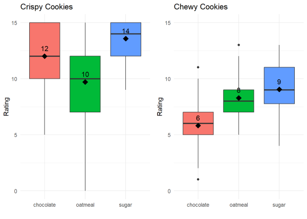
We can visualize the ratings for each cookie type and cookie texture and the mean values data with box plots. The black diamond represents our mean value and the black line represents our median value for each cookie type and texture.
#Create box plot for crispy cookies
boxplot_crispy <-
  ggplot(df4, aes(x = CookieType, y = crispy, fill = CookieType)) +
  geom_boxplot(show.legend = FALSE) +

  #Add mean point
  stat_summary(fun = mean, geom = "point", size = 4, color = "black",
               shape = 18, show.legend = FALSE) +

  #Add mean value as text
  stat_summary(fun = mean, geom = "text", aes(label = round(after_stat(y), 0)),
               position = position_nudge(y = 0.7), size = 4) +

  #Add labels
  labs(title = "Chewy Cookies", y = "Rating", x = "") +
  labs(title = "Crispy Cookies", y = "Rating", x = "") +

  #Change aesthetics
  theme_minimal()
#Create box plot for chewy cookies
boxplot_chewy <-
  ggplot(df4, aes(x = CookieType, y = chewy, fill = CookieType)) +
  geom_boxplot(show.legend = FALSE) +

  #Add mean point
  stat_summary(fun = mean, geom = "point", size = 4, color = "black",
               shape = 18, show.legend = FALSE) +

  #Add mean value as text
  stat_summary(fun = mean, geom = "text", aes(label = round(after_stat(y), 0)),
               position = position_nudge(y = 0.7), size = 4) +

  #Change labels
  labs(title = "Chewy Cookies", y = "Rating", x = "") +

  #Set y-axis limit from 0 to 15
  scale_y_continuous(limits = c(0, 15)) +

  #Change aesthetics
  theme_minimal()

From our mean values, we can see that people generally preferred crispy cookies over chewy cookies and that a crispy sugar cookie had the highest rating! We want to test this statistically but we now have to account for both the cookie type and the texture. In other words, we have 2 dependent variables. The cookie rating is dependent on the cookie type and the cookie texture.
In this case, we will use Multivariate analysis of variance (MANOVA).
#Run MANOVA
manova.test <- manova(cbind(crispy, chewy) ~ CookieType, data = df4)
#Get summary of the MANOVA
summary(manova.test)
            Df  Pillai approx F num Df den Df    Pr(>F)
CookieType   2 0.57781   60.332      4    594 < 2.2e-16 ***
Residuals  297
---
Signif. codes:  0 '***' 0.001 '**' 0.01 '*' 0.05 '.' 0.1 ' ' 1
We can see that there are significant differences between our groups (p < 0.001). We can reject the null hypothesis that there is no difference between the cookie types and conclude that it is likely cookie type is associated with the crispy and chewy ratings of the cookies.
To see which textures differ, we can call summary.aov() on our MANOVA result.
#See which textures differ
summary.aov(manova.test)
 Response crispy :
             Df  Sum Sq Mean Sq F value    Pr(>F)
CookieType    2  757.73  378.86   54.53 < 2.2e-16 ***
Residuals   297 2063.51    6.95
---
Signif. codes:  0 '***' 0.001 '**' 0.01 '*' 0.05 '.' 0.1 ' ' 1
 Response chewy :
             Df  Sum Sq Mean Sq F value    Pr(>F)
CookieType    2  570.38 285.190  66.831 < 2.2e-16 ***
Residuals   297 1267.39   4.267
---
Signif. codes:  0 '***' 0.001 '**' 0.01 '*' 0.05 '.' 0.1 ' ' 1
The variables are significantly different between the cookie textures of crispy and chewy.
Additional considerations
Since this article is written for beginners and is an introduction to significance testing of the mean, we did not cover assumptions or other technical details of these tests. However, these are an important part of using the tests correctly and understanding them, and we direct the reader to explore additional resources on t-tests, ANOVA, and MANOVA. We have listed a few resources here:
t-tests:
- Diez, D., Cetinkaya-Rundel, M., Barr, C. (2019). OpenIntro Statistics. (Fourth Edition ed.) OpenIntro, Inc. https://www.openintro.org/book/os/ Access OpenIntro Statistics (Chapter 7) here
- Fein, E.C. et al. (2022) Statistics for Research Students: An open access resource with self-tests and illustrative examples. Toowoomba, Queensland: University of Southern Queensland. Access Statistics for Research Students (Chapter 3) here
- Illowsky, B. et al. (2023) Introductory Statistics 2e. OpenStax. Access OpenStax Introductory Statistics (Chapters 9 and 10) here
ANOVA:
- Diez, D., Cetinkaya-Rundel, M., Barr, C. (2019). OpenIntro Statistics 4th ed. OpenIntro, Inc. https://www.openintro.org/book/os/ Access OpenIntro Statistics (Chapter 7) here
- Fein, E.C. et al. (2022). Statistics for Research Students: An open access resource with self-tests and illustrative examples. Toowoomba, Queensland: University of Southern Queensland. Access Statistics for Research Students (Chapter 6) here
- Illowsky, B. et al. (2023). Introductory Statistics 2e. OpenStax. Access OpenStax Introductory Statistics (Chapter 13) here
- Webb, R. (2021). Mostly Harmless Statistics. PDXOpen: Open Educational Resources. 36. https://pdxscholar.library.pdx.edu/pdxopen/36 Access Mostly Harmless Elementary Statistics (Chapter 10) here
MANOVA:
- Everitt, B., & Hothorn, T. (2010). A handbook of statistical analyses using R (2nd ed.). CRC Press. 978-1-4200-7933-3.
- Hair, J.F. et al. (2009). Multivariate Data Analysis. 7th ed. Erscheinungsort nicht ermittelbar: Prentice Hall. 9780138132637.
- Johnson, R. A., & Wichern, D. W. (2007). Applied multivariate statistical analysis (6th ed.). Pearson Prentice Hall.
R session details
The analysis was done using the R Statistical language (v4.5.1; R Core Team, 2025) on Windows 11 x64, using the packages ggplot2 (v3.5.2) and dplyr (v1.1.4).
References
- Auguie, B. (2017). gridExtra: Miscellaneous Functions for “Grid” Graphics. R package version 2.3, https://CRAN.R-project.org/package=gridExtra.
- R Core Team (2024). R: A Language and Environment for Statistical Computing. R Foundation for Statistical Computing, Vienna, Austria. https://www.R-project.org/.
- Wickham, H. (2016). ggplot2: Elegant Graphics for Data Analysis. Springer-Verlag, New York.
- Wickham, H., François, R., Henry, L., Müller, K., Vaughan D. (2023). dplyr: A Grammar of Data Manipulation. R package version 1.1.3, https://CRAN.R-project.org/package=dplyr.
- Zhu, H. (2021). kableExtra: Construct Complex Table with ‘kable’ and Pipe Syntax. R package version 1.3.4, https://CRAN.R-project.org/package=kableExtra.
- Xie, Y. (2023). knitr: A General-Purpose Package for Dynamic Report Generation in R. R package version 1.45, https://yihui.org/knitr/
Lauren Brideau
StatLab Associate
University of Virginia Library
November 19, 2024
For questions or clarifications regarding this article, contact statlab@virginia.edu.
View the entire collection of UVA Library StatLab articles, or learn how to cite.
