
When we perform statistical tests, we often want to obtain a p-value, which describes the probability of obtaining test results at least as extreme as the observed result, assuming that the null hypothesis is true. In other words, how likely would it be to observe an effect as large (or larger) than the observed effect from chance and chance alone if the null is true? Common statistical approaches such as t-tests, ANOVAs, and linear regression make assumptions about the data or the errors. These approaches are called “parametric tests.” If the assumptions of parametric tests are not met, then the accuracy of the p-value may be affected, such as an increased false positive rate.
Permutation-based approaches offer alternative methods to test for significance that relax the assumptions made by parametric tests. Permutation tests calculate p-values by: 1) calculating a test statistic, 2) permuting (i.e. reshuffling) the data, 3) recalculating the test statistic on the permuted data, 4) repeating steps 2 and 3 many times (often 1000 - 10000 times), and 5) compare the original test statistics to the “null distribution” of test statistics derived from the permuted data.
By permuting the data, we are obscuring any apparent relationships or associations in the data. Repeatedly calculating test statistics on permuted data builds a distribution of test statistics that are possible under a true null hypothesis (i.e. a null distribution). Statistical significance is present when the original test statistics are as large or larger than 95% of the permuted test statistics from the null distribution (assuming \(\alpha\) = 0.05).
Let’s demonstrate a permutation test with a simple example in R. Here we load the {ggplot2} package for plotting tools and the {dplyr} package to help with data wrangling. These packages can be installed using the install.packages() function.
library(ggplot2)
library(dplyr)
Imagine we are developing a new allergy medication and testing its efficacy relative to a control treatment. Both treatments were tested on 50 people. We are curious if the average response, measured as a comfort rating, differs between the control and treated groups. Below we generate data for this example. The control group has a mean comfort rating of about 65, and the treated group has a mean rating of approximately 70.
set.seed(12345)   # set seed for reproducibility
s1 <- rnorm(n = 50, mean = 65, sd = 10)   # control group
s2 <- rnorm(n = 50, mean = 70, sd = 10)   # treated group
# create column indicating which group a rating corresponds to
groups <- c(rep('control',length(s1)), rep('treated',length(s2)))
# combine into a data frame
dat <- data.frame(rating = c(s1,s2), group = factor(groups))
To test if the mean rating differs between the control and treated groups, we can perform a two-sample t-test using the lm() function. The model below tests whether the average rating differs by group and p-values are returned using the summary() function. The estimated difference between groups is listed under Estimate in the grouptreated row. The associated p-value is listed under Pr(>|t|).
mod <- lm(rating ~ group, data = dat)
summary(mod)
Call:
lm(formula = rating ~ group, data = dat)
Residuals:
    Min      1Q  Median      3Q     Max
-26.578  -8.628   1.985   6.431  21.663
Coefficients:
             Estimate Std. Error t value Pr(>|t|)
(Intercept)    66.796      1.582  42.230  < 2e-16 ***
grouptreated    6.313      2.237   2.822  0.00578 **
---
Signif. codes:  0 '***' 0.001 '**' 0.01 '*' 0.05 '.' 0.1 ' ' 1
Residual standard error: 11.18 on 98 degrees of freedom
Multiple R-squared:  0.07516,   Adjusted R-squared:  0.06572
F-statistic: 7.964 on 1 and 98 DF,  p-value: 0.005778
The p-value above was calculated using a t-test, which assumes the data is independent, normally distributed, and has equal variances. The data that we generated meets these assumptions. The p-value is 0.0058, which represents the probability of observing a difference in means this large or larger under a true null hypothesis. In other words, we can reject our null hypothesis that there is no difference in mean ratings between the control and treated groups.
Let’s try to replicate these results using a permutation-based approach. Below we prepare to run a for loop by setting the number of permutations (in this case, 1000) and creating a list to append the permuted data to. Note that we add our original data to the list. Assuming a true null hypothesis that there is no difference in means between groups, the observed data is one of the possible random combinations of observations.
n_perm <- 1000
output_list <- vector("list", n_perm)
# append original data (permutation 1)
dat$permutation <- 1
# reassign groups to the permuted data
dat$new_group <- factor(groups)
output_list[[1]] <- dat
Next, we iterate through the 999 remaining permutations. During each loop, we generate a vector using the sample() function to permute the data.
for (i in 2:n_perm) {
  perm <- sample(1:length(groups), size = length(groups))

  newdat <- dat[perm, ]
  newdat$permutation <- i
  # reassign groups to the permuted data
  newdat$new_group <- groups
  output_list[[i]] <- newdat
}
output <- do.call(rbind, output_list)
Before calculating the difference in means for all our permutations, we can visually represent what the permutations are doing to the original data. Below we will plot each rating as a point. The color of the point represents the original group (control or treated) that the observation belonged to before permuting. Its position on the x-axis (either ‘control’ or ‘treated’) represents the new group that the observation belongs to after permuting. Panel 1 displays the observed data, and panels 2-9 display the first 8 permutations that we performed. Before we make our plots, we calculate the means of the groups to serve as a visual aid in the panels (shown by the black crossbars).
means <- output %>%
  filter(permutation %in% c(1:9)) %>%   # select first 9 rows
  group_by(permutation, new_group) %>%
  summarise(mean_rating = mean(rating)) %>%   # calculate mean for each group
  ungroup()
# plot
ggplot(data = output[output$permutation %in% c(1:9),], # select first 9 rows
       aes(x = new_group, y = rating, color = group)) +
  geom_point(alpha = .5, position = position_jitter(width = .2)) +
  geom_crossbar(data = means,
    aes(x = new_group, y = mean_rating, ymin = mean_rating, ymax = mean_rating),
    color = "black", width = 0.4,) +
  facet_wrap(vars(permutation)) +   # create separate panels for each permutation
  theme_bw() +
  xlab('Permuted group') +
  ylab('Rating') +
  labs(color = 'Original \ngroup')
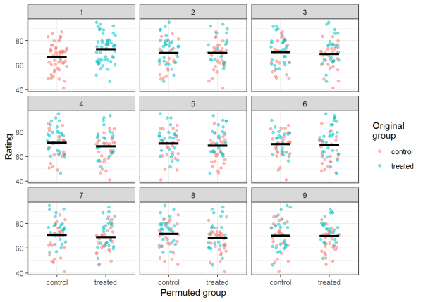
Visually assessing panel 1, you can see that the control group has a noticeably lower mean than the treated group, just as we designed the data. Examining panels 2-9, we can see that by permuting the data, we are rearranging the observations such that the means for each group (and the differences between them) are random. In order to calculate a p-value, we will calculate the means for both groups for each permutation. Then we will take the difference between the groups for each permutation. After doing so, we will have a null distribution of 1000 differences in means between the control and treated groups.
# calculate the means for group 1 for each permutation
group_1 <- output %>%
  filter(new_group == 'control') %>%
  group_by(permutation) %>%
  summarise(av_rating = mean(rating)) %>%
  pull(av_rating)
# calculate the means for group 2 for each permutation
group_2 <- output %>%
  filter(new_group == 'treated') %>%
  group_by(permutation) %>%
  summarise(av_rating = mean(rating)) %>%
  pull(av_rating)
# calculate difference in means for each permutation
difference <- group_2 - group_1
We can compare the observed difference in means with the null distribution by plotting a histogram and adding a red line to represent the observed differences in means. If the red line is near the extremes of the null distribution, then our observed test statistic is likely to have a small p-value, since randomly permuted data rarely produce values as large or larger.
hist(difference, breaks = 40, main = 'Histogram of difference in means')
abline(v = difference[1], col = "red", lwd = 2)
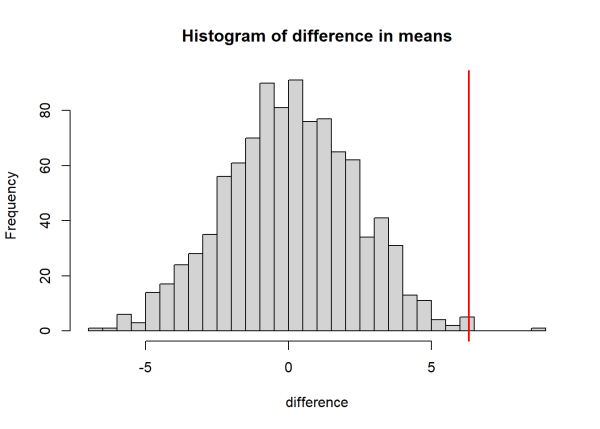
The visualization above indicates that our test statistic may be significant. Let’s calculate the p-value. Here, we divide the number of times that the null distribution is at least as large as the observed value, then divide by the number of permutations. This calculates the probability that the permuted (null) values exceed our test statistic (i.e. the p-value). In the code below, we take the absolute value of the test statistics to perform a two sided test (we don’t have prior reasoning that the difference between groups would be positive or negative).
pval <- length(difference[abs(difference) >= abs(difference[1])])/n_perm
pval
[1] 0.005
Using permutation-based approaches to test for significance, we calculated a p-value of 0.005, which is comparable to the p-value from the t-test earlier.
In the example above, using either a t-test or permutation test is valid and will yield the same results. However, if the data within each group were not normally distributed or not independent, then the assumptions of the t-test would be violated. Fortunately, permutation tests do not make such strict assumptions although they still require independence (however, see “experimental exchangeability” in Anderson 2001a). This makes permutation-based approaches slightly more flexible than parametric tests, the main drawback being computational time, as permutation tests are repetitive.
Exchangeability
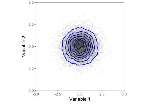
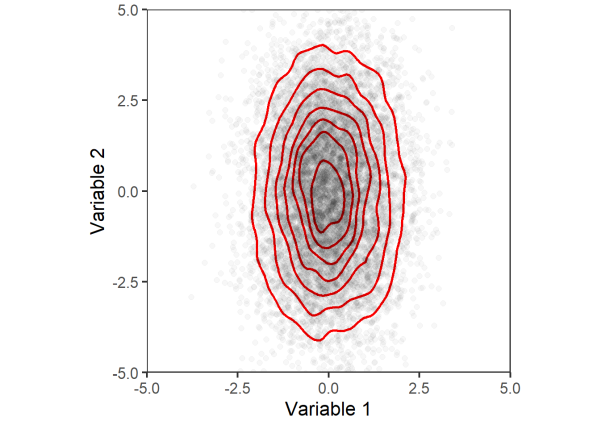
While permutation-based approaches make less assumptions than parametric tests, important considerations must be made when exchanging two variables, as we did in the example above (permuting between the control and treated groups). Variables are only exchangeable if, under the null hypothesis, permuting observations between them does not change their joint distribution (Winkler et al. 2014 ). We can demonstrate this assumption visually using simulated data. Below we create two random variables with the same mean and standard deviation.
n <- 10000   # number of points
set.seed(1234)   # for reproducibility
v1 <- rnorm(n = n, mean = 0, sd = 1)   # variable 1
v2 <- rnorm(n = n, mean = 0, sd = 1)   # variable 2
dat <- data.frame(v1 = v1, v2 = v2) # combine into data frame
We can visualize the joint distribution of the two variables with a scatter plot. As another visual aid, we will use geom_density_2d to plot contours around areas with the highest densities of points.
# plotting function
joint_dist_plot <- function(data = NULL, color = 'blue') {
  ggplot(data = data, aes(x = v1, y = v2)) +
    geom_density_2d(linewidth = 1, color = color) +
    geom_point(alpha = .03, size = 2) +
    theme_bw(base_size = 16) +
    theme(aspect.ratio = 1,
          panel.grid = element_blank()) +
    coord_cartesian(xlim = c(-5,5),
                    ylim = c(-5,5),
                    expand = F) +
    xlab('Variable 1') +
    ylab('Variable 2')
}
# plot
dat %>%
  joint_dist_plot()
Next, we will permute the data by reshuffling the observations between the two variables. Once again, we will plot the joint distribution using a scatter plot with density contours.
# permute
perm <- sample(c(v1,v2))
v1_perm <- perm[1:n]
v2_perm <- perm[(n+1):(2*n)]
dat_perm <- data.frame(v1 = v1_perm, v2 = v2_perm)
# plot
dat_perm %>%
  joint_dist_plot()
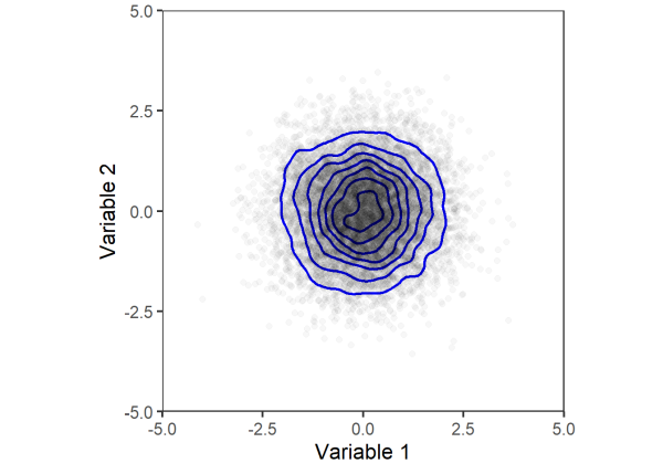
Comparing the two plots above, we can see that the joint distribution of variables 1 and 2 does not change after permuting. Thus, the two variables are considered exchangeable and can be permuted to test for significance.
Let’s consider a similar example. Here we generate two variables with the same mean but different standard deviations. Plotting their joint distributions, we can see that variable 2 has more variability (i.e. spread of points across the y-axis) compared to variable 1 (less spread across the x-axis).
set.seed(5678)   # for reproducibility
v1 <- rnorm(n = n, mean = 0, sd = 1)   # variable 1
v2 <- rnorm(n = n, mean = 0, sd = 2)   # variable 2
dat <- data.frame(v1 = v1, v2 = v2)
# plot
dat %>%
  joint_dist_plot(color = 'red')
Again, we will permute the data and plot the joint distribution.
# permute
perm <- sample(c(v1,v2))
v1_perm <- perm[1:n]
v2_perm <- perm[(n+1):(2*n)]
dat_perm <- data.frame(v1 = v1_perm, v2 = v2_perm)
dat_perm %>%
  joint_dist_plot(color = 'red')
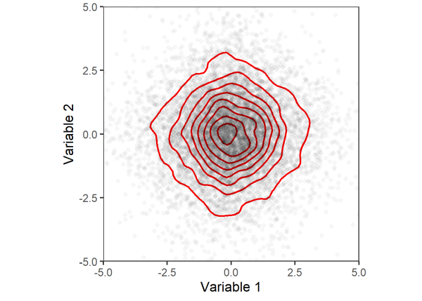
Comparing the last two plots, we can clearly see that the joint distribution between variables 1 and 2 changed after permuting the data. Thus, the assumption of exchangeability is not met and we may not use these variables in permutation tests. While permutation approaches relax some of the assumptions made by parametric tests, they are sensitive to heterogeneous variances (Boik 1987, Anderson 2001b), which violate the assumption of exchangeability.
Returning to the first example comparing the difference in means in allergy comfort rating between a control and treated group, exchangeability was not violated. This is because the control and treated groups had the same standard deviations (i.e. homogeneous variances) and under the null hypothesis, we assumed that the groups had no difference in means (similar to the joint distributions with blue contours above). Therefore, the observations between the control and treated groups were exchangeable under a true null hypothesis (Anderson 2001a).
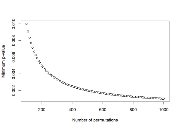
Choosing the number of permutations
As a quick aside, the number of permutations used affects what values your p-value can take on, and the maximum number of permutations possible is limited by the sample size and data structure. The number of possible combinations of n observations in k-sized groups is explained here. In the allergy medication example above, the number of possible permutations of 100 observations into two groups of 50 is:
choose(100, 50)
[1] 1.008913e+29
Choosing the number of permutations is a trade off between precision and computation time. Performing \(10^{29}\) permutations is not practical, so it is important to choose an appropriate number of permutations. The minimum p-value that can be obtained from a permutation test is \(1/(\text{number of permutations})\). As the number of permutations increases, the minimum p-value decreases at the expense of increased computation time. The simple code below shows how the minimum p-value changes with increasing permutations. In practice, choosing 1,000 or 10,000 permutations is typically recommended.
# generate values from 100 to 1000, by increments of 10
n_perm <- seq(100,1000, by = 10)
# calculate minimum p-value
min_p_value <- 1/n_perm
# plot
plot(n_perm, min_p_value,
     xlab = 'Number of permutations',
     ylab = 'Minimum p-value')
Using permutation tests with linear regression
Permutation-based approaches can also be used to test the significance of predictors in a linear model. Rather than permuting data between variables as we did with the difference in means permutation test, here we will be permuting the response variable and re-running the model many times. Then, we will compare the observed coefficients to the null distributions created by running the model on the permuted data.
Let’s demonstrate this process using simulated data. Below we create two variables, x1 and x2. Next, we combine them (with added random noise) to create our response variable, y. Notice that the slope for x1 is greater than x2 (5 versus 1, respectively).
# set seed for reproducibility
set.seed(1)
# simulate some data to use as predictor variables
x1 <- rnorm(n = 200, mean = 100, sd = 20)
x2 <- rnorm(n = 200, mean = 50, sd = 10)
# make a response variable that is a function of the other two variables plus noise
y <- 5*x1 + 1*x2 + rnorm(n = 200, mean = 0, sd = 200)
Visually exploring the data, x1 shows a clear, positive association with y while x2 seems unrelated to y:
par(mfrow = c(1,2))  # plot side by side
plot(x1, y)
plot(x2, y)
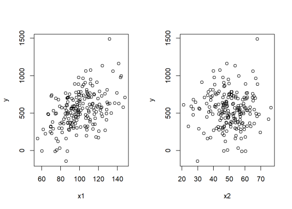
Next, we combine the variables into a data frame and use the lm() function to model the response variable, y as a function of x1 and x2. Our null hypotheses are that there is no association between either of our predictors and the response variable, assuming the other predictor is in the model. For example, the slope of x1 does not differ from 0 when x2 is in the model, and vice versa.
dat <- data.frame(y = y, x1 = x1, x2 = x2)
mod <- lm(y ~ x1 + x2, data = dat)
Calling summary() on the object returns model outputs, here we will focus on the coefficients of x1 and x2 (listed under Estimate) and their associated p-values (listed under Pr(>|t|)).
summary(mod)
Call:
lm(formula = y ~ x1 + x2, data = dat)
Residuals:
    Min      1Q  Median      3Q     Max
-592.39 -132.31   -6.82  135.88  755.38
Coefficients:
            Estimate Std. Error t value Pr(>|t|)
(Intercept) -60.3341   114.2199  -0.528    0.598
x1            5.7790     0.8186   7.060 2.79e-11 ***
x2            0.4745     1.5050   0.315    0.753
---
Signif. codes:  0 '***' 0.001 '**' 0.01 '*' 0.05 '.' 0.1 ' ' 1
Residual standard error: 214.5 on 197 degrees of freedom
Multiple R-squared:  0.202, Adjusted R-squared:  0.1939
F-statistic: 24.93 on 2 and 197 DF,  p-value: 2.222e-10
Similar to the first example, significance is assessed using a t-test. Here, the test that we are performing assumes the data is independent and the linear model has normally distributed and homoscedastic (i.e. constant variance) error terms. Based on how we generated the data for this example, these assumptions are satisfied. The model output indicates that the x1 variable is significant (p < 0.001) and x2 is not significant (i.e. does not differ from 0; p = 0.753).
In order to calculate p-vlaues using permutation-based approaches, we will permute the response variable, y, refit the linear model, save the coefficients, and repeat many times (in this case, 10,000). The number possible of permutations here is \(200!\). See this link explaining permutations when order matters.
n_perm <- 10000
# create output data frame to append to
output <- data.frame(x1 = rep(NA, n_perm), x2 = rep(NA, n_perm))
# append the observed coeficients as part of null distribution
output[1,] <- mod$coefficients[2:3]
for (i in 2:nrow(output)) {
  new_order <-  sample(200)

  dat$y_perm <- dat$y[new_order]   # permute data

  mod_perm <- lm(y_perm ~ x1 + x2, data = dat)

  output[i,] <- mod_perm$coefficients[2:3]
}
Once again, we can compare our observed estimates (red line) against the null distributions.
par(mfrow = c(2,1))
hist(output$x1, breaks = 100, main = "x1 coefficient")
abline(v = output[1,1], col = "red", lwd = 2)
hist(output$x2, breaks = 100, main = "x2 coefficient")
abline(v = output[1,2], col = "red", lwd = 2)
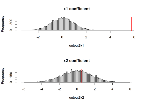
The histograms above indicate that the observed coefficient for x1 is relatively extreme compared to the null distribution, while the observed coefficient for x2 is common under its null distribution. Similar to before, we can calculate p-values by calculating the probability that the null distribution is at least as extreme as the observed coefficients.
# calculate p-values, use abs() for a two sided test
pval <- apply(output, 2, function(x) length(x[abs(x) >= abs(x[1])])/n_perm)
pval
    x1     x2
0.0001 0.7805
Our results are comparable to the output of the summary() function. x1 is significant (i.e. its slope differs from 0, p = .0001) and x2 is not significant (i.e. its slope does not differ from 0, p = 0.7805).
While both the parametric and permutation tests are valid in this example, the assumptions of parametric tests are commonly violated, making permutation-based approaches useful in these scenarios. Permutation tests are used when modeling data such as dissimilarity indices (Lichstein 2006), phylogenetic data (Legendre et al. 1994), pairwise correlations (Walter et al. 2017), and medical imaging data (Winkler et al. 2014). In these instances, permutation tests provide useful tools to test for significance when the assumption of parametric tests are violated.
This article provides an introduction to significance testing using permutation-based methods. More complex data structures and experimental designs (e.g. repeated measures, factorial designs) may require more complex permutation schemes (see Anderson 2001a; Anderson 2001b; Winkler et al. 2014 for examples). For these cases, the {permute} package provides useful tools to design permutation schemes (Simpson et al. 2022). The {permute} package also ensures that permutations are not repeated, which was extremely unlikely in the examples that we provided but is an important consideration when there are less possible permutations (see the {permute} vignette for more information).
One final note: when comparing two independent samples that are both highly skewed and unbalanced (i.e., different sample sizes), Christenson and Zabriskie (2021) warn a permutation test may be doomed to fail. In this case they recommend transforming the data toward normality, perhaps using a Box-Cox transformation, and then comparing the means of the transformed data using either a t-test or a permutation test.
R session details
The analysis was done using the R Statistical language (v4.5.1; R Core Team, 2025) on Windows 11 x64, using the packages ggplot2 (v3.5.2) and dplyr (v1.1.4).
References
- Anderson, M. J. 2001a. Permutation tests for univariate or multivariate analysis of variance and regression. Can. J. Fish. Aquat. Sci. 58: 626–639. doi:10.1139/f01-004
- Anderson, M. J. 2001b. A new method for non-parametric multivariate analysis of variance. Austral Ecology 26.
- Boik, R. J. 1987. The Fisher-Pitman permutation test: A non-robust alternative to the normal theory F test when variances are heterogeneous. British Journal of Mathematical and Statistical Psychology 40: 26–42. doi:10.1111/j.2044-8317.1987.tb00865.x
- Christensen, W. F., & Zabriskie, B. N. (2021). When Your Permutation Test is Doomed to Fail. The American Statistician, 76(1), 53–63. https://doi.org/10.1080/00031305.2021.1902856
- Furey, Edward “Permutations Calculator nPr” at https://www.calculatorsoup.com/calculators/discretemathematics/permutations.php from CalculatorSoup, https://www.calculatorsoup.com - Online Calculators
- Legendre, P., F.-J. Lapointe, and P. Casgrain. 1994. Modeling Brain Evolution from Behavior: A Permutational Regression Approach. Evolution 48: 1487–1499. doi:10.1111/j.1558-5646.1994.tb02191.x
- Lichstein, J. W. 2007. Multiple regression on distance matrices: a multivariate spatial analysis tool. Plant Ecol 188: 117–131. doi:10.1007/s11258-006-9126-3
- R Core Team. 2025. R: A Language and Environment for Statistical Computing. R Foundation for Statistical Computing, Vienna, Austria. https://www.R-project.org/.
- Simpson, G. L., R Core Team, D. M. Bates, and J. Oksanen. 2022. permute: Functions for Generating Restricted Permutations of Data.
- Walter, J. A., L. W. Sheppard, T. L. Anderson, J. H. Kastens, O. N. Bjørnstad, A. M. Liebhold, and D. C. Reuman. 2017. The geography of spatial synchrony B. Blasius [ed.]. Ecology Letters 20: 801–814. doi:10.1111/ele.12782
- Wickham, H. 2016. ggplot2: Elegant Graphics for Data Analysis. Springer-Verlag New York.
- Wickham, H., R. François, L. Henry, K. Müller, D. Vaughan, P. Software, and PBC. 2023. dplyr: A Grammar of Data Manipulation.
- Winkler, A. M., G. R. Ridgway, M. A. Webster, S. M. Smith, and T. E. Nichols. 2014. Permutation inference for the general linear model. NeuroImage 92: 381–397. doi:10.1016/j.neuroimage.2014.01.060
Ethan Kadiyala
StatLab Associate
University of Virginia Library
May 27, 2025
For questions or clarifications regarding this article, contact statlab@virginia.edu.
View the entire collection of UVA Library StatLab articles, or learn how to cite.