This article assumes basic familiarity with the use and interpretation of logistic regression, odds and probabilities, and true/false positives/negatives. The examples are coded in R. ROC curves and AUC have important limitations, and I encourage reading through the section at the end of the article to get a sense of when and why the tools can be of limited use.
Predicting whether a stock will be up or not at the end of the week, whether an orange tree will survive or perish in a cold snap, or whether a tennis player will win or lose their next match are all examples of binary classification problems. The goal in each case is to make one of two possible predictions or determinations: The stock will or won’t rise; the tree will or won’t survive; the tennis player will or won’t overcome their opponent. Statistical and machine-learning models can assist in making these predictions, and there are a number of viable models on offer, like logistic regressions and naive Bayes classifiers.1 Regardless of the model used, evaluating the model’s performance is a key step in validating it for use in real-world decision-making and prediction. A common evaluative tool is the ROC curve. ROC curves are graphs that plot a model’s false-positive rate against its true-positive rate across a range of classification thresholds; that is, across various cutoffs used to split real-valued model outputs (such as probabilities) into binary predictions of “Yes”/1/“Success”/etc. and “No”/0/“Failure”/etc. (ROC stands for receiver operating characteristic; the name is an echo of the wartime context in which the graphs were developed: They came about in World War II as a way of assessing the accuracy of radio operators’ determinations of whether radar blips were genuine signals—e.g., fighter planes—or noise.)
Say that I estimate a logistic regression for a data set containing a binary outcome variable, \(Y\), with values of Yes and No, and a set of predictor variables, \(X_1, X_2, ..., X_j\). I can use that model to estimate the probability that each observation in the original data set—or, even better, in an independent data set or a previously set-aside chunk of the original data—will be a Yes case. Let’s call these probabilities \(P_1, P_2, ..., P_i\). I can convert the probability estimated for each observation into a binary prediction—Yes or No—based on some classification threshold, \(T\). For example, I might begin by setting \(T = 0.5\).
\[\begin{equation} \text{Binary prediction for the i}^{th}\text{observation} = \left\{ \begin{array}{lr} Yes, & \text{if } P_i > T\\ No, & \text{if } P_i \leq T\\ \end{array} \right\} \end{equation}\]
The binary predictions can be compared to the actual values of \(Y\) to determine the counts of true positives, false positives, true negatives, and false negatives among the model’s predictions at a particular classification threshold. These counts comprise a confusion matrix:

From there, true-positive and false-positive rates—the constituent values of a ROC curve—are easily derived:
\[\text{True-positive rate (TPR)} = \frac{\text{True positives (TP)}}{\text{True positives (TP) + False negatives (FN)}}\] \[\text{False-positive rate (FPR)} = \frac{\text{False positives (FP)}}{\text{False positives (FP) + True negatives (TN)}}\]
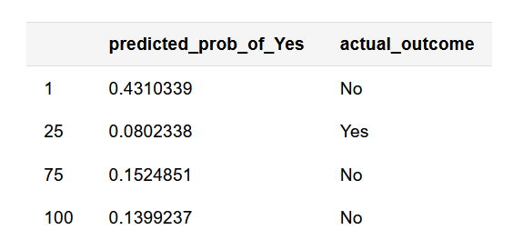
For a given model, we can calculate these rates at a range of classification thresholds. (“What are the TPR and FPR when a probability of 0.10 divides predictions into Yes’s and No’s?” “What about a probability of 0.20?” “What about…?”) These calculations don’t need to be performed manually; software packages like pROC and ROCR in R quickly generate ROC curves by calculating TPR/FPR values for various classification thresholds, using programmatic rules and speedy algorithms to determine thresholds and corresponding TPRs/FPRs.2 Once TPRs and FPRs have been calculated for a range of classification thresholds, generating the corresponding ROC curve is simply a matter of plotting those points, with the classification threshold decreasing—“relaxing”—from left to right on the graph. For example, below is a ROC curve generated with the pROC package based on some simulated probabilities and outcomes. You can read in the data from the link and follow along if you please.
library(pROC)
library(ggplot2)

# Read in simulated data
sim_dat <- read.csv('http://static.lib.virginia.edu/statlab/materials/data/roc_sim_dat.csv', header = T)

# See a few rows
knitr::kable(sim_dat[c(1, 25, 75, 100), ], align = c('l', 'l'))
# Use pROC calculate TPR/FPR across a range of classification thresholds
sim_roc <- roc(response = sim_dat$actual_outcome,
               predictor = sim_dat$predicted_prob_of_Yes,
               levels = c('No', 'Yes'))
# response: vector of actual outcomes
# predictor: vector of probabilities, one for each observation
# levels: response values to be taken as "No"/0/"Failure"/etc. and "Yes"/1/"Success"/etc., respectively

# Plot ROC curve
# - pROC::ggroc() prints the ROC curve using ggplot2; you can print the curve using base R graphics with pROC::plot.roc()
# - legacy.axes = TRUE ensures that the x-axis is displayed as FPR from 0 to 1 as opposed to
#     specificity (1-FPR) from 1 to 0
ggroc(sim_roc, legacy.axes = TRUE) +
  labs(x = 'False-positive rate', y = 'True-positive rate', title = 'Simulated ROC curve')
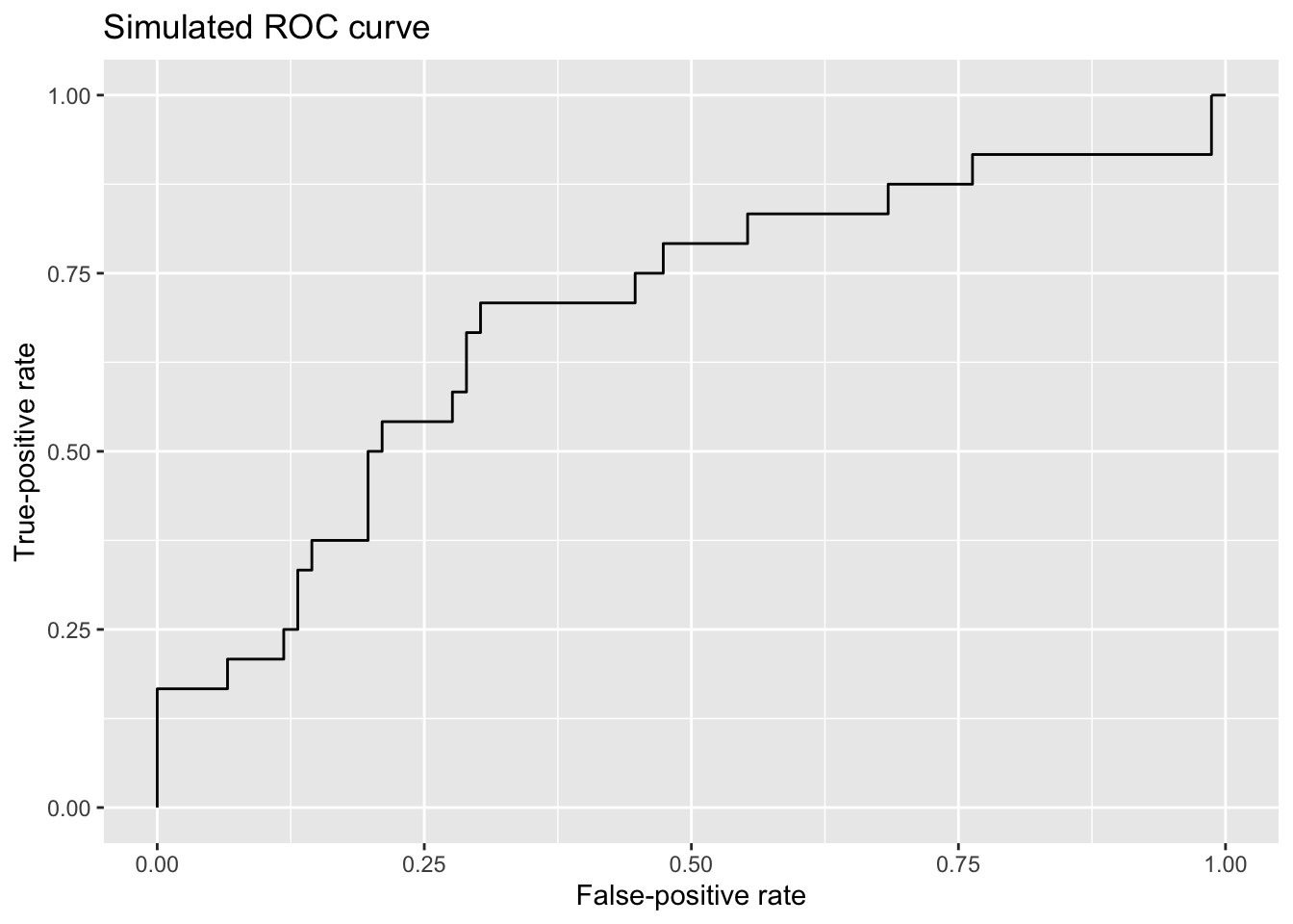
This ROC curve demonstrates something fundamental about models used for binary classification: The dual interests of maximizing true-positive rates and minimizing false-positive rates are in tension. As the classification threshold for a Yes is relaxed (moving left to right on the plot), more actual Yes’s are predicted to be Yes’s—desirable model behavior!—but the cost for that increase in successful identification of Yes cases is that more No cases are wrongfully predicted to be Yes’s as well.
Consider that if I set the classification threshold for a prediction of Yes at a probability of 1.00, the threshold is so strict that I’m going to miss all of the true Yes’s, but in exchange, I’m not going to mistakenly predict that any true No’s are Yes’s. (This state of predictive affairs is reflected on the far left of the ROC curve.) Conversely, if I set the classification threshold at 0.00, I’m going to predict that every observation is a Yes. I’m therefore going to achieve a true-positive rate of 100%, but that will be in exchange for suffering from a false-positive rate of 100% as well. (This maximally relaxed threshold is reflected on the far right side of the ROC curve.)
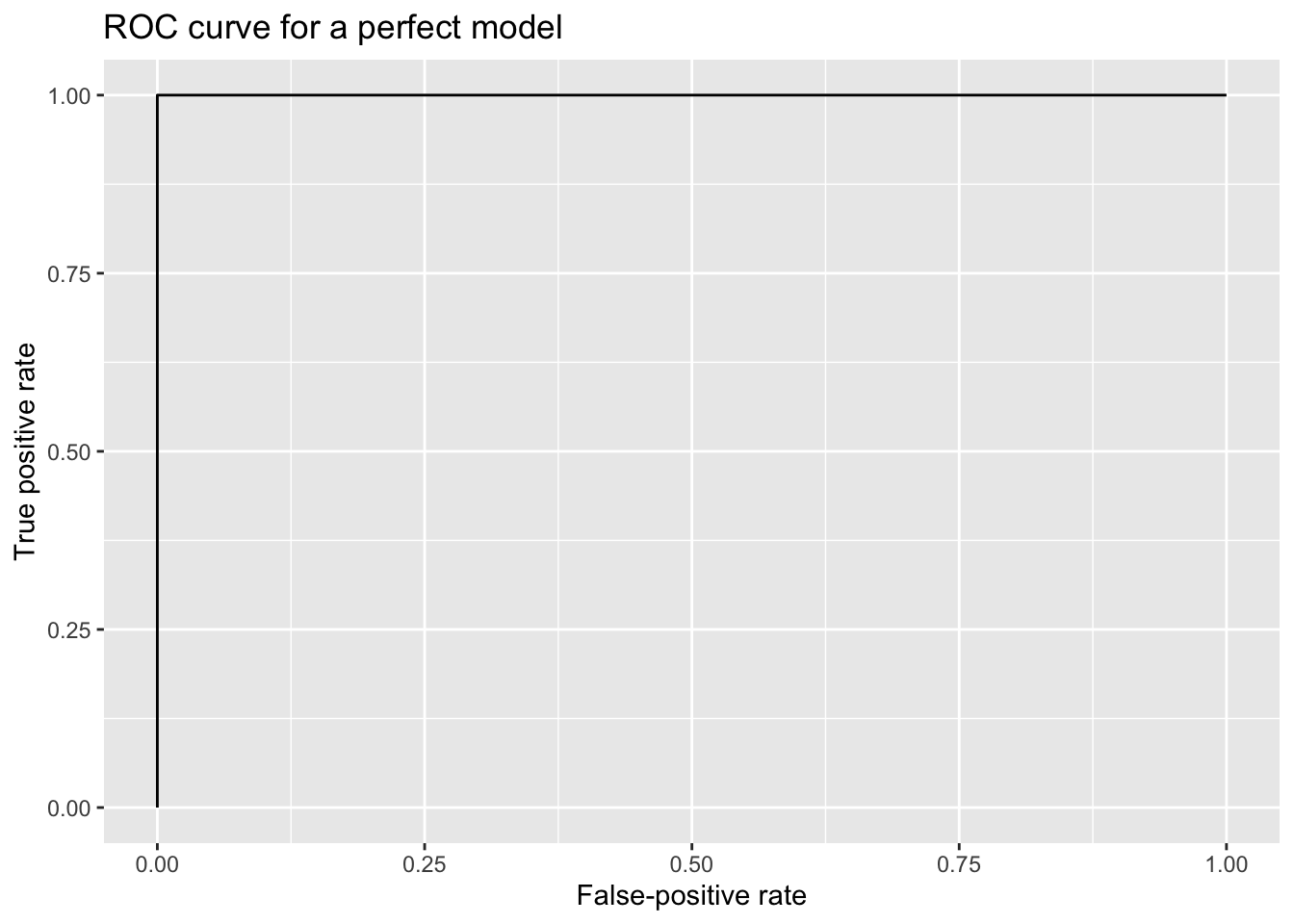
A perfectly predictive model—for example, a model that assigned a probability of 0 to every true No case and a probability of 1 every true Yes case—would generate the following ROC curve:
A useless, guessing model—a model that simply assigned an identical probability of Yes to every observation—would generate a diagonal ROC curve. The model has no discriminant ability, so its FPR and TPR are equivalent. (Say that the model assigns a probability of 0.50 to every case. For every threshold from 1.00 down to a hair above 0.50, the (FPR, TPR) point on the ROC curve is (0.00, 0.00); for every threshold from just under 0.50 to 0.00, the (FPR, TPR) point on the ROC curve is (1.00, 1.00).)
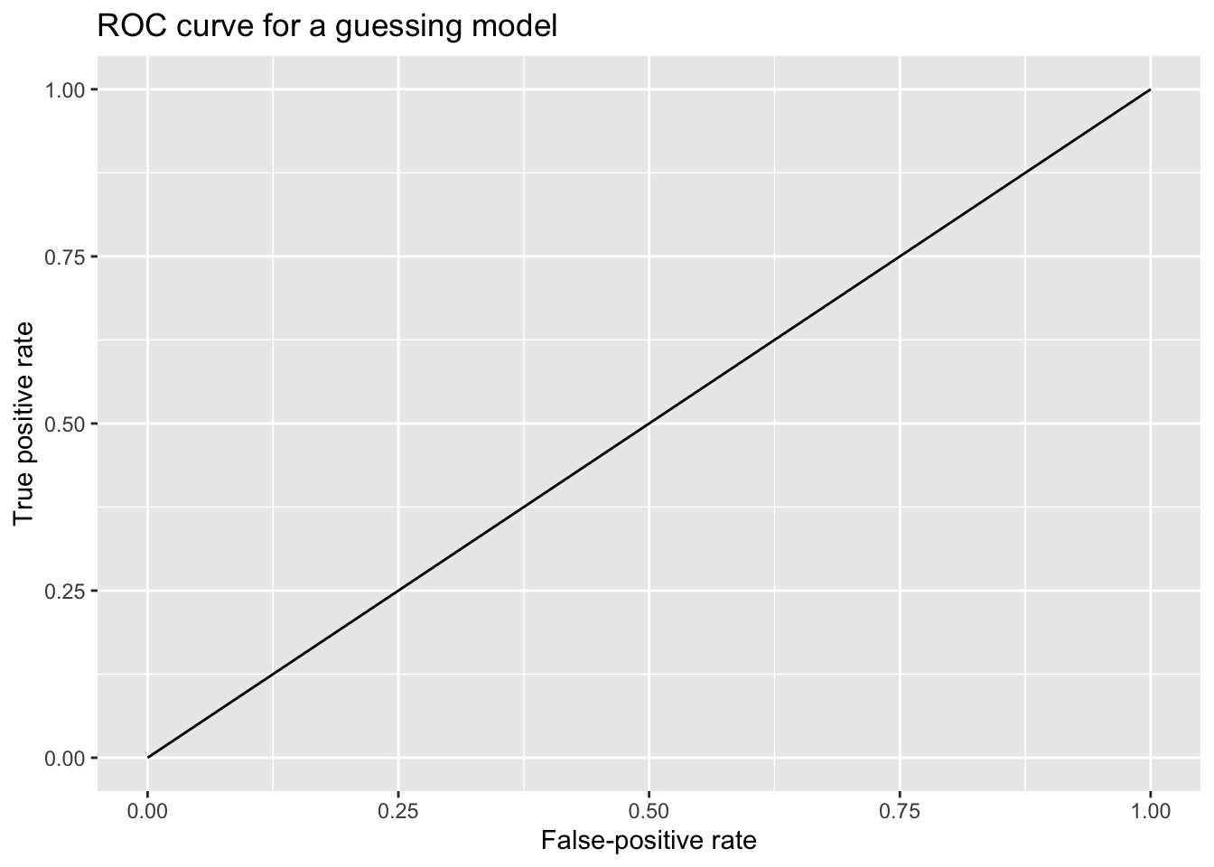
The contrast between the guessing model and the perfectly predictive model suggests something: The area under the ROC curve (AUC)—literally, the amount of space beneath it—scales with overall classification performance. The AUC for the perfect model is 1.00, but it’s 0.50 for the guessing model. Returning to the simulated ROC curve from before, we can add an AUC value as an indication of overall performance across various classification thresholds. (Internally, the software calculates the AUC by summing the areas of trapezoids formed between points on the ROC curve.)
# Calculate AUC using pROC::auc()
auc(sim_roc)
Area under the curve: 0.6897
ggroc(sim_roc, legacy.axes = TRUE) +
  labs(x = 'False-positive rate', y = 'True-positive rate', title = 'Simulated ROC curve') +
  annotate('text', x = .5, y = .5, label = paste0('AUC: ',round(auc(sim_roc), digits = 2)))
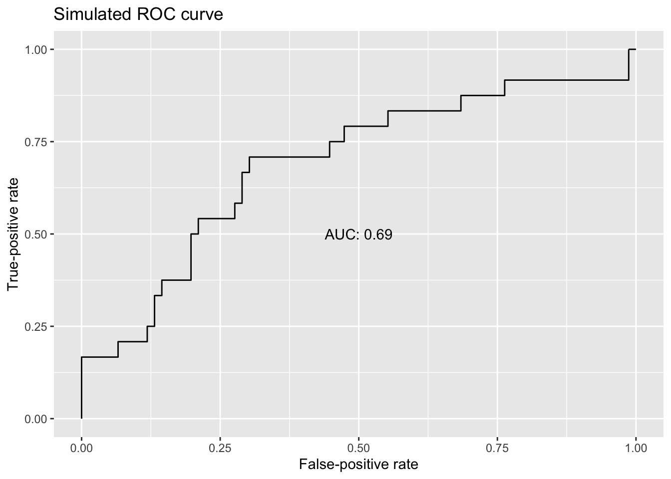
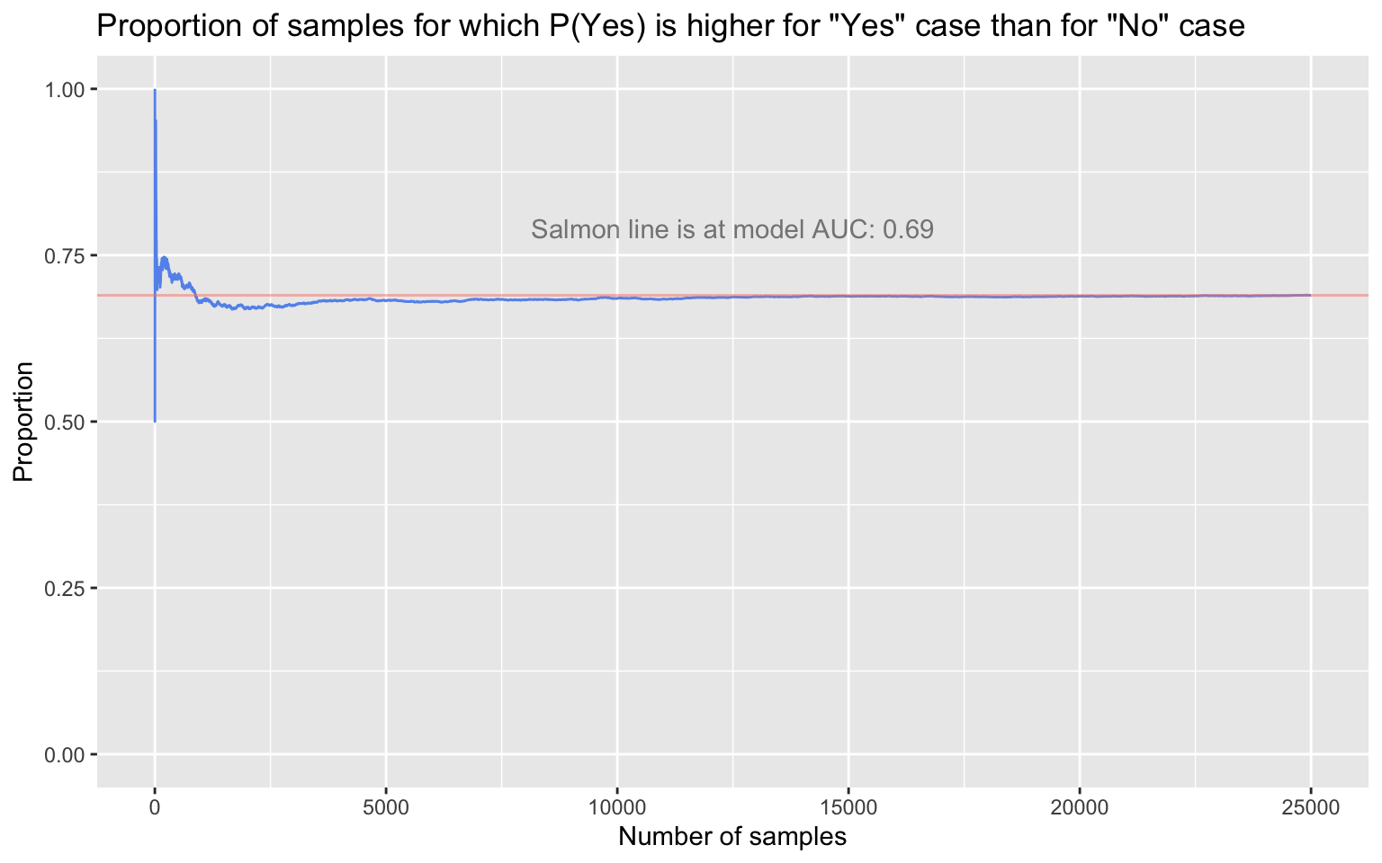
The AUC has a probabilistic interpretation, one that we can straightforwardly demonstrate: The AUC is the probability that the real-valued model output (e.g., the probability) for a randomly selected Yes case will be higher than the real-valued model output for a randomly selected No case. We should see, then, that if we repeatedly sample one true Yes case and one true No case at random from the simulated data, the long-run proportion of times that the Yes case’s predicted probability of being a Yes is greater than the No case’s predicted probability of being a Yes will converge to 0.69.
# Sample a "Yes" case and a "No" case many times, and compare
# the predicted probabilities of "Yes" for each pair
set.seed(2022)
samples <- 25000
yes_case_probs <- sample(sim_dat[sim_dat$actual_outcome == 'Yes', 'predicted_prob_of_Yes'],
                         samples, replace = TRUE)
no_case_probs <- sample(sim_dat[sim_dat$actual_outcome == 'No', 'predicted_prob_of_Yes'],
                        samples, replace = TRUE)
prob_yes_higher_than_prob_no <- yes_case_probs > no_case_probs

# Proportion of all samples in which the predicted probability of
# "Yes" was higher for actual-Yes case than for actual-No case
round(mean(prob_yes_higher_than_prob_no), digits = 4)
[1] 0.6898
# Plot running proportion of samples in which predicted probability
# of "Yes" was higher for true-Yes case than for true-No case
running_proportion <- cumsum(prob_yes_higher_than_prob_no) / seq_along(prob_yes_higher_than_prob_no)
running_proportion_dat <- data.frame(draw = 1:samples, running_proportion)
ggplot(running_proportion_dat, aes(x = draw, y = running_proportion)) +
  geom_line(color = 'cornflowerblue') +
  geom_hline(yintercept = round(auc(sim_roc), digits = 4), alpha = .5, color = 'salmon') +
  labs(y = 'Proportion', x = 'Number of samples',
       title = 'Proportion of samples for which P(Yes) is higher for "Yes" case than for "No" case') +
  annotate('text', x = (samples/2), y = (round(auc(sim_roc), digits = 2) + 0.1),
           label = paste0('Salmon line is at model AUC: ', round(auc(sim_roc), digits = 2)),
           alpha = .5) + ylim(0,1)
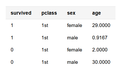
Subject to some important limitations that I discuss below, the AUC can assist in comparing the overall performance of models used for binary classification. For example, consider two logistic regressions I generate using the titanic3 data set, made available by Vanderbilt’s Frank Harrell, which contains information on whether Titanic passengers survived the wreck or died at sea, as well as passenger-level data like cabin class, age, and sex. The first logistic regression predicts survival (survived: 1/survived or 0/died) from passenger cabin class (pclass: 1st, 2nd, or 3rd); the second predicts survival from passenger cabin class, passenger age, and passenger sex. Below, I subset a few columns of interest and, for simplicity, remove rows missing data on the variables of interest; I then generate each model.
Hmisc::getHdata(titanic3)

# For simplicity, remove rows missing data on the variables of interest
titanic3 <- titanic3[, c('survived', 'pclass', 'sex', 'age')] |> na.omit()

# First few rows
knitr::kable(head(titanic3, n = 4), align = rep('l', ncol(titanic3)))
# First model
titanic_mod1 <- glm(survived ~ pclass, data = titanic3, family = binomial)
# Odds ratios
exp(coef(titanic_mod1))
(Intercept)   pclass2nd   pclass3rd
  1.7572816   0.4482328   0.2014783
# Second model
titanic_mod2 <- glm(survived ~ pclass + sex + age, data = titanic3, family = binomial)
# Odds ratios
exp(coef(titanic_mod2))
(Intercept)   pclass2nd   pclass3rd     sexmale         age
33.85457044  0.27787894  0.10130084  0.08226211  0.96619149
I can use each model to generate a survival probability for each passenger (winding up with two probabilities per person). With probabilities from each model as well as actual survival outcomes in hand, I’ll use the pROC package as before to generate TPRs and FPRs at a range of classification thresholds (in effect, seeing how good each model is at re-generating the actual values of survived at various thresholds). The TPR and FPR values comprise a ROC curve for each model.
# ROC curve for first model
probs_mod1 <- predict(titanic_mod1, type = 'response')
roc_mod1 <- roc(response = titanic3$survived, predictor = probs_mod1)
mod1_plot <- ggroc(roc_mod1, legacy.axes = TRUE) +
  labs(x = 'False-positive rate', y = 'True-positive rate',
       title = 'ROC curve\nsurvived ~ pclass') +
  annotate('text', x = .5, y = .5, label = paste0('AUC: ', round(auc(roc_mod1), digits = 2)))

# ROC curve for second model
probs_mod2 <- predict(titanic_mod2, type = 'response')
roc_mod2 <- roc(response = titanic3$survived, predictor = probs_mod2)
mod2_plot <- ggroc(roc_mod2, legacy.axes = TRUE) +
  labs(x = 'False-positive rate', y = 'True-positive rate',
       title = 'ROC curve\nsurvived ~ pclass + age + sex') +
  annotate('text', x = .5, y = .5, label = paste0('AUC: ', round(auc(roc_mod2), digits = 2)))

ggpubr::ggarrange(mod1_plot, mod2_plot, nrow = 1)
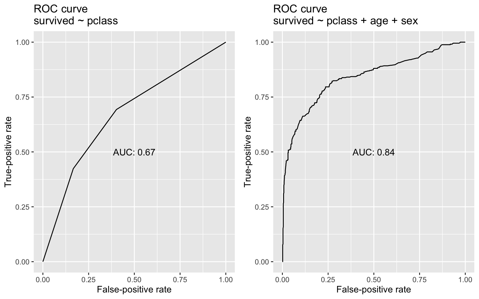
With the addition of age and sex as predictors, the AUC jumps by about 25%. In this case, the latter model that includes age and sex is definitively better—hardly a surprising result, given what we know about wreck and its survivors. Returning once again to AUC’s probabilistic interpretation: If we randomly pulled one person who lived and one person who died from the data, the second model would be much more likely than the first model to rate the survivor’s probability of living as higher than that of the person who died. Here, AUC proves useful for identifying the superior model. But I close with a number of cautionary notes about AUC, as no metric is a panacea, and AUC has its limitations:
Insensitivity to different error costs
AUC is insensitive to differences in the real-world costs of making different kinds of classification errors. There are many circumstances in which someone will be more concerned with false positives than false negatives, or vice versa; in those situations, an aggregate measure of classification performance like AUC is of limited use. Disease diagnosis and spam detection are clear examples. When diagnosing a fast-progressing, serious disease, it may be preferable to erroneously flag someone as having the disease (a false positive) than to miss that they have it at all (a false negative). The first error can be rectified with a follow-up test; the second error less so. Conversely, for a model designed to determine which emails are spam, a false positive is worse than a false negative: A false negative means that an irritating but obviously ludicrous inquiry about a $5,000,000 overseas inheritance that, can-you-believe-it?, will be processed as soon as you send your bank details slithers its way into your inbox; a false positive, however, means that your 1099-DIV gets routed to your junk folder, where it may remain until after Tax Day. Blindly comparing the AUCs of potential models won’t help optimize errors of a specific type.
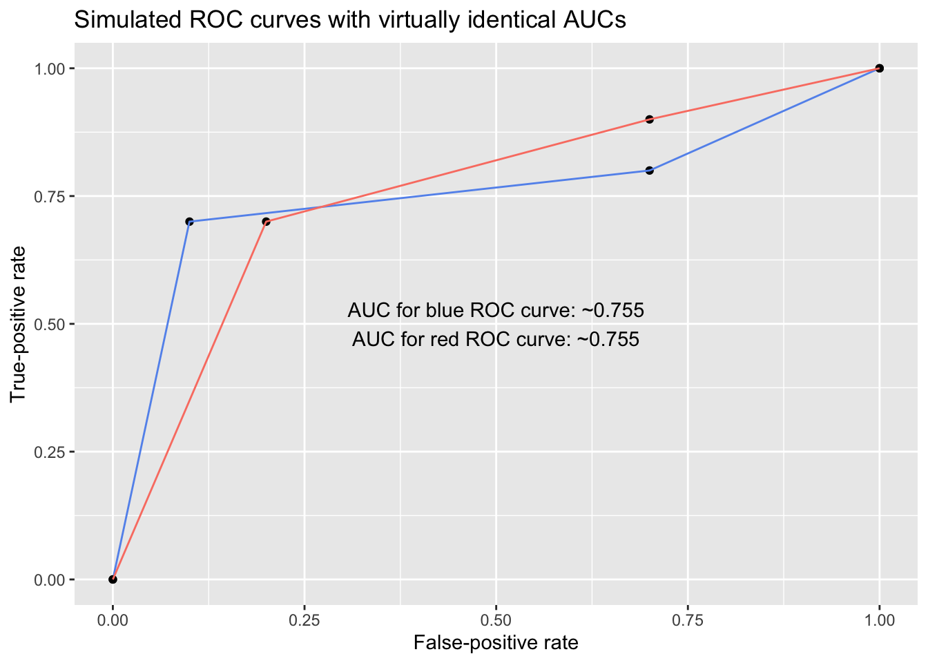
For example, below are two ROC curves with virtually identical AUCs. However, despite sharing AUC values, the models exhibit different behavior, and their usefulness differs depending on whether the user is most concerned with minimizing false positives or minimizing false negatives: To someone concerned with keeping the false-positive rate under, say, 25%, the blue model is superior, but to someone concerned with keeping the false-negative rate (1 - TPR) under 25%, the red model is superior.
# Points for each ROC curve
roc1 <- data.frame(x = c(0, .1, .7, 1), y = c(0, .7, .8, 1))
roc2 <- data.frame(x = c(0, .2, .7, 1), y = c(0, .7, .9, 1))

# Calculate AUCs
# - approxfun() generates an approximate function linking a set of points
# - integrate() calculates the area under a function for a desired interval
auc_roc1 <- integrate(approxfun(roc1$x, roc1$y), lower = 0, upper = 1)
auc_roc2 <- integrate(approxfun(roc2$x, roc2$y), lower = 0, upper = 1)

ggplot() +
  geom_point(data = roc1, aes(x, y)) + geom_line(data = roc1, aes(x, y), color = 'cornflowerblue') +
  geom_point(data = roc2, aes(x, y)) + geom_line(data = roc2, aes(x, y), color = 'salmon') +
  labs(x = 'False-positive rate', y = 'True-positive rate',
       title = 'Simulated ROC curves with virtually identical AUCs') +
  annotate('text', x = .5, y = .5,
           label = paste0('AUC for blue ROC curve: ~', round(auc_roc1$value, digits = 3),
                          '\nAUC for red ROC curve: ~', round(auc_roc2$value, digits = 3)))
In this vein, someone developing a model may simply be unwilling to tolerate particular (low) true-positive rates or (high) false-positive rates. If so, they can evaluate the partial AUC (pAUC)—the AUC calculated between selected FPR or TPR values. For example, someone developing a spam-detection model might decide to write off FPRs above 0.025 out of hand. She would look only at the AUC between FPR = 0.00 (specificity = 1.00) and FPR = 0.025 (specificity = 0.975), and she could focus on maximizing AUC within that range as opposed to across the full graph. Contemporary ROC curve software generally offers functions for calculating pAUC; for example, to retrieve to the pAUC from FPR = 0.00 to FPR = 0.30 for the multivariable Titanic model using pROC, one can run:
# pAUC range entered as specificity values (i.e., 1 - FPR)
auc(roc_mod2, partial.auc = c(1.00, 0.70), partial.auc.focus = 'specificity')
Partial area under the curve (specificity 1-0.7): 0.2
High AUC does not mean high calibration—nor does it mean that binarizing predictions is wise
AUC reflects the overall classification performance of a model, not the accuracy of a model’s real-valued outputs (e.g., probabilities) underlying its classifications. Note from before that AUC has a probabilistic interpretation: It’s the probability that a randomly selected “Yes”/1/“Success” case will have a higher model-estimated probability than a randomly selected “No”/0/“Failure” case. The exact probabilities are irrelevant for AUC; what matters is their relative ordering. As a concrete example: Say I have two models that I use to predict whether each in a set of six homes is likely to flood in an upcoming hurricane. Each model generates a set of flood probabilities for the houses (the flood_prob_mod1 and flood_prob_mod2 variables below). The first model estimates a flood probability of either 0.51 or 0.49 for every house, whereas the second model generates a range of probabilities. The actual flooding outcomes (1 = flooding; 0 = no flooding) are in the flooded variable:
flood_dat <- data.frame(flood_prob_mod1 = c(.51, .51, .51, .49, .49, .49),
                        flood_prob_mod2 = c(.99, .75, .51, .49, .25, .01),
                        flooded = c(1, 1, 1, 0, 0, 0))
flood_dat
  flood_prob_mod1 flood_prob_mod2 flooded
1            0.51            0.99       1
2            0.51            0.75       1
3            0.51            0.51       1
4            0.49            0.49       0
5            0.49            0.25       0
6            0.49            0.01       0
roc(response = flood_dat$flooded, predictor = flood_dat$flood_prob_mod1)
Call:
roc.default(response = flood_dat$flooded, predictor = flood_dat$flood_prob_mod1)

Data: flood_dat$flood_prob_mod1 in 3 controls (flood_dat$flooded 0) < 3 cases (flood_dat$flooded 1).
Area under the curve: 1
roc(response = flood_dat$flooded, predictor = flood_dat$flood_prob_mod2)
Call:
roc.default(response = flood_dat$flooded, predictor = flood_dat$flood_prob_mod2)

Data: flood_dat$flood_prob_mod2 in 3 controls (flood_dat$flooded 0) < 3 cases (flood_dat$flooded 1).
Area under the curve: 1
Both models assigned every flooded home a higher flood probability than every unflooded home. The AUC—the probability that a randomly selected flooded home received a higher flood probability than a randomly selected unflooded home—is 1.00 for both. But if I was trying to sort out where to direct a limited pool of resources to prevent flooding when the next hurricane comes, I’d reach for the second model, as it provides more granularity in its estimates of the threat, even though the models’ AUCs were identical. A high AUC does not mean that a model is producing well-calibrated, accurate probabilities. To evaluate probabilistic accuracy, consider a metric like the Brier score, which is responsive to how close estimated probabilities (0.10, 0.85, etc.) are to actual outcomes (0, 1, etc.). Further, just because a model can be used to generate binary predictions does not mean that it should. For example, the questions relevant to a homeowner’s real life—“How soon do I need to make flood-resistant upgrades to my house?”—are better informed by knowing whether the estimated flood probability is 0.51 or 0.95 than by knowing that the probability falls on one side of a dichotomizing line.
Be wary of overfitting
Finally: Chasing a higher and higher AUC can lead to model overfitting. Data sets are jam-packed with idiosyncrasies, and stuffing predictor after predictor into your model in an attempt to juice out an AUC value of 0.87 instead of 0.86 can degrade the model’s generalizability and practical utility. Cross-validating—testing your model on previously unseen data, not just “back-evaluating” its performance on the same data used to generate it—is helpful on this front. With AUC, as with many statistical measures, Goodhart’s Law is worth keeping in mind: When a measure becomes a target, it ceases to be a good measure.
R session details
The analysis was done using the R Statistical language (v4.5.2; R Core Team, 2025) on Windows 11 x64, using the packages pROC (v1.19.0.1) and ggplot2 (v4.0.1).
References
- Fawcett, T. (2006). An introduction to ROC analysis. Pattern Recognition Letters, 27(8), 861–874. https://doi.org/10.1016/j.patrec.2005.10.010
- Robin et al. (2011). pROC: An open-source package for R and S+ to analyze and compare ROC curves. BMC Bioinformatics, 12, 77. https://doi.org/10.1186/1471-2105-12-77
Jacob Goldstein-Greenwood
Research Data Scientist
University of Virginia Library
April 15, 2022
- Note that some models—like logistic regressions—don’t technically classify; they generate probabilities that, when it’s appropriate, can be converted into binary predictions. Vegas won’t let me bet $50 that “Nadal has a 64% chance of winning the 2022 French Open,” so even if my model spits out a probability of 0.64, I’ve got to get binary with my clay-court conjecture. ↩︎
- For example, the pROC package determines the thresholds at which to calculate TPR and FPR coordinates by taking the mean of all pairs of consecutive input values (e.g., probabilities), and it has a few different algorithms for determining the actual ROC curve points (selection between them can be a matter of computational efficiency). See pages 70 and 73 of the pROC reference manual for a discussion of the package’s algorithm offerings and threshold-selection process, respectively. ↩︎
For questions or clarifications regarding this article, contact statlab@virginia.edu.
View the entire collection of UVA Library StatLab articles, or learn how to cite.
