
In this article, we demonstrate how to include mathematical symbols and formulas in plots created with R. This can mean adding a formula in the title of the plot, adding symbols to axis labels, annotating a plot with some math, and so on.
R provides a \(\LaTeX\)-like language for defining mathematical expressions. It is documented on the plotmath help page, which can be accessed by typing ?plotmath in the R console. You can also see a demo of this language by running the code demo(plotmath). Going forward, we’ll refer to this language as “plotmath.”
plotmath expressions can be used in titles, subtitles, axis labels, legends, and annotations within a plot. It works in both base R graphics and ggplot2.
To create a mathematical expression using the plotmath language, we place the expression inside the expression() function. In general, the expression() function allows us to protect R code from evaluation. But when it comes to plotmath, the plotmath expression is converted to mathematical typesetting.
A simple example using a Greek symbol
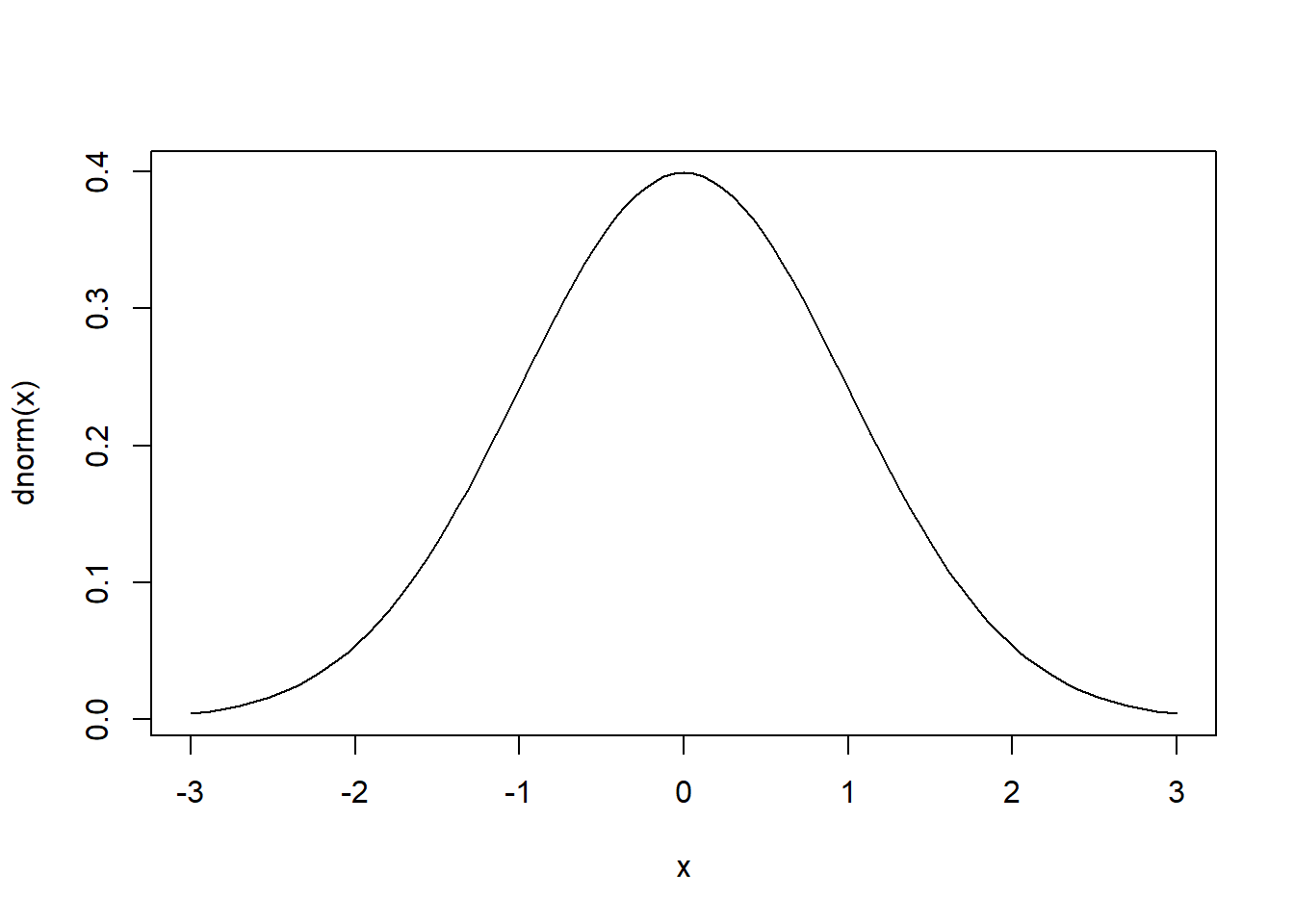
Here’s a simple plot with no mathematical notation. It’s a standard normal distribution. The curve() function plots mathematical functions with an x argument on the domain defined by the from and to arguments. The dnorm() function is the formula for the normal distribution with default mean and standard deviation set to 0 and 1, respectively.
curve(dnorm(x), from = -3, to = 3)
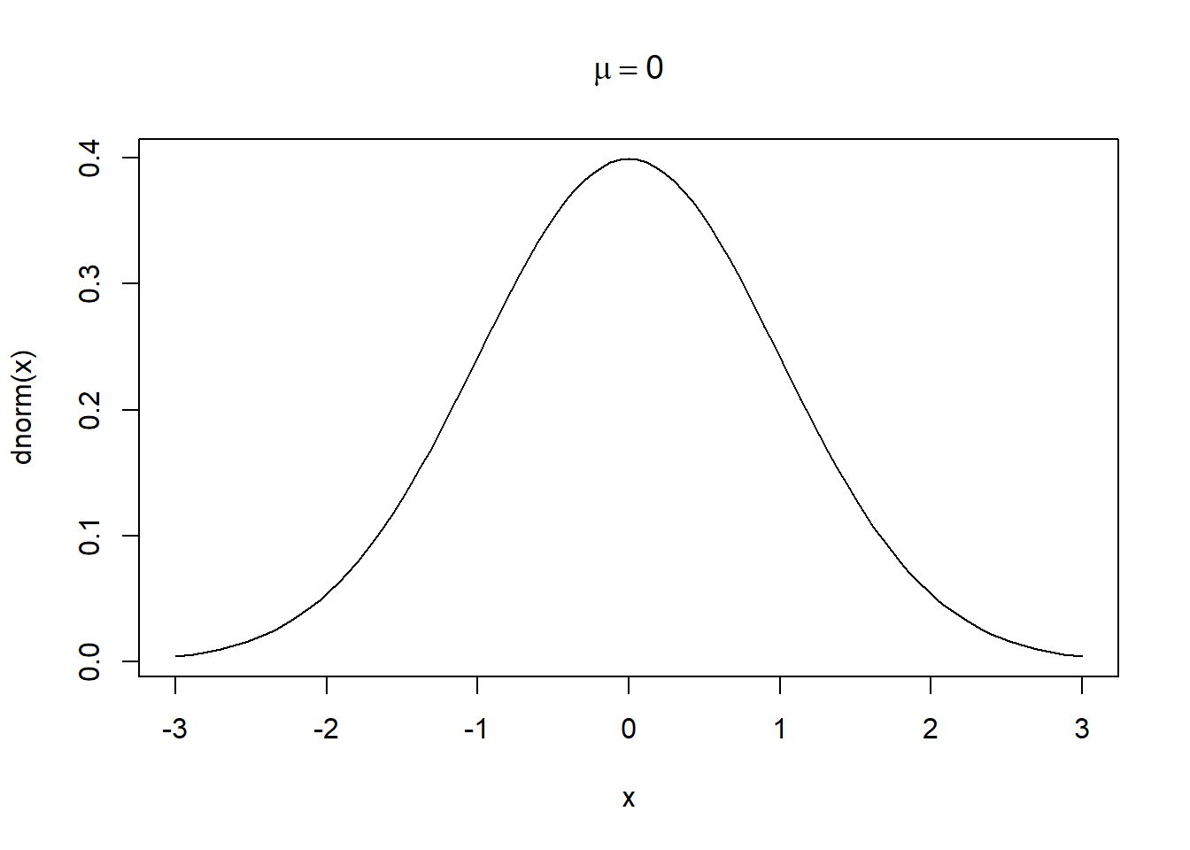
Now we add an expression to the title of the plot: “mu == 0”. Two equals signs are rendered as a single equals sign. The keyword mu is rendered as a lowercase Greek mu, \(\mu\). Notice we wrap the expression in the expression() function.
curve(dnorm(x), from = -3, to = 3,
      main = expression(mu == 0))
All the letters of the Greek alphabet are available as plotmath keywords:
alpha–omega(lowercase)Alpha–Omega(uppercase)
Equalities are defined the same as they are in R code:
x == yx != y(not equal)x < yx <= yx > yx >= y
A few common expressions include:
x^2sqrt(x)sqrt(x, y)(yth root of x)hat(x)(x with a circumflex)bar(x)(x bar)x*y(juxtapose x and y)x %*% y(x times y)x %+-% y(x plus or minus y)x[i](x subscript i)infinity(infinity symbol)frac(x, y)(x over y)
No one has total recall of all plotmath expressions. Use ?plotmath as your reference.
Combining symbols and text
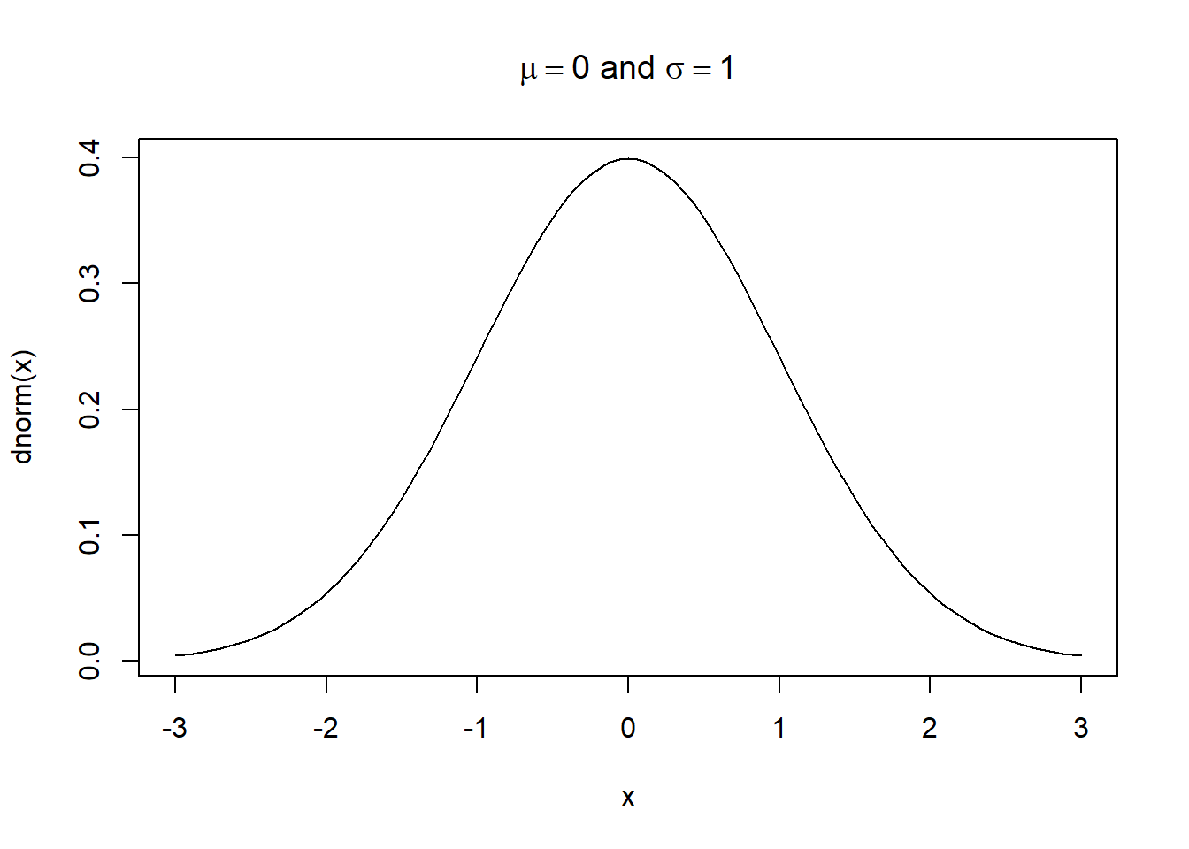
To mix plotmath and text, we use the paste() function within expression(). For example, let’s include “and sigma == 1” in the plot title for our standard normal curve. Notice how the sigma keyword is rendered as the Greek symbol, \(\sigma\).
curve(dnorm(x), from = -3, to = 3,
      main = expression(paste(mu == 0, " and ", sigma == 1)))
Combining plotmath and saved objects
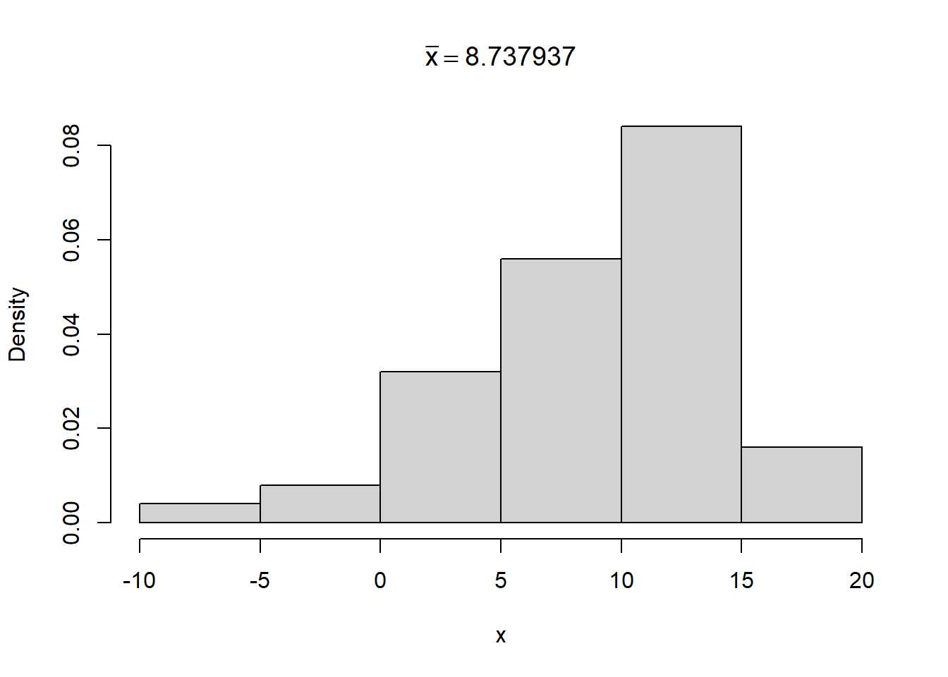
If we want to use an object saved in our global environment in our plotmath expression, we need to build the expression in the bquote() function and wrap the object in .(). A demonstration is more instructive than an explanation.
Below we sample 50 observations from a normal distribution with mean 10 and standard deviation 5. Then we calculate the sample mean and save it as m. Finally we plot a histogram and add \(\bar{x} = \text{m}\) to the title of the plot, where the value of m is plotted in the title. Altogether, the expression is created using the code bquote(bar(x) == .(m)).
set.seed(99)
x <- rnorm(50, mean = 10, sd = 5)
m <- mean(x)   # sample mean
hist(x, freq = FALSE, main = bquote(bar(x) == .(m)))
Building plotmath expressions
The previous three examples were simple. However, math expressions can be complicated and take time to create. It can help to have a “sandbox” to gradually build and test your plotmath expressions. Here’s one way using plot() and text().
plot(1,1, type = "n")creates an empty plot.text(1,1, expression())will plot your expression in the middle of the plot.
Once you’re done with your expression, you can copy and paste it into the R code where needed or save it as an object.
Below we build the formula for a simple linear model.
plot(1,1, type = "n")
text(1,1, expression(y == beta[0] + beta[1]*x + epsilon))
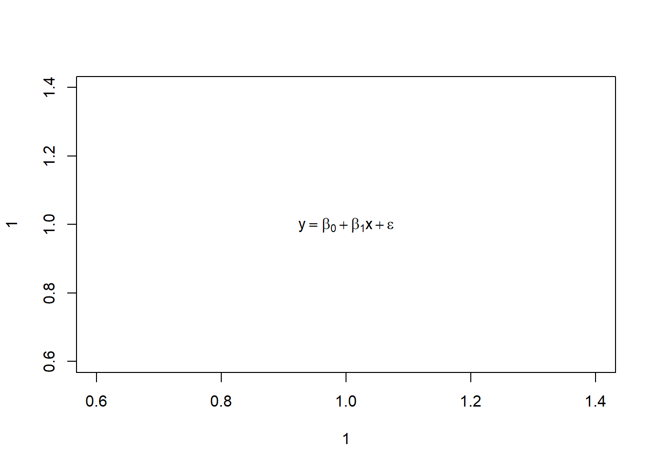
Let’s say we’re happy with that. We can save it.
e <- expression(y == beta[0] + beta[1]*x + epsilon)
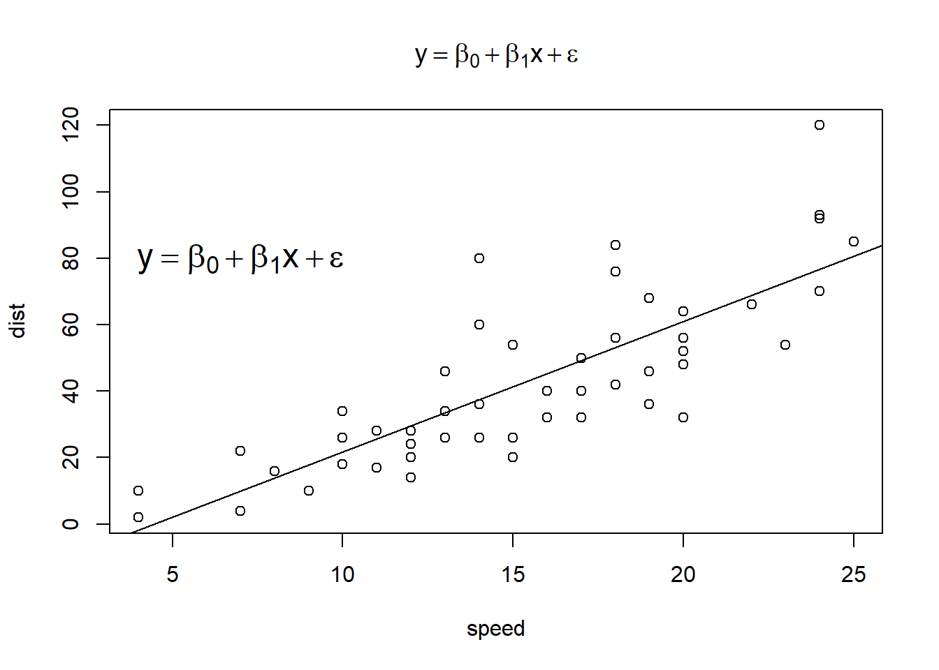
And then we can use it in a plot. For example, below we fit a simple linear model using the cars data set included with R. Next we plot the raw data as well as the fitted line. Finally, we use the same expression in the title of the plot and as an annotation using the text() function. (Yes, it’s redundant, but it’s just for demonstration.) The first two arguments to text() are the x and y coordinates where we want to place the expression.
Note: The cex (character expansion) argument makes your expression bigger or smaller. A value of 1.5 makes it 50% bigger. A value of 0.9 makes it 10% smaller.
# model dist as a function of speed using the cars data set included with R.
m <- lm(dist ~ speed, cars)
plot(dist ~ speed, cars, main = e)
abline(m)
text(7, 80, e, cex = 1.5)
plotmath with ggplot2
ggplot2 also allows plotmath expressions, but how you use them depends on where you want them.
- In
labs(),ggtitle()andscale_*()functions, use plotmath expressions just as you would in base R. - In
annotate(),geom_text()andgeom_label(), use plotmath language as a character string without theexpression()function, and set the argumentparse = TRUE. (Note: Using plotmath withexpression()in these functions does seem to work but produces a warning in RStudio, at least when using version 3.3.6 of ggplot2.)
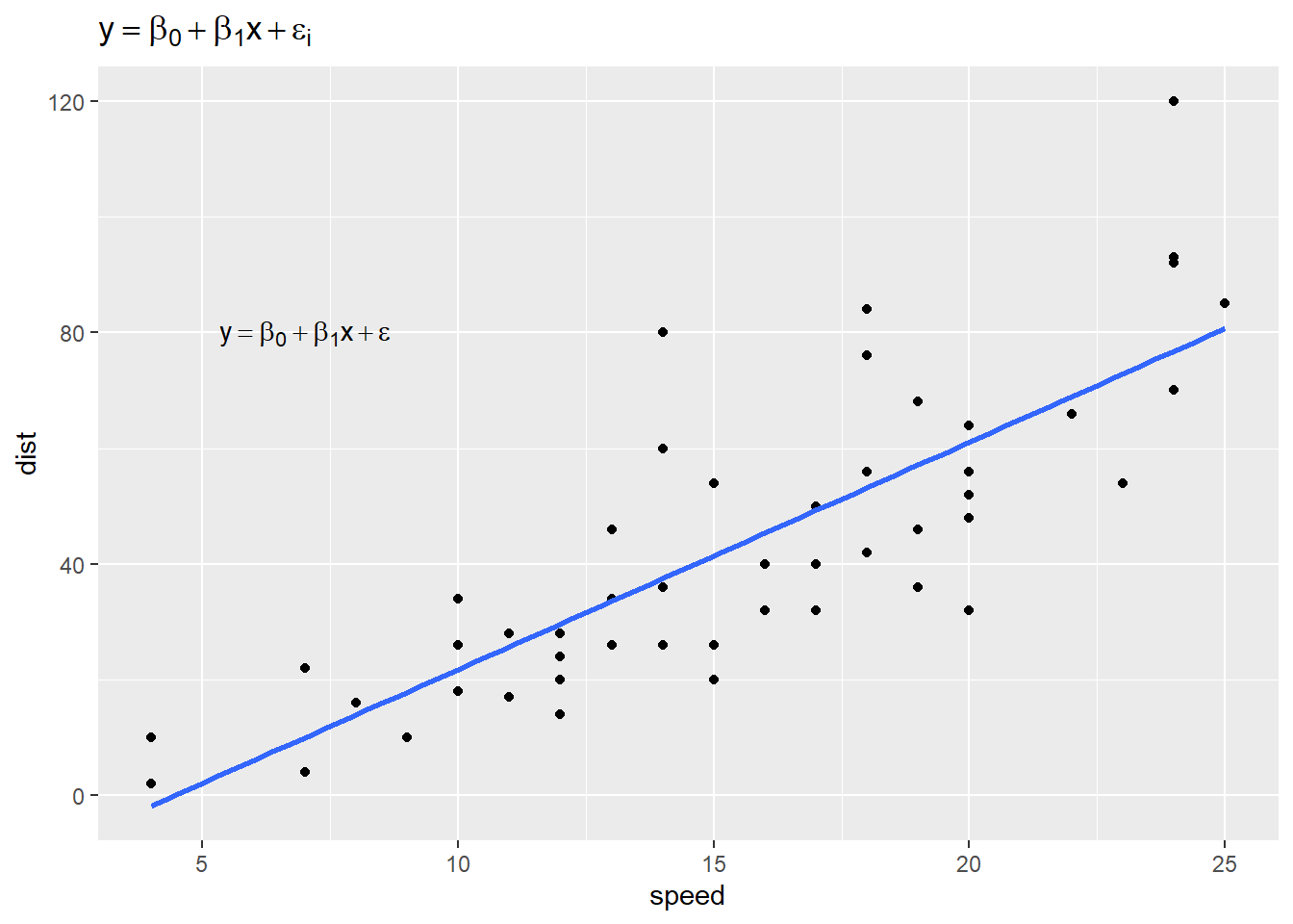
Below we recreate our previous graph using ggplot2.
library(ggplot2)
# plotmath expression wrapped in expression()
e <- expression(y == beta[0] + beta[1]*x + epsilon[i])
# plotmath expression as a character string
e2 <- "y == beta[0] + beta[1]*x + epsilon"
ggplot(cars) +
  aes(x = speed, y = dist) +
  geom_point() +
  geom_smooth(method = "lm", se = FALSE) +
  annotate("text", 7, 80, label = e2, parse = TRUE) +
  labs(title = e)
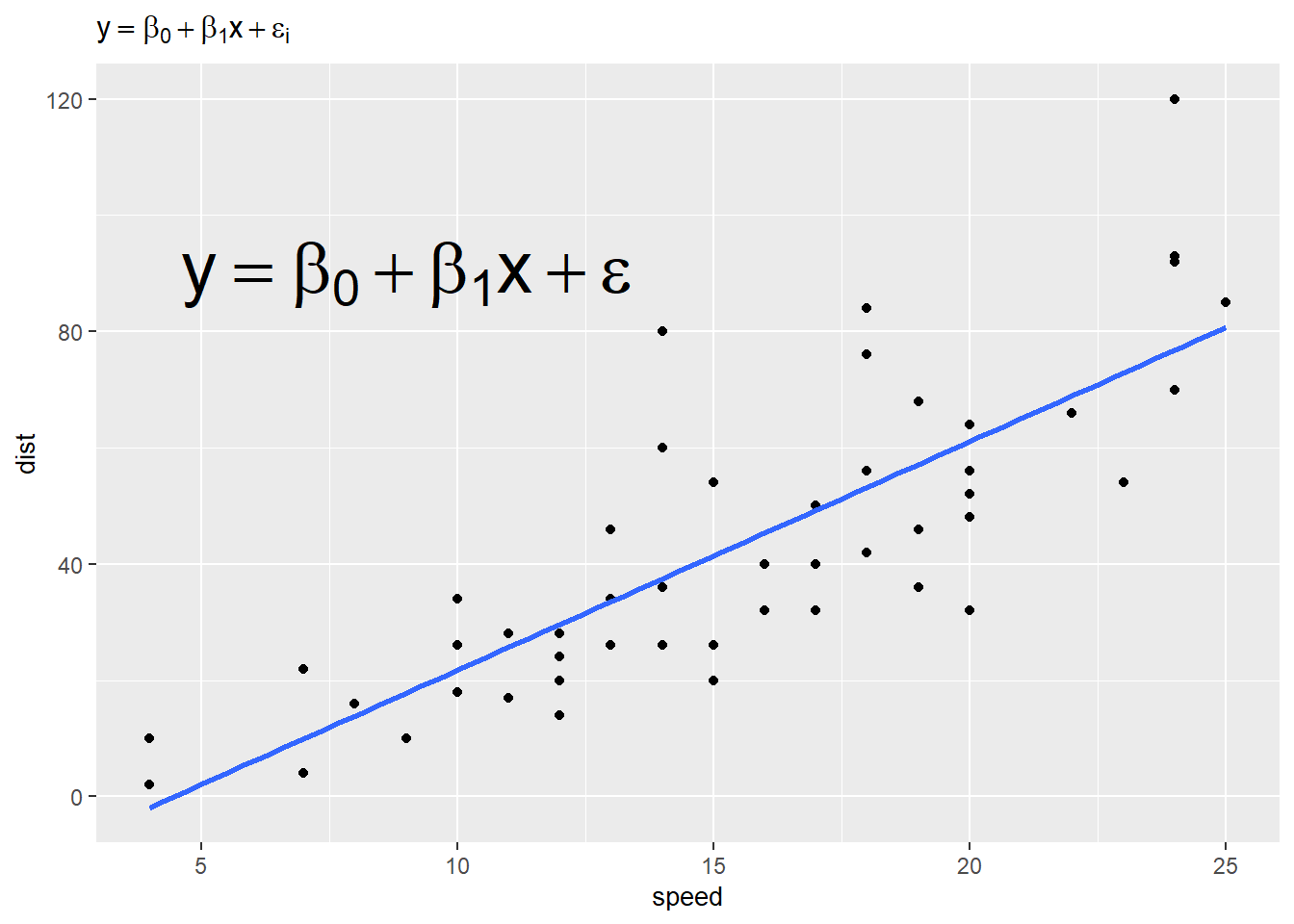
To change the size of your expression:
- In
annotate(),geom_text()andgeom_label(), use thesizeargument to specify point size in mm. - For expressions in
labs(),ggtitle()andscale_*(), you need to use thetheme()function and modify the appropriate argument withelement_text(size = x), wherexis the traditional point size as specified in programs like MS Word.
To use a traditional point size in annotate(), geom_text() and geom_label(), set size = x /.pt where x is your desired point size. (.pt is a conversion factor that ggplot2 provides.)
For example:
ggplot(cars) +
  aes(x = speed, y = dist) +
  geom_point() +
  geom_smooth(method = "lm", se = FALSE) +
  annotate("text", 9, 90, label = e2, parse = TRUE, size = 10) + # 10 mm
  labs(title = e) +
  theme(title = element_text(size = 10))  # point size 10
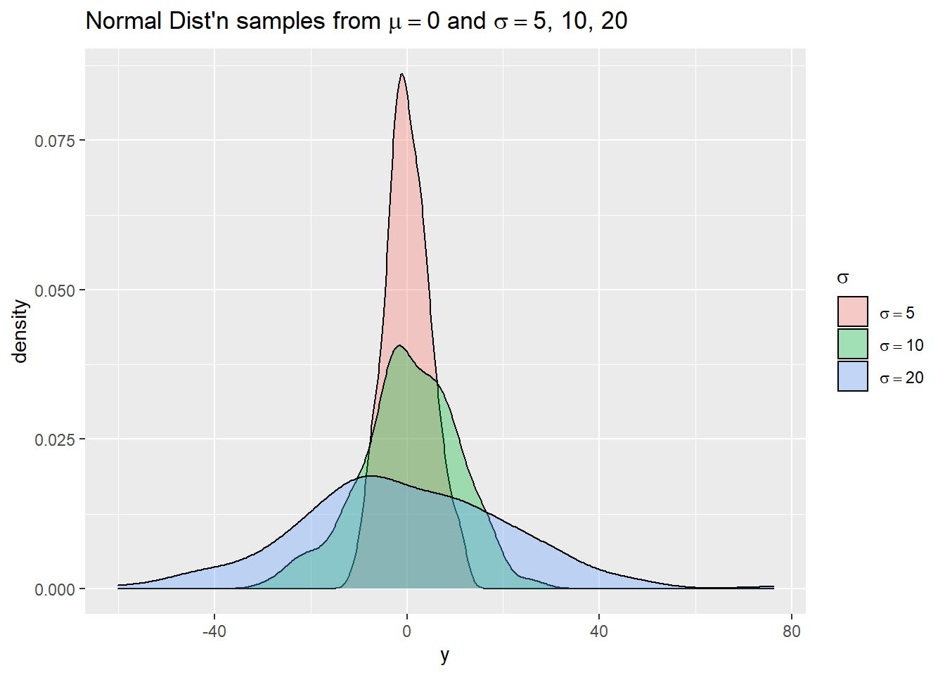
We mentioned the scale_*() functions use regular plotmath expressions. Below we demonstrate this using simulated data. We use simple plotmath expressions in the title of the legend and in the legend labels. Notice the labels need to be provided as a list object, not a vector.
# simulate 3 x 200 sets of random normal data;
# mean = 0, sd = 5, 10, 20
n <- 200
g <- gl(n = 3, k = n)   # generate group labels
set.seed(1)
y <- c(rnorm(n, sd = 5),
       rnorm(n, sd = 10),
       rnorm(n, sd = 20))
d <- data.frame(y, g)
# Now plot the three approximate densities using ggplot
ggplot(d) +
  aes(x = y, fill = g) +
  geom_density(alpha = 1/3) +
  scale_fill_discrete(expression(sigma), labels =
                        list(expression(sigma == 5),
                             expression(sigma == 10),
                             expression(sigma == 20))) +
  labs(title = expression(paste("Normal Dist'n samples from ", mu == 0, " and ",
                                sigma == "5, 10, 20")))
To see more examples of plotmath, run the code example(plotmath), which executes the example code on the plotmath help page.
R session details
The analysis was done using the R Statistical language (v4.5.1; R Core Team, 2025) on Windows 11 x64, using the packages ggplot2 (v3.5.2).
References
- Murrell, P. and Ihaka, R. (2000). An approach to providing mathematical annotation in plots. Journal of Computational and Graphical Statistics, 9, 582–599. doi:10.2307/1390947.
- R Core Team (2022). R: A language and environment for statistical computing. R Foundation for Statistical Computing, Vienna, Austria. URL https://www.R-project.org/.
- Wickham, H. (2016). ggplot2: Elegant Graphics for Data Analysis. Springer-Verlag, New York.
Clay Ford
Statistical Research Consultant
University of Virginia Library
August 4, 2022
For questions or clarifications regarding this article, contact statlab@virginia.edu.
View the entire collection of UVA Library StatLab articles, or learn how to cite.