
Logistic regression is a flexible tool for modeling binary outcomes. A logistic regression describes the probability, \(P\), of 1/“yes”/“success” (versus 0/“no”/“failure”) as a linear combination of predictors:
\[\text{log}\left(\frac{P}{1-P}\right) = B_0 + B_1X_1 + B_2X_2 + ... + B_kX_k\]
Though free of the distributional assumptions of linear regression—e.g., normally distributed errors with constant variance, \(e \sim N(0, \sigma^2)\)—a “standard” logistic regression model (lacking nonlinear terms, such as splines) does assume linearity between the predictors and the logit of the outcome (the log-odds of 1/“yes”/“success”). For the practicing analyst who fits a logistic regression, there are several goodness-of-fit tests on offer for assessing the compatibility between the model and its underlying data (see Harrell, 2015, section 10.5). A poor fit for a model lacking nonlinear terms can signal that the imposition of linearity was inappropriate. (Likewise, it can signal that a key predictor, or a couple, may have been omitted from the model. Distinguishing between possible causes of poor fits can leave even the most ataraxic analyst weary and withered.)
When working with a reasonably large sample, an analyst can use a single-plot graphical method to assess whether the relationship between a predictor and the log-odds of some binary outcome is plausibly linear. The log-odds of the outcome, y, are not naturally in the data, as the outcome is recorded simply as ones and zeros. But log-odds can be approximated for “chunks” of predictor values: The analyst can divide observations into buckets—say, deciles—based on the values of a predictor, x. She can then estimate the log-odds of y within each bucket by calculating the proportion of y = 1 responses, P, and then by taking \(\text{log}(\frac{P}{1-P})\). Plotting the log-odds values against the (ordered) buckets gives a visual approximation of the relationship between x and the log-odds of y (Harrell, 2015, pp. 237–239; Menard, 2002, pp. 70–71).
This approach extends naturally to the two-predictor case: One can stratify observations by values of a second predictor, z, before undertaking the “bucketing” process described above. If z is a binary predictor, the stratification is intuitive: Group the z = 0 observations together and the z = 1 observations together. Likewise, for a multinomial or ordinal z, group observations by category or ordinal value. For a continuous z, one could proceed by stratifying observations by terciles or quartiles of z. The analyst can then plot different lines for each stratified group, with the lines again capturing the approximate relationship between the log-odds of y and (buckets of) x. In the two-predictor case, the plot can reveal whether an interaction between x and z is warranted in the model: If the lines for different stratified groups vary in slope, then assuming that the relationship between x to the log-odds of y is constant across z is unwarranted.
Below, I demonstrate this approach using a pair of simulated data sets. In the first, I simulate a binary variable, y, as an additive (non-interactive) outcome of a continuous x variable and a binary z variable. In the second, I simulate y as the outcome of an interaction between x and z. Within each data set, I stratify observations by z, group observations by decile of x, compute the log-odds of y, and then plot x groups against those values, with separate lines for the z = 0 and z = 1 observations.
library(ggplot2)
set.seed(11)
### Simulate data
# Predictors
x <- rnorm(n = 2500, mean = 1, sd = 1)
z <- rbinom(n = 2500, size = 1, prob = .5)
# Non-interactive outcome
logit_y_no_int <- 1*x + 1.25*z
prob_y_no_int <- exp(logit_y_no_int) / (1 + exp(logit_y_no_int))
y_no_int <- rbinom(length(prob_y_no_int), 1, prob_y_no_int)
# Interactive outcome
logit_y_int <- 1*x + 1.25*z - 0.75*x*z
prob_y_int <- exp(logit_y_int) / (1 + exp(logit_y_int))
y_int <- rbinom(length(prob_y_int), 1, prob_y_int)
d <- data.frame(x, z, y_no_int, y_int)
### Stratify and bucket
strat_dat <- split(d, d$z)
for (i in 1:length(strat_dat)) {
  strat_dat[[i]]$decile <- cut(strat_dat[[i]]$x,
                               breaks = quantile(strat_dat[[i]]$x, probs = seq(0, 1, length = 11)),
                               include.lowest = T)
}
d <- do.call('rbind', strat_dat)
### Structure and plot data
d <- tidyr::pivot_longer(d, cols = c('y_no_int', 'y_int'),
                         names_to = 'model', values_to = 'y')
plot_dat <- aggregate(d$y, by = list(d$model, d$z, d$decile), mean)
colnames(plot_dat) <- c('model', 'z', 'decile_x', 'prob')
plot_dat$log_odds <- log(plot_dat$prob / (1 - plot_dat$prob))
plot_dat$decile_x <- rep(1:10, times = 2, each = 2)
plot_dat$z <- factor(plot_dat$z, levels = 0:1)
plot_dat$model <- factor(plot_dat$model, levels = c('y_no_int', 'y_int'))
ggplot(plot_dat, aes(decile_x, log_odds, color = z)) +
  geom_point() +
  geom_line(alpha = .25) +
  geom_smooth(method = 'lm', se = F, lwd = .5) +
  facet_wrap(~model,
             labeller = as_labeller(c('y_no_int' = 'No interaction', 'y_int' = 'Interaction'))) +
  labs(title = 'Estimated log-odds of y = 1 across deciles of x, stratified by z',
       x = 'Decile of x', y = 'Log-odds of y = 1', color = 'z') +
  scale_x_continuous(breaks = 1:10) +
  scale_color_manual(values = c('salmon', 'cornflowerblue'))
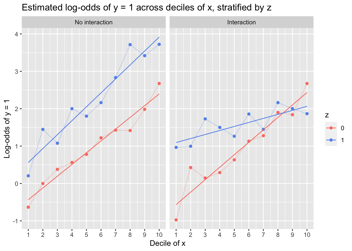
The lefthand plot, in which y was simulated as a non-interactive function of x and z, captures the (true) linear trend reasonably well, and although there is subtle deviation in the slopes of the z = 0 and z = 1 lines, one can comfortably assert linearity and additivity. Conversely, the righthand plot reveals that although a linear relationship between x and the log-odds of y is plausible within the z = 0 and z = 1 groups, the relationship differs handily between then: Fitting an interaction of x and z would be necessary to capture the data-generating process.
But even under optimized conditions, using simulated data in which there is a known linear relationship between predictors and the log-odds of the outcome, the plots are not foolproof diagnostic tools: Log-odds bounce around across deciles, and although the general trend captured by each line is reasonably linear, one could be forgiven for perceiving potentially important—albeit spurious, in this case—nonlinearities (such as among the z = 1 observations in the righthand plot, where x appears to almost have a periodic relationship with the coarsely estimated log-odds of y).
In the plots above, I’ve connected log-odds values at sequential deciles. I find this useful for getting a sense of whether deviations might be systematic—“Are deviations consistently positive? Consistently negative? Curved in an obvious way?”—or whether they could plausibly be considered noise. (As an alternative approach, one could add nonparametically smoothed curves between points, as Harrell [2015] demonstrates with LOESS lines on p. 238 of Regression Modeling Strategies. Implement LOESS in the code above by replacing method = 'lm' with method = 'loess' in geom_smooth().)
Multiple questions complicate the construction of these plots:
- Do I have a large enough sample in each “bucket” to get an estimate of log-odds that is not just noise?
- How many buckets should I use?
Regarding (1): Consider that in a 30-observation data set with a single predictor, x, chopping up observations by decile of x leaves a mere three observations in each bucket. The estimated log-odds value for each decile is thus one of the following:
\[\text{log}\left(\frac{0}{1-0}\right) = -\infty;~\text{log}\left(\frac{1/3}{1-(1/3)}\right) = -0.693;~\text{log}\left(\frac{2/3}{1-(2/3)}\right) = 0.693;~\text{log}\left(\frac{3/3}{1-(3/3)}\right) = \infty\]
Across the deciles of x, the log-odds can only bounce between -0.693 and 0.693. This hardly makes for an informative plot—it becomes mere visual vacillation. Harrell (2015) recommends choosing buckets such that each one has at least 20 observations.
Regarding (2): Using too low a number of buckets can distort and suppress nonlinear patterns. Below, I simulate a data set in which the true log-odds of y are a cubic polynomial of x, and I sample a one or zero (y) for each observation by randomly drawing from a Bernoulli distribution corresponding to the observation’s log-odds of y. I then construct nine of the linearity-assessment plots described above, with the first having four buckets (buckets based on quartiles), the second having five (buckets based on quintiles), and so on up to 12.
library(ggplot2)
set.seed(999)
### Simulate data
x <- runif(n = 1000, min = -2.5, max = 2.5)
logit_y <- .5 + .1*x - .2*(x^2) + .4*(x^3)
prob_y <- exp(logit_y) / (1 + exp(logit_y))
y <- rbinom(length(prob_y), 1, prob_y)
d <- data.frame(x, y)
### Stratify and bucket
ntiles <- c(4:12)
out <- data.frame()
for (i in 1:length(ntiles)) {
  d$ntile_var <- cut(d$x,
                      breaks = quantile(d$x, probs = seq(0, 1, length = ntiles[i] + 1)),
                      include.lowest = T)
  plot_dat <- aggregate(d$y, by = list(d$ntile_var), mean)
  colnames(plot_dat) <- c('decile', 'prob')
  plot_dat$logodds <- log(plot_dat$prob / (1 - plot_dat$prob))
  plot_dat$ntiles <- 1:ntiles[i]
  plot_dat$buckets <- ntiles[i]
  out <- rbind(out, plot_dat)
}
### Structure and plot data
ggplot(out, aes(ntiles, logodds)) +
  geom_point() +
  geom_line(alpha = .25, color = '#264653') +
  geom_smooth(method = 'lm', color = '#e76f51', se = F, lwd = .5) +
  facet_wrap(~buckets, scales = 'free_x',
             labeller = as_labeller(function(x) { paste0('Buckets: ', x) })) +
  labs(title = 'Estimated log-odds of y = 1 across buckets (n-tiles) of x',
       subtitle = 'Faceted by number of buckets',
       x = 'n-tile of x', y = 'Log-odds of y = 1',
       caption = expression(paste('Note: In the ', italic('Buckets: 12'),
                                  ' plot, the y-value at x = 1 is undefined, as P(Y=1) = 0')),
       parse = T) +
  scale_x_continuous(breaks = \(x) { 1:max(x) }) +
  theme(panel.grid = element_blank(),
        panel.background = element_rect(fill = 'white'),
        axis.line = element_line(color = 'black'),
        strip.background = element_rect(fill = 'white', color = 'black'))
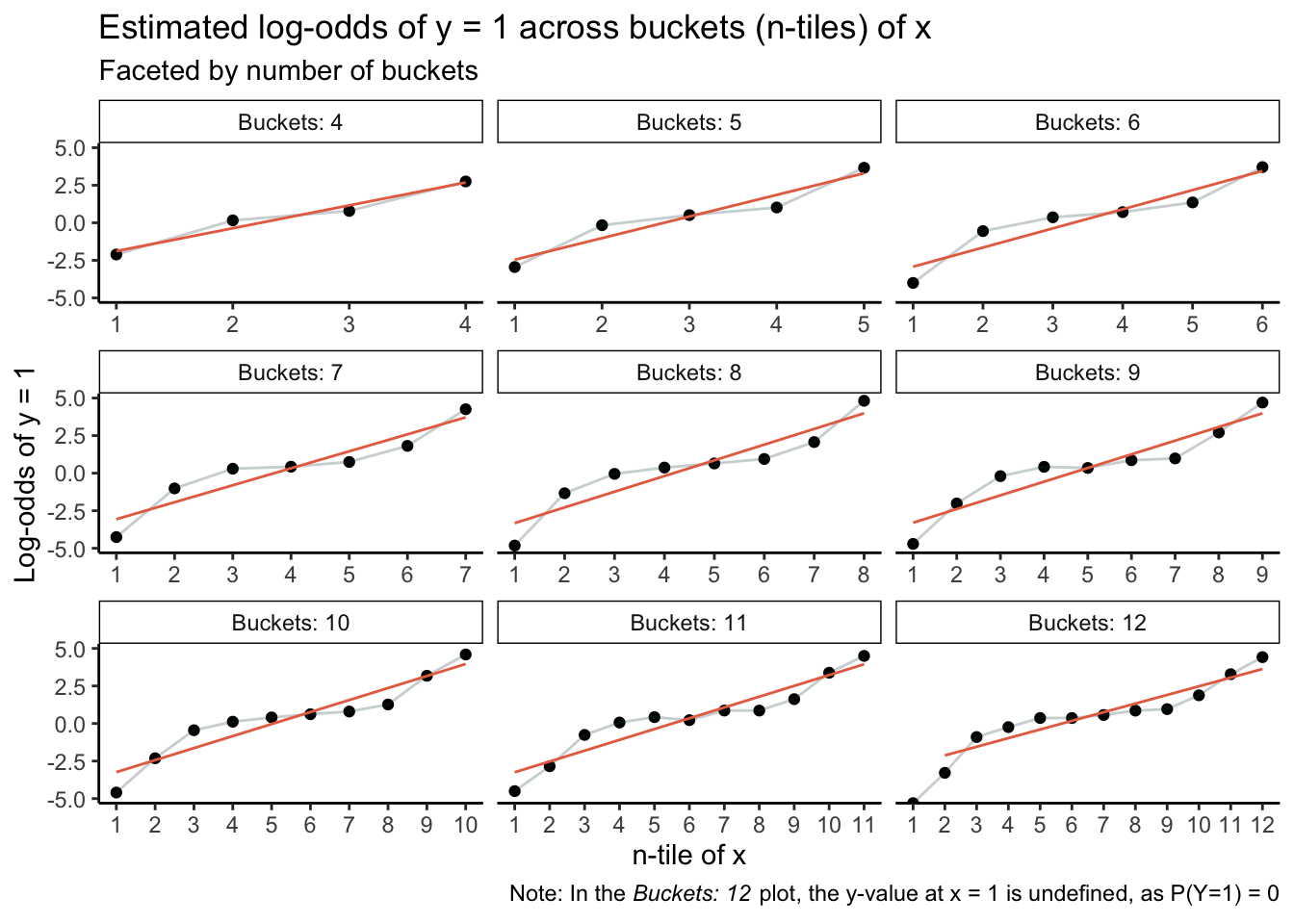
The top-left plot, in which buckets are based on quartiles of x, is acutely misleading: The minor blips away from a straight line are easily (mis)interpreted as noise. Likewise for the Buckets: 5 plot. Plots thereafter start to clearly capture nonlinearity, but if an analyst were in an incautious mood, even the Buckets: 6 plot could be interpreted as revealing noisy deviations as opposed to exposing the inadequacy of a linear functional form.
Err away from low bucket counts. Dividing observations by deciles of a predictor is a broadly reasonable starting place, sample size permitting. Note, though, that in some cases, a given splitting system may produce buckets (especially the first and/or last) in which there are exclusively outcome values of one or zero. \(\text{log}(\frac{P}{1-P})\) would be undefined, and the analyst may consider reducing the bucket count (by one) as a means of preventing \(P(Y=1)\) from being one or zero anywhere.
For one- and two-predictor logistic regressions, this graphical linearity assessment is useful, but it’s no panacea. I’m loath to use it on its own unless staring down a patently linear plot based on a sizable sample. This hesitancy is in no small part because these plots can be easily accompanied by goodness-of-fit tests and explicit model comparisons in which one assesses the relative viability of linear and nonlinear models. (Harrell [2015] discusses several of these approaches in detail in Regression Modeling Strategies, section 10.5.) Say that I inspect the Buckets: 10 plot above and feel largely convinced that a nonlinear model would be more appropriate than a linear one. I can fit a logistic regression model in which the relationship between x and y is linear in the logit, and I can likewise fit a nonlinear model using natural splines:
m1 <- glm(y ~ x, data = d, family = 'binomial')
m2 <- glm(y ~ splines::ns(x, df = 5), data = d, family = 'binomial')
AIC(m1, m2)
   df      AIC
m1  2 933.5556
m2  6 877.3632
In a welcome reinforcement of the intuition prompted by the plot, model comparison based on AIC values is clear: The nonlinear model is superior.
R session details
The analysis was done using the R Statistical language (v4.5.1; R Core Team, 2025) on Windows 11 x64 using the package ggplot2 (v3.5.2).
References
- Harrell, F. E., Jr. (2015). Regression modeling strategies (2nd ed.). Springer.
- Menard, S. (2002). Applied logistic regression analysis (2nd ed.). Sage.
- R Core Team (2025). R: A Language and Environment for Statistical Computing. R Foundation for Statistical Computing, Vienna, Austria. https://www.R-project.org/.
- Wickham, H. (2016). ggplot2: Elegant Graphics for Data Analysis. Springer-Verlag New York.
Jacob Goldstein-Greenwood
Research Data Scientist
University of Virginia Library
October 18, 2023
For questions or clarifications regarding this article, contact statlab@virginia.edu.
View the entire collection of UVA Library StatLab articles, or learn how to cite.