Note: This version of the article contains static images of maps generated with Leaflet. You can view a version with interactive maps here.
A striking feature of many maps from early in the history of cartography is their linearity. Being primarily for travel (and given the technological limitations on how faithfully geographies could be understood and displayed), maps from centuries past often took the form of long scrolls or spans of parchment displaying the ordered features of routes (which river would be encountered after which village, and so on). The Tabula Peutingeriana, possibly the only extant map of the ancient Roman road system, is more than twenty feet long despite being a far slimmer foot or so in width. It reflects an approach to cartography that treats maps as itineraries, as ordered schematics. The linear design has a delightful functionality: The geographic realism we expect from a contemporary map (who nowadays would represent the journey from Denver to Aspen as a horizontal line?) is subjugated to the practical concern of safely finding one’s way from Florence to Rome.
But maps do much more than give travel instructions these days. Data scientists and journalists put them to work representing quantitative differences across space and time, from the disparate effects of climate change on richer and poorer neighborhoods to the amount of time people were spending at home across the US early on in the COVID-19 pandemic. For these purposes, linearity just won’t do: We don’t need to represent the journey between two points; we need to represent data about many areas simultaneously.
Doing so in R is alluringly easy with Leaflet. Leaflet is an open-source JavaScript library for making interactive maps. Its use is simple: The user creates a map widget and then layers features onto that map widget until the display and interactivity are as desired. (This process will feel familiar to users of the R community’s darling package ggplot2.)
In this article, I’ll review two common ways of representing data on a map using Leaflet in R: (1) Defining regions on a map and distinguishing them based on their value on some measure using colors and shading (“choropleths,” these maps are called), and (2) marking individual points on a map (e.g., archaeological dig sites, baseball stadiums, voting locations, etc.).
If you plan to code along with the examples below, be sure to install and load the leaflet package. I also recommend installing and/or loading the magrittr package so that you can make use of the pipe operator (%>%) to chain functions, which proves to simplify the map-building process greatly. Install and/or load the following packages too; I call on them at various points in the code below: sf, geojsonio, htmltools, htmlwidgets, stringi, and RColorBrewer.
library(leaflet)
library(magrittr)
library(sf)
library(geojsonio)
library(htmltools)
library(htmlwidgets)
library(stringi)
library(RColorBrewer)
Choropleths
The goal: Build a choropleth to represent the average price of electricity (in cents per kilowatt-hour) across each of the 48 contiguous US states (+ DC) in 2018. The data are sourced from the US Energy Information Administration, and you can access them using the code below.1
A peek at the data:
dat <- read.csv('https://static.lib.virginia.edu/statlab/materials/data/state_electricity_data_2018.csv')
head(dat)
        NAME centskWh
1    Alabama     9.63
2     Alaska    19.36
3    Arizona    10.85
4   Arkansas     7.78
5 California    16.58
6   Colorado    10.02
Whenever we’re working with Leaflet, we use the function leaflet() to initialize a map widget.
m <- leaflet()
Running m at this point will simply load a gray panel void of any geographic features. This is the hollow shell of the eventual choropleth.
Before we define our areas of interest (states) and layer on data (electricity costs), the map widget needs a “basemap” to serve as its foundation. Basemaps consist of map tiles—individual map sections that join together to form a composite picture. The simplest way to add a basemap to the map widget is with addTiles(). Running this without adjustment will result in an overhead view of the whole world. Since the data at hand are for US states, the map should be centered on America: The setView() function allows the user to specify a longitude (east-west) and latitude (north-south) to serve as the initial center of the map. (The geographic center of the contiguous US? Not far from the Kansas-Nebraska border.)
By default, addTiles() generates a basemap using OpenStreetMap tiles. They’re suitable, but the options of which tiles to use are extensive. Check out a lengthy list here. I’m partial to the washed simplicity of the “CartoDB.PositronNoLabels” tiles, so I’ll use those in the maps that follow. You can use addProviderTiles() instead of addTiles() to pick from among a prespecified set of third-party options, or you can call a tile set from a URL by providing a link in addTiles().
m <- leaflet() %>%
  addProviderTiles(providers$CartoDB.PositronNoLabels)  %>%
  setView(lng = -96.25, lat = 39.50, zoom = 4)
m
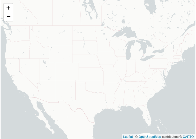
With that, we have a basemap. But we need to represent each state as a distinct area that we can associate with an electricity cost. We can feed Leaflet the necessary spatial data using shapefiles. The Census Bureau is an excellent source of shapefiles for the US, and the shapefiles it offers cover many levels of geographic granularity (states, counties, school districts, congressional districts, and more).
For these maps, we’ll use the Census Bureau’s 2019 1:5,000,000 US states shapefile, which you can directly download here. The file you’ll need to read in ends with .shp, and you can read it in with read_sf() from the sf package. (Note: The folder you download from the Census Bureau will contain other files—.dbf, .shx, and more—in addition to the .shp file. You’ll need to keep those files in the same directory from which you read in the .shp file. You can learn more about the structure of shapefiles here.) After we read in the shapefile, we change the coordinate reference system to WGS84 using the st_transform() function. To do this we specify the EPSG code 4326. (This prevents warnings about "inconsistent datum".)
states <- read_sf('cb_2019_us_state_5m/cb_2019_us_state_5m.shp')
states <- st_transform(states, 4326)
The shapefile has been assigned to the object states, and it contains a geometry column with the spatial data. With it, we can now define each state on the basemap using the addPolygons() function:
m <- leaflet() %>%
  addProviderTiles(providers$CartoDB.PositronNoLabels)  %>%
  setView(lng = -96.25, lat = 39.50, zoom = 4) %>%
  addPolygons(data = states,
              weight = 1)
m
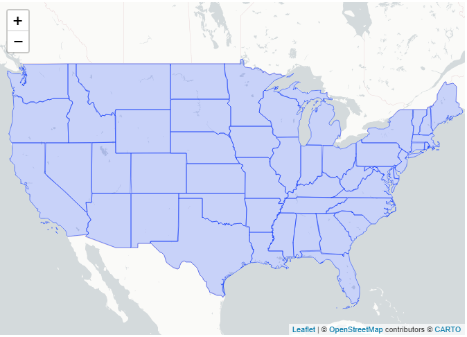
We need to somehow combine the electricity price data (dat) with the shapefile (states). Note, though, that the shapefile contains 56 elements, whereas dat contains 51. What gives? The Census Bureau shapefile contains geospatial data for a few areas in addition to the 50 states + DC, like Guam. As we don’t need to retain these regions in the choropleth of the contiguous 48 states + DC, we can drop them during the merge process. We’ll merge dat and states based on the shared variable NAME, which contains state names in both objects. It’s prudent, though, to confirm that the state naming conventions are identical across the two objects: For example, might one list the nation’s capital as “Washington, D.C.” while the other labels it “Washington, DC”? Checking for this is simple enough. The following code evaluates whether every element of dat$NAME is contained in states$NAME; if TRUE—as we see that the expression is—we know that every state name listed in the electricity-cost data (dat) can be matched with a state name in the shapefile (states).
is.element(dat$NAME, states$NAME) %>%
  all()
[1] TRUE
Now we merge. By including all.x = F as an argument, we specify that elements of states that do not have a match in dat (e.g., Guam) should not be retained in the merged object. We can also go ahead and drop Hawaii and Alaska from the merged dataframe because they won’t be represented in the final choropleth.
states <- merge(states, dat, by = 'NAME', all.x = F)
states <- states[!(states$NAME == 'Hawaii' | states$NAME == 'Alaska'), ]
Shading and coloring are what make a choropleth a choropleth, so we need to define some rules for coloration. To map colors to continuous values, use colorNumeric(), specifying the color palette that values should be mapped to and the values. Here, I use the “Blues” palette from RColorBrewer.
paletteNum <- colorNumeric('Blues', domain = states$centskWh)
Alternatively, we can map colors to bins of values instead of doing so continuously. In the electricity cost data, values range from ~7 cents to ~19 cents. We can break this range up into discrete colorable bins:
costBins <- c(7:19, Inf)
paletteBinned <- colorBin('YlGnBu', domain = states$centskWh, bins = costBins)
colorNumeric() and colorBin() each generate a function to be used when creating a choropleth; the functions take a value and return a color. States in this choropleth will be colored using the continuous function, so we insert paletteNum() in the addPolygons() function below. (Several other arguments have been added to addPolygons() as well that adjust the aesthetics of the plot.)
m <- leaflet() %>%
  addProviderTiles(providers$CartoDB.PositronNoLabels)  %>%
  setView(lng = -96.25, lat = 39.50, zoom = 4) %>%
  addPolygons(data = states,

              # state border stroke color
              color = 'white',

              # soften the weight of the state borders
              weight = 1,

              # values >1 simplify the polygons' lines for less detail but faster loading
              smoothFactor = .3,

              # set opacity of polygons
              fillOpacity = .75,

              # specify that the each state should be colored per paletteNum()
              fillColor = ~paletteNum(states$centskWh))
m
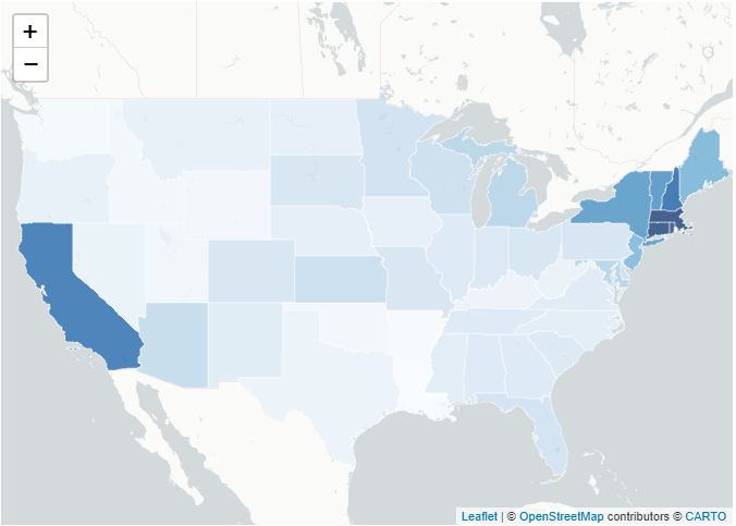
And lo, we have a choropleth. But this is incomplete: We have no legend information (which shade represents an expensive state?), no state labels, and the extent of interactivity that this map offers is zooming in and out and dragging the view around.
For labels: We’ll use sprintf() in combination with lapply() and HTML() (from htmltools) to generate a formatted, HTML-tagged label for each state.2 The cbind() statement stitches the labels onto the states objects. The labels can be included in the choropleth by adding a label argument in addPolygons(), and labelOptions provides additional customizability (label color, etc.).
stateLabels <- sprintf('<b>%s</b><br/>%g cents/kWh',
                       states$NAME, states$centskWh) %>%
  lapply(function(x) HTML(x))

states <- cbind(states, matrix(stateLabels, ncol = 1, dimnames = list(c(), c('stateLabels'))))
A legend is an easy addition with the addLegend() function: Just specify the color-palette function (the function we created with colorNumeric()), the values used for generating colors per that function, a position (e.g., ‘topleft’), and a title. (See ?addLegend() for additional options.)
Finally, we’ll take advantage of Leaflet’s interactivity features by adding a highlightOptions argument as part of addPolygons(). This allows us to define a response for sections of the map when a cursor passes over them. We’ll keep it simple: While being moused over, states will be emphasized by a blue line.
m <- leaflet() %>%
  addProviderTiles(providers$CartoDB.PositronNoLabels) %>%
  setView(lng = -96.25, lat = 39.50, zoom = 3.5) %>%
  addPolygons(data = states,
              color = 'white',
              weight = 1,
              smoothFactor = .3,
              fillOpacity = .75,
              fillColor = ~paletteNum(states$centskWh),
              label = ~stateLabels,
              labelOptions = labelOptions(
                style = list(color = 'gray30'),
                textsize = '10px'),
              highlightOptions = highlightOptions(
                weight = 3,
                color = 'dodgerblue'
                )
              ) %>%
  addLegend(pal = paletteNum, values = states$centskWh,
            title = '<small>2018 Avg. Electricity Cost<br>(cents/kWh | source: US EIA)</small>',
            position = 'bottomleft')
m
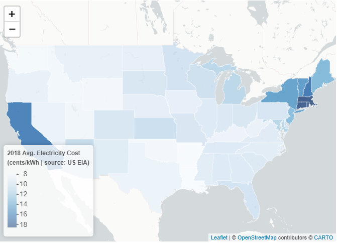
Using a choropleth in this case is a service to the people engaging with your data: Why make them slog through a spreadsheet when a map is far more digestible?
There are multiple options to export and save the interactive map, including:
- Embed the map in an R Markdown HTML document
- Embed the map in a Shiny App (this is beyond the scope of this intro, but Shiny integration is a plus of using Leaflet in R)
- Export the map as an HTML file directly from the RStudio Viewer
- Use the
saveWidget()function from the htmlwidgets package orsave_html()from htmltools:
saveWidget(m, file = paste0(getwd(), '/choropleth.html'))
# or
save_html(m, file = paste0(getwd(), '/choropleth.html'))
Individual Map Markers
The pronounced polygons and cheerful colors of a choropleth are useful for displaying data relevant to whole regions. But individual points have their place, and Leaflet again makes plotting them painless. To walk through how to do so here, I’ll use a dataset maintained by James Fee (cageyjames on GitHub) containing latitudes and longitudes for professional baseball ballparks across the world. As of November 2020, there are upward of 500 ballparks listed in the data—plenty for our purposes. (You can learn more about the dataset here.3)
These data come as a GeoJSON file (GeoJSON is another format for storing geospatial data, similar to the Census shapefiles used above). You can use the code below to read in the data (November 2020 version) using geojson_read() from the geojsonio package. I also do a spot of data cleaning and preprocessing in the lines below; if you’re following along in R, be sure to run those.
baseball <- geojson_read('https://static.lib.virginia.edu/statlab/materials/data/ballparks.geojson',
                         what = 'sp') # "sp" = spatial object

# Two latitude values are each stored with an unnecessary trailing comma at the end;
# remove those commas using stringi tools:
baseball$Lat[which(stri_detect(baseball$Lat, fixed = ','))] <-
  unlist(stri_split(stri_subset(baseball$Lat, fixed = ','), fixed = ','))[c(1,3)]

# Lat and Long are stored as character strings; convert them to numeric:
baseball@data[, c('Lat', 'Long')] <-
  lapply(baseball@data[, c('Lat', 'Long')], function(x) as.numeric(as.character(x)))
Each baseball park has an associated latitude (Lat) and longitude (Long). For the choropleth above, latitudes and longitudes in the shapefile defined state boundaries; here, those values are used to identify single points. To plot those points, we adopt the same general process as before: Initialize a map widget, add basemap tiles, set the view parameters, and then add layers containing our data of interest. We can plot points in a few different ways. Below is the simplest case: Simply swap in addMarkers() (specifying longitude and latitude variables) where we would have used addPolygons() in the choropleth.
mBaseball <- leaflet() %>%
  addProviderTiles(providers$CartoDB.PositronNoLabels) %>%
  setView(lat = 15, lng = 0, zoom = 1.5) %>%
  addMarkers(data = baseball,
             lng = ~Long,
             lat = ~Lat)
mBaseball
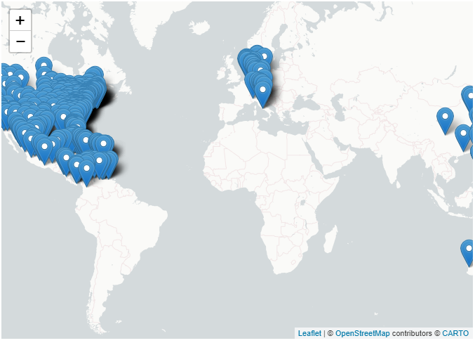
We’ve now marked each ballpark on the map. But they’re currently unidentifiable, so let’s add labels in the form of interactive pop-ups that appear when someone clicks on a given marker We follow a similar process as we did when labeling states in the choropleth:
labelsBaseball <- sprintf('<b>%s</b>',
                          baseball$Ballpark) %>%
  lapply(function(x) HTML(x))

baseball <- cbind(baseball, matrix(labelsBaseball, ncol = 1, dimnames = list(c(), c('labelsBaseball'))))

mBaseball <- leaflet() %>%
  addProviderTiles(providers$CartoDB.PositronNoLabels) %>%
  setView(lat = 15, lng = 0, zoom = 1.5) %>%
  addMarkers(data = baseball,
             lng = ~Long,
             lat = ~Lat,
             popup = ~labelsBaseball)
mBaseball
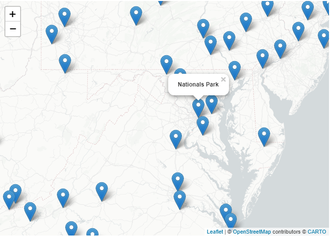
The teardrop markers do the trick, but we’re not limited to them. Consider, for example, using circle markers by calling addCircleMarkers() instead of addMarkers(). Further, our maps can be much more dynamic and flexible than the map above. Say that we wanted to be able to independently view Major League, Double-A, and Triple-A fields. In this case, we can add each set of parks as its own layer and add interactive functionality with addLayersControl() to allow each layer to be turned “on” or “off.”
mBaseball <- leaflet() %>%
  addProviderTiles(providers$CartoDB.PositronNoLabels) %>%
  setView(lng = -96.25, lat = 33, zoom = 3.5) %>%
  addCircleMarkers(data = baseball[baseball$Class == 'Majors', ],
                   lng = ~Long,
                   lat = ~Lat,
                   radius = 3,
                   color = 'midnightblue',
                   popup = ~labelsBaseball,
                   group = 'Major League Fields') %>%
  addCircleMarkers(data = baseball[baseball$Class == 'Triple-A', ],
                   lng = ~Long,
                   lat = ~Lat,
                   radius = 3,
                   color = 'mediumaquamarine',
                   popup = ~labelsBaseball,
                   group = 'Triple-A Fields') %>%
  addCircleMarkers(data = baseball[baseball$Class == 'Double-A', ],
                   lng = ~Long,
                   lat = ~Lat,
                   radius = 3,
                   color = 'salmon',
                   popup = ~labelsBaseball,
                   group = 'Double-A Fields') %>%
  addLayersControl(overlayGroups = c('Major League Fields', 'Triple-A Fields', 'Double-A Fields'),
                   options = layersControlOptions(collapsed = FALSE),
                   position = 'bottomleft')
mBaseball
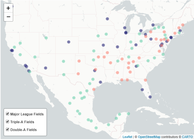
Data are most useful when they’re communicable, and when we’re dealing with data that can be geospatially organized, maps maximize communicability. Compared to a set of markers on a map or a choropleth with neatly delineated regions, rows and columns can be opaque. To find our way across the Roman Empire in antiquity, we could lean on the Tabula Peutingeriana; to find our way in a world of data, we can lean on Leaflet.
Useful links and additional notes:
- Census Bureau shapefiles for areas of frequent interest (states, counties, etc.) can be accessed here.
- The RStudio team has put together a comprehensive website discussing the
leafletpackage here. - Instead of calling
data = ...inaddPolygons()/addMarkers()/etc., you can alternatively specify a data object immediately in theleaflet()map-widget initialization statement (m <- leafet(data = ...) %>% ...). - The
mapspackage contains a helpful assortment of shapefiles for a range of geographies (e.g., Italy; world cities with populations over 40,000; the US mainland; etc.). Calling geospatial data from this package can save you a shapefile import step. - The
tigrispackage (CRAN; GitHub) aims to provide similar functionality asmapsby allowing users to directly download and call US Census Bureau shapefiles; however, as of November 1, 2020, the current package build isn’t functional. Once its errors are resolved, it should be a handy tool.
R session details
The analysis was done using the R Statistical language (v4.5.2; R Core Team, 2025) on Windows 11 x64, using the packages magrittr (v2.0.4), geojsonio (v0.11.3), leaflet (v2.2.3), htmltools (v0.5.8.1), stringi (v1.8.7), RColorBrewer (v1.1.3), sf (v1.0.22) and htmlwidgets (v1.6.4).
Jacob Goldstein-Greenwood
StatLab Associate
University of Virginia Library
November 6, 2020
- Source: US Energy Information Administration. The version of the 2018 electricity-cost data used here is current as of November 2020. ↩︎
- A basic guide on formatting text with HTML tags is here, and a helpful chapter on the use of
sprintf()to create formatted character strings is here. ↩︎ - The dataset, GeoJSON-Ballparks, is made available and used per the terms of the Open Data Commons Attribution License. ↩︎
For questions or clarifications regarding this article, contact statlab@virginia.edu.
View the entire collection of UVA Library StatLab articles, or learn how to cite.
