
Data that has many features or variables, sometimes with the number of variables even exceeding the number of samples, is often referred to as high-dimensional data. High-dimensional data may present challenges for computation, data management, and collinearity. Therefore, a common approach is to reduce the number of dimensions.
There are many methods for dimensionality reduction, including approaches ranging from variable selection to multivariate linear discriminant analysis. Here, we will focus on Principal Component Analysis (PCA). PCA was first introduced by Karl Pearson in 1901 and later, independently by Hotelling in 1933. PCA is now one of the most widely used data reduction techniques. It is considered an unsupervised approach because it only looks at the input features and is not trained on labeled data (i.e. it doesn’t have supervised training from data with known outcomes). PCA is also a multivariate approach, or a method that finds relationships between more than one independent variable.
The goal of PCA is to reduce the number of dimensions while still maintaining the most important information in the original variables. This is achieved by creating some number of a smaller set of uncorrelated variables, which are known as the principal components. The principal components, or reduced dimensions of the data, are linear combinations of the original variables. This raises an important point of PCA, it assumes linear relationships between variables.
Often, a few principal components are able to account for most of the variability in the data. For this reason, the principal components are commonly used in additional analyses. For example, the principal components may be used in regression analysis if there are too many explanatory variables or the explanatory variables are highly correlated with each other. Simply, PCA aims to reduce the number of variables in the data while preserving the most important information.
In this article, we will explore how to use and understand PCA through the R statistical programming language. First, we’ll load the packages used throughout this article. If you do not have one or more of the packages, you can install them using install.packages().
# Load packages
library(dplyr)       # For data wrangling
library(ggplot2)     # For creating plots
library(MASS)        # For generating data
library(factoextra)  # For scree plots
library(patchwork)   # For creating plots
We will simulate data of length 50 (n = 50) by creating correlated variables (v) where our first variable is v1 and the following variables are generated from v1 plus some noise. As the standard deviation increases (argument sd =) the noise increases. Notice that the standard deviations we specify are small because we are creating variables with higher correlation values. For this demonstration, we will use five variables, although PCA is often applied to data with many more dimensions.
set.seed(1997)

# Create v1 which has 50 values and has a mean of 6
v1 <- rnorm(n = 50, mean = 6)

# Create v2
v2 <- v1 + rnorm(n = 50, sd = 0.7)

# Create v3
v3 <- v1 + rnorm(n = 50, sd = 0.4)

# Create v4
v4 <- v1 + rnorm(n = 50, sd = 0.2)

# Create v5
v5 <- v1 + rnorm(n = 50, sd = 0.8)

# Create a dataframe from v1, v2, v3, v4, and v5
df <- data.frame(v1, v2, v3, v4, v5)

# View first 5 rows of data
head(df)
        v1       v2       v3       v4       v5
1 5.232492 6.058631 5.264419 4.984312 4.896110
2 6.905089 7.004193 6.477879 6.908186 6.210024
3 4.893392 4.941380 5.022441 4.708531 5.455200
4 5.887934 5.009588 6.151061 5.590965 6.424973
5 4.262497 4.120041 4.758584 4.463166 5.434568
6 6.229586 6.163027 6.415022 5.994820 6.641357
We will compute correlations among the variables using Pearson correlation; this is the default in cor(). While other correlation measures, such as Spearman’s rank correlation, can be used, PCA assumes linear relationships between the variables and pearson correlation measures the strength and direction of linear relationships.
Pearson correlation ranges from -1 to 1. Values close to -1 indicate a strong, negative relationship (as one variable increases, the other variable decreases) while values toward 1 indicate a strong, positive linear relationship (as one variable increases, the other variable also increases). Values close to zero indicate little to no linear relationship between the two variables. Importantly, this does not mean there is no relationship in the data, but that there is not a linear one. An important consideration when using Pearson correlation is that it is sensitive to outliers.
# Compute Pearson correlation coefficients among the variables
cor(df, method = "pearson")
          v1        v2        v3        v4        v5
v1 1.0000000 0.8028821 0.9166816 0.9765765 0.6045126
v2 0.8028821 1.0000000 0.7557898 0.8025673 0.5266304
v3 0.9166816 0.7557898 1.0000000 0.9107819 0.5761768
v4 0.9765765 0.8025673 0.9107819 1.0000000 0.5957991
v5 0.6045126 0.5266304 0.5761768 0.5957991 1.0000000
From the results, we can see that the variables are positively correlated. Notice that the variables with greater standard deviations (such as v5) tend to have lower correlation coefficients with the other variables.
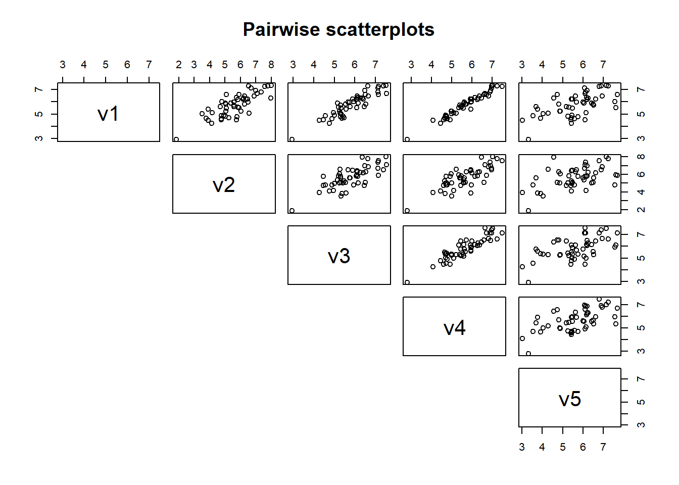
We can also plot the data to visualize these relationships by using a scatterplot. We will use the function pairs() on df to create pairwise scatterplots to examine relationships among variables. Notice that variables with a high correlation have a tight relationship, or less scatter, while variables with a lower correlation tend to have greater scatter.
We have five variables so we will get 10 scatterplots to visualize the bivariate (or two variable) relationships. In high dimensional data sets, there may be many more variables than five. For example, if we had 15 variables, there would be 105 plots to examine, which may be unreasonable.
pairs(df,
      #symmetric, so set to NULL
      lower.panel = NULL,
      main = "Pairwise scatterplots")
While pairwise scatterplots provide a visual assessment of relationships among variables, PCA relies on linear algebra to identify directions that maximize variation in the data. This is accomplished by finding new axes and rotating the data using a linear transformation. We can use a simple schematic going from two-dimensional to one-dimensional data to visualize this.
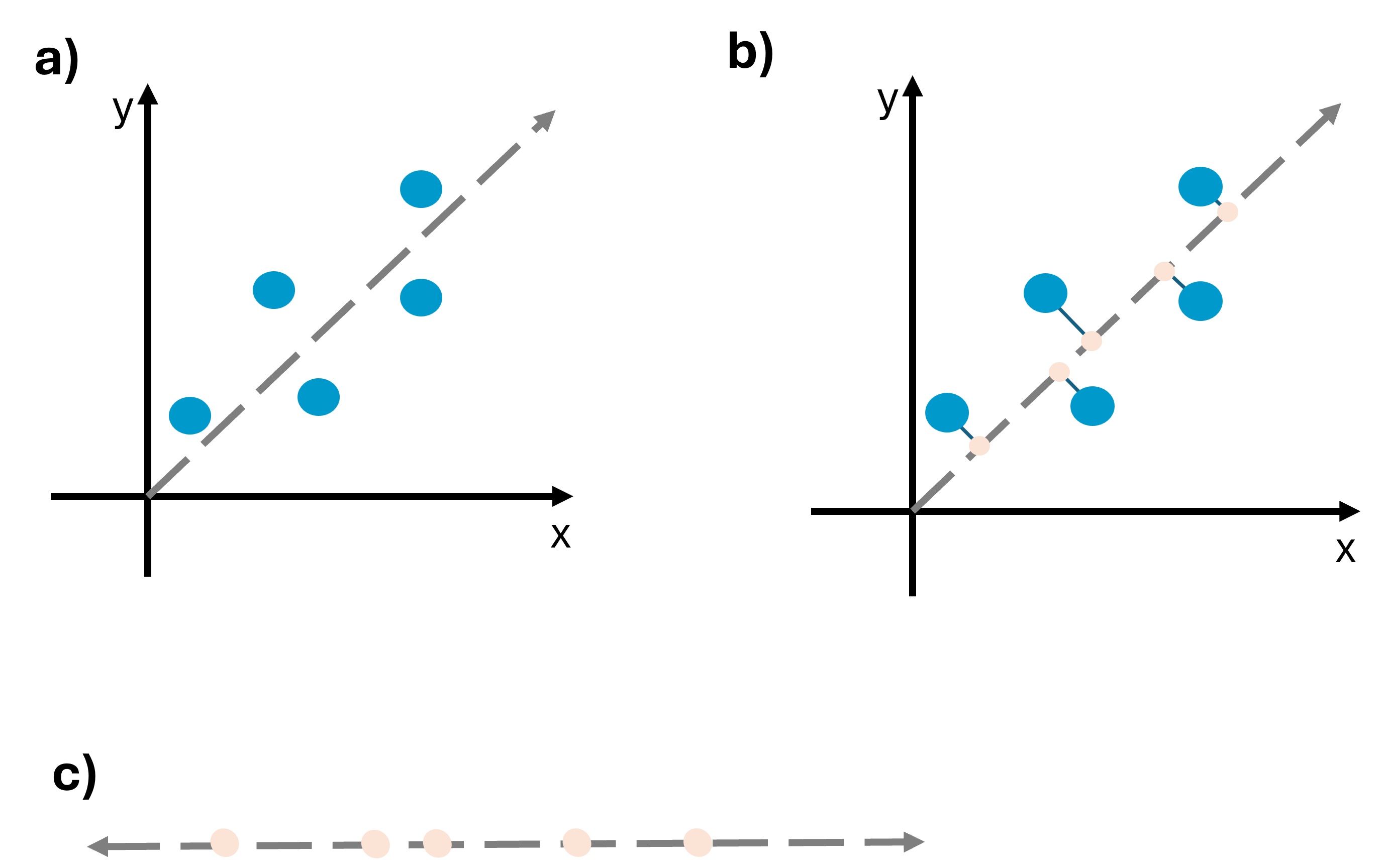
In (a), x and y are positively correlated, as x increases, y also increases. The dashed gray line represents the axis along which variation is maximized. In (b), observations are projected onto this axis at a 90 degree angle. This transformation yields (c), a new coordinate system where the data has been reduced from two dimensions (x and y) to one dimension. The points from (a) have been projected onto the coordinate system in (c).
Below, we can look at an example where the direction explains less variance and therefore captures less of the data’s structure. Notice that the points are closer together.
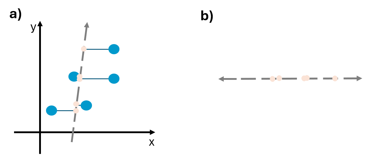
It’s important to recognize that we care about maximizing variation because when variance is maximized more information can be found along that direction. In other words, when points are spread out, and there is high variance, there can be interesting differences. However, if points are tightly clustered together and the variance is low, there is little information.
In PCA, such transformations occur through eigen-decomposition of a matrix using eigenvalues and eigenvectors. An eigenvalue is a type of scalar, and it gives a factor by which an eigenvector is stretched or compressed. An eigenvector is a nonzero vector where a linear transformation can change the length but not rotate. We explore eigenvalues and eigenvectors below.
Finding eigenvalues
For simplicity, let’s take v1 and v2, which have a Pearson correlation of 0.8, and find the eigenvalues. Our correlation matrix of v1 and v2 is:
# Create correlation matrix
A <- cor(cbind(v1, v2))

# Print correlation matrix
print(A)
          v1        v2
v1 1.0000000 0.8028821
v2 0.8028821 1.0000000
Notice that A is square matrix because it has the same number of rows and columns (2x2). To find the eigenvalues of the correlation matrix, we will solve for \(\lambda\) using the equation
\[ Av = \lambda v \]
where A is the matrix, v is the eigenvector, and \(\lambda\) is the eigenvalue that we will solve for. This equation tells us that multiplying the matrix by the eigenvector (\(Av\)) is the same as scaling the eigenvector by \(\lambda\) (\(\lambda v\)).
\(\lambda\) is the scalar, or simply a single number that we will solve for. Like the word suggests, scalars can essentially “scale” things by the amount of the scalar. Here, \(\lambda\) stretches or shrinks the vector. To read more about scalars, see Introduction to Applied Linear Algebra, Chapter 1: Vectors.
Notice then that \(Av\) is matrix multiplication while the right hand side of the equation is scalar multiplication.
We set the equation equal to 0
\[ Av - \lambda v = 0 \]
As the equation currently stands, we can’t subtract a matrix (A) by a scalar (number; \(\lambda\)). Therefore, we turn \(\lambda\) into a matrix using the identity matrix I.
The identity matrix is a matrix with 1’s along the diagonal and 0’s elsewhere. In this example, our identity matrix is:
I = diag(nrow = 2)

I
     [,1] [,2]
[1,]    1    0
[2,]    0    1
The identity matrix can be used because \(Iv = v\). We can rewrite the equation:
\[ Av - \lambda Iv = 0 \]
Now, v can be factored out since it is in both terms
\[ (A - \lambda I)v = 0 \] Notice that this equation is true if \(v = 0\). However, we are looking for a nonzero solution. To find when there are nonzero solutions, the determinant can be used and is represented by the bars in the equation below. The determinant represents how a transformation scales area (two dimensions) or volume (in higher dimensional data). This equation is referred to as the characteristic equation.
\[ |A - \lambda I| = 0 \]
To solve the equation and find the eigenvalues, we need to do a bit of math. Looking at the equation \(|A - \lambda I| = 0\), we have a matrix, A, and a matrix, I. We plug these into the formula to get:
\[ \left| \begin{pmatrix} 1 & 0.8 \\ 0.8 & 1 \end{pmatrix} - \lambda \begin{pmatrix} 1 & 0 \\ 0 & 1 \end{pmatrix} \right| = 0 \]
We multiply \(\lambda\) by I which gives:
\[ \left| \begin{pmatrix} 1 & 0.8 \\ 0.8 & 1 \end{pmatrix} - \begin{pmatrix} \lambda & 0 \\ 0 & \lambda \end{pmatrix} \right| = 0 \]
We now need to subtract the matrices. This is accomplished by subtracting the values in the matching positions (for example, top left value in the first matrix is subtracted by the top left value in second matrix)
\[ \left| \begin{pmatrix} 1 - \lambda & 0.8 \\ 0.8 & 1 - \lambda \end{pmatrix} \right| = 0 \]
Now, we take the determinant by multiplying the diagonals. Therefore, the determinant is \((1 - \lambda)(1 - \lambda) - (0.8)(0.8)\) which gives \((1 - \lambda)^2 - 0.64 = 0\).
We solve the equation by adding 0.64 to both sides and then taking the square root.
\[ (1 - \lambda)^2 = 0.64 \]
\[ \sqrt{(1 - \lambda)} = \sqrt{0.64} \]
\[ 1 - \lambda = \pm0.8 \]
Subtract 1 from both sides and multiply by -1
\[ \lambda = 1.8 \text{ and } \lambda = 0.2 \]
Therefore, the eigenvalues are 0.2 and 1.8. These values tell us how much variance there is along each principal component. Higher values mean that there is more variation explained along that component.
Because we used a special case, with a 2x2 correlation matrix, we can simplify and say that our eigenvalues are 1 + pearson correlation and 1 - pearson correlation. Plugging in the Pearson correlation values we found above, we get:
\[ 1 + 0.802 = 1.802 \]
\[ 1 - 0.802 = 0.198 \]
Finding eigenvectors
Now that the eigenvalues have been found, we will find the eigenvectors to determine the direction along which we can explain the eigenvalues. In other words, the eigenvalue tells us how much variance is explained and the eigenvector gives the direction along which that is explained. We return to the equation:
\[ (A - \lambda I)v = 0 \]
Remember that the matrix is a square, 2x2 matrix. We are looking for 2-dimensional vectors, or a vector with two components. Therefore, we can say that:
\[ v = \begin{pmatrix} x \\ y \end{pmatrix} \]
where x = first component and y = second component that are unknown. If the matrix was 3x3, there would be x, y, z. We’ll plug in the values for the matrix and \(\lambda\) (we’ll use 1.8 for \(\lambda\) here). We can substitute the values in
\[ \left( \begin{pmatrix} 1 & 0.8 \\ 0.8 & 1 \end{pmatrix} - \begin{pmatrix} 1.8 & 0 \\ 0 & 1.8 \end{pmatrix} \right) \begin{pmatrix} x \\ y \end{pmatrix} = 0 \]
Subtract the matrices and multiply by v to get
\[ \begin{pmatrix} -0.8x & 0.8y \\ 0.8x & -0.8y \end{pmatrix} = 0 \]
From this, we get the equations
\[ -0.8x + 0.8y = 0 \] \[ 0.8x - 0.8y = 0 \]
For both equations, we can divide by 0.8 to get \(-x + y = 0\) and \(x - y = 0\) which becomes the equation \(x = y\). For whatever number \(x\) is, \(y\) must also be that number. For example, (1, 1) or (4, 4). Remember that eigenvectors are giving a direction. \(x = y\) tells us that for this, both of the variables move together in the same direction. The eigenvector with the form
\[ v = \begin{pmatrix} x \\ y \end{pmatrix} \]
Can be rewritten for this as
\[ v = \begin{pmatrix} x \\ x \end{pmatrix} \]
If we solve for \(\lambda = 0.2\), we would see that y = -x. In other words, the variables move in opposite directions.
Visualizing eigenvalues and eigenvectors
It can be helpful to visualize this. Let’s simulate data that has a correlation matrix of 0.8, this time with 1000 points.
set.seed(2026)

#correlation
rho <- 0.8

#correlation matrix
cor.mat <- matrix(c(1, rho, rho, 1), nrow = 2)

#simulate data and convert to a data frame
df2 <- mvrnorm(n = 1000, mu = c(0, 0), Sigma = cor.mat) %>%
        as.data.frame()

#Print df
head(df2)
           V1         V2
1 -0.06602755  1.0537759
2 -1.30900882 -0.7395604
3 -0.28862078  0.5528065
4  0.03005769 -0.1908572
5 -0.96832227 -0.2965375
6 -2.19092485 -2.5830184
Get the correlation matrix of df2
cor(df2)
         V1       V2
V1 1.000000 0.808273
V2 0.808273 1.000000
The eigenvalues and eigenvectors can be obtained using the function eigen()
df2.eigen <- eigen(cor.mat)

df2.eigen
eigen() decomposition
$values
[1] 1.8 0.2

$vectors
          [,1]       [,2]
[1,] 0.7071068 -0.7071068
[2,] 0.7071068  0.7071068
We can plot the points and visualize the eigenvalues and eigenvectors. Notice below that we are multiplying the eigenvectors by the square root of the eigenvalues. This is because the eigenvalue describes the variance along the eigenvectors direction and multiplying the eigenvector by the square root of the eigenvalue scales it so that the length along that axis equals one standard deviation. In other words, the rotated coordinate axes can be thought of coinciding with the axes of a contour that summarizes the underlying bivariate distribution of the data. The lengths of the axes of this contour are proportional to the square roots of the eigenvalues.
#Create arrows
arrows <- data.frame(x = 0, y = 0,
                     x_end = df2.eigen$vectors[1, ]* sqrt(df2.eigen$values),
                     y_end = df2.eigen$vectors[2, ]* sqrt(df2.eigen$values),
                     pc = c("PC1", "PC2"))

#Plot
ggplot(df2, aes(V1, V2)) +
  geom_point(alpha = 0.1) +

  #eigenvector arrows
  geom_segment(data = arrows,
               aes(x = x, y = y, xend = x_end, yend = y_end, color = pc),
               arrow = arrow(length = unit(0.25, "cm")),
               linewidth = 1.2) +

  coord_equal() +
  theme_minimal()
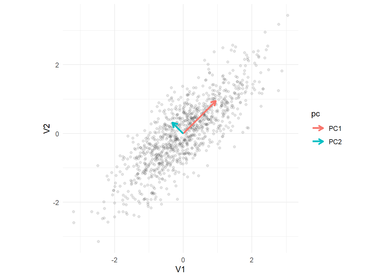
The arrows represent the eigenvectors, with the length of the arrow scaled by the corresponding eigenvalues. Notice that the arrows are perpendicular to each other. In other words, they are orthogonal or at a 90 degree angle. PC2 is always orthogonal to PC1. We can see that the greatest variance occurs along PC1.
The principal components
The eigenvalues can be arranged in descending order so that the first eigenvalue explains the most variance, and so on. For the eigenvalues we calculated above the order is 1.8, 0.2. The eigenvectors give directions and therefore define a new coordinate system where the variance is maximized. Remember, the eigenvalues indicate how important each component is in explaining variance and the eigenvectors give the corresponding directions. Using this information, the principal components are obtained with the eigenvector giving the direction and the eigenvalue giving the importance.
PC1 captures the direction with the greatest variance in the data. PC2 is orthogonal (at a right angle) to PC1. In this way, PCA rotates the coordinate system to identify linear combinations of v1 and v2 that maximize variation. This allows us to achieve the goal of reducing dimensionality while preserving variation.
Running PCA in R
We will run PCA using the stats package on the dataframe, df.
Often, we will want to scale the data to ensure that all the variables contribute equally (same units) and center the data to remove the mean (how far away something is from the mean value). We can do this using the scale() function.
# Scale and center data
df_scaled <- scale(df)

# View first 5 rows
head(df_scaled)
             v1         v2         v3          v4         v5
[1,] -0.5277175  0.3344037 -0.5768015 -0.73298816 -0.6464485
[2,]  1.2649654  1.1020314  0.7308529  1.32067144  0.5046955
[3,] -0.8911641 -0.5726051 -0.8375633 -1.02737359 -0.1566197
[4,]  0.1747822 -0.5172323  0.3786662 -0.08541026  0.6930163
[5,] -1.5673547 -1.2393857 -1.1219025 -1.28929021 -0.1746956
[6,]  0.5409631  0.4191550  0.6631165  0.34568990  0.8825939
Notice that this did not change the relationship between variables. Here, we can see that the correlation between our variables is still the same as when we called cor(df).
cor(df_scaled, method = "pearson")
          v1        v2        v3        v4        v5
v1 1.0000000 0.8028821 0.9166816 0.9765765 0.6045126
v2 0.8028821 1.0000000 0.7557898 0.8025673 0.5266304
v3 0.9166816 0.7557898 1.0000000 0.9107819 0.5761768
v4 0.9765765 0.8025673 0.9107819 1.0000000 0.5957991
v5 0.6045126 0.5266304 0.5761768 0.5957991 1.0000000
We run PCA using the prcomp() function from the stats package. We are going to use df and include the arguments center = TRUE and scale. = TRUE so that the function centers (mean of zero) and scales (make variables have comparable units) the data for us instead of doing this manually as we did above.
# Run PCA
pca1 <- prcomp(df,
               center = TRUE,
               scale. = TRUE)

# Look at the summary
summary(pca1)
Importance of components:
                          PC1    PC2     PC3     PC4     PC5
Standard deviation     2.0068 0.7492 0.53256 0.32318 0.15241
Proportion of Variance 0.8055 0.1123 0.05672 0.02089 0.00465
Cumulative Proportion  0.8055 0.9177 0.97447 0.99535 1.00000
First, notice that five principal components have been created (PC1 through PC5). The row “Standard deviation” tells us the spread of the data points that are projected onto each principal component. The standard deviation is actually the square root of the eigenvalues. Notice that PC1, has the highest standard deviation because it captures the greatest variability. The row “Proportion of Variance” tells us how much variance an individual principal component explains. Here, PC1 explains 80% of the variance and PC2 explains about 11% of the total variance in the data. The row “Cumulative Proportion” tells us how much the principal components cumulatively explain. Together, PC1 and PC2 explain about 91% of the total variance (80% + 11%).
The variation in the full data is only fully accounted for when using all of the principal components. So, we need to decide how many components are enough to summarize the data. There are a few methods that are commonly used for this. One of the more popular methods is using the number of components that allows you to retain a percentage of the variation in the original data. Using principal components that explain around 70% to 90% are commonly used values. Other methods include excluding principal components that have eigenvalues less than the average and keeping principal components that have eigenvalues greater than one (Kaiser rule). Choosing the number of principal components is an important step as selecting too few may result in lost information while keeping too many may lead to overfitting or high computational complexity.
Remember, PCA is essentially rotating the original axis to maximize variance explained. In this process, we can define new coordinates as a point along the new principal component axes. These are called scores. We can extract the scores and look at their correlations to see that they have little to no correlation with each other.
# Get scores
head(pca1$x)
            PC1        PC2         PC3        PC4         PC5
[1,] -0.9627369 -0.3557960 -0.76639140 -0.1247367 -0.14768410
[2,]  2.2480972 -0.3161135 -0.12105651  0.4227201  0.02077269
[3,] -1.6220096  0.4405850 -0.24002206 -0.1130620 -0.09035963
[4,]  0.2422711  0.6719340  0.58545638 -0.2202881 -0.16600019
[5,] -2.5042120  0.7636426  0.02210746 -0.2127028  0.21017045
[6,]  1.2344150  0.4753576  0.04848056 -0.1975909 -0.12406222
# Get correlation coefficients on the scores
cor(pca1$x)
              PC1           PC2           PC3           PC4           PC5
PC1  1.000000e+00 -1.495074e-16  1.572385e-16  3.708941e-16  8.287361e-16
PC2 -1.495074e-16  1.000000e+00 -6.225926e-17 -1.209347e-16 -1.074832e-15
PC3  1.572385e-16 -6.225926e-17  1.000000e+00  3.291358e-16  1.165278e-15
PC4  3.708941e-16 -1.209347e-16  3.291358e-16  1.000000e+00  1.606148e-16
PC5  8.287361e-16 -1.074832e-15  1.165278e-15  1.606148e-16  1.000000e+00
We can visualize the percentage of variance explained and the eigenvalues using a scree plot. Scree plots help show the number of principal components, ordered by importance. There is often a clear change in slope, indicating that the variance explained, and the eigenvalue, drops significantly. Because of this shape, some people refer to these as elbow plots. The base R function screeplot() can be used to create a basic scree plot, but we choose to use the fviz_eig() function from the factoextra package which displays the information retained by each principal component. The first plot shows the percentage of variance explained while the second plot shows the eigenvalues.
# Get variance explained
variance_pct <- summary(pca1)$importance[2,] * 100  # row 2 = proportion of variance
eigenvalues   <- pca1$sdev^2  # squaring the standard deviation returns the eigenvalues

# Variance
scree_var <- fviz_eig(pca1, choice = "variance", addlabels = TRUE) +
    expand_limits(y = max(variance_pct) + 10)


# Eigenvalue
scree_eig <- fviz_eig(pca1, choice = "eigenvalue", addlabels = TRUE) +
  expand_limits(y = max(eigenvalues) + 0.5)

# Join plots
scree_var / scree_eig
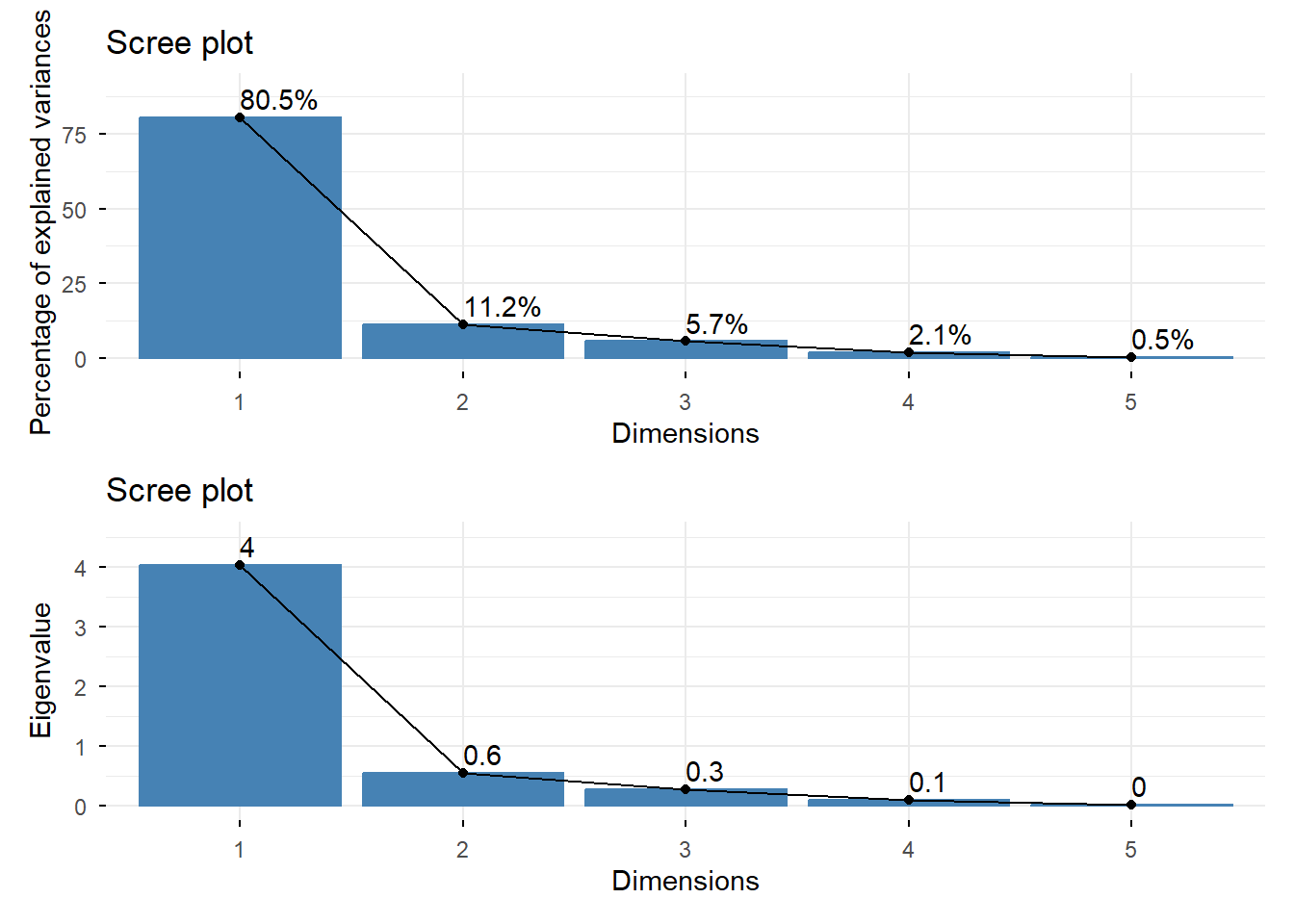
As seen in the summary, PC1 has the highest percentage of variance explained and also the highest eigenvalue. There is a clear “elbow”, or change in slope, from PC1 to PC2.
We can also create a biplot where the points show the scores and the vectors show the loadings, or value that indicates how much each variable contributes to the principal component.
biplot(pca1)
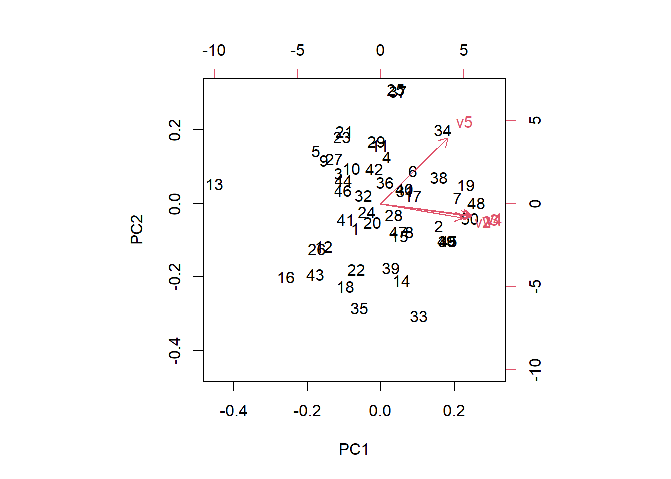
The bottom and left axes are the PC1 and PC2 scores, respectively while the top and right axes are the loadings. The vectors start at the origin of PC1 and PC2 with v1:v4 primarily contributing to PC1. The small angles between the vectors indicate positive correlations. Variable v5 contributes to both PC1 and PC2 as the vector is orientated diagonally in the first quadrant. In a similar way, observations (numbers on the plot) to the right have a stronger influence on PC1 while observations to the left have lower PC1 values.
We can examine the loadings by looking at the rotation component of the PCA output. Notice that the rows are the original variables (v1:5) and the columns are the principal components. Each value indicates how much a variable contributes to a given component.
pca1$rotation
         PC1        PC2         PC3         PC4           PC5
v1 0.4833551 -0.1627383  0.23112283  0.40197015 -0.7244903901
v2 0.4345857 -0.2014975 -0.87156540 -0.10443748 -0.0007851724
v3 0.4675704 -0.1740296  0.36732358 -0.78426422  0.0330851570
v4 0.4818574 -0.1758347  0.22508609  0.46076156  0.6884262277
v5 0.3559418  0.9336546 -0.03695434 -0.01188374  0.0093680044
Variable one (v1) contributes the most to PC1, followed by variable 4 (v4).
PCA on uncorrelated variables
A common goal of PCA is to reduce redundant information by explaining shared variation among correlated variables. As such, applying PCA to variables that are not correlated is far less informative and can return the original variables.
We demonstrate this by generating five variables with little to no correlation
set.seed(2026)

# Create 5 rows of data with 50 observations
df3 <- as.data.frame(matrix(rnorm(50 * 5), ncol = 5))

# View first 5 rows
head(df3)
           V1         V2         V3         V4         V5
1  0.52058907 -1.1698987  1.2162665 0.02432675 -0.4320264
2 -1.07969076 -0.2062002 -0.4938432 0.33463519  0.4585911
3  0.13923812 -0.9306103 -0.2277847 0.98941100 -0.2293520
4 -0.08474878  0.4493976 -1.1116489 0.50037511 -1.8569622
5 -0.66663962 -0.6448065  0.9958331 0.57690787 -0.2896742
6 -2.51608903 -0.2314227  0.5618289 1.14269094  1.7671412
The variables are weakly correlated, with the highest correlation coefficient being 0.2.
# Check correlation
cor(df3)
            V1          V2          V3          V4          V5
V1  1.00000000  0.23850882 -0.06784573 -0.07264173 -0.02846353
V2  0.23850882  1.00000000 -0.01658451 -0.05126970  0.03238777
V3 -0.06784573 -0.01658451  1.00000000 -0.08585025  0.06416905
V4 -0.07264173 -0.05126970 -0.08585025  1.00000000  0.05326546
V5 -0.02846353  0.03238777  0.06416905  0.05326546  1.00000000
We run PCA on df3 and view the summary.
# Run PCA
pca3 <- prcomp(df3, center = TRUE, scale. = TRUE)

# Look at the summary
summary(pca3)
Importance of components:
                          PC1    PC2    PC3    PC4    PC5
Standard deviation     1.1282 1.0437 1.0222 0.9185 0.8657
Proportion of Variance 0.2546 0.2179 0.2090 0.1687 0.1499
Cumulative Proportion  0.2546 0.4724 0.6814 0.8501 1.0000
PC1 now only accounts for 25% of the variance and four out of the five components are required to capture over 80% of the total variation.
Some additional notes
PCA can help reduce the complexity of a dataset by summarizing many correlated variables into a smaller number of uncorrelated components, making patterns easier to understand. It is a widely used tool. However, a challenge with PCA is interpretation. Because the principal components are linear combinations of the variables, they can lack a physical, straightforward meaning. Moreover, because PCA uses Pearson correlation, which is a measure of linear relationships, nonlinear relationships may be obscured leading to an incomplete understanding of the data.
Here, we ran PCA using the correlation matrix. However, you can also use the covariance matrix. The choice between using the correlation or covariance matrix often includes the measurement scale of the variables as well as goals of the analysis and consideration of the data. However, if the variables are on similar scales, the covariance matrix is a common choice because it preserves the original structure of the data, allowing variables with high variability to contribute to the principal components more. Using the correlation matrix allows each variable to contribute equally, regardless of the original scale of the variables. As such, the correlation matrix is often used when the variables are measured on different scales.
With the function prcomp(), using the argument scale. = TRUE runs PCA on the correlation matrix while scale. = FALSE uses the covariance matrix. The default in prcomp() is FALSE, although the package authors note that scaling is generally advisable.
R session details
This analysis was done using the R Statistical language (v4.5.3; R Core Team, 2026) on Windows 11x64, using the packages dplyr (v1.2.0), ggplot2 (v4.0.2), MASS (v7.3.65), factoextra (v2.0.0), and patchwork (v1.3.2).
References
- Abdi, H, & Williams, L. J. (2010). Principal component analysis. WIREs Computational Statistics, 2(4), 433–459. https://doi.org/10.1002/wics.101
- Boyd, S., & Vandenberghe, L. (2018). Introduction to Applied Linear Algebra: Vectors, Matrices, and Least Squares (1st ed.). Cambridge University Press & Assessment. https://doi.org/10.1017/9781108583664
- Everitt, B. S., & Dunn, G. (2001). Applied multivariate data analysis-* (1st ed.). Wiley. https://doi.org/10.1002/9781118887486.
- Gareth, J, Witten, D, Hastie, T, Tibshirani, R (2021). An introduction to statistical learning: with applications in R (2nd ed.). Springer.
- Hefferon, J. (with Open Textbook Library). (2020). Linear Algebra. Jim Hefferon. 978-1944325039.
- Johnson R and Wichern D. (2007). Applied Multivariate Statistical Analysis. Prentice Hall. Page 448.
- Kassambara A, Mundt F (2026). factoextra: Extract and Visualize the Results of Multivariate Data Analyses. R package version 2.0.0. With contributions from Laszlo Erdey (Faculty of Economics and Business, University of Debrecen, Hungary), https://CRAN.R-project.org/package=factoextra.
- Mishra, S., Sarkar, U., Taraphder, S., Datta, S., Swain, D., Saikhom, R., Panda, S., & Laishram, M. (2017). Principal Component Analysis. International Journal of Livestock Research, 1. https://doi.org/10.5455/ijlr.20170415115235
- Pedersen T (2025). patchwork: The Composer of Plots. doi:10.32614/CRAN.package.patchwork https://doi.org/10.32614/CRAN.package.patchwork, R package version 1.3.2, https://CRAN.R-project.org/package=patchwork.
- Saccenti, E. (2024). A gentle introduction to principal component analysis using tea‐pots, dinosaurs, and pizza. Teaching Statistics, 46(1), 38–52. https://doi.org/10.1111/test.12363
- Venables, W. N. & Ripley, B. D. (2002). Modern Applied Statistics with S. Fourth Edition. Springer, New York. ISBN 0-387-95457-0.
- Wickham, H. (2016). ggplot2: Elegant Graphics for Data Analysis. Springer-Verlag New York.
- Wickham, H, François R, Henry L, Müller K, Vaughan D (2026). dplyr: A Grammar of Data Manipulation. doi:10.32614/CRAN.package.dplyr https://doi.org/10.32614/CRAN.package.dplyr, R package version 1.2.0, https://CRAN.R-project.org/package=dplyr.
Lauren Brideau
StatLab Associate
University of Virginia Library
June 15, 2026
For questions or clarifications regarding this article, contact statlab@virginia.edu.
View the entire collection of UVA Library StatLab articles, or learn how to cite.