
Maps are used to represent many things we are familiar with, such as roads, the geography of politics, climate, resources, and economics. Maps of animal migrations, storms, and McDonald’s locations can be used to visualize patterns across space. By displaying data geographically, maps can reveal patterns that might be hard to discern from a table.
A common type of map is a choropleth map. The word choropleth stems from the Greek words choro (meaning area or region) and pleth (to fill or fullness). Together, they refer to the practice of creating a map that fills geographic areas by data values. Choropleth maps use different colors or shading to represent data across space, allowing values to be compared across states, counties, cities or other geographic boundaries. As such, these maps help people visualize information that is linked to geographic regions. For example, although New York state has a population of around 20 million people, a choropleth map of population density by city would show that people are largely concentrated around some bigger cities, like New York City. In the same way, a choropleth map of the United States could help show you that hotspots of lyme disease include the northeast. We can use choropleth maps to compare locations, find areas of high and low values, and highlight regions that stand out from others.
Choropleth maps are a type of “thematic map”. This means that they focus on a specific theme or subject, including anything from the average rainfall by state to the number of doughnut shops per town. Some common variables displayed with choropleth maps include population density, income, and politics. Notably, choropleth maps can be used to visualize patterns across a wide range of spatial scales, from global patterns to individual neighborhoods.
To create a choropleth map two main things are needed: data values and the geographic boundaries that those data correspond to. In some cases, the spatial information may be contained within a data file itself. However, a data file may only include place names such as towns or US states, rather than the spatial information needed to map their locations. In these cases, you will need an external data source to obtain the corresponding spatial information.
In this example, we will create a choropleth map, examine the importance of normalizing data, and obtain population data to create a choropleth map. Finally, we’ll end by exploring map customizations that can be made in R.
First, we’ll load the packages we will use throughout the article. If you do not have one or more of these packages, you can install them using install.packages().
library(dplyr)      #For data wrangling
library(ggplot2)    #For creating plots
library(viridis)    #For color palettes

#For working with spatial & population data
library(sf)         #For working with spatial data
library(tigris)     #For getting shapefiles and population data
library(tidycensus) #To work with census data
library(ggspatial)  #For map elements

#To join plots
library(cowplot)    #For joining maps
Creating a choropleth map
To create a choropleth map, we need the boundaries of the geographic areas we are going to display. These boundaries (which are often stored in shapefiles, a widely used format for storing geographic information) define the places that will be colored according to the values of the data. To demonstrate this, let’s create a map of Virginia (a state in the USA) with its counties randomly colored according to values sampled from a normal distribution.
We obtain the Virginia county boundaries to serve as the base outline for the choropleth map by using the tigris package and calling the function counties(). Using the tigris package, you can also get many other shapefiles from the United States Census Bureau, such as state and census tracts.
#Get county shapefiles
va_counties <- counties("VA", cb = TRUE, progress_bar = FALSE)

#Display the class
class(va_counties)
[1] "sf" "data.frame"
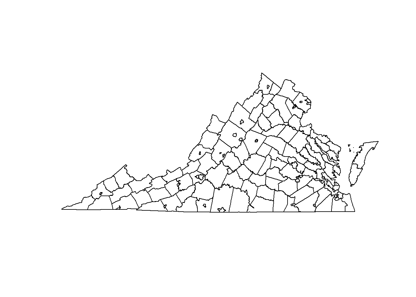
Notice that va_counties is an “sf” class as well as a “data.frame”. The “sf” class tells us that spatial information (geometry) is attached, allowing it to be plotted as a map.
We display a map of Virginia counties by calling the geometry column.
plot(va_counties$geometry)
Next, we will generate example data to display on the map. These data values will determine how each county is colored.
#Set a seed for reproducibility
set.seed(1984)

#Create a data frame
va_example <- data.frame(GEOID = va_counties$GEOID,

  #For each county, sample a value from a normal distribution
  #with mean of 500 and standard deviation of 250
  value = rnorm(nrow(va_counties), mean = 500, sd = 250))

#Join va_counties and va_example
va_example.sf <- va_counties %>%
  left_join(va_example, by = "GEOID")
Now we can create a choropleth map using the ggplot2 package. First, specify the data frame (with the spatial information), the column to fill the boundaries by (here, the randomly generated data in the column “value”), and call geom_sf() to visualize the sf (or simple features; an sf object is used to store geographic information) object.
We apply a few customizations by adding a color gradient to make the patterns easier to interpret and adding theme_classic() to create a cleaner appearance.
#Create choropleth map
ggplot(va_example.sf, aes(fill = value)) +
  geom_sf() +

  #change the color palette and labels
  scale_fill_viridis_c() +
  labs(x = "Longitude", y = "Latitude", ,
       title = "Example choropleth map of Virginia counties") +

  #for the plot design
  theme_classic()
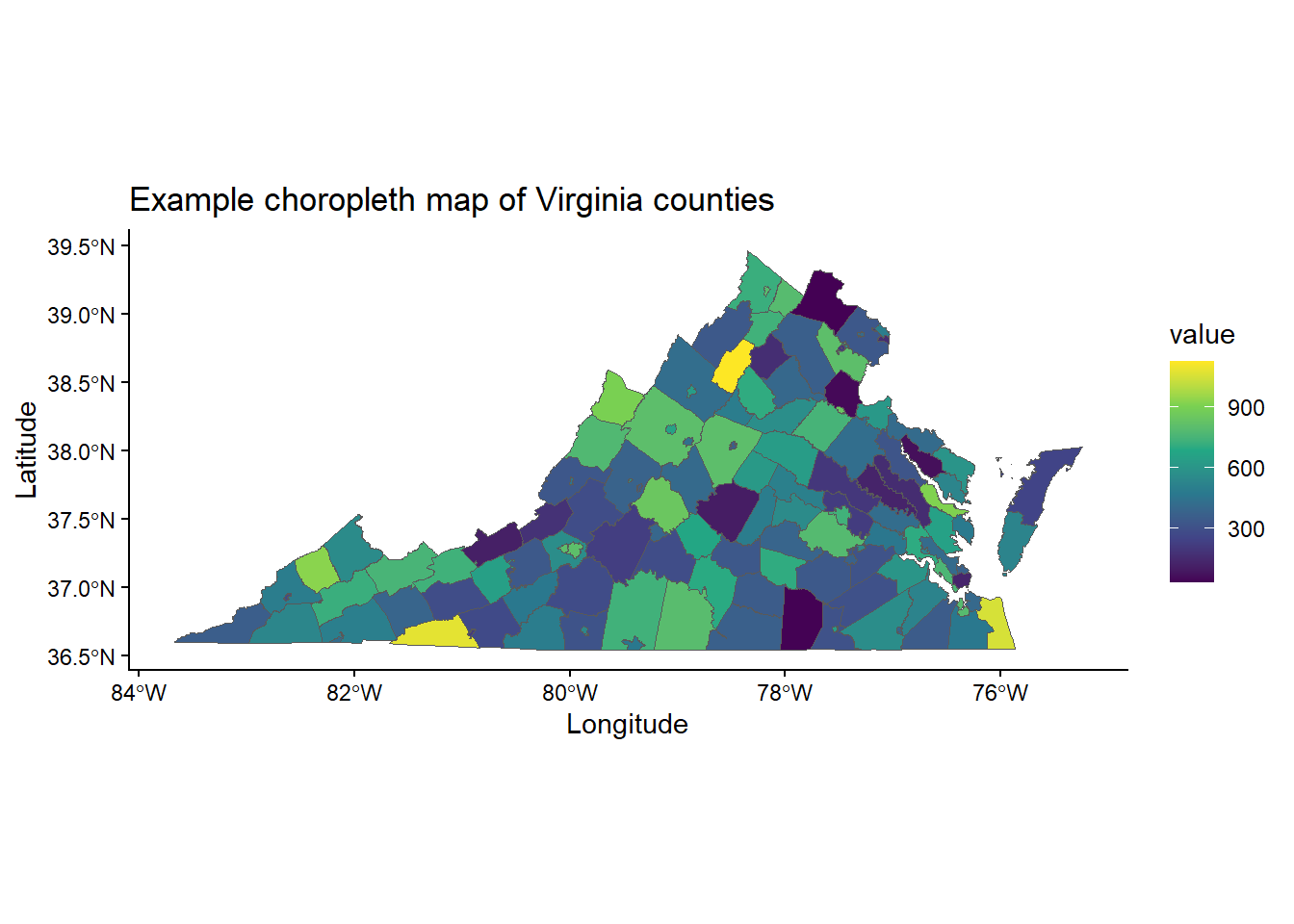
The choropleth map allows us to easily compare values between the counties. By looking at the map, we can see which counties were assigned higher values (yellow) and which were assigned lower values (dark blue).
Mapping population data with tidycensus
We created a map using data that we generated. In practice, however, you may not have data available for mapping or you may want to incorporate commonly used data sets, such as population, into an analysis. Population data is among the most widely used data in a choropleth map. We can obtain population data in R using the tidycensus package and create a choropleth map in a few simple steps.
Tidycensus uses an application programming interface (API) to retrieve census data. API keys are unique codes allowing services to recognize your requests for data. Storing the API key in your R environment instead of in your script can help keep it private since the key is unique to you.
Before starting with tidycensus, you need to get an API key by going to this link and inputting your organization name and email. You will then receive an email with your API key. Take that key and put it into the function census_api_key(), setting the argument install = TRUE to keep the key for future uses in R, if you would like to keep it for future uses.
Make sure you activate the key using the link that is sent to your email! If you accidentally set an incorrect key, you can reset it by using the argument overwrite = TRUE.
#Install the API key and set it for future uses
census_api_key("put_your_api_key_here", install = TRUE)
After completing these steps, you should see a message that your API key has been stored. Restart R or run readRenviron("~/.Renviron") to start using the tidycensus package.
Once the API is set up, we can easily begin using census data. We will use the function get_acs() to retrieve the total population (variables = "B01003_001") for counties in Virginia in 20201. Setting geometry = TRUE adds a ‘geometry’ column containing the spatial information needed to create a map.
#Get total population data by county for Virginia
va_pop.c <- get_acs(geography = "county",
                    state = "VA",
                    variables = "B01003_001",
                    geometry = TRUE,
                    year = 2020,
                    progress_bar = FALSE)

#Create the map
ggplot(va_pop.c, aes(fill = estimate)) +
  geom_sf() +
  labs(x = "Longitude", y = "Latitude",
       title = "Estimated total population of Virginia counties in 2020") +
  theme_classic()
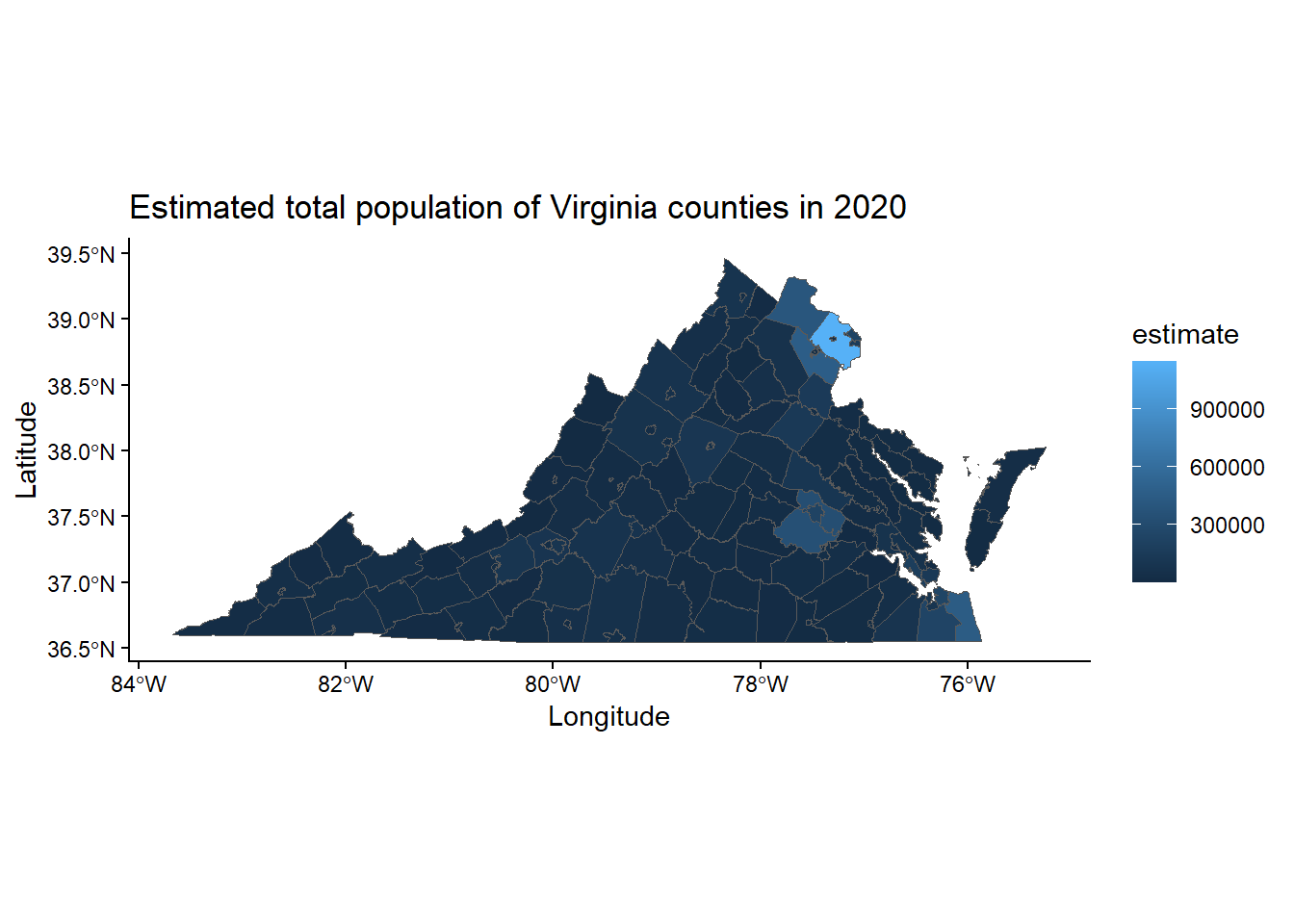
In a few easy steps, we were able to create a map of the total population of Virginia counties. However, plotting the total population by county does not necessarily show where people are most concentrated in Virginia. A county may have a large total population because it covers a large geographic area. In contrast, a small county may have a high concentration of people in a relatively small area. Because this map shows the total number of people rather than population density (or how densely people are distributed), it can be difficult to distinguish between areas with large populations and areas with high population densities.
Normalizing values for a choropleth map
To make meaningful comparisons across space, it is often helpful to normalize data. Imagine if there were two countries: Country A has a population of 50k people and Country B has 10k people. It might seem like Country A is more populated, but what if it is 10 times larger than Country B? In this way, total population tells us how many people live in a place, but it doesn’t tell us how concentrated people are. Normalizing data by regions, countries, or other spatial boundaries can allow for more meaningful comparisons of the data across space.
A widespread approach to normalizing data for choropleth maps is to divide the variable of interest by the area of the regions you are plotting. This method converts raw values (e.g. counts) to a density or rate per unit area.
We demonstrate normalizing data by taking our total population values (in the column “estimate”) for Virginia counties and normalizing by the area of each county. To do this, we need the area of each county which we can get by calling st_area() from the sf package.
#Get the area of each Virginia county
va_pop.area <- va_pop.c %>%

  #Get the area of the counties
  mutate(area_m2 = st_area(geometry),

  #Create a column of the area in km2
  area_km2 = as.numeric(area_m2)/1e6)

#Look at the first few rows of the NAME, estimate, area_m2 and area_km2 columns
head(va_pop.area[, c("NAME", "estimate", "area_m2", "area_km2")])
Simple feature collection with 6 features and 4 fields
Geometry type: MULTIPOLYGON
Dimension:     XY
Bounding box:  xmin: -78.86928 ymin: 37.07817 xmax: -77.22393 ymax: 39.10285
Geodetic CRS:  NAD83
                             NAME estimate          area_m2  area_km2
1  Prince Edward County, Virginia    22892  916154080 [m^2]  916.1541
2     Buckingham County, Virginia    17087 1510455593 [m^2] 1510.4556
3           Page County, Virginia    23862  810725023 [m^2]  810.7250
4 Prince William County, Virginia   466834  886172414 [m^2]  886.1724
5     Shenandoah County, Virginia    43441 1324673109 [m^2] 1324.6731
6       Fauquier County, Virginia    70353 1686681425 [m^2] 1686.6814
                        geometry
1 MULTIPOLYGON (((-78.69247 3...
2 MULTIPOLYGON (((-78.83284 3...
3 MULTIPOLYGON (((-78.69115 3...
4 MULTIPOLYGON (((-77.48114 3...
5 MULTIPOLYGON (((-78.86928 3...
6 MULTIPOLYGON (((-78.13117 3...
Notice that the “area_m2” column that we created using st_area() has units [m^2] displayed. This is because it is of class “units”, with physical measurement units attached. We can also see that va_pop.area is a simple features (sf) class and contains the geometry “multipolygon”, or multiple polygons.
class(va_pop.area$area_m2)
[1] "units"
Now that we have the area of the counties, we can calculate the population density by normalizing the data (total population for each county) by the area of each county. We then recreate the map with the normalized data to show population density, making it easier to see where most people are concentrated.
va_pop.norm <- va_pop.area %>%

  #Divide the total population by the county area
  mutate(pop_density = (estimate / area_km2))

#Create the map
ggplot(va_pop.norm, aes(fill = pop_density)) +
  geom_sf() +
  scale_fill_viridis_c() +
  labs(x = "Longitude", y = "Latitude",
       fill = "Population \ndensity \n(no. people per km2)") +
  theme_classic()
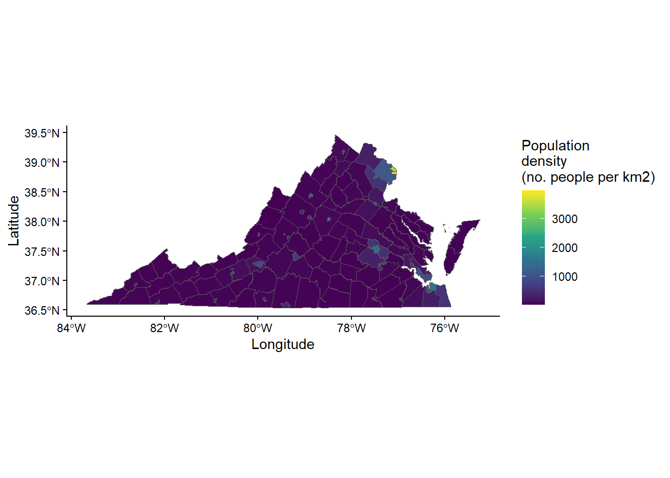
This map shows us that some of the cities, particularly around the Washington DC and Virginia Beach regions have higher population densities. Yet, much of Virginia has a comparatively lower population density, with a few smaller areas of high population density.
Large differences in the data can be hard to visualize
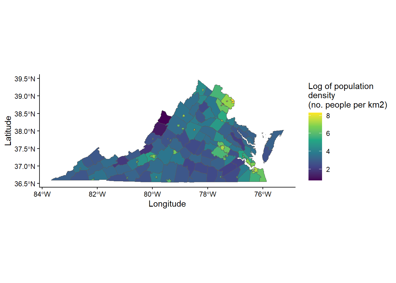
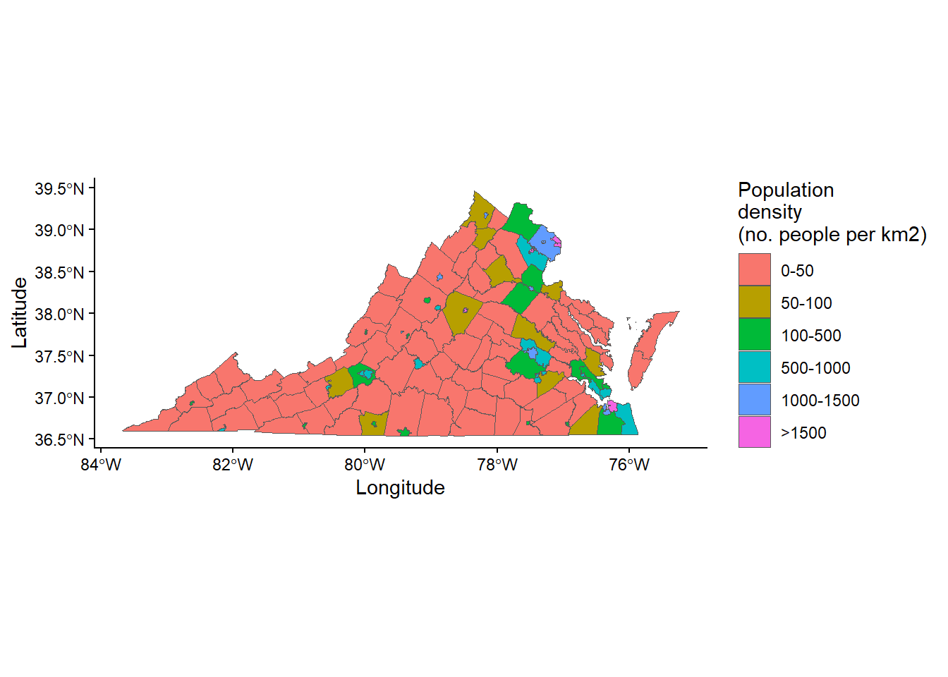
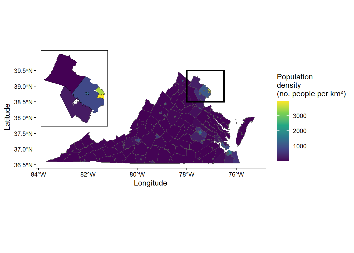
As a result of the large differences in population density coupled with the large geographic extent of less densely populated regions, the lower-density regions dominate the map. There are a few ways to address this challenge. First, we could transform the data (e.g. log transformation to change the scale of the data), which would make the patterns easier to visualize but also make the original values more difficult to interpret. We could also categorize the data into a smaller number of bins (e.g. grouping continuous values into a few categories, such as small, medium, and large). However, this approach reduces information that we have in the continuous data. Finally, we could create an inset map to highlight a smaller region of interest on the map. This approach draws attention to a smaller section of the map. We will explore these options below.
First, we create a choropleth using log-transformed data.
# ====== 1. Log transform the data ======
l.transform.map <-

  #add log() to transform the population density
  ggplot(va_pop.norm, aes(fill = log(pop_density))) +
  geom_sf() +

  #Change colors, labels, and theme
  scale_fill_viridis_c() +
  labs(x = "Longitude", y = "Latitude",
       fill = "Log of population \ndensity \n(no. people per km2)") +
  theme_classic()

#Print the map
l.transform.map
Next, we create a choropleth map using binned data.
# ====== 2. Bin the data ======
binned.data <- va_pop.norm %>%

  #Create bins from pop_density using the function cut()
  mutate(density_bin = cut(pop_density,
                           breaks = c(0, 50, 100, 500, 1000, 1500, Inf),
                           labels = c("0-50", "50-100", "100-500", "500-1000",
                                      "1000-1500", ">1500")))

#Create map using the binned data
bin.map <-
  ggplot(binned.data, aes(fill = density_bin)) +
  geom_sf() +

  #Change labels and theme
  labs(x = "Longitude", y = "Latitude",
       fill = "Population \ndensity \n(no. people per km2)") +
  theme_classic()

#Print the map
bin.map
Finally, we create a map with an inset map2.
# ====== Create an inset map ======
#Subset the data to Northern Virginia (NOVA)
nova <- va_pop.norm %>%
  dplyr::filter(NAME %in% c("Fairfax County, Virginia",
                            "Fairfax city, Virginia",
                            "Arlington County, Virginia",
                            "Alexandria city, Virginia",
                            "Loudoun County, Virginia",
                            "Prince William County, Virginia"))

#Create a bounding box for NOVA by specifying the coordinates of the
#bounding box
nova_bb <- data.frame(xmin = -78, xmax = -76.5, ymin = 38.5, ymax = 39.5)

#Create the main map
main_map <- ggplot(va_pop.norm, aes(fill = pop_density)) +
  geom_sf() +

  #Add a rectangle around Virginia
  geom_rect(data = nova_bb,
            aes(xmin = xmin, ymin = ymin,
                xmax = xmax, ymax = ymax), inherit.aes = FALSE,
            color = "black", linewidth = 1, fill = NA) +

  #Edit labels, colors, and the theme
  scale_fill_viridis_c() +
  labs(x = "Longitude", y = "Latitude",
       fill = "Population\ndensity\n(no. people per km²)") +
  theme_classic()

#Create the inset map by using "nova" created above
inset_map <- ggplot(nova, aes(fill = pop_density)) +
  geom_sf() +
  scale_fill_viridis_c() +
  theme_void() +
  theme(panel.border = element_rect(color = "black", fill = NA),
        legend.position = "none")

#Join the main and inset map using ggdraw() from the cowplot package
map_with_inset <-
  ggdraw() +
  draw_plot(main_map) +
  draw_plot(inset_map, x = 0.06, y = 0.5,
            width = 0.3, height = 0.3)

#Print the map
map_with_inset
All of the approaches we explored above have both pros and cons, and the best choice often depends on the information and patterns that you want to highlight.
Customizing choropleth maps
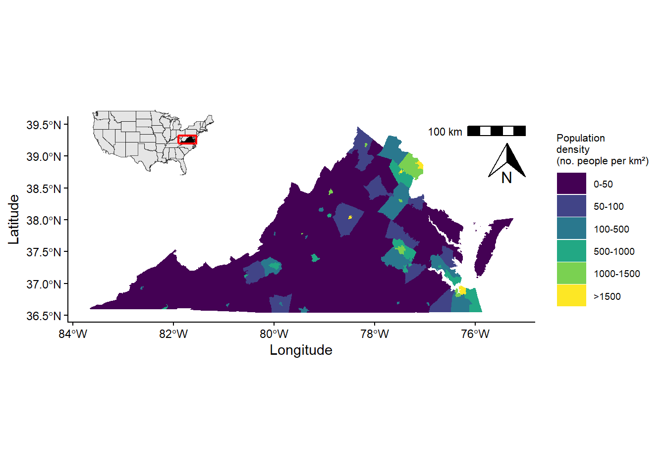
Once you’ve created a map, there are many ways to customize it, including changing the background and color palette or adding map elements such as a north arrow, legend, scale bar, or labels. We explore a few of these options below using the binned.data map.
#Create an inset map of the US states
states <- states(cb = TRUE, progress_bar = FALSE, year = 2020) %>%
  filter(!STUSPS %in% c("AK", "HI", "PR", "GU", "AS", "MP", "VI"))

#Get Virginia so we can highlight it on the map
va <- states %>% filter(NAME == "Virginia")

#Get the bounding box to put around Virginia
va_bbox <- st_as_sfc(st_bbox(va))

#Create the inset map
us.inset.map <-
  ggplot() +

  #fill the states with the color "gray90"
  geom_sf(data = states, fill = "gray90") +

  #fill Virginia with the color "black"
  geom_sf(data = va, fill = "black") +

  #Make the rectangle bounding box around Virginia red with no fill
  geom_sf(data = va_bbox, fill = NA, color = "red", linewidth = 0.8) +

  theme_void()

#Create the main map
va.map <-

#Use the binned.data data frame to create the map
binned.data %>%
ggplot(., aes(fill = density_bin)) +
  geom_sf(color = NA) + #no outline color for the states

  #Edit the fill colors and legend
  scale_fill_viridis_d() +
  guides(fill = guide_legend(keyheight = unit(0.6, "cm"),
                             keywidth = unit(0.8, "cm"))) +

  #Add labels
  labs(x = "Longitude", y = "Latitude",
       fill = "Population\ndensity\n(no. people per km²)") +

  #Add a north arrow with the ggspatial package
  annotation_north_arrow(location = "tr", #top right
                         which_north = TRUE, #points to the north pole
                         height = unit(1, "cm"), width = unit(1, "cm"),
                         pad_y = unit(0.7, "cm")) +

  #Add a scale bar with the ggspatial package
  annotation_scale(location = "tr", #top right
                   width_hint = 0.2) +

  #Edit the plot theme
  theme_classic() +
  theme(legend.title =element_text(size = 8),
        legend.text = element_text(size = 7),
        legend.key.height = unit(0.1, "cm"),
        legend.key.width = unit(0.01, "cm"))

#Join the inset and main maps using ggdraw() from the cowplot package
ggdraw() +

  #add va.map
  draw_plot(va.map) +

  #add us.inset.map and specify the location, width, and height
  draw_plot(us.inset.map, x = 0.13, y = 0.6,
            width = 0.2, height = 0.2)
Conclusion
Choropleth maps are extremely useful, widely used, and a helpful tool for visualizing spatial data. They are easy to customize and can be an effective way to communicate spatial data.
However, choropleth maps have some challenges and limitations. For example, they typically only show one variable at a time, and they can be misleading if the value being plotted does not describe the region as a whole. In some cases, other mapping approaches may be more appropriate. For instance, when the size of the predefined geographic regions can misrepresent interpretations, hexagon tile maps may provide a more effective visualization technique (see Kobakian & Cook, 2026).
R session details
The analysis was done using the R Statistical language (v4.6.1; R Core Team, 2026) on Windows 11 x64, using the packages ggspatial (v1.1.10), viridis (v0.6.5), viridisLite (v0.4.3), sf (v1.1.2), tigris (v2.2.1), tidycensus (v1.8.1), ggplot2 (v4.0.3), dplyr (v1.2.1) and cowplot (v1.2.0).
References
- Dunnington D (2025). ggspatial: Spatial Data Framework for ggplot2. doi:10.32614/CRAN.package.ggspatial
- Garnier S, Ross N, Rudis R, Camargo AP, Sciaini M, Scherer C (2024). viridis(Lite) - Colorblind-Friendly Color Maps for R.
- Kirk A (2016). Choropleth Map. SAGE Publications, Ltd.; doi:10.4135/9781529776553
- Kobakian S, Cook D (2026). Comparing the Effectiveness of the Choropleth Map With a Hexagon Tile Map for Communicating Patterns in Australian Spatial Statistics. Aust N Z J Stat. 68(2):e70058. doi:10.1111/anzs.70058
- Pebesma E, Bivand R (2023). Spatial Data Science: With Applications in R. Chapman and Hall/CRC. https://doi.org/10.1201/9780429459016
- Pebesma E 2018. Simple Features for R: Standardized Support for Spatial Vector Data. The R Journal 10 (1), 439-446, https://doi.org/10.32614/RJ-2018-009
- Pedersen T (2025). patchwork: The Composer of Plots. doi:10.32614/CRAN.package.patchwork
- Schiewe J (2019). Empirical Studies on the Visual Perception of Spatial Patterns in Choropleth Maps. KN - J Cartogr Geogr Inf. 69(3):217-228. doi:10.1007/s42489-019-00026-y
- Walker K (2025). tigris: Load Census TIGER/Line Shapefiles. doi:10.32614/CRAN.package.tigris
- Walker K, Herman M (2026). tidycensus: Load US Census Boundary and Attribute Data as ‘tidyverse’ and ‘sf’-Ready Data Frames. doi:10.32614/CRAN.package.tidycensus
- Wickham H, François R, Henry L, Müller K, Vaughan D (2026). dplyr: A Grammar of Data Manipulation. doi:10.32614/CRAN.package.dplyr
- Wickham H (2016). ggplot2: Elegant Graphics for Data Analysis. Springer-Verlag New York
- Wilke C (2025). cowplot: Streamlined Plot Theme and Plot Annotations for ‘ggplot2’. doi:10.32614/CRAN.package.cowplot
Lauren Brideau
StatLab Associate
University of Virginia Library
August 31, 2026
- Variables that can be loaded can be found by using the
load_variables()function in the tidycensus package. In this argument, you will need to specify a year and a data set. We recommend the “Searching for variables” section in the tidycensus vignette and the United States Census Bureau website (https://data.census.gov/) for more information.↩︎ - A bounding box is a rectangular box used to define the geographic extent of a region. To create a bounding box, you can specify the minimum and maximum coordinates, if you know them (for example, see “nova_bb” created above). You could also acquire coordinates using another program, such as Google Earth Pro. If you are working with an sf object, the function
st_bbox()will return the bounding box of that object (see “va_bbox” above).↩︎
For questions or clarifications regarding this article, contact statlab@virginia.edu.
View the entire collection of UVA Library StatLab articles, or learn how to cite.