
Introduction
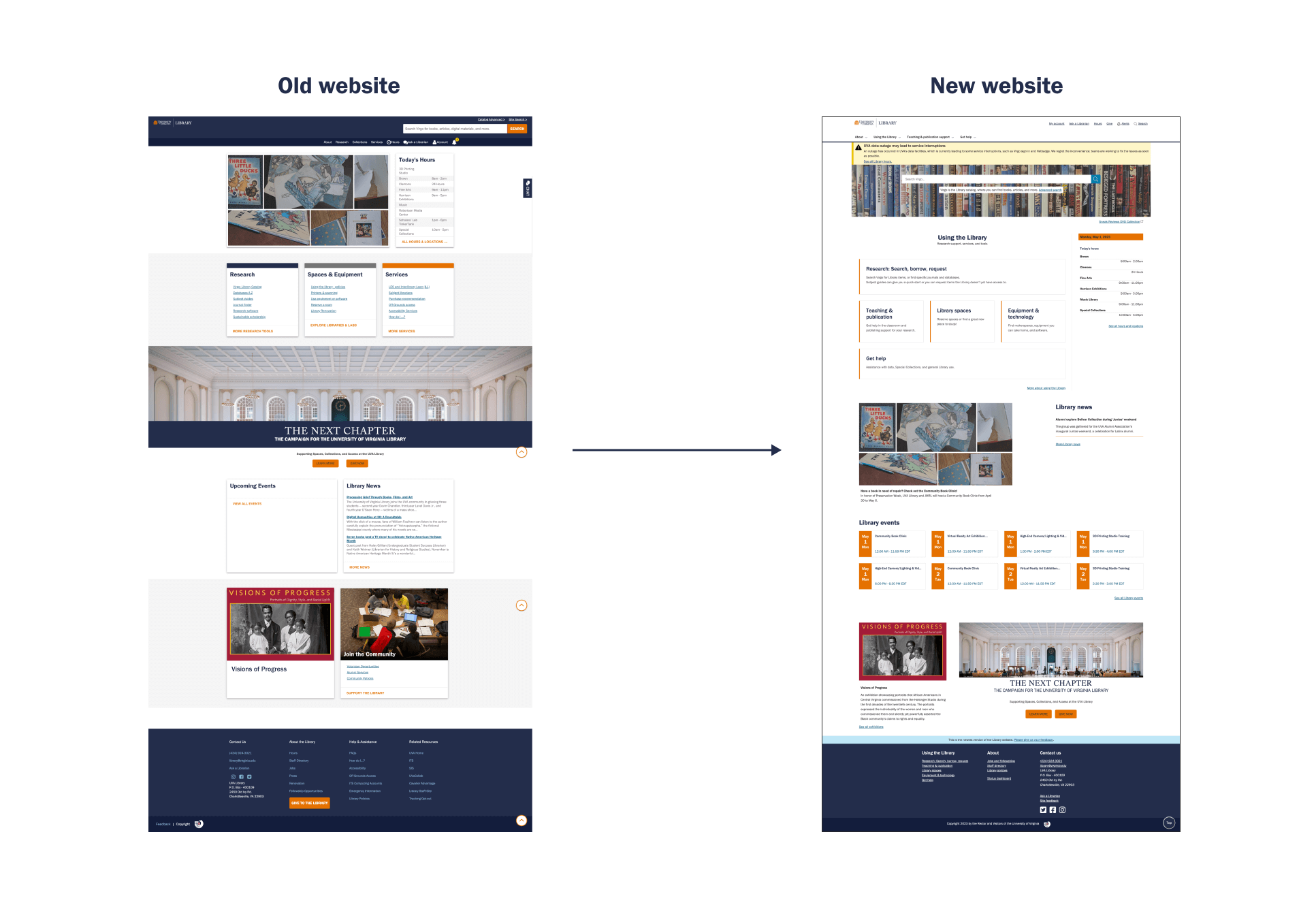
Research and testing over the past four years highlighted elements of the previous website which were in need of improvement. The previous website used terms which were unfamiliar to its users, had lower visibility of important elements and services, and did not provide an interface intuitive enough for novice users. Feedback from research and testing was incorporated to provide an inclusive experience for the library’s diverse range of users. Multiple design iterations led to a cleaner, fresher and user-centered web interface.
Let’s look at how the homepage evolved.
Project overview
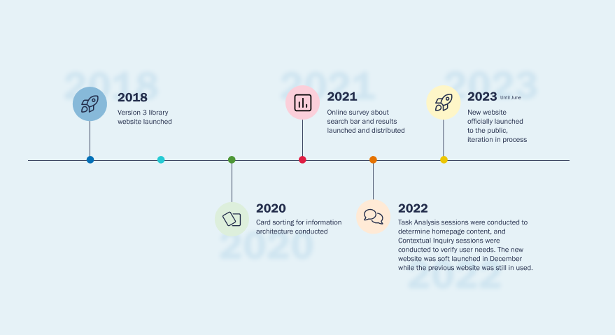
Various research methods (user interviews, online surveys, card sorting, tree testing, contextual inquiry, task analysis and A/B testing) were conducted with multiple user groups (graduate students, undergraduate students and faculty members) to understand users’ behaviors, concerns and requirements for UVA’s library website. The library’s primary goals were to determine:
- How users navigate the website.
- Which features and pages are most relevant to users.
- How to improve efficiency.
- How to make interfaces more accessible.
Over 100 participants were involved in these sessions, which involved answering questions and directly interacting with prototypes.
This article will focus on the following five key elements which were changed significantly and explain the design process that the UX team has been through.
- Task-oriented Information Architecture.
- Main navigation bar.
- Virgo search bar and Collections banner image.
- Regional page boxes.
- New look and feel.
Task-oriented Information Architecture
The library revisited the perspectives of users, and which elements of the website were most relevant to them through card sorting and tree testing methods. This was an important step towards helping users achieve their goals.
Users were more likely to say, “I need to search or request a book or library space”, instead of, “I need a page which says Collections or Services”. Placing their tasks and actions first, the library aimed to circumvent assumptions about users’ library jargon knowledge. Libraries tend to be a metaphorical pillar of knowledge which can be intimidating to users not accustomed to that environment (also known as “library anxiety”). With the new design, the library wants users to know that they are welcome to freely explore this online environment.
- Library anxiety and user mental models
-
Library anxiety refers to the "feeling that one’s research skills are inadequate and that those shortcomings should be hidden". In some students, this manifests as an outright fear of libraries and the librarians who work there (https://en.wikipedia.org/wiki/Library_anxiety).
A user's mental models refers to the user's perception of how something works.
This redesign aimed to align the website's conceptual model with the user's mental model.
Main navigation bar
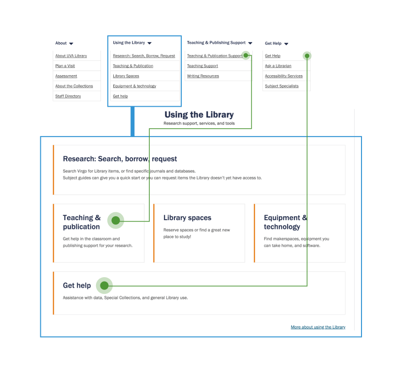
A significant change to the information architecture is the reconstruction of the main navigation bar. Research showed that navigation paths were not necessarily tailored to what the users need, especially the novice users. The previous website tended to assume that users have prior knowledge of what an academic library is and how it functions. For example, a significant amount of content and navigation paths led to “Collections”, which is not necessarily relevant for most users based on the research data collected. On the other hand, task goals such as accessing research materials and library services, were not being adequately met because they are not as visible on the main navigation bar.
How might we create intuitive user flows that can work with users who come in with various background and needs of using the library?
After learning about the most popular library services that users need from research and data, card sorting sessions were conducted in 2020 to helped researchers develop categories that made the most sense to users to organize the content. These sessions highlighted the fact that a strict hierarchy that works for all users does not exist. As a result, a heterarchical approach was considered to organize content so that users (with varying knowledge about the website) can access content through one of multiple paths available based on their knowledge and intuition.
For example, “Equipment & Technology” is a box on home page which can be interacted with, but also resides under the “Using the library” drop-down menu, as well as at the bottom of the “Search, Borrow, Request” regional page.
Participants appreciated the new layout, with one saying,
“Unlike the other [previous] library site where you sort of, were expected to come in with exactly what you wanted…These allow for more exploration.”
Virgo search bar and Collections banner image
Usability testing sessions conducted in 2022 showed that the Virgo search bar was the most prominently used feature on the library website’s homepage. However, in the previous website, the Virgo search bar was located at the top right corner, which users found to be “easy to miss” and “invisible”.
How might we display the Virgo search feature on the home page to make it intuitive, seamless, and easy to access?
Bringing the Virgo search to the body of the website adds visual importance to the content. A short explanation of using the Virgo catalog also provides a high-level summary of what the Virgo catalog is to new users if it is their first visit to the UVA library’s website. Additionally, featuring Collections images behind the Virgo search bar encourages users to explore and learn more about the unique collections that the UVA library has by using the Virgo search bar. This combination of a larger Virgo search bar and the Collections image grabs the user’s attention when they land on the homepage by adding visual importance and interactivity, while providing a welcoming and fun visual experience for them.
- Usability principles of visual attention and front doors title
-
The usability principle of visual attention is the ability to focus on specific details in an ocean of information. This includes minimizing change blindness (making design changes clear to the user), front loading (placing important information up front), and using clear headings for content.
Dan Brown’s fifth principle of UX information architecture is the principle of front doors, which is concerned with how, and why users arrive at the design in question in the first place (https://www.onething.design/blogs/information-architecture-its-8-principles/).
Regional page boxes
A new way to present and visualize information was introduced to compliment the new information architecture and navigation paths in the redesigned website. The team started by simplifying the existing content on the home page and library core services into buckets and categories, and performed valuable card sorting techniques, where those buckets were ranked in order of importance and visual weight based on research insights and user data. Those discussions and findings led to the current design of the reginal page boxes.
Prioritizing information to offload users’ cognitive burden is an important step the team took in their design solutions. For example, explanatory text under each box in the “Using the library block” scaffolds users' knowledge about what is behind the block, and encourages users to explore and interact further based on their goals of visiting the website. The home page blocks are also intentionally designed with an orange bar on the left and a hover state to provide readability guidance and immediate feedback to encourage people to click and learn more.
Noticeably, the home page content blocks are not exactly split into identical visual weights – this is because the content weight differently based on research. For example, in the “Using the library” block, Search Borrow Request was considered more important. Thus, it was showed be more prominent than the other boxes spatially.
New look and feel
There were visual elements in the previous website which added visual noise to the user experience Through a careful UX review, we found the following evidence: the intensive use of UVA brand blue, all-caps headlines, big font sizes, and box shadows. The heavy and cluttered UI of the previous website (combined with the previous information architecture) intensified library anxiety among users, and made the interface feel unapproachable and overwhelming.
How might we provide an open, welcoming and fun library experience for users of all kinds?
After a UX review of design principles and research insights, the UX team was led to re-designing the look and feel of the website in the following aspects:
- Airiness and light-weighted interface: The bold use of white spaces on the new website is designed to incorporate the new information architecture informed from research. According to the proximity design principle, objects that are placed closer together tend to be seen as a single unit rather than individual, unrelated parts. White space allows users to look for information they need on the home page intuitively and efficiently, by grouping related information together and removing excessive visual weights.
- Gestalt’s principle of proximity
-
The word “gestalt” (pronounced guh-shtaalt) means “form” or “pattern”.
The principle of proximity states that we perceive objects which are close to one another as a group. It can also be used to define the direction of the user's attention.
The principle of proximity can be used for images, shapes, typography, website menus, print layouts, forms, and even car dashboards.
Check out some great examples of the applications of Gestalt's principle of proximity.
- The careful usage of UVA branding colors: The UVA branding palette (the UVA orange and blue) is a powerful and important asset in establishing a strong, consistent identity for the university. In the previous website, the brand orange was used minimally due to accessibility concerns while the use of the brand blue was intense. The team stripped all the bold colors out and replaced them with the subtle and light touch of the UVA brand colors in elements such as the event blocks, the home page blocks and the hours block. This was implemented in order to reduce visual noise while highlighting important content, in order to establish a trustworthy, friendly and welcoming visual experience for users from diverse backgrounds, associated with UVA.
- Design Principles and Branding
-
Understanding the principles of visual design and applying them strategically will result in high-impact designs that effectively communicate the brand message, captivate the audience and strengthen the brand identity. Check out this article and learn more about design and brand strategy.
- Interaction animations: There were very few interactions and animations used on the previous website. The team decided to adopt subtle animations such as hovering effects to provide immediate feedback to the users when they interact with the home page. By letting the users know that their actions have an impact, we aim to provide a dynamic and interesting experience that can ease “library anxiety”. These animations can be seen when users hover over a block on the home page, and are more interactive if they explore deeper into other pages such as “Equipment and Technology”.
- Photos and visuals: Graphics improve the overall look and feel of the website allowing it to be more welcoming and livelier. They also enhance the website's usability by visually breaking down and grouping content. The graphics and photos about the UVA library’s collection and on-going exhibitions encourage users to stay on the website and freely explore and learn about the UVA library.
By performing rigorous UX research and making careful design considerations on usage of colors, photography, content and animations, the new website is an improvement of the previous version, bringing an open, welcoming and trustworthy user experience, while also allowing the content to shine with the new information architecture model.