
When fitting a linear model we make two assumptions about the distribution of residuals:
- The residuals have constant variance
- The residuals are normally distributed with mean 0 and the variance from the first assumption
Common methods for assessing the plausibility of these assumptions are creating Residuals versus Fitted plots and QQ plots, respectively. Base R makes it very easy to create these plots after fitting a model. Let’s demonstrate using R version 4.4.0.
Below we load the Duncan data frame from the {carData} package, which contains data on the prestige of 45 US occupations in 1950. Prestige is the percentage of respondents in a social survey who rated the occupation as “good” or better in terms of prestige. We model prestige as a function of income, education, and type of occupation. It appears occupations with higher levels of income and education were associated with higher prestige in 1950. That doesn’t seem surprising.
library(carData)
m <- lm(prestige ~ income + education + type, data = Duncan)
summary(m)
Call:
lm(formula = prestige ~ income + education + type, data = Duncan)

Residuals:
    Min      1Q  Median      3Q     Max
-14.890  -5.740  -1.754   5.442  28.972

Coefficients:
             Estimate Std. Error t value Pr(>|t|)
(Intercept)  -0.18503    3.71377  -0.050  0.96051
income        0.59755    0.08936   6.687 5.12e-08 ***
education     0.34532    0.11361   3.040  0.00416 **
typeprof     16.65751    6.99301   2.382  0.02206 *
typewc      -14.66113    6.10877  -2.400  0.02114 *
---
Signif. codes:  0 '***' 0.001 '**' 0.01 '*' 0.05 '.' 0.1 ' ' 1

Residual standard error: 9.744 on 40 degrees of freedom
Multiple R-squared:  0.9131,    Adjusted R-squared:  0.9044
F-statistic:   105 on 4 and 40 DF,  p-value: < 2.2e-16
Now let’s visually assess the constant variance and normality assumptions of the residuals using the plot() method. By default, calling plot() on a lm object returns four plots. We’re interested in the first two, so we use the which argument to specify one plot at a time. Setting which = 1 returns the Residuals versus Fitted plot.
plot(m, which = 1)
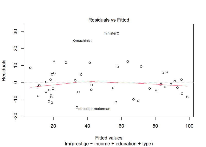
The variance looks fairly constant with most residuals ranging between -10 and 10. However, there are a couple of occupations with residuals higher than 20. How concerned should we be about non-constant variance based on this plot?
Re-running plot() with which = 2 returns a QQ plot of the residuals. Normally distributed data should fall along the dotted diagonal line.
plot(m, which = 2)
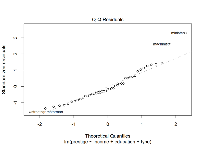
The same two occupations seem further away from the diagonal line than the rest. There is also a little burst away from the line at the bottom left corner. How worried should we be about lack of normality based on this plot?
This is where lineup plots come in handy. The basic idea is to generate multiple plots that satisfy the assumption under consideration and then randomly drop in our diagnostic plot to see if we can identify it in a “lineup”.
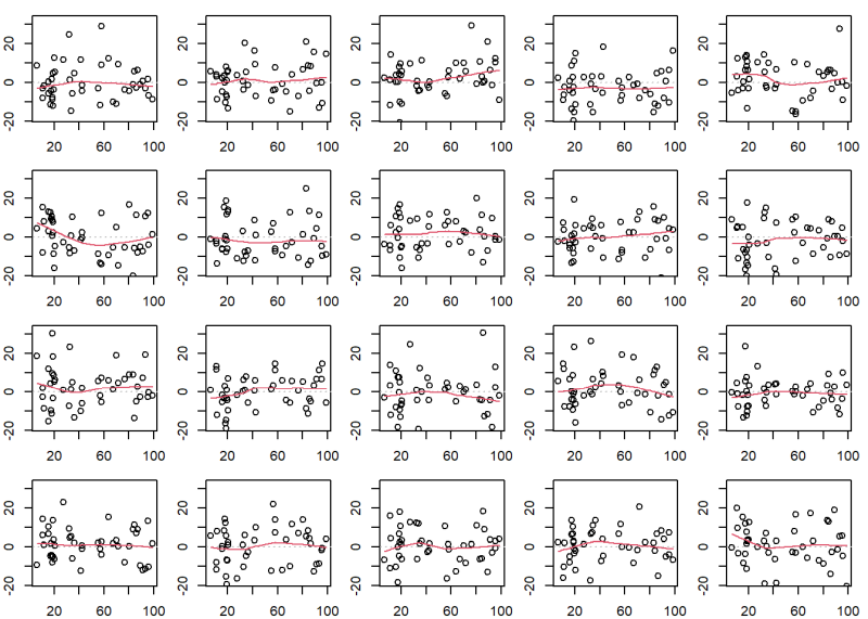
Before we show how to do this, see if you can pick out our Residuals versus Fitted plot in the following lineup of 20 plots. Nineteen of these plots show residuals with constant variance plotted against the fitted values. Only one shows the actual model residuals.
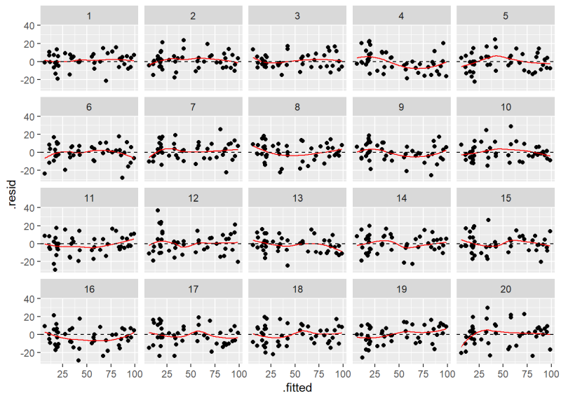
If you had a hard time identifying the original plot we created using plot(m, which = 1), then there’s probably no need to worry about the assumption of constant variance being violated. In case you couldn’t find it, the original Residuals versus Fitted plot is number 10.
Now take a look at the QQ plot lineup. Can you identify the original QQ plot?

We’ll give it away: it’s plot 18. All the others are plots of normally distributed data. How much does plot 18 jump out at you? How “bad” does it look compared to, say, plots 5 or 19?
It seems the assumptions of constant variance and normality are probably safe thanks to how easily the original diagnostic plots blend in with the plots where the assumptions are satisfied.
Now let’s learn how to create these plots with the help of the {nullabor} package. The package itself does not generate the plots. Instead it helps generate the data that we can use to create the plots.
First we load the package and then add the model residuals and fitted values to our original data frame. Next we create a data frame that contains our original residuals and fitted values, and 19 additional sets of data with residuals that satisfy the normality and constant variance assumptions. This is done with two functions: null_lm() and lineup(). The null_lm() function creates a function to generate residuals. The method = 'sigma' and sigma = sigma(m) arguments specify the method we want to use to generate residuals. This is then piped into the lineup() function to create the other 19 data sets. We save the result as a data frame named “lineup_df”. You’ll notice we added a set.seed(1) statement. This allows you to generate the same data sets. In practice, you probably wouldn’t use set.seed(), but we do it so you can get the same results in this article.
# install.packages("nullabor")
library(nullabor)
Duncan <- data.frame(Duncan,
                     .resid = residuals(m),
                     .fitted = fitted(m))
set.seed(1)
lineup_df <- null_lm(formula(m), method = 'sigma', sigma = sigma(m)) |>
  lineup(Duncan)
decrypt("5K6x PQcQ sD hA8scsAD vy")
The output above, decrypt("5K6x PQcQ sD hA8scsAD vy"), is a function you can run in the R console to reveal the position of the original data. Simply copy and paste into the console and hit Enter.
decrypt("5K6x PQcQ sD hA8scsAD vy")
[1] "True data in position 10"
This tells us that the plot will be labelled “10” when we create our lineup plot.
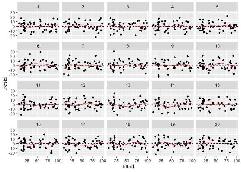
To create the plot, we use the {ggplot2} package. Notice we use facet_wrap(~ .sample) to create the 20 plots, where .sample is the variable that identifies the data sets.
ggplot(lineup_df) +
  aes(x = .fitted, y = .resid) +
  geom_point() +
  geom_smooth(se = F, color = "red", linewidth = 0.5) +
  geom_hline(yintercept = 0, linetype = 2) +
  facet_wrap(~ .sample)

The plot labeled “10” is the original Residuals versus Fitted Values plot.
To create the lineup for the QQ plots, we use {ggplot2} again with the geom_qq() and geom_qq_line() functions. We can use the same data frame we just created, but we may want to re-run the {nullabor} functions to scramble the location of the original plot. We do that again with a new call to set.seed().
set.seed(2)
lineup_df <- null_lm(formula(m), method = 'sigma', sigma = sigma(m)) |>
  lineup(Duncan)
decrypt("5K6x PQcQ sD hA8scsAD vt")
ggplot(lineup_df) +
  aes(sample = .resid) +
  geom_qq() +
  geom_qq_line() +
  facet_wrap(~ .sample)
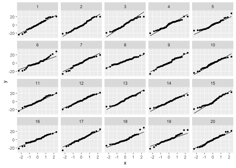
As before we can use the provided decrypt() message to reveal the location of the original data.
decrypt("5K6x PQcQ sD hA8scsAD vt")
[1] "True data in position 18"
So what is the {nullabor} package doing underneath the hood to generate these data sets? If we look at the summary of our model output we’ll see a line that says Residual standard error: 9.744. That’s the estimated standard deviation of the normal distribution from which the residuals are assumed to be drawn. The {nullabor} package is using the rnorm() function to generate data from such a distribution. We can do that ourselves in a for loop. Notice below in the call to rnorm() we set sd = sigma(m). The sigma() function extracts the residual standard error from a model object, which in this case is 9.744.
# create an area of 4 x 5 plots with smaller margins;
# bottom, left, top, right have 2, 2, 1, 1 lines of margin
op <- par(mar = c(2,2,1,1), mfrow = c(4, 5))

# original Residuals versus Fitted plot
# extendrange: extends range by specified percentage
# panel.smooth: add smooth trend line
ylim <- extendrange(residuals(m), f = 0.08)
plot(fitted(m), residuals(m), ylim = ylim)
abline(h = 0, lty = 3, col = "gray")
panel.smooth(fitted(m), residuals(m))

# create 19 plots using data that satisfies assumptions
for(i in 1:19){
  yr <- rnorm(n = nrow(Duncan), mean = 0, sd = sigma(m))
  plot(fitted(m), yr, ylim = ylim)
  abline(h = 0, lty = 3, col = "gray")
  panel.smooth(fitted(m), yr)
}

# reset graphing parameters to defaults
par(op)
Of course this isn’t a true lineup plot because we know the location of the original diagnostic plot. But it demonstrates how {nullabor} is generating the data sets.
In addition to method = "sigma", the {nullabor} package provides methods for bootstrap residuals ("boot"), parametric bootstrap residuals ("pboot"), and rotation residuals ("rotate"), which is the default. Rotation residuals are generated by regressing a random sample from a N(0,1) distribution on the predictors and then rescaling the residuals of that model such that the squared length matches the observed residual sum of squares (RSS) of the original model. Details are provided in Buja et al. (2009) and Langsrud (2005). Implementation in R is pretty easy. Here’s how to generate one set of rotation residuals.
# draw values from N(0,1) distribution
y_new <- rnorm(nrow(Duncan))
# regress sample on predictors
m_new <- lm(y_new ~ income + education + type, data = Duncan)
# calculate rotation residuals
r <- residuals(m_new) *
  sqrt(sum(residuals(m)^2)/sum(residuals(m_new)^2))
Below we use the null_lm() function to generate rotation residuals and create a new lineup plot. The result is very similar to what we created above. The result of the decrypt() function tells us the original plot is in position 6.
set.seed(3)
lineup_df <- null_lm(formula(m)) |>
  lineup(Duncan)
ggplot(lineup_df) +
  aes(x = .fitted, y = .resid) +
  geom_point() +
  geom_smooth(se = F, color = "red", linewidth = 0.5) +
  geom_hline(yintercept = 0, linetype = 2) +
  facet_wrap(~ .sample)
decrypt("5K6x PQcQ sD hA8scsAD VC")
[1] "True data in position 6"
It’s worth noting that the assumptions of constant variance and normality for residuals are generally regarded as the least important assumptions when it comes to linear modeling. Both Faraway and Gelman et al. rank them last in their ordered lists of modeling assumptions. The latter even recommends not performing diagnostics for the normality of regression residuals (p. 155). Nevertheless, severe violations of these assumptions could signal problems with your model and it certainly doesn’t hurt to look at the plots given how easy they are to create in R. But if your plots seem inconclusive in some way, consider creating a set of lineup plots to help you interpret them in the context of plots with satisfied assumptions.
References
- Buja, A., Cook, D., Hofmann, H., Lawrence, M., Lee, E.-K., Swayne, D. F, Wickham, H. (2009). Statistical Inference for Exploratory Data Analysis and Model Diagnostics. Royal Society Philosophical Transactions A, 367(1906):4361–4383. http://rsta.royalsocietypublishing.org/content/367/1906/4361.article-info
- Faraway, J. (2015). Linear Models with R, Second Edition. CRC Press.
- Fox J, Weisberg S, Price B (2022). carData: Companion to Applied Regression Data Sets. R package version 3.0-5, https://CRAN.R-project.org/package=carData.
- Gelman, A., Hill, J., Vehtari, A. (2021). Regression and Other Stories. Cambridge University Press. (pages 153–155)
- Langsrud, Ø. (2005) Rotation tests. Statistics and Computing, 15(1):53–60, 2005. ISSN 0960-3174. doi: http://dx.doi.org/10.1007/s11222-005-4789-5.
- R Core Team (2024). R: A Language and Environment for Statistical Computing. R Foundation for Statistical Computing, Vienna, Austria. https://www.R-project.org/. Version 4.4.0.
- Wickham, H. (2016). ggplot2: Elegant Graphics for Data Analysis. Springer-Verlag New York.
Clay Ford
Statistical Research Consultant
University of Virginia Library
April 26, 2024
For questions or clarifications regarding this article, contact statlab@virginia.edu.
View the entire collection of UVA Library StatLab articles, or learn how to cite.