
Logistic regression is a popular and effective way of modeling a binary response. For example, we might wonder what influences a person to volunteer, or not volunteer, for psychological research. Some do, some don’t. Are there independent variables that would help explain or distinguish between those who volunteer and those who don’t? Logistic regression gives us a mathematical model that we can we use to estimate the probability of someone volunteering given certain independent variables.
The model that logistic regression gives us is usually presented in a table of results with lots of numbers. The coefficients are on the log-odds scale along with standard errors, test statistics and p-values. It can be difficult to translate these numbers into some intuition about how the model “works”, especially if it has interactions.
One way to make the model more meaningful is to actually use it with some typical values to make predictions. We can plug in various combinations of independent values and get predicted probabilities. Having done this we can then plot the results and see how predicted probabilities change as we vary our independent variables. These kinds of plots are called “effect plots”. In this post we show how to create these plots in R.
We’ll use the effects package by Fox, et al. The effects package creates graphical and tabular effect displays for various statistical models. Below we show how it works with a logistic model, but it can be used for linear models, mixed-effect models, ordered logit models, and several others.
We alluded to modeling whether or not someone volunteers for psychological research. The effects package includes such data for demonstration purposes. The data are from Cowles and Davis (1987) and are in the Cowles data frame. First we load the package and fit a model. We fit a logistic model in R using the glm() function with the family argument set to “binomial”. The formula syntax says to model volunteer as a function of sex, neuroticism, extraversion, and the interaction of neuroticism and extraversion. (Neuroticism and extraversion are scale measurements from the Eysenck personality inventory.)
# install.packages("effects")
library(effects)
mod.cowles <- glm(volunteer ~ sex + neuroticism*extraversion,
                  data=Cowles, family=binomial)
summary(mod.cowles)
Call:
glm(formula = volunteer ~ sex + neuroticism * extraversion, family = binomial,
    data = Cowles)

Coefficients:
                          Estimate Std. Error z value Pr(>|z|)
(Intercept)              -2.358207   0.501320  -4.704 2.55e-06 ***
sexmale                  -0.247152   0.111631  -2.214  0.02683 *
neuroticism               0.110777   0.037648   2.942  0.00326 **
extraversion              0.166816   0.037719   4.423 9.75e-06 ***
neuroticism:extraversion -0.008552   0.002934  -2.915  0.00355 **
---
Signif. codes:  0 '***' 0.001 '**' 0.01 '*' 0.05 '.' 0.1 ' ' 1

(Dispersion parameter for binomial family taken to be 1)

    Null deviance: 1933.5  on 1420  degrees of freedom
Residual deviance: 1897.4  on 1416  degrees of freedom
AIC: 1907.4

Number of Fisher Scoring iterations: 4
The summary of results looks promising, at least where statistical significance is concerned. But what does it mean? It appears males are less likely to volunteer because of the negative coefficient (-0.24), but how much less likely? What about the interaction coefficient of -0.008? What are we to make of that? The effects package can help us answer these questions.
The fast and easy way to get started with the effects package is to simply use the allEffects() function in combination with plot(), like so:
plot(allEffects(mod.cowles))
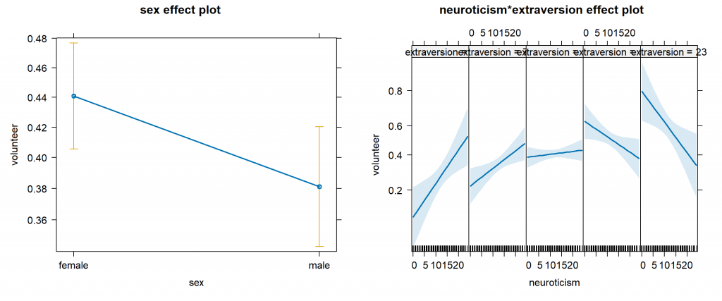
Just like that we have two effect plots! Granted, the plot on the right is a bit cramped and some of the labels are difficult to read, but we can clearly see a trend line that varies and changes trajectory. Let’s take a closer look at each plot.
On the left we have predicted probabilities for sex. Females have a higher expected probability of volunteering than males (0.44 vs 0.38). The plot also includes 95% error bars to give us some idea of the uncertainty of our estimate.
So how did the effects package make those estimates? We can figure this out by saving the results of the allEffects() function to an object and investigating. When we do it for this model we get a list object with two elements, one for each graph. Within each list element are several values used to create the effect plots. The model.matrix element for the first list element contains the independent variables used in generating the predictions for each sex.
e.out <- allEffects(mod.cowles)
e.out$sex$model.matrix
  (Intercept) sexmale neuroticism extraversion neuroticism:extraversion
1           1       0    11.47009     12.37298                 141.9192
2           1       1    11.47009     12.37298                 141.9192
This says the predictions were generated using the same values in each case except sex. The values for neuroticism, extraversion, and neuroticism:extraversion are their means:
mean(Cowles$neuroticism)
[1] 11.47009
mean(Cowles$extraversion)
[1] 12.37298
mean(Cowles$neuroticism) * mean(Cowles$extraversion) # interaction
[1] 141.9192
We can verify the calculations manually as follows:
plogis(e.out$sex$model.matrix %*% coef(mod.cowles))
       [,1]
1 0.4409440
2 0.3811939
First we multiply the model.matrix values by their respective coefficients using “matrix multiplication” via the %*% operator. Then we convert the result to probabilities by taking the inverse logit using the plogis() function. This formula is usually provided in statistics textbooks as
\[\text{Prob}\{Y = 1 |X\} = [1 + \text{exp}(-X\beta)]^{-1} \] The %*% operator performs the \(X\beta\) multiplication and plogis() takes care of the rest.
XB <- e.out$sex$model.matrix %*% coef(mod.cowles)
(1 + exp(-XB))^(-1)
       [,1]
1 0.4409440
2 0.3811939
We could also get the same result using the predict() function with a new data frame. Notice we have to specify type="response" to get predicted probabilities.
# using predict with new data
ndata <- data.frame(sex=factor(c("female","male")),
                      neuroticism=11.47009, extraversion=12.37298)
predict(object = mod.cowles, newdata = ndata, type = "response")
        1         2
0.4409441 0.3811940
If we want, we can create the sex effect plot using median values for neuroticism and extraversion by setting the typical argument to median, like so:
plot(allEffects(mod.cowles, typical=median))
(plot not shown.)
The neuroticism*extraversion effect plot above (on the right) shows us how the probability of volunteering changes for various combinations of neuroticism and extraversion scores. To see what those values are, use the allEffects() function without plotting it.
allEffects(mod.cowles)
 model: volunteer ~ sex + neuroticism * extraversion

 sex effect
sex
   female      male
0.4409440 0.3811939

 neuroticism*extraversion effect
           extraversion
neuroticism         2       7.2        12        18        23
         0  0.1056408 0.2194941 0.3851139 0.6301828 0.7969085
         6  0.1716423 0.2741987 0.3967524 0.5680733 0.7008823
         12 0.2665883 0.3366564 0.4085089 0.5037470 0.5831997
         18 0.3893675 0.4053947 0.4203710 0.4392964 0.4552060
         24 0.5279854 0.4780532 0.4323257 0.3768301 0.3328688
We see neuroticism ranges from 0 to 24 in increments of 6, while extraversion ranges from 2 to 23 in varying increments. These values were automatically determined by the allEffects() function, but as we’ll see we can specify those values ourselves if we prefer. The plot shows five graphs, one for each value of extraversion. Within each of the five plots, the values of neuroticism vary along the x-axis.
In the bottom left plot, we see that the predicted probability of volunteering increases as neuroticism increases given that one has an extraversion score of 2. In the upper right plot, we see the opposite occur. The predicted probability of volunteering decreases as neuroticism increases given that one has an extraversion score of 23. This plot demonstrates an interaction. The effect of neuroticism depends on the level of extraversion, and vice versa.
Once again we’re essentially plugging various values of neuroticism and extraversion into our model to generate predictions. But recall we also have sex in the model. What is that set to? Let’s look at our effects object again, specifically the first few rows of the model.matrix for the neuroticism*extraversion effect plot:
head(e.out$`neuroticism:extraversion`$model.matrix)
  (Intercept)   sexmale neuroticism extraversion neuroticism:extraversion
1           1 0.4510908           0          2.0                        0
2           1 0.4510908           6          2.0                       12
3           1 0.4510908          12          2.0                       24
4           1 0.4510908          18          2.0                       36
5           1 0.4510908          24          2.0                       48
6           1 0.4510908           0          7.2                        0
We see sex is set to 0.4510908. Now sex is a 0/1 indicator for whether or not someone is male, so where is 0.4510908 coming from? That’s the proportion of 1’s (or males) in the data:
prop.table(table(Cowles$sex))
   female      male
0.5489092 0.4510908
That may not sit well with some. There’s a good argument to be made that sex should either take a value of 1 or 0. No one is 0.45 male. We may also want to use different values for neuroticism and extraversion. We can do that with the xlevels and given.values arguments.
The xlevels argument is used to set the number of levels for any “focal predictor” that is NOT a factor. The term “focal predictor” basically refers to interactions. Neuroticism and extraversion are numeric (not factors), and they have an interaction in the model, so we would need to set their values using xlevels. The given.values argument is used to set particular columns of the model matrix to specific values for predictors that are NOT focal predictors. Sex is not involved in an interaction, so it is not a focal predictor. Let’s use these two arguments to tweak our graphs. Notice that xlevels requires a list while given.values requires a named vector.
plot(allEffects(mod.cowles,
           xlevels=list(extraversion=seq(10, 20, 2), neuroticism=10:20),
           given.values=c(sexmale=1)))
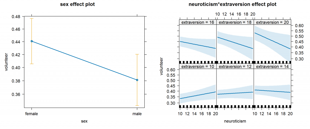
The sex effect plot is the same, but our neuroticism*extraversion effect plot has changed quite a bit. We now have six graphs for the six levels of extraversion we specified. We also set the sex coefficient to 1, so these graphs refer to males. The same interaction is evident as the slopes of the lines change as extraversion changes. But notice the confidence band widens as neuroticism increases, indicating we have few subjects with high neuroticism scores, and hence less confidence in our predictions.
If we just want the neuroticism*extraversion effect plot, we can use the Effect() function with plot() to create a single graph. This provides much needed screen space to made the plot labels legible.
plot(Effect(focal.predictors = c("neuroticism","extraversion"),
            mod = mod.cowles,
            xlevels=list(extraversion=seq(10, 20, 2), neuroticism=10:20),
            given.values=c(sexmale=1)))
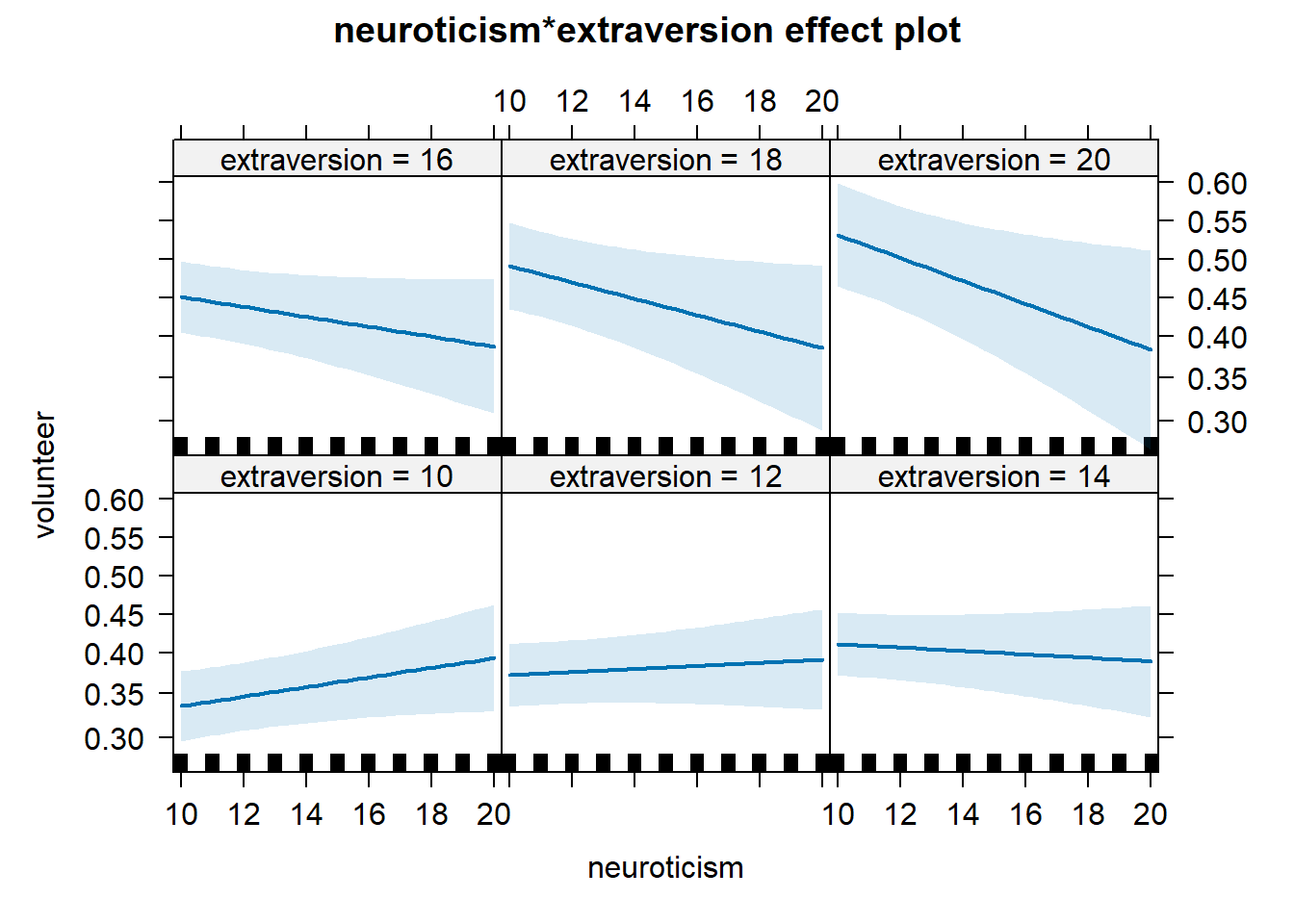
An additional argument is required to specify the focal predictors, but otherwise the syntax is the same as allEffects(). We could also specify “sex” as a focal predictor and get 6 plots for each gender.
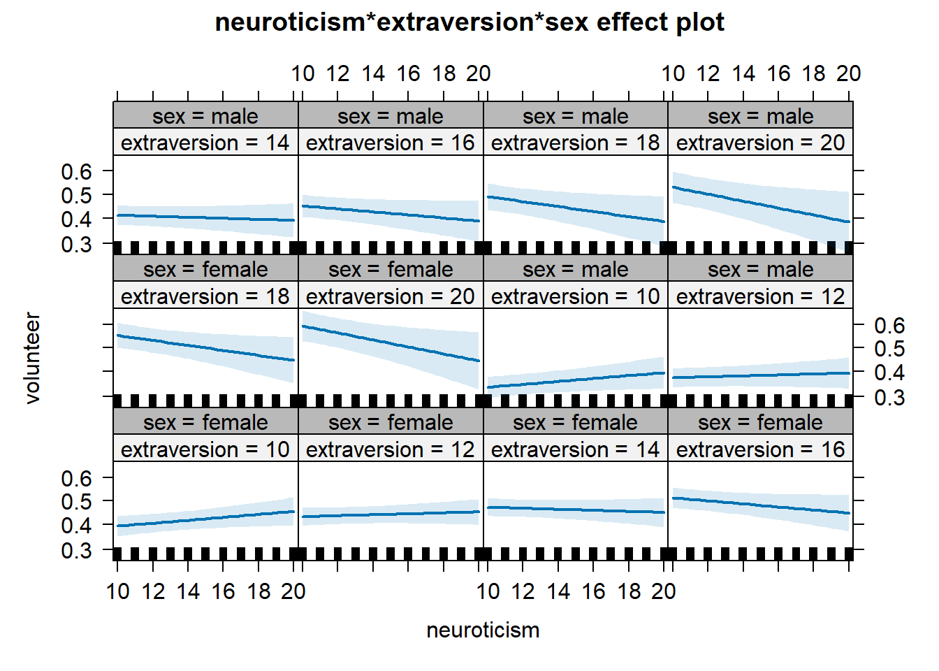
plot(Effect(focal.predictors = c("neuroticism","extraversion","sex"),
            mod = mod.cowles,
            xlevels=list(extraversion=seq(10, 20, 2), neuroticism=10:20)))
Or we can specify multiline = TRUE to combine the sex effect into only 6 plots.
plot(Effect(focal.predictors = c("neuroticism","extraversion","sex"),
            mod = mod.cowles,
            xlevels=list(extraversion=seq(10, 20, 2), neuroticism=10:20)),
     multiline = TRUE)
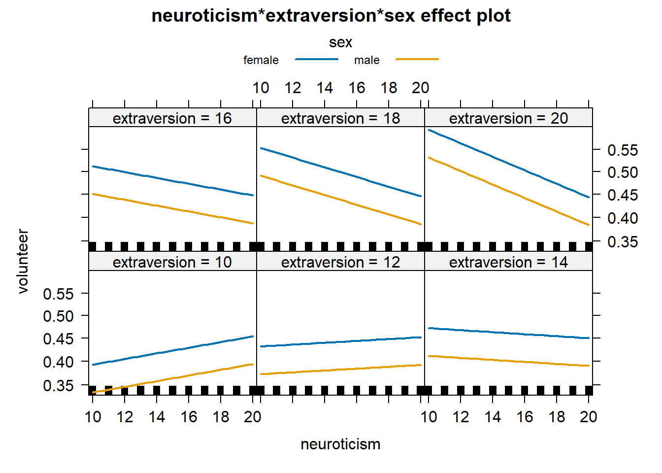
Two things to notice are the confidence bands are removed by default and the lines are parallel in each graph. We can add the confidence bands back into the plot using ci.style = "bands" in the plot function (but it doesn’t look very good and thus we don’t show it.). The lines are also parallel since our model does not interact sex with neuroticism and extraversion. As it turns out, neuroticism and extraversion do not significantly interact with sex.
The effects package can handle many different types of statistical models and its graphs are highly customizable. See the examples in the documentation for several good examples. In the meantime, simply using allEffects() with plot() is great way to start visualizing your model. The default settings tend to work well and give you a good start on creating your own effect plots.
References
- Cowles M and Davis C (1987). The subject matter of psychology: Volunteers. British Journal of Social Psychology 26, 97–102.
- Fox J (2003). Effect displays in R for generalised linear models. Journal of Statistical Software 8:15, 1–27, http://www.jstatsoft.org/v08/i15/.
- R Core Team (2023). R: A Language and Environment for Statistical Computing. R Foundation for Statistical Computing, Vienna, Austria. https://www.R-project.org/.
Clay Ford
Statistical Research Consultant
University of Virginia Library
April 22, 2016
Updated May 16, 2023
For questions or clarifications regarding this article, contact statlab@virginia.edu.
View the entire collection of UVA Library StatLab articles, or learn how to cite.