
When it comes to confidence intervals and hypothesis testing there are two important limitations to keep in mind.
The significance level,1 \(\alpha\), or the confidence interval coverage, \(1 - \alpha\),
- only apply to one test or estimate, not to a series of tests or estimates.
- are only appropriate if the estimate or test was not suggested by the data.
Let’s illustrate both of these limitations via simulation using R.
Below we draw two sets of data (n = 27) from the same normal distribution and run a t-test. The set.seed(1) line ensures we both draw the same random data in case you want to follow along. The null hypothesis is that both means are the same. The results are stored in an object we named tt.
set.seed(1)
x1 <- rnorm(27, 10, 1) # mean = 10, sd = 1
x2 <- rnorm(27, 10, 1)
tt <- t.test(x1, x2)
The tt object is a list that contains, among other things, the test statistic, the p-value of the test, and the confidence interval on the difference in means. We can extract the values as follows:
tt$statistic
         t
  0.655122
tt$p.value
[1] 0.5154183
tt$conf.int
  [1] -0.3053332  0.6008267
  attr(,"conf.level")
  [1] 0.95
It is not surprising the result of the test is a high p-value. There is a very high probability of getting a test statistic such as 0.655 when two means come from the same distribution.2 Our conclusion is to fail to reject the null hypothesis. Likewise, the 95% confidence interval overlaps with 0, indicating a great deal of uncertainty about whether the difference in means is positive, negative, or virtually indistinguishable.
Of course, it is entirely possible to get a faulty “significant” result when drawing two sets of data from the same normal distribution. In other words, we could randomly draw two sets of data and get two means that are so different that the t-test would return a small p-value, or a confidence interval that does not overlap 0, and lead us to believe we have found a real difference. This is known as a Type 1 error: declaring we have found a difference where none exists.
Let’s see how often a Type 1 error might occur using our sample size and distribution. Below we use the replicate() function to repeat what we did above 999 times. Notice that we can directly extract the p-value from the t-test (instead of saving it) and that we just need to wrap our code with curly braces: {}. We save the result as a vector called results which contains TRUE/FALSE values corresponding to whether or not the p-value was less than 0.05, our chosen significance level, \(\alpha\). Finally we calculate the proportion of times we get a p-value less than 0.05 by taking the mean of results. (Recall that in R, TRUE/FALSE are equivalent to 1/0, and that the mean of ones and zeros is the proportion of ones.)
results <- replicate(999, expr = {
  x1 <- rnorm(27, 10, 1)
  x2 <- rnorm(27, 10, 1)
  t.test(x1, x2)$p.value < 0.05})
mean(results)
[1] 0.05205205
About 5 percent of the time, we get a p-value below our significance level of 0.05, which represents the times we may be led to believe an effect or difference is present when it really isn’t.
We can demonstrate the same phenomenon using 95% (or 1 - \(\alpha\)) confidence intervals as follows:
results <- replicate(999, expr = {
  x1 <- rnorm(27, 10, 1)
  x2 <- rnorm(27, 10, 1)
  diff(t.test(x1, x2)$conf.int < 0) == 0})
mean(results)
[1] 0.05105105
About 5 percent of the time, we calculate a confidence interval that does not overlap 0, which represents the times we may be led to believe an effect or difference is truly positive or negative when it really isn’t. Both of these simulations are consistent with the idea that the significance level of a test, or the coverage of a confidence interval, applies to only one test or estimate.
Now let’s repeat this process with not one but with three tests. We draw three sets of data from the same normal distribution and compare all three to each other. The results vector contains TRUE or FALSE values depending on if any of the p-values are less than 0.05.
# multiple tests
results <- replicate(999, expr = {
  x1 <- rnorm(27, 10, 1)
  x2 <- rnorm(27, 10, 1)
  x3 <- rnorm(27, 10, 1)
  t.test(x1, x2)$p.value < 0.05 |
    t.test(x2, x3)$p.value < 0.05 |
    t.test(x1, x3)$p.value < 0.05})
mean(results)
[1] 0.1191191
With three tests, we get p-values under 0.05 about 12 percent of the time. Our Type 1 error rate is inflated. This demonstrates our first point above that a significance level or confidence interval coverage applies to only one test or estimate, not to a series of tests or estimates.
To illustrate our second point, let’s generate a 30 x 6 matrix of values drawn from a standard normal distribution with mean 0 and standard deviation 1. Next we apply the mean() function on the columns of the matrix. Finally we conduct a t-test between the minimum and maximum means. The result is nearly “significant” with a p-value of 0.06, though of course declaring significance would be wrong. We know all 6 means are the result of data drawn from the same normal distribution.
set.seed(3)
mat <- matrix(data = rnorm(30 * 6), nrow = 30, ncol = 6)
means <- apply(mat, 2, mean)
t.test(mat[,which.min(means)], mat[,which.max(means)])
   Welch Two Sample t-test

  data:  mat[, which.min(means)] and mat[, which.max(means)]
  t = -1.903, df = 57.582, p-value = 0.06204
  alternative hypothesis: true difference in means is not equal to 0
  95 percent confidence interval:
   -1.18227134  0.02997463
  sample estimates:
   mean of x  mean of y
  -0.2579345  0.3182139
Like before, let’s see what happens when we repeat this process many times using the replicate() function.
results <- replicate(n = 999, expr = {
  mat <- matrix(data = rnorm(30 * 6), nrow = 30, ncol = 6)
  means <- apply(mat, 2, mean)
  t.test(mat[,which.min(means)], mat[,which.max(means)])$p.value < 0.05
})
mean(results)
[1] 0.3673674
By always comparing the minimum and maximum means in the above simulation, we reject the null hypothesis of no difference an astonishing 37 percent of the time. This demonstrates our second limitation that a significance level or confidence interval coverage is appropriate only if the estimate or test was not suggested by the data.
While these limitations are important to remember, they don’t mean we can’t make multiple comparisons or make accommodations for comparisons that appear interesting after data have been collected. The remainder of this blog post discusses a few ways to do this using the R package multcomp.
To begin, we’ll load some example data on cereal box designs. These data come from the text Applied Linear Statistical Models (Kutner et al., 2005) and concern a food company that wants to test four different package designs for a brand of cereal. Twenty stores with similar sales volumes and cereal shelf space were selected, and each package design was assigned to five stores. (One store failed to report data, so the final data only had four observations for one of the designs.) Sales in number of cases were collected during the study period. Of interest was whether box design had any effect on sales.
The data consist of three columns: num_cases (number of cases sold at a store), colors (3 versus 5 colors in the design of the box), and cartoons (were cartoons included in the design?). The colors column is imported as a number, so we convert it to factor to ensure it’s treated as a categorical variable in our analysis.
cereal <- read.csv("https://static.lib.virginia.edu/statlab/materials/data/cereal.csv")
cereal$colors <- factor(cereal$colors)
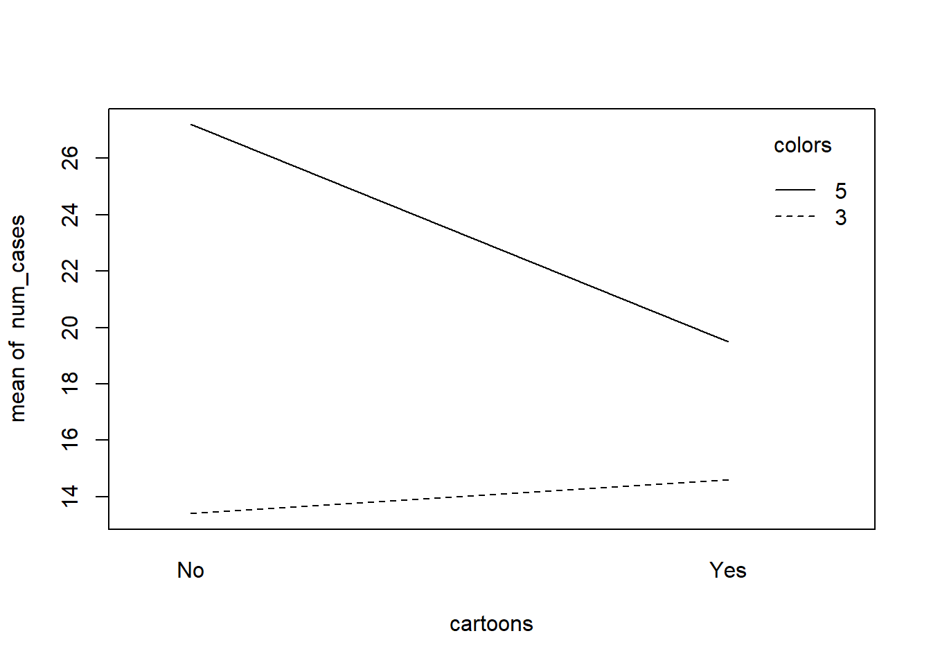
We can quickly check the means of the four designs using the aggregate() function. The design with 5 colors and no cartoons sold the most cases.
aggregate(num_cases ~ colors + cartoons, cereal, mean)
    colors cartoons num_cases
  1      3       No      13.4
  2      5       No      27.2
  3      3      Yes      14.6
  4      5      Yes      19.5
When your data have two categorical variables and a numeric response, an interaction plot is a good way to quickly visualize your data. Here we use the base R function interaction.plot(). It appears adding cartoons to a design with 5 colors could lead to a real decrease in sales.
with(cereal, interaction.plot(x.factor = cartoons,
                              trace.factor = colors,
                              response = num_cases))
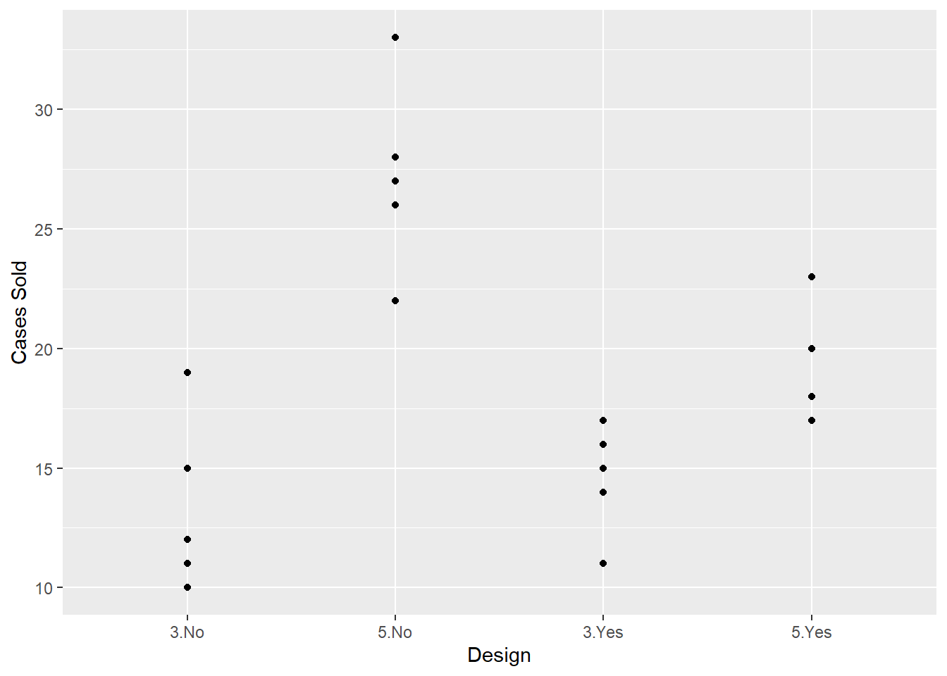
We can also use ggplot2 to visualize the data. Here’s a scatterplot of number of cases sold by design. Notice we have to use the interaction() function to create a single design variable.
library(ggplot2)
ggplot(cereal) +
  aes(x = interaction(colors, cartoons), y = num_cases) +
  geom_point() +
  labs(x = "Design", y = "Cases Sold")
There are many comparisons we might like to make in this study. Some we might know in advance, such as whether or not cartoons in a design affect sales. Other comparisons may only come to mind after the data are collected, such as 3-color designs versus 5-color designs given that both have cartoons incorporated.
To begin, we need to fit a model. In statistics classes this is often described as “running an ANOVA.” We want to test if there are any differences between the four means. The null hypothesis is there are no differences between the means. If we fail to reject the null, we may not have much reason to proceed to multiple comparisons. On the other hand, rejecting the null leads to investigating where the differences lie and how big they are. This is where multiple comparisons come into play.
One way to fit a model is using the lm() function. Below we model num_cases as a function of colors and cartoons. The * means fit an interaction. That is, allow the effect of colors to vary with cartoons and vice versa. The result shows a significant interaction which suggests the effects of colors and cartoons are confounded. In other words, we can’t look at the effect of colors without taking cartoons into consideration.
m1 <- lm(num_cases ~ colors * cartoons, data = cereal)
anova(m1)
  Analysis of Variance Table

  Response: num_cases
                  Df Sum Sq Mean Sq F value    Pr(>F)
  colors           1 452.87  452.87 42.9392 9.153e-06 ***
  cartoons         1  42.17   42.17  3.9982  0.063999 .
  colors:cartoons  1  93.19   93.19  8.8358  0.009489 **
  Residuals       15 158.20   10.55
  ---
  Signif. codes:  0 '***' 0.001 '**' 0.01 '*' 0.05 '.' 0.1 ' ' 1
This ANOVA table is usually described as a 2-factor ANOVA. However, it is sometimes desirable to work with one factor instead of two. This can make specifying comparisons easier. So instead of working with the two factors of colors and cartoons, we can work with one factor that we might call design. We can use the interaction() function to quickly modify our data frame and add a column that contains a 4-level categorical variable for design. Below we do that and then fit a new model with just the design variable.
cereal$design <- interaction(cereal$colors, cereal$cartoons)
m2 <- lm(num_cases ~ design, data = cereal)
anova(m2)
  Analysis of Variance Table

  Response: num_cases
            Df Sum Sq Mean Sq F value    Pr(>F)
  design     3 588.22 196.074  18.591 2.585e-05 ***
  Residuals 15 158.20  10.547
  ---
  Signif. codes:  0 '***' 0.001 '**' 0.01 '*' 0.05 '.' 0.1 ' ' 1
Now we get an ANOVA table associated with a 1-factor ANOVA. The small p-value leads us to reject the null of no difference between means and to explore the differences in design.
A very common and powerful multiple comparison procedure is the Tukey procedure. It allows us to make all pairwise comparisons of means without inflating the Type 1 error rate. In our case, since we have four designs, we have six possible pairwise comparisons we may want to make.3 The math behind the Tukey procedure is not terribly difficult, but it’s a bit too much of a tangent to take for this blog post. Besides, we’re not actually going to use the traditional Tukey procedure. Instead we’re going to use a general framework for simultaneous inference as provided by the multcomp package. The general idea is to use the joint multivariate t distribution of the individual test statistics in a linear model to perform simultaneous inference in a single step. That’s a mouthful, but rest assured the Tukey procedure can be embedded into this framework. See the multcomp vignette for the mathematical details: vignette("generalsiminf").
The workhorse function in multcomp is glht(), which stands for generalized linear hypothesis test. It takes a model object and performs a hypothesis test of specified multiple comparisons. The multiple comparisons are specified using the linfct argument, which is an abbreviation of “linear function.” The linear function needs to be specified as a matrix, where each row represents a comparison. In statistics literature this is often called a contrast matrix. (We describe contrast matrices in more detail below.) The multcomp package provides a function to quickly generate contrast matrices called mcp() which is short for “multiple comparisons.” One way mcp() can be used is by setting our factor variable equal to a keyword for a contrast matrix. Below we specify “Tukey”.4
library(multcomp)
comp1 <- glht(m2, linfct = mcp(design = "Tukey"))
summary(comp1)
    Simultaneous Tests for General Linear Hypotheses

  Multiple Comparisons of Means: Tukey Contrasts


  Fit: lm(formula = num_cases ~ design, data = cereal)

  Linear Hypotheses:
                     Estimate Std. Error t value Pr(>|t|)
  5.No - 3.No == 0     13.800      2.054   6.719   <0.001 ***
  3.Yes - 3.No == 0     1.200      2.054   0.584   0.9352
  5.Yes - 3.No == 0     6.100      2.179   2.800   0.0584 .
  3.Yes - 5.No == 0   -12.600      2.054  -6.135   <0.001 ***
  5.Yes - 5.No == 0    -7.700      2.179  -3.534   0.0143 *
  5.Yes - 3.Yes == 0    4.900      2.179   2.249   0.1549
  ---
  Signif. codes:  0 '***' 0.001 '**' 0.01 '*' 0.05 '.' 0.1 ' ' 1
  (Adjusted p values reported -- single-step method)
The summary shows all six possible comparisons for the design levels. Each row summarizes a hypothesis test of no difference between the two designs being compared. For example, in the first row, 5.No - 3.No == 0 translates into: “The difference between a design with 5 colors and no cartoon and a design with 3 colors and no cartoon is equal to 0.” The estimated difference in means is 13.8. The small p-value listed in the last column suggests this difference would be quite unexpected if the true difference between means really was 0.
The last line of the summary states, “Adjusted p values reported -- single-step method.” This means the p-values have been “corrected” (i.e., increased) for the fact we’re making six comparisons. The adjustment was done using the “single-step method,” which refers to the joint t distribution of test statistics we alluded to earlier. There are many methods for adjusting p-values. See ?summary.glht and ?p.adjust for a list of what’s available with multcomp and base R. To change the adjustment method, use the adjusted() function with the test argument in the summary() call. For example, to see no p-value adjustment, use “none”. Notice we get five significant differences instead of the three we got with the single-step method.
summary(comp1, test = adjusted("none"))
    Simultaneous Tests for General Linear Hypotheses

  Multiple Comparisons of Means: Tukey Contrasts


  Fit: lm(formula = num_cases ~ design, data = cereal)

  Linear Hypotheses:
                     Estimate Std. Error t value Pr(>|t|)
  5.No - 3.No == 0     13.800      2.054   6.719 6.88e-06 ***
  3.Yes - 3.No == 0     1.200      2.054   0.584   0.5677
  5.Yes - 3.No == 0     6.100      2.179   2.800   0.0135 *
  3.Yes - 5.No == 0   -12.600      2.054  -6.135 1.91e-05 ***
  5.Yes - 5.No == 0    -7.700      2.179  -3.534   0.0030 **
  5.Yes - 3.Yes == 0    4.900      2.179   2.249   0.0399 *
  ---
  Signif. codes:  0 '***' 0.001 '**' 0.01 '*' 0.05 '.' 0.1 ' ' 1
  (Adjusted p values reported -- none method)
In addition to hypothesis tests, we should also construct confidence intervals to provide some indication of the uncertainty in our estimate as well as the direction and magnitude of the differences. The multcomp package provides a confint() method for this with default coverage set to 95%.
confint(comp1)
    Simultaneous Confidence Intervals

  Multiple Comparisons of Means: Tukey Contrasts


  Fit: lm(formula = num_cases ~ design, data = cereal)

  Quantile = 2.8813
  95% family-wise confidence level


  Linear Hypotheses:
                     Estimate lwr      upr
  5.No - 3.No == 0    13.8000   7.8819  19.7181
  3.Yes - 3.No == 0    1.2000  -4.7181   7.1181
  5.Yes - 3.No == 0    6.1000  -0.1771  12.3771
  3.Yes - 5.No == 0  -12.6000 -18.5181  -6.6819
  5.Yes - 5.No == 0   -7.7000 -13.9771  -1.4229
  5.Yes - 3.Yes == 0   4.9000  -1.3771  11.1771
The confidence intervals are easier to digest with a plot. The multcomp package also provides a plot() method for this, although you often need to adjust the left-hand margins to see the y-axis labels. That’s what we had to do in this case:
par(mar = c(5.1, 7.1, 4.1, 2.1))
plot(comp1)
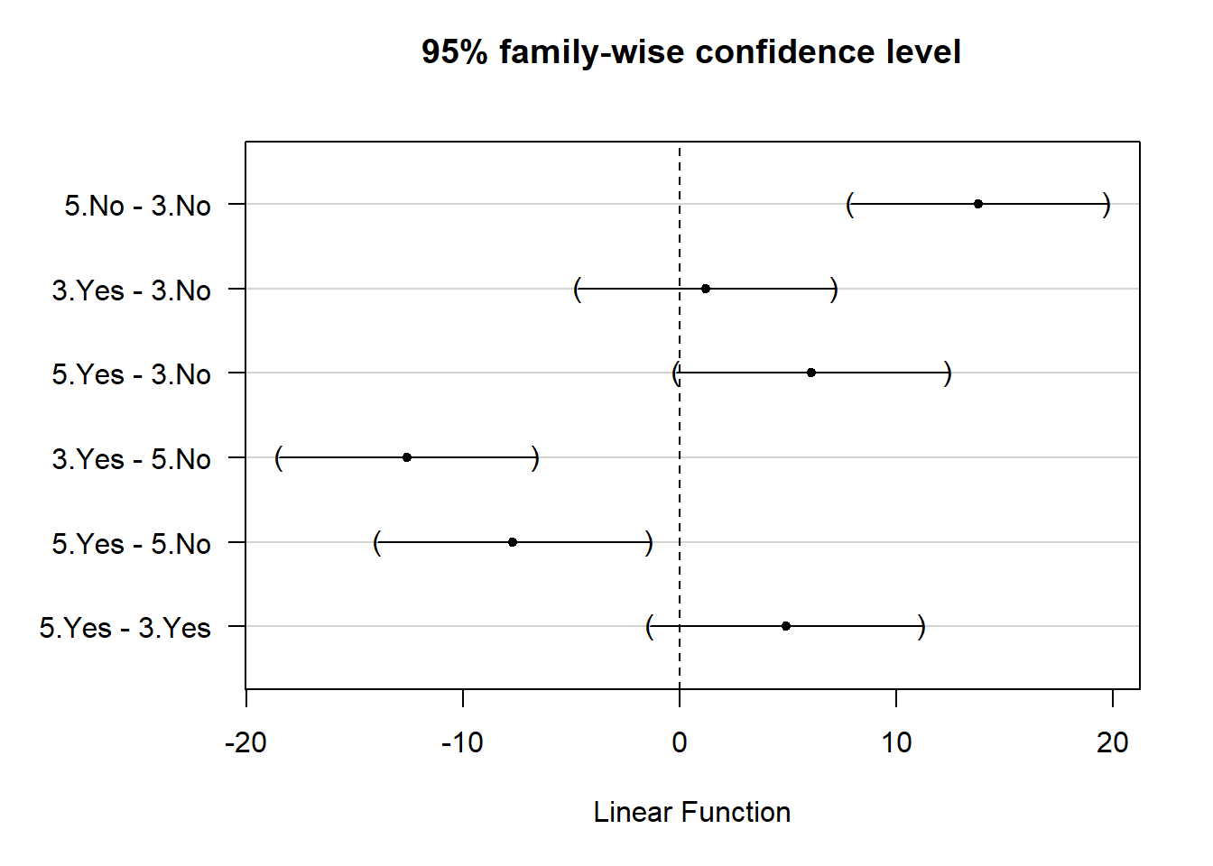
Thanks to this plot, it’s rather easy to see, for example, that we might expect a 5-color design with no cartoons to sell about 10–20 more cases than 3-color design with no cartoons.
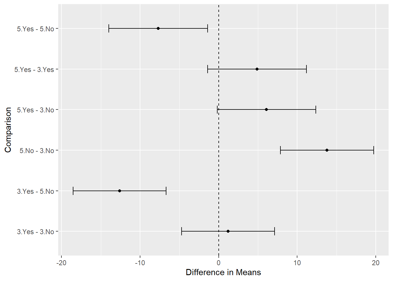
It’s not too difficult to make a ggplot2 version of this graphic. We just need to save the confint() object, extract the data frame, and add a grouping variable to it.
ci_out <- confint(comp1)
ci_df <- as.data.frame(ci_out$confint)
ci_df$group <- row.names(ci_df)

ggplot(ci_df) +
  aes(x = Estimate, y = group) +
  geom_point() +
  geom_errorbar(aes(xmin = lwr, xmax = upr), width = 0.2) +
  geom_vline(xintercept = 0, linetype = 2) +
  labs(x = "Difference in Means", y = "Comparison")
It’s not too hard to turn the above code into a function to be used again with other contrasts. Here’s a very basic function we named plot_multcomp(). The ... allows us to pass additional arguments to the confint() function such as level.
plot_multcomp <- function(obj, ...){
  ci_out <- confint(obj, ...)
  ci_df <- as.data.frame(ci_out$confint)
  ci_df$group <- row.names(ci_df)
  ggplot2::ggplot(ci_df) +
    ggplot2::aes(x = Estimate, y = group) +
    ggplot2::geom_point() +
    ggplot2::geom_errorbar(aes(xmin = lwr, xmax = upr), width = 0.2) +
    ggplot2::geom_vline(xintercept = 0, linetype = 2) +
    ggplot2::labs(x = "Difference in Means", y = "Comparison")
}
We’ll use this function in the next example.
While all pairwise comparisons are a common and easy procedure to implement, we may want to make custom comparisons. The authors of Applied Linear Statistical Models present the following list of possible comparisons for these data (p. 741):
- compare mean sales for the two 3-color designs
- compare mean sales for the 3- and 5-color designs
- compare mean sales for designs with and without cartoons
- compare mean sales for design 3 (3-color, with cartoons) with average of all designs
To set up these comparisons, we need to define a contrast matrix. Each row of the matrix will contain a comparison. Each column of the matrix represents a value to be plugged into our model. Since our model has four coefficients and we want to make four comparisons, we’ll have a 4 x 4 matrix.
Before we set up our matrix, let’s refit our model without an intercept. This will help us explain how contrast matrices work. We just need to add -1 to the model formula. The result is a model with one coefficient per design level. The coefficients in this case are simply the means for each design.
m3 <- lm(num_cases ~ -1 + design, data = cereal)
summary(m3)
  Call:
  lm(formula = num_cases ~ -1 + design, data = cereal)

  Residuals:
     Min     1Q Median     3Q    Max
   -5.20  -1.95  -0.20   1.50   5.80

  Coefficients:
              Estimate Std. Error t value Pr(>|t|)
  design3.No    13.400      1.452   9.226 1.43e-07 ***
  design5.No    27.200      1.452  18.728 8.16e-12 ***
  design3.Yes   14.600      1.452  10.053 4.66e-08 ***
  design5.Yes   19.500      1.624  12.009 4.28e-09 ***
  ---
  Signif. codes:  0 '***' 0.001 '**' 0.01 '*' 0.05 '.' 0.1 ' ' 1

  Residual standard error: 3.248 on 15 degrees of freedom
  Multiple R-squared:  0.9785, Adjusted R-squared:  0.9727
  F-statistic: 170.3 on 4 and 15 DF,  p-value: 2.64e-12
If we wanted to use this model to, say, compare mean sales for the two 3-color designs, we would need to subtract the third coefficient from the first coefficient and then set the result equal to 0. One way to express that is as follows:
\[1 \times \text{design3.No} + 0 \times \text{design5.No} -1 \times \text{design3.Yes} + 0 \times \text{design5.Yes} = 0\]
The values we plugged into our model form one of the rows of the contrast matrix:
[1, 0, -1, 0]
To compare the mean sales for the 3- and 5-color designs, we would plug in the following values:
[1/2, -1/2, 1/2, -1/2]
Why 1/2? Because the means for the 3- and 5-color designs are determined by adding two coefficients each and dividing by 2. The comparison of means for designs with and without cartoons is similarly created.
To create a contrast for comparing design 3 to the mean of all designs is a little trickier. It can help to write out the comparison formula:
\[\mu_3 - \frac{\mu_1 + \mu_2 + \mu_3 + \mu_4}{4} = 0\] Notice this can be rewritten and simplified:
\[\frac{4}{4}\mu_3 - \frac{1}{4}\mu_1 - \frac{1}{4}\mu_2 - \frac{1}{4}\mu_3 - \frac{1}{4}\mu_4 = 0\] \[-\frac{1}{4}\mu_1 - \frac{1}{4}\mu_2 + \frac{3}{4}\mu_3 - \frac{1}{4}\mu_4 = 0\] Which provides our contrast coefficients:
[-1/4, -1/4, 3/4, -1/4]
Let’s create a contrast matrix called K and plug it into glht():
K <- rbind(c(1, 0, -1, 0),
           c(1/2, -1/2, 1/2, -1/2),
           c(1, 1, -1, -1),
           c(-1/4, -1/4, 3/4, -1/4))

comp2 <- glht(m3, linfct = K)
summary(comp2)
    Simultaneous Tests for General Linear Hypotheses

  Fit: lm(formula = num_cases ~ -1 + design, data = cereal)

  Linear Hypotheses:
         Estimate Std. Error t value Pr(>|t|)
  1 == 0   -1.200      2.054  -0.584   0.8984
  2 == 0   -9.350      1.497  -6.246   <0.001 ***
  3 == 0    6.500      2.994   2.171   0.1291
  4 == 0   -4.075      1.271  -3.207   0.0181 *
  ---
  Signif. codes:  0 '***' 0.001 '**' 0.01 '*' 0.05 '.' 0.1 ' ' 1
  (Adjusted p values reported -- single-step method)
It appears the second comparison, mean sales for 3-color design versus 5-color designs, has the largest magnitude.
Again we can create confidence intervals and visualize. Let’s use the function we created above:
plot_multcomp(confint(comp2))
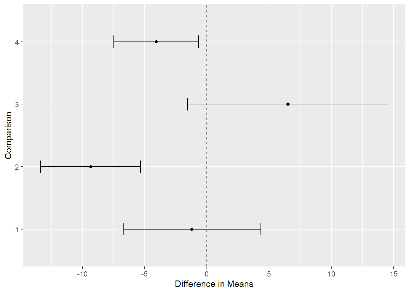
It would help to know what each “Comparison” number means. We can add that as a caption to our plot. Notice we can also reverse the order of the y-axis using scale_y_discrete(limits = rev).
# create a caption
key <- paste0("Comparison 1: 3 color no cartoons - 3 color with cartoons",
              "\nComparison 2: 3 color designs - 5 color designs",
              "\nComparison 3: no cartoons - with cartoons",
              "\nComparison 4: Design 3 mean - mean of all 4 designs")

plot_multcomp(confint(comp2)) +
  scale_y_discrete(limits = rev) +
  labs(title = "Contrasts of Cereal Designs", caption = key) +
  theme(plot.caption = element_text(hjust = 0))
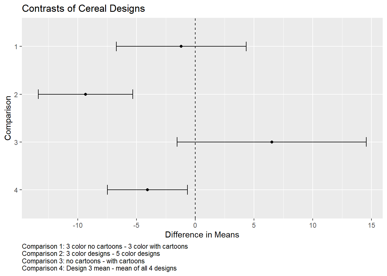
It appears a 5-color design is superior to a 3-color design. It also appears the mean for design 3 (3-color, no cartoon) could be appreciably less than the mean of all designs.
This is just one example of using multcomp with a basic 1-factor model fit with lm(). We demonstrated using Tukey’s procedure for those instances where you might want to explore comparisons suggested by the data. We followed that by demonstrating the use of a custom contrast matrix to make multiple planned comparisons. Each of these help us get around the limitations of traditional hypothesis testing and confidence intervals stated at the beginning of the post. It’s also important to note that the glht() function in the multcomp package will work for generalized linear models (glm()), mixed-effects models (nlme::lme(), lme4::lmer(), lme4::glmer()), Cox proportional hazards models (survival::coxph()), parametric survival models (survival::survreg()), and others.
R session details
The analysis was done using the R Statistical language (v4.5.1; R Core Team, 2025) on Windows 11 x64, using the packages mvtnorm (v1.3.3), TH.data (v1.1.4), multcomp (v1.4.28), survival (v3.8.3), MASS (v7.3.65) and ggplot2 (v3.5.2).
References
- Hothorn, T., Bretz, F., & Westfall, P. (2008). Simultaneous inference in general parametric models. Biometrical Journal, 50(3), 346--363. https://doi.org/10.1002/bimj.200810425
- Kutner, M. H., Nachtsheim, C. J., Neter, J., & Li, W. (2005). Applied linear statistical models (5th ed). McGraw-Hill/Irwin.
- R Core Team. (2020). R: A language and environment for statistical computing. R Foundation for Statistical Computing. https://www.R-project.org/
- Wickham, H. (2016) ggplot2: Elegant graphics for data analysis. Springer-Verlag.
Clay Ford
Statistical Research Consultant
University of Virginia Library
November 6, 2020
- A quick reminder that a significance level is simply a threshold for a hypothesis test. If a p-value falls below it, we may decide we have good evidence of some effect, say a difference in means. Significance levels are arbitrary, but traditionally they are set to \(\alpha = 0.05\). Confidence intervals are an estimated effect, say a difference in means, plus or minus a margin of error. The margin of error is determined in part by the significance level, which again is arbitrary and usually \(\alpha = 0.05\), or \((1 - 0.05) \times 100 = 95\) percent. In addition to communicating uncertainty about our effect estimate, confidence intervals provide information about the direction and magnitude of the effect. ↩︎
- Technically, the p-value in this case is the probability of getting a test statistic as large or larger, or as small or smaller, if the two means were the same. This is known as a two-sided test. ↩︎
- If you have k different groups, you can calculate the number of possible pairwise comparisons using the
choose()function. For example, with k = 4,choose(4, 2)returns 6. ↩︎ - See
?contrMatfor all available contrast matrices. ↩︎
For questions or clarifications regarding this article, contact statlab@virginia.edu.
View the entire collection of UVA Library StatLab articles, or learn how to cite.