
What are empirical cumulative distribution functions and what can we do with them? To answer the first question, let’s first step back and make sure we understand "distributions", or more specifically, "probability distributions".
A Basic Probability Distribution
Imagine a simple event, say flipping a coin 3 times. Here are all the possible outcomes, where H = head and T = tails:
- HHH
- HHT
- HTH
- THH
- HTT
- TTH
- THT
- TTT
Now imagine H = "success". Our outcomes can be modified as follows:
- HHH (3 successes)
- HHT (2 successes)
- HTH (2 successes)
- THH (2 successes)
- HTT (1 success)
- TTH (1 success)
- THT (1 success)
- TTT (0 successes)
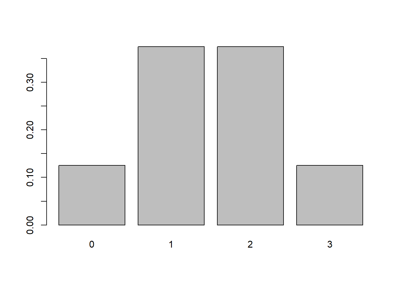
Since there are 8 possible outcomes, the probabilities for 0, 1, 2, and 3 successes are
- 0 successes: 1/8
- 1 successes: 3/8
- 2 successes: 3/8
- 3 successes: 1/8
If we sum those probabilities we get 1. And this represents the "probability distribution" for our event. Formally this event follows a Binomial distribution because the events are independent, there are a fixed number of trials (3), the probability is the same for each flip (0.5), and our outcome is the number of "successes" in the number of trials. In fact what we just demonstrated is a binomial distribution with 3 trials and probability equal to 0.5. This is sometimes abbreviated as b(3,0.5). We can quickly generate the probabilities in R using the dbinom function:
dbinom(0:3, size = 3, prob = 0.5)
[1] 0.125 0.375 0.375 0.125
We can quickly visualize this probability distribution with the barplot function:
barplot(dbinom(x = 0:3, size = 3, prob = 0.5), names.arg = 0:3)
The function used to generate these probabilities is often referred to as the "density" function, hence the "d" in front of binom. Distributions that generate probabilities for discrete values, such as the binomial in this example, are sometimes called "probability mass functions" or PMFs. Distributions that generate probabilities for continuous values, such as the Normal, are sometimes called "probability density functions", or PDFs. However in R, regardless of PMF or PDF, the function that generates the probabilities is known as the "density" function.
Cumulative Distribution Function
Now let's talk about "cumulative" probabilities. These are probabilities that accumulate as we move from left to right along the x-axis in our probability distribution. Looking at the distribution plot above that would be
- \(P(X\le0)\)
- \(P(X\le1)\)
- \(P(X\le2)\)
- \(P(X\le3)\)
We can quickly calculate these:
- \(P(X\le0) = \frac{1}{8}\)
- \(P(X\le1) = \frac{1}{8} + \frac{3}{8} = \frac{1}{2}\)
- \(P(X\le2) = \frac{1}{8} + \frac{3}{8} + \frac{3}{8} = \frac{7}{8}\)
- \(P(X\le3) = \frac{1}{8} + \frac{3}{8} + \frac{3}{8} + \frac{1}{8} = 1\)
The distribution of these probabilities is known as the cumulative distribution. Again there is a function in R that generates these probabilities for us. Instead of a "d" in front of "binom" we put a "p".
pbinom(0:3, size = 3, prob = 0.5)
[1] 0.125 0.500 0.875 1.000
This function is often just referred to as the "distribution function", which can be confusing when you're trying to get your head around probability distributions in general. Plotting this function takes a bit more work. We'll demonstrate an easier way to make this plot shortly, so we present the following code without comment.
plot(0:3, pbinom(0:3, size = 3, prob = 0.5),
     ylim = c(0,1),
     xaxt='n', pch = 19,
     ylab = 'Prob', xlab = 'x')
axis(side = 1, at = 0:3, labels = 0:3)
segments(x0 = c(0, 1, 2), y0 = c(0.125, 0.5, 0.875),
         x1 = c(1, 2, 3), y1 = c(0.125, 0.5, 0.875))
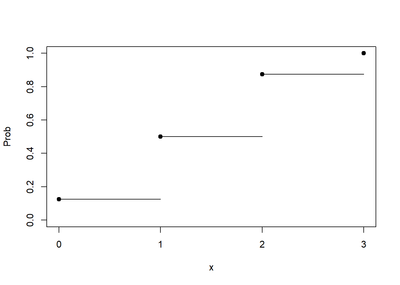
This plot is sometimes called a step plot. As soon as you hit a point on the x-axis, you "step" up to the next probability. The probability of 0 or less is 0.125. Hence the straight line from 0 to 1. At 1 we step up to 0.5, because the probability of 1 or less if 0.5. And so forth. At 3, we have a dot at 1. The probability of 3 or fewer is certainty. We're guaranteed to get 3 or fewer successes in our binomial distribution.
Now let's demonstrate what we did above with a continuous distribution. To keep it relatively simple we'll use the standard normal distribution, which has a mean of 0 and a standard deviation of 1. Unlike our coin flipping example above which could be understood precisely with a binomial distribution, there is no "off-the-shelf" example from real life that maps perfectly to a standard normal distribution. Therefore we'll have to use our imagination.
Let's first draw the distribution using the curve function. The first argument, dnorm(x), is basically the math formula that draws the line. Notice the "d" in front of "norm"; this is the "density" function. The defaults of the dnorm function is mean = 0 and standard deviation = 1. The from and to arguments say draw this curve using values of x ranging from -3 to 3.
curve(dnorm(x), from = -3, to = 3)
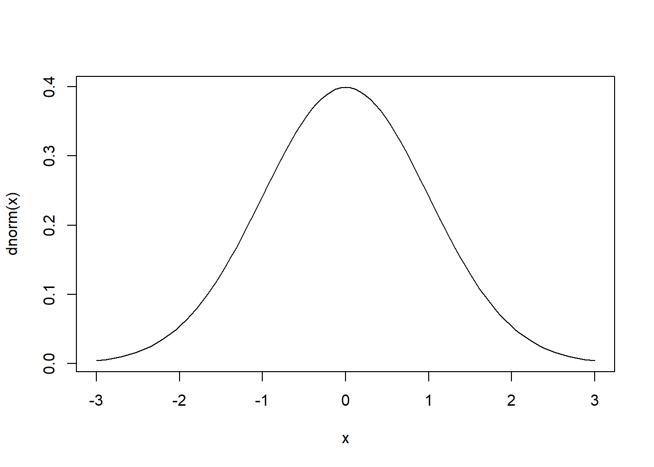
The curve is a smooth line, which means it's a probability distribution for all real numbers. The area under the curve is 1 because it's a probability distribution.
Imagine reaching into this distribution and drawing a number. What's the probability of getting 1.134523768923? It's essentially 0. Why? Because there's \(\frac{1}{\infty}\) chance of selecting it. Why is \(\infty\) in the denominator? Because there is an infinite number of possibilities. If that seems confusing, just imagine zooming into the x axis with finer and finer resolution, with decimals stretching to the horizon. This means the y axis values don't represent probability but rather "density". The density is essentially the probability of a small range of values divided by that range. If that, too, seems confusing, it's OK. Just remember we don't use normal distributions (or any continuous distribution) to get exact probabilities. We use them to get probabilities for a range of values.
For example, what is the probability that x is less than or equal to -1? For this we can use the pnorm function, which is the cumulative distribution function for the normal distribution.
pnorm(-1)
[1] 0.1586553
The mosaic package provides the handy plotDist function for quickly visualizing this probability. By placing mosaic:: before the function we can call the function without loading the mosaic package. The groups argument says create two regions: one for less than -1, and another for greater than -1. The type='h' argument says draw a "histogram-like" plot. The two colors are for the respective regions. Obviously "norm" means draw a normal distribution. Again the default is mean 0 and standard deviation 1.
# install.packages('mosaic')
mosaic::plotDist('norm', groups = x < -1,
                 type='h', col = c('grey', 'lightblue'))
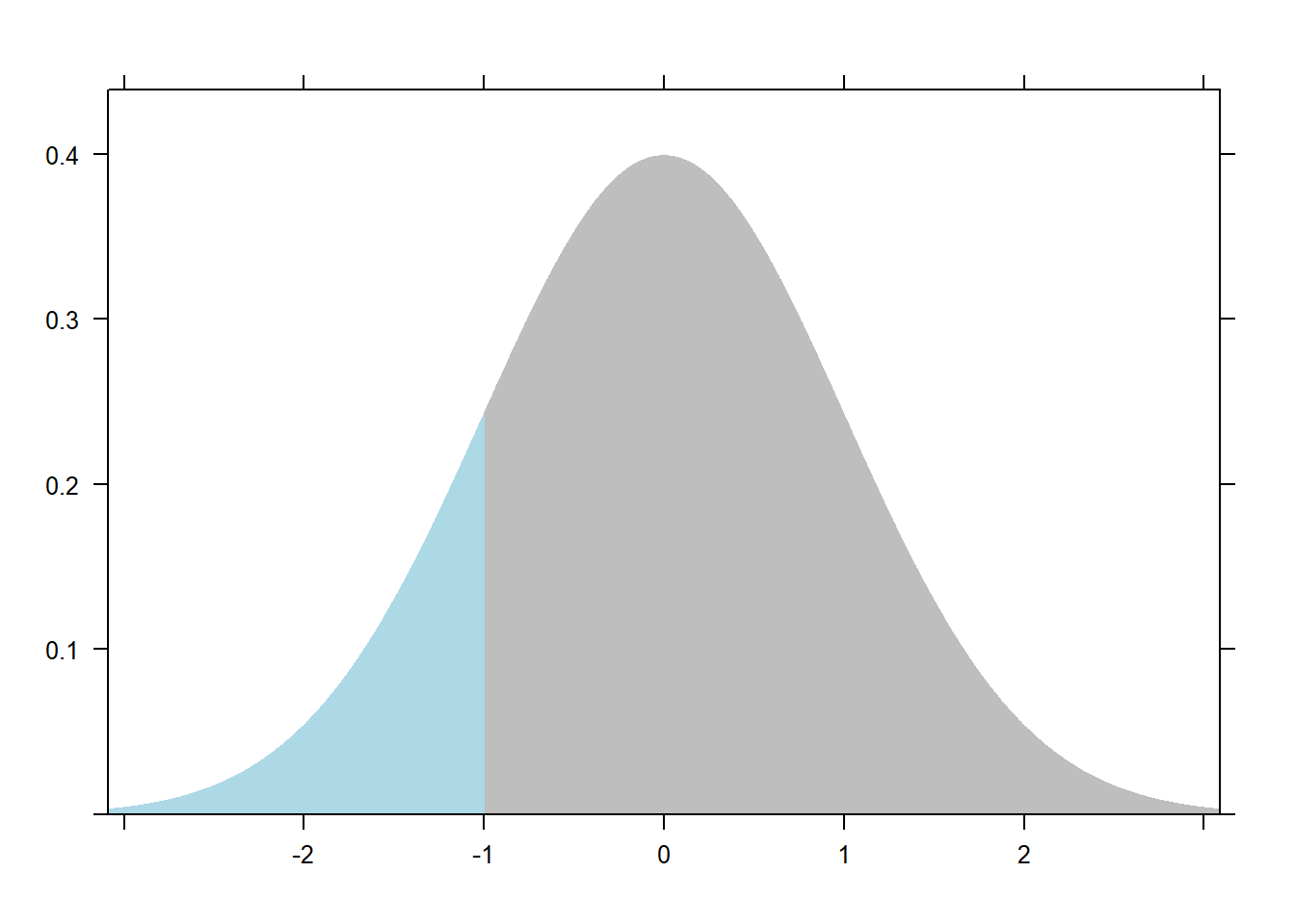
This plot actually shows cumulative probability. The blue region is equal to 0.1586553, the probability we draw a value of -1 or less from this distribution. Recall we used the cumulative distribution function to get this value. To visualize all the cumulative probabilities for the standard normal distribution, we can again use the curve function but this time with pnorm.
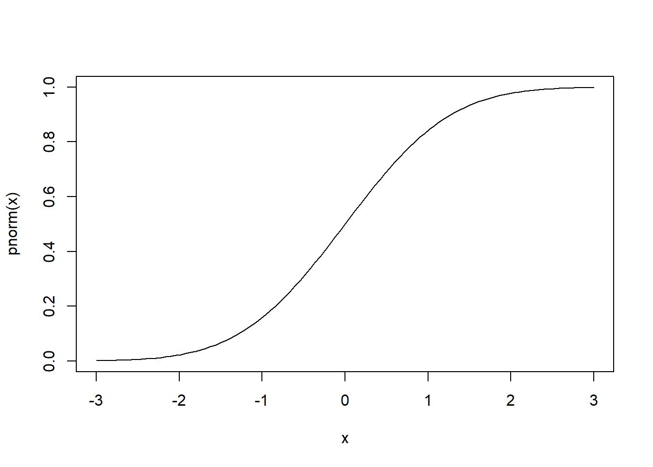
curve(pnorm(x), from = -3, to = 3)
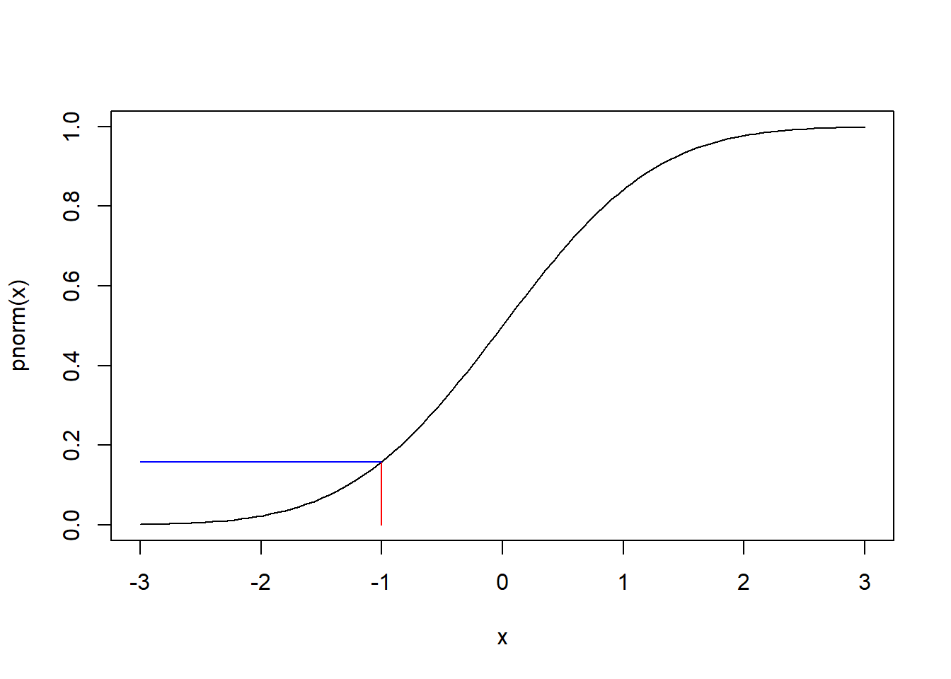
If we look at -1 on the x axis and go straight up to the line, and then go directly left to the x axis, it should land on 0.1586553. We can add this to the plot using segments:
curve(pnorm(x), from = -3, to = 3)
segments(x0 = -1, y0 = 0,
         x1 = -1, y1 = pnorm(-1), col = 'red')
segments(x0 = -1, y0 = pnorm(-1),
         x1 = -3, y1 = pnorm(-1), col = 'blue')
Again this is a smooth line because we're dealing with an infinite number of real values.
Empirical Cumulative Distribution Functions
Now that we're clear on cumulative distributions, let's explore empirical cumulative distributions. "Empirical" means we're concerned with observations rather than theory. The cumulative distributions we explored above were based on theory. We used the binomial and normal cumulative distributions, respectively, to calculate probabilities and visualize the distribution. In real life, however, the data we collect or observe does not come from a theoretical distribution. We have to use the data itself to create a cumulative distribution.
We can do this in R with the ecdf function. ECDF stands for "Empirical Cumulative Distribution Function". Note the last word: "Function". The ecdf function returns a function. Just as pbinom and pnorm were the cumulative distribution functions for our theoretical data, ecdf creates a cumulative distribution function for our observed data. Let's try this out with the rock data set that comes with R.
The rock data set contains measurements on 48 rock samples from a petroleum reservoir. It contains 4 variables: area, peri, shape, and perm. We'll work with the area variable, which is the total area of pores in each sample.
The ecdf functions works on numeric vectors, which are often columns of numbers in a data frame. Below we give it the area column of the rock data frame.
ecdf(rock$area)
  Empirical CDF
  Call: ecdf(rock$area)
   x[1:47] =   1016,   1468,   1651,  ...,  11878,  12212
Notice the output is not that useful. That's because the ecdf function returns a function. We need to assign the result to a name so we can create our ECDF function. Let's use Fn
Fn <- ecdf(rock$area)
Now you have a custom cumulative distribution function you can use with your data. For example we can create a step plot to visualize the cumulative distribution.
plot(Fn)
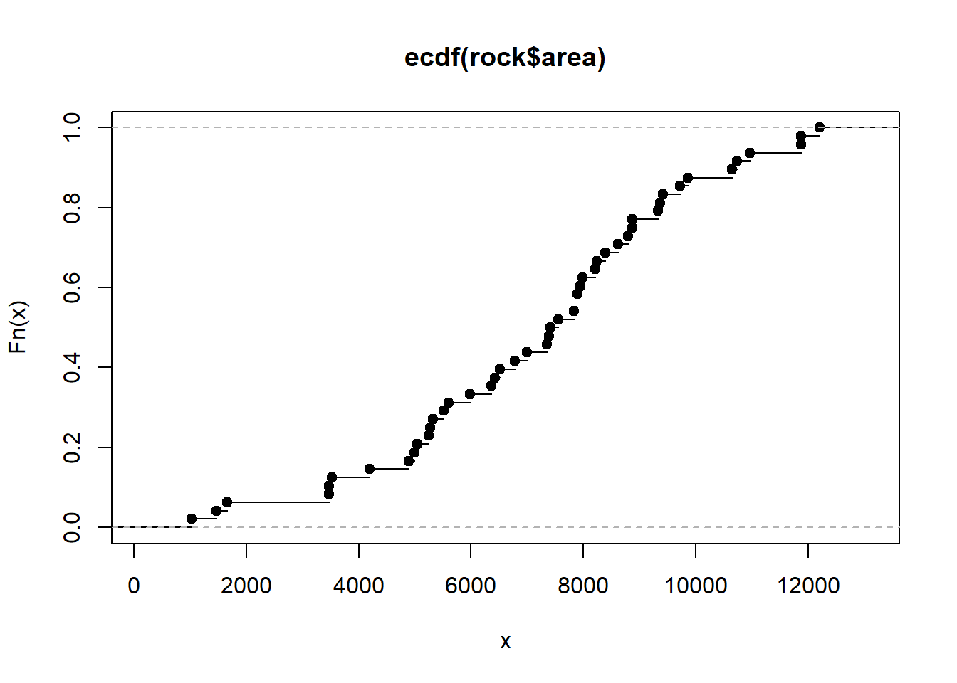
Looking at the plot we can see the estimated probability that the area of a sample is less than or equal to 8000 is about 0.6. But we don't have to rely on eye-balling the graph. We have a function! We can use it to get a more precise estimate. Just give it a number within the range of the x-axis and it will return the cumulative probability.
# Prob area less than or equal to 8000
Fn(8000)
[1] 0.625
We can use the function with more than one value. For example, we can get estimated probabilities that area is less than or equal to 4000, 6000, and 8000.
Fn(c(4000, 6000, 8000))
[1] 0.1250000 0.3333333 0.6250000
There is also a summary method for ECDF functions. It returns a summary of the unique values of the observed data. Notice it's similar to the traditional summary method for numeric vectors, but the result is slightly different since it's summarizing the unique values instead of all values.
summary(Fn)
  Empirical CDF:     47 unique values with summary
     Min. 1st Qu.  Median    Mean 3rd Qu.    Max.
     1016    5292    7416    7173    8871   12212
summary(rock$area)
     Min. 1st Qu.  Median    Mean 3rd Qu.    Max.
     1016    5305    7487    7188    8870   12212
Finally, if we like, we can superimpose a theoretical cumulative distribution over the ECDF. This may help us assess whether or not we can assume our data could be modeled with a particular theoretical distribution. For example, could our data be thought of as having been sampled from a Normal distribution? Below we plot the step function and then overlay a cumulative Normal distribution using the mean and standard deviation of our observed data.
plot(ecdf(rock$area))
curve(pnorm(x, mean(rock$area), sd(rock$area)),
      from = 0, to = 12000, add = TRUE, col='blue', lwd = 2)
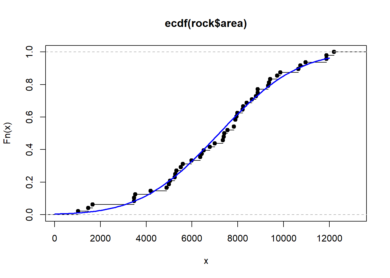
The lines seem to overlap quite a bit, suggesting the data could be approximated with a Normal distribution. We can also compare estimates from our ECDF with a theoretical CDF. We saw that the probability that area is less than or equal to 8000 is about 0.625. How does that compare to a Normal cumulative distribution with a mean and standard deviation of rock$area?
pnorm(8000, mean = mean(rock$area), sd = sd(rock$area))
[1] 0.6189223
That's quite close!
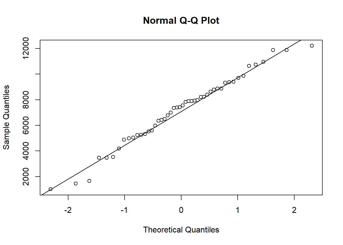
Another graphical assessment is the Q-Q plot, which can also be easily done in R using the qqnorm and qqline functions. The idea is that if the points fall along the diagonal line then we have good evidence the data are plausibly normal. Again this plot reveals that the data look like they could be well approximated with a Normal distribution. (For more on Q-Q plots, see our article, Understanding Q-Q Plots).
qqnorm(rock$area)
qqline(rock$area)
R session details
Analyses were conducted using the R Statistical language (version 4.5.1; R Core Team, 2025) on Windows 11 x64 (build 26100).
References
- R. Pruim, D. T. Kaplan and N. J. Horton. The mosaic Package: Helping Students to 'Think with Data' Using R (2017). The R Journal, 9(1):77-102.
- R Core Team (2023). R: A Language and Environment for Statistical Computing. R Foundation for Statistical Computing, Vienna, Austria. https://www.R-project.org/.
Clay Ford
Statistical Research Consultant
University of Virginia Library
July 9, 2020
For questions or clarifications regarding this article, contact statlab@virginia.edu.
View the entire collection of UVA Library StatLab articles, or learn how to cite.