
When doing linear modeling or ANOVA it’s useful to examine whether or not the effect of one variable depends on the level of one or more variables. If it does then we have what is called an “interaction”. This means variables combine or interact to affect the response. The simplest type of interaction is the interaction between two two-level categorical variables. Let’s say we have gender (male and female), treatment (yes or no), and a continuous response measure. If the response to treatment depends on gender, then we have an interaction.
Using R, we can simulate data such as this. The following code first generates a vector of gender labels, 20 each of “male” and “female”. Then it generates treatment labels, 10 each of “yes” and “no”, alternating twice so we have 10 treated and 10 untreated for each gender. Next we generate the response by randomly sampling from two different normal distributions, one with mean 15 and the other with mean 10. Notice we create an interaction by sampling from the distributions in a different order for each gender. Finally we combine our vectors into a data frame.
gender <- gl(n = 2, k = 20, labels = c("male", "female"))
trt <- rep(rep(c("yes", "no"), each = 10), 2)
set.seed(1)
resp <- c(
  rnorm(n = 20, mean = rep(c(15,10), each =10)),
  rnorm(n = 20, mean = rep(c(10,15), each =10))
  )
dat <- data.frame(gender, trt, resp)
Now that we have our data, let’s see how the mean response changes based on the two “main” effects:
aggregate(resp ~ gender, data = dat, mean)
  gender     resp
1   male 12.69052
2 female 12.49353
aggregate(resp ~ trt, data = dat, mean)
  trt     resp
1  no 12.68479
2 yes 12.49926
Neither appear to have any effect on the mean response value. But what about their interaction? We can see this by looking at the mean response by both gender and trt using tapply():
with(dat, tapply(resp, list(gender, trt), mean))
             no       yes
male   10.24884 15.132203
female 15.12073  9.866327
Now we see something happening. The effect of trt depends on gender. If you’re male, trt causes the mean response to increase by about 5. If you’re female, trt causes the mean response to decrease by about 5. The two variables interact.
A helpful function for visualizing interactions is interaction.plot(). It basically plots the means we just examined and connects them with lines. The first argument, x.factor, is the variable you want on the x-axis. The second variable, trace.factor, is how you want to group the lines it draws. The third argument, response, is your response variable.
interaction.plot(x.factor = dat$trt,
                 trace.factor = dat$gender,
                 response = dat$resp)
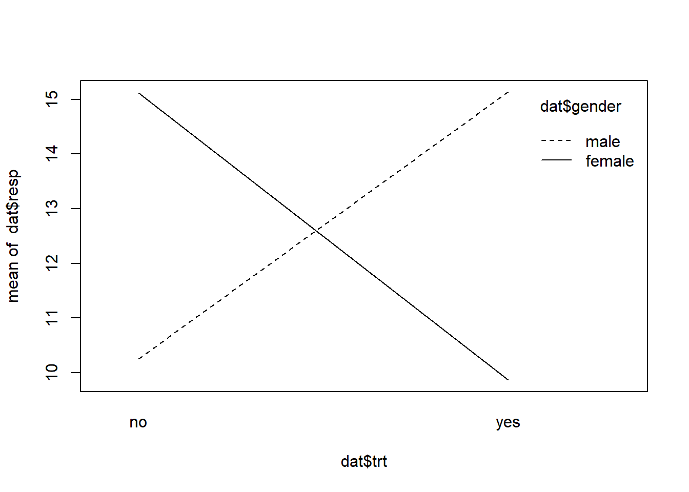
The resulting plot shows an interaction. The lines cross. At the ends of each line are the means we previously examined. A plot such as this can be useful in visualizing an interaction and providing some sense of how strong it is. This is a very strong interaction as the lines are nearly perpendicular. An interaction where the lines cross is sometimes called an “interference” or “antagonistic” interaction effect.
Boxplots can be also be useful in detecting and visualizing interactions. Below we use R’s formula notation to specify that “resp” be plotted by the interaction of gender and trt. That’s what the asterisk means in formula notation.
boxplot(resp ~ gender * trt, data = dat)
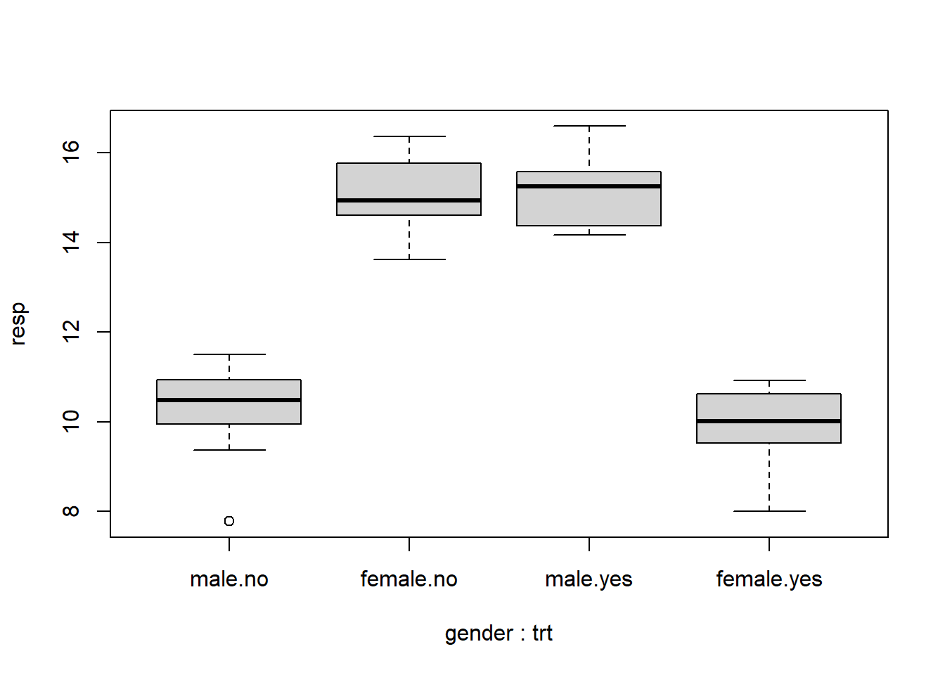
By interacting two two-level variables we basically get a new four-level variable. We see once again that the effect of trt flips depending on gender.
A common method for analyzing the effect of categorical variables on a continuous response variable is the Analysis of Variance, or ANOVA. In R we can do this with the aov() function. Once again we employ formula notation to specify the model. Below it says “model response as a function of gender, treatment and the interaction of gender and treatment.”
aov1 <- aov(resp ~ trt * gender, data = dat)
summary(aov1)
            Df Sum Sq Mean Sq F value Pr(>F)
trt          1   0.34    0.34   0.415  0.524
gender       1   0.39    0.39   0.468  0.499
trt:gender   1 256.94  256.94 309.548 <2e-16 ***
Residuals   36  29.88    0.83
---
Signif. codes:  0 '***' 0.001 '**' 0.01 '*' 0.05 '.' 0.1 ' ' 1
The main effects by themselves are not significant but the interaction is. This makes sense given our aggregated means above. We saw that the mean response was virtually no different based on gender or trt alone, but did vary substantially when both variables were combined. We can extract the same information from our aov1 object using the model.tables() function, which reports the grand mean, the means by main effects, and the means by the interaction:
model.tables(aov1, type = "means")
Tables of means
Grand mean

12.59203

 trt
trt
    no    yes
12.685 12.499

 gender
gender
  male female
12.691 12.494

 trt:gender
     gender
trt   male   female
  no  10.249 15.121
  yes 15.132  9.866
We can also fit a linear model to these data using the lm() function:
lm1 <- lm(resp ~ trt * gender, data = dat)
summary(lm1)
Call:
lm(formula = resp ~ trt * gender, data = dat)

Residuals:
    Min      1Q  Median      3Q     Max
-2.4635 -0.4570  0.1093  0.6152  1.4631

Coefficients:
                    Estimate Std. Error t value Pr(>|t|)
(Intercept)          10.2488     0.2881   35.57  < 2e-16 ***
trtyes                4.8834     0.4074   11.98 3.98e-14 ***
genderfemale          4.8719     0.4074   11.96 4.26e-14 ***
trtyes:genderfemale -10.1378     0.5762  -17.59  < 2e-16 ***
---
Signif. codes:  0 '***' 0.001 '**' 0.01 '*' 0.05 '.' 0.1 ' ' 1

Residual standard error: 0.9111 on 36 degrees of freedom
Multiple R-squared:  0.8961,    Adjusted R-squared:  0.8874
F-statistic: 103.5 on 3 and 36 DF,  p-value: < 2.2e-16
This returns a table of coefficients. (Incidentally we can get these same coefficients from the aov1 object by using coef(aov1).) Notice everything is “significant”. This just means the coefficients are significantly different from 0. It does not contradict the ANOVA results. Nor does it mean the main effects are significant. If we want a test for the significance of main effects, we can use anova(lm1), which outputs the same anova table that aov() created.
The intercept in the linear model output is simply the mean response for gender=“male” and trt=“no”. (Compare it to the model.tables() output above.) The coefficient for “genderfemale” is what you add to the intercept to get the mean response for gender=“female” when trt=“no”. Likewise, The coefficient for “trtyes” is what you add to the intercept to get the mean response for trt=“yes” when gender=“male”.
The remaining combination to estimate is gender=“female” and trt=“yes”. For those settings, we add all the coefficients together to get the mean response for gender=“female” when trt=“yes”. Because of this it’s difficult to interpret the coefficient for the interaction. What does -10 mean exactly? In some sense, at least in this example, it basically offsets the main effects of gender and trt. If we look at the interaction plot again, we see that trt=“yes” and gender=“female” has about the same mean response as trt=“no” and gender=“male”.
lm() and aov() both give the same results but show different summaries. In fact, aov() is just a wrapper for lm(). The only reason to use aov() is to create an aov object for use with functions such as model.tables().
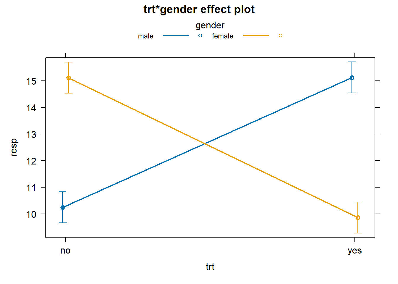
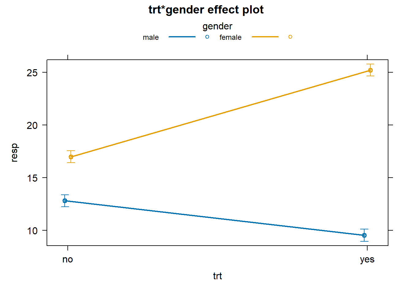
Using the effects package we can create a formal interaction plot with standard error bars to indicate the uncertainty in our estimates.
library(effects)
# works for aov and lm objects.
plot(allEffects(aov1), multiline = TRUE, ci.style = "bars")
Another type of interaction is one in which the variables combine to amplify an effect. Let’s simulate some data to demonstrate. When simulating the response we establish a treatment effect for the first 20 observations by sampling 10 each from N(10,1) and N(13,1) distributions, respectively. We then amplify that effect by gender for the next 20 observations by sampling from N(25,1) and N(17,1) distributions, respectively.
set.seed(12)
resp <- c(
  rnorm(n = 20, mean = rep(c(10,13), each = 10)),
  rnorm(n = 20, mean = rep(c(25,17), each = 10))
)

dat2 <- data.frame(gender, trt, resp)
interaction.plot(x.factor = dat2$trt,
                 trace.factor = dat2$gender,
                 response = dat2$resp)
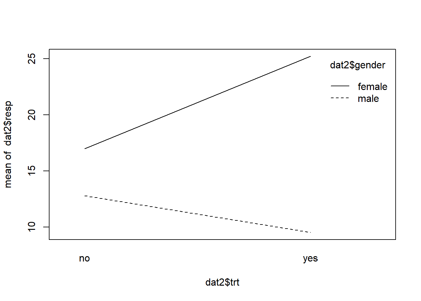
In this interaction the lines depart. An interaction effect like this is sometimes called a “reinforcement” or “synergistic” interaction effect. We see there’s a difference between genders when trt=“no”, but that difference is reinforced when trt=“yes” for each gender.
Running an ANOVA on these data reveal a significant interaction as we expect, but notice the main effects are significant as well.
aov2 <- aov(resp ~ trt * gender, data = dat2)
summary(aov2)
            Df Sum Sq Mean Sq F value   Pr(>F)
trt          1   61.3    61.3   77.36 1.71e-10 ***
gender       1  985.8   985.8 1244.88  < 2e-16 ***
trt:gender   1  330.3   330.3  417.09  < 2e-16 ***
Residuals   36   28.5     0.8
---
Signif. codes:  0 '***' 0.001 '**' 0.01 '*' 0.05 '.' 0.1 ' ' 1
That means the effects of gender and trt individually explain a fair amount of variability in the data. We can get a feel for this by looking at the mean response for each of these variables in addition to the mean response by the interaction.
model.tables(aov2, type = "means")
Tables of means
Grand mean

16.13323

 trt
trt
    no    yes
14.896 17.371

 gender
gender
  male female
11.169 21.098

 trt:gender
     gender
trt   male   female
  no  12.805 16.987
  yes  9.533 25.209
Fitting a linear model provides a table of coefficients, but once again it’s hard to interpret the interaction coefficient. As before the intercept is the mean response for males with trt=“no” while the other coefficients are what we add to the intercept to get the other three mean responses. And of course we can make a formal interaction plot with error bars.
lm2 <- lm(resp ~ trt * gender, data = dat2)
summary(lm2)
Call:
lm(formula = resp ~ trt * gender, data = dat2)

Residuals:
     Min       1Q   Median       3Q      Max
-1.53043 -0.50900 -0.08787  0.40449  2.08545

Coefficients:
                    Estimate Std. Error t value Pr(>|t|)
(Intercept)          12.8048     0.2814  45.503  < 2e-16 ***
trtyes               -3.2720     0.3980  -8.222 8.81e-10 ***
genderfemale          4.1818     0.3980  10.508 1.63e-12 ***
trtyes:genderfemale  11.4942     0.5628  20.423  < 2e-16 ***
---
Signif. codes:  0 '***' 0.001 '**' 0.01 '*' 0.05 '.' 0.1 ' ' 1

Residual standard error: 0.8899 on 36 degrees of freedom
Multiple R-squared:  0.9797,    Adjusted R-squared:  0.978
F-statistic: 579.8 on 3 and 36 DF,  p-value: < 2.2e-16
plot(allEffects(aov2), multiline = TRUE, ci.style = "bars")
What about data with no interaction? How does that look? Let’s first simulate it. Notice how we generated the response. The means of the distribution change for each treatment, but the difference between them does not change for each gender.
set.seed(12)
resp <- c(
  rnorm(n = 20, mean = rep(c(10,15), each = 10)),
  rnorm(n = 20, mean = rep(c(12,17), each = 10))
)

dat3 <- data.frame(gender, trt, resp)
interaction.plot(x.factor = dat3$trt,
                 trace.factor = dat3$gender,
                 response = dat3$resp)
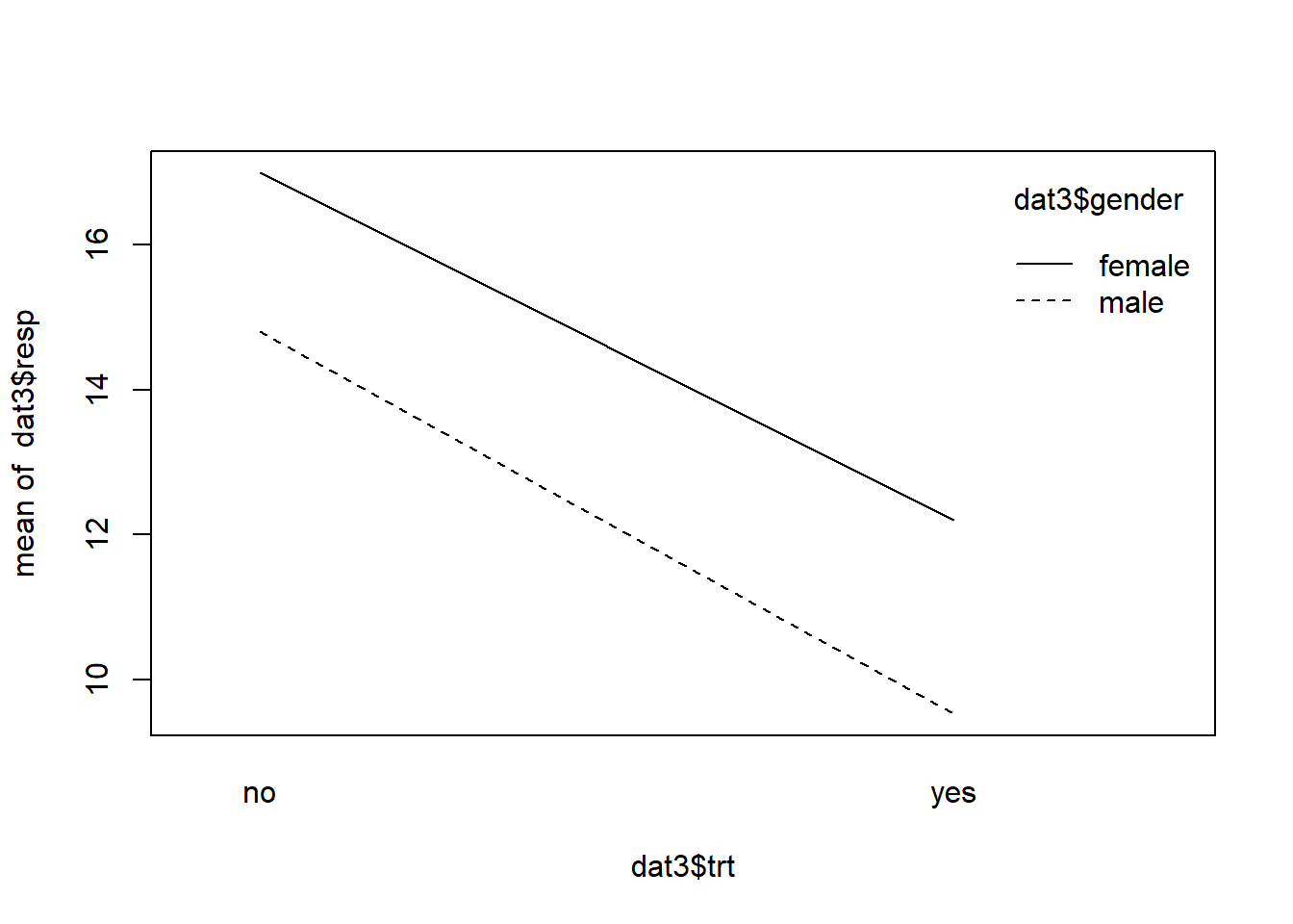
The lines are basically parallel indicating the absence of an interaction effect. The effect of trt does not depend on gender. If we do an ANOVA, we see the interaction is not significant.
summary(aov(resp ~ trt * gender, data = dat3))
            Df Sum Sq Mean Sq F value   Pr(>F)
trt          1 252.50  252.50 318.850  < 2e-16 ***
gender       1  58.99   58.99  74.497 2.72e-10 ***
trt:gender   1   0.61    0.61   0.771    0.386
Residuals   36  28.51    0.79
---
Signif. codes:  0 '***' 0.001 '**' 0.01 '*' 0.05 '.' 0.1 ' ' 1
Of course statistical “significance” is just one of several things to check. If your data set is large enough, even the smallest interaction will appear significant. That’s how an interaction plot can help you determine if a statistically significant interaction is also meaningfully significant.
Interactions can also happen between a continuous and a categorical variable. Let’s see what this looks like by simulating some data. This time we generate our response by using a linear model with some random noise from a Normal distribution and then we plot the data using the ggplot2 package. Notice how we map the color of the dots to gender.
set.seed(2)
gender <- sample(0:1, size = 40, replace = TRUE)
x1 <- sort(runif(n = 40, min = 0, max = 4))
y <- 20 + 7*x1 + 10*gender - 5*gender*x1 + rnorm(40,sd = 0.7)
dat4 <- data.frame(gender = factor(gender, labels = c("male","female")), x1, y)

library(ggplot2)
ggplot(dat4, aes(x=x1, y=y, color=gender)) +
  geom_point()
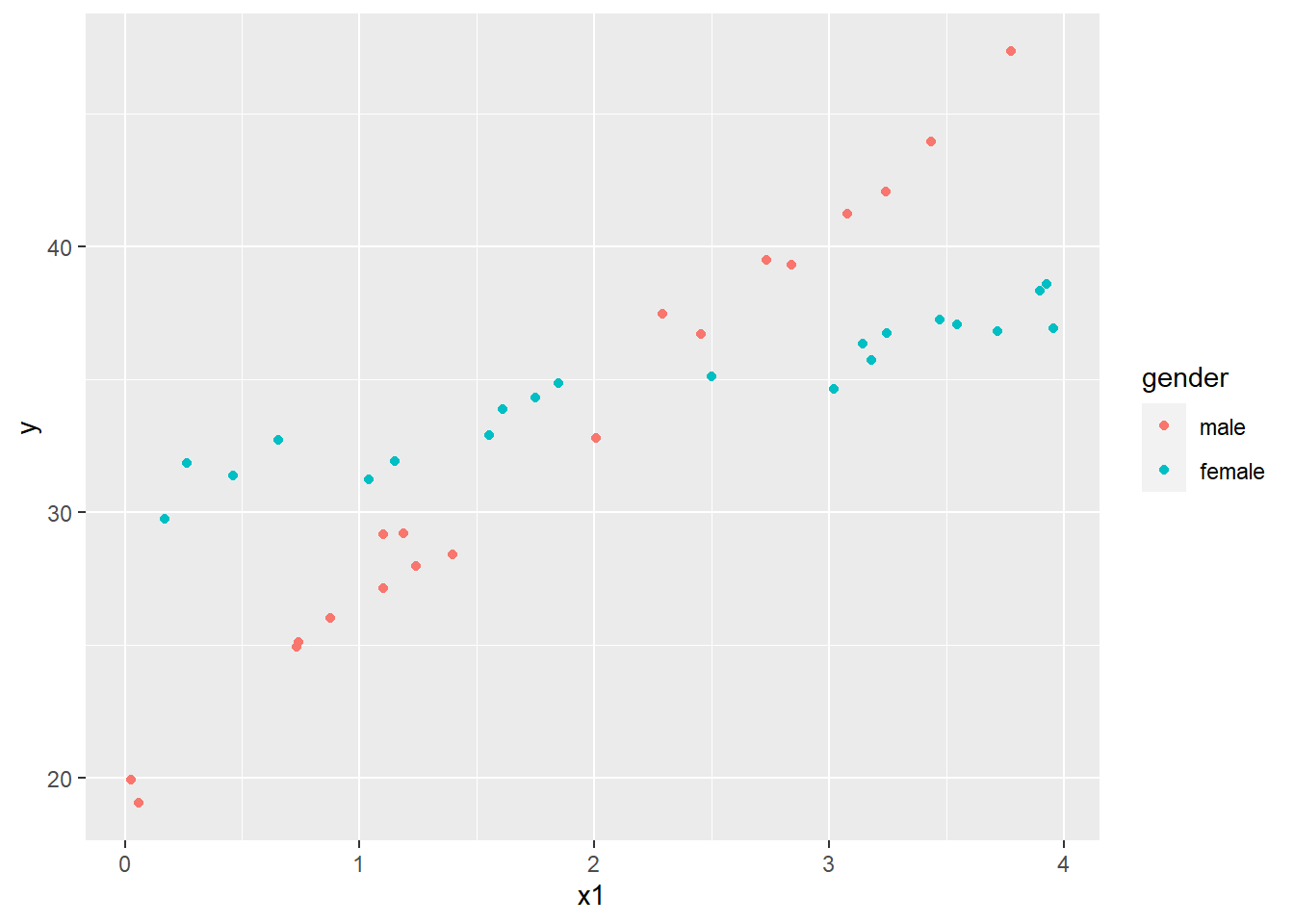
This looks a lot like our first interaction plot, except we have scattered dots replacing lines. As the x1 variable increases, the response increases for both genders, but it increases much more dramatically for males. To analyze this data we use the Analysis of Covariance, or ANCOVA. In R this simply means we use lm() to fit the model. Because the scatter of points are intersecting by gender, we want to include an interaction.
lm3 <- lm(y ~ x1 * gender, data = dat4)
summary(lm3)
Call:
lm(formula = y ~ x1 * gender, data = dat4)

Residuals:
     Min       1Q   Median       3Q      Max
-1.37689 -0.55701  0.05924  0.48865  1.70517

Coefficients:
                Estimate Std. Error t value Pr(>|t|)
(Intercept)      19.5924     0.3512   55.79   <2e-16 ***
x1                7.1349     0.1650   43.25   <2e-16 ***
genderfemale     10.8778     0.5026   21.64   <2e-16 ***
x1:genderfemale  -5.2979     0.2142  -24.73   <2e-16 ***
---
Signif. codes:  0 '***' 0.001 '**' 0.01 '*' 0.05 '.' 0.1 ' ' 1

Residual standard error: 0.8095 on 36 degrees of freedom
Multiple R-squared:  0.9833,    Adjusted R-squared:  0.982
F-statistic: 708.2 on 3 and 36 DF,  p-value: < 2.2e-16
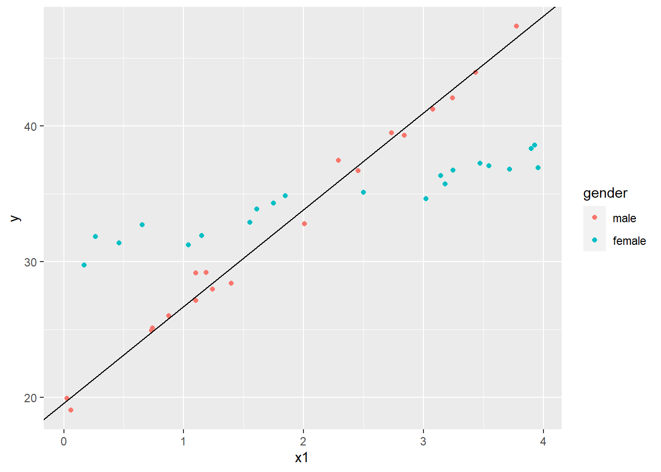
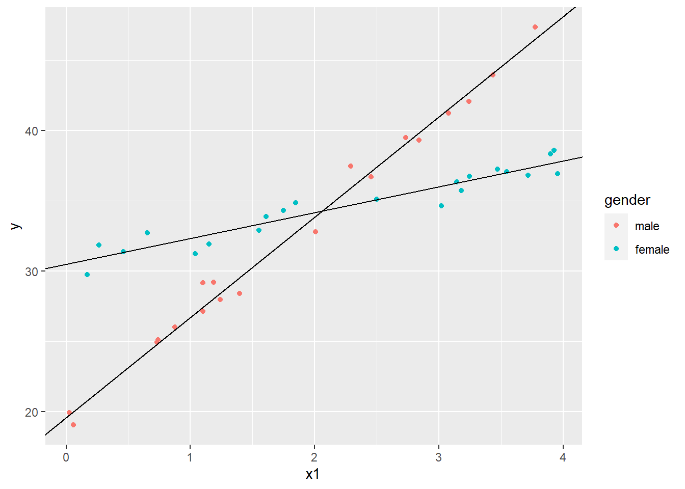
Unlike the previous linear models with two categorical predictors, the coefficients in this model have ready interpretations. If we think of gender taking the value 0 for males and 1 for females, we see that the coefficients for the Intercept and x1 are the intercept and slope for the best fitting line through the “male” scatterplot. We can plot that as follows using the geom_abline() function:
# save the coefficients into a vector
cs <- coef(lm3)
ggplot(dat4, aes(x=x1, y=y, color=gender)) +
  geom_point() +
  geom_abline(intercept = cs[1], slope = cs[2])
The female coefficient is what we add to the intercept when gender = 1. Likewise, the interaction coefficient is what we add to the x1 coefficient when gender = 1. Let’s plot that line as well.
ggplot(dat4, aes(x=x1, y=y, color=gender)) +
  geom_point() +
  geom_abline(intercept = cs[1], slope = cs[2]) +
  geom_abline(intercept = cs[1] + cs[3], slope = cs[2] + cs[4])
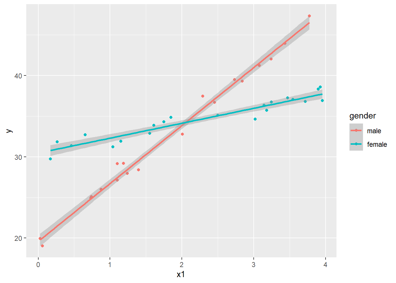
The gender coefficient is the difference in intercepts while the interaction coefficient is the difference in slopes. The former may not be of much interest, but the latter is certainly important. It tells us that the trajectory for females is about -4.5 lower than males. ggplot will actually plot these lines for us with geom_smooth() function and method='lm'.
ggplot(dat4, aes(x=x1, y=y, color=gender)) +
  geom_point() +
  geom_smooth(method="lm")
Or we can use the effects package again.
plot(allEffects(lm3), multiline = TRUE, ci.style = "bands")
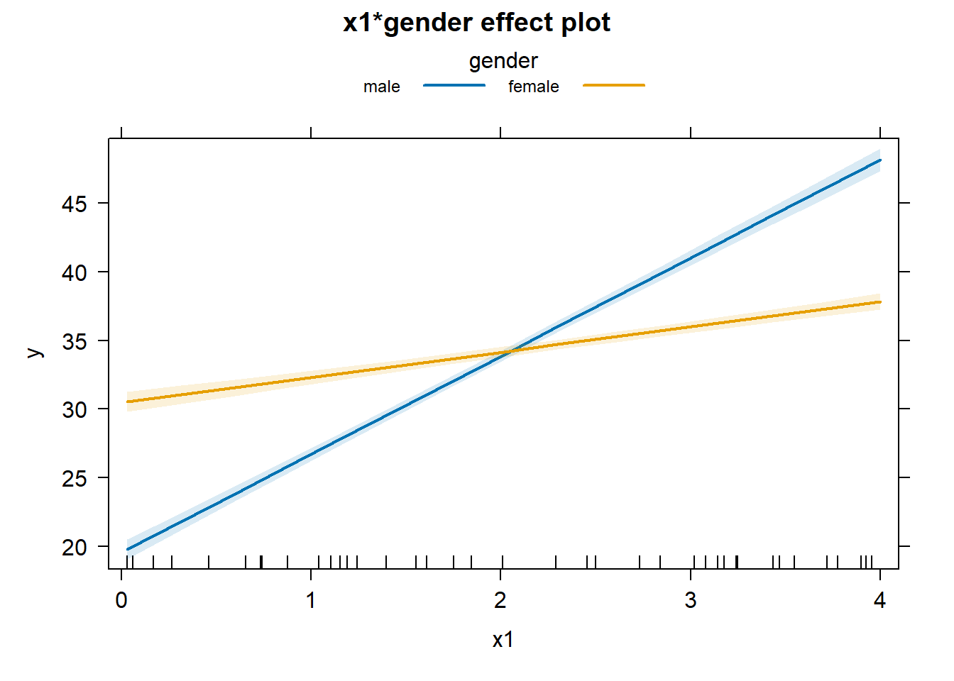
It looks like an interaction plot! The difference here is how uncertainty is expressed. With categorical variables the uncertainty is expressed as bars at the ends of the lines. With a continuous variable, the uncertainly is expressed as bands around the lines.
Interactions can get yet more complicated. Two continuous variables can interact. Three variables can interact. You can have multiple two-way interactions. And so on. Even though software makes it easy to fit lots of interactions, Kutner, et al. (2005) suggest keeping two things in mind when fitting models with interactions:
-
Adding interaction terms to a regression model can result in high multicollinearities. A partial remedy is to center the predictor variables.
-
When you have a large number of predictor variables, the potential number of interactions is large. Therefore it’s desirable, if possible, to identify those interactions that most likely influence the response. One thing you can try is plotting the residuals of a main-effects-only model against different interaction terms to see which ones appear to be influential in affecting the response.
As an example of #1, run the following R code to see how centering the predictor variables reduces the variance inflation factors (VIF). A VIF in excess of 10 is usually taken as an indication that multicollinearity is influencing the model. Before centering, the VIF is about 60 for the main effects and 200 for the interaction. But after centering they fall well below 10.
# stackloss: sample data that come with R
fit1 <- lm(stack.loss ~ Air.Flow * Water.Temp , data = stackloss)
library(faraway) # for vif function
vif(fit1)

# center variables and re-check VIF
fit2 <- lm(stack.loss ~ I(Air.Flow - mean(Air.Flow)) * I(Water.Temp - mean(Water.Temp)) , data = stackloss)
vif(fit2)
As an example of #2, the following R code fits a main-effects-only model and then plots the residuals against interactions. You’ll notice that none appear to influence the response. There is no pattern in the plot. Hence we may decide not to model interactions.
fit3 <- lm(stack.loss ~ Air.Flow + Water.Temp + Acid.Conc., data = stackloss)
plot(stackloss$Air.Flow * stackloss$Water.Temp, residuals(fit3))
plot(stackloss$Air.Flow * stackloss$Acid.Conc., residuals(fit3))
plot(stackloss$Water.Temp * stackloss$Acid.Conc., residuals(fit3))
References
- Fox J and Weisberg S (2019). An R Companion to Applied Regression, 3rd Edition. Thousand Oaks, CA https://socialsciences.mcmaster.ca/jfox/Books/Companion/index.html
- Kutner M, et al. (2005). Applied Linear Statistical Models. McGraw-Hill. (Ch. 8)
- R Core Team (2023). R: A Language and Environment for Statistical Computing. R Foundation for Statistical Computing, Vienna, Austria. https://www.R-project.org/.
- Wickham H. ggplot2: Elegant Graphics for Data Analysis. Springer-Verlag New York, 2016.
Clay Ford
Statistical Research Consultant
University of Virginia Library
March 25, 2016
Updated May 16, 2023
For questions or clarifications regarding this article, contact statlab@virginia.edu.
View the entire collection of UVA Library StatLab articles, or learn how to cite.