
Real world problems and data are complex and there are often situations where we want to simultaneously look at relationships between more than one variable. We call these analyses multivariate statistics. Non-metric multidimensional scaling, or NMDS, is one multivariate technique that allows us to visualize these complex relationships in less dimensions. In other words, NMDS takes complex, multivariate data and represents the relationships in a way that is easier for interpretation. Dubé et al. (2021) used NMDS to show how composition of bacteria communities changed across coral reef genotypes while Spoon et al. (2020) used NMDS to examine relationships between household recovery following a series of earthquakes. NMDS is used across many fields but is especially common in biology and ecology to look at community composition.
NMDS is accomplished by using a distance or dissimilarity matrix to create an ordination. Let’s break this down. In our multivariate dataset, we have many variables or attributes that are contributing to the dissimilarity among our observations; each of these variables represents a dimension. With ordination, we want to summarize and then project the data to less dimensions while reducing information that is lost so that we can more easily visualize patterns in the data. First, we choose a distance measure that suits our data. Being able to choose one of many distance measures is one reason why NMDS is a flexible ordination technique. A few common measures include Jaccard for biography data or Bray-Curtis for abundance data. Second, NMDS uses this distance matrix with an iterative process to arrange points in our ordination space so that the rank order of dissimilarities are preserved as much as possible. With rank orders, our solution depends on proximity of rank orders instead of numerical values between our observed distances. Imagine that we have a multivariate dataset; objects are ranked from objects that are most similar to objects that are most dissimilar. This is done for each pair of objects. These points are then placed in ordination space and arranged so that the rank order of dissimilarities is reproduced as best as possible in the reduced space. This is how NMDS aims to represent distances (non-metric) in a simplified representation (multidimensional scaling).
In NMDS, we specify the number of dimensions we want to view the ordination in; usually a small number (2 or 3) is used for easy visualization purposes. However, we could add as many dimensions as variables that we have. In a 2-dimensional ordination we have 2 axes and in a 3-dimensional ordination we have 3 axes. As you can imagine, the more dimensions you add the harder the ordination is to interpret.
Now that we know how NMDS works. Let’s work through an example with some data. Imagine we went on a field campaign last week in two forests to collect species. We sample 10 sites in a Pine Forest and 10 sites in an Oak Forest. After sorting our samples back at the lab and identifying what we collected, we found we collected a total of 8 species between all of our samples. We want to see if the Oak and Pine forest communities are similar.
Simulate data & plot
First, let’s load our packages and simulate some data. If you do not have one or more of the packages, you can install them using the install.packages() function. For example, install.packages("vegan").
# Load packages
library(vegan)      # for NMDS functions
library(tidyverse)  # for data wrangling and ggplot2
library(goeveg)     # for NMDS scree plot
# Reproducibility
set.seed(1)
# Create "site1" to "site20"
site_names <- paste0("site", 1:20)
# Create "species1" to "species8" and "Pine Forest" and "Oak Forest"
species_names <- paste0("species", 1:8)
habitat_names <- rep(c("PineForest", "OakForest"), each = 80)
# Create data frame
df <-
  data.frame(
    Site = rep(site_names, each = 8),
    Species = rep(species_names, times = 1),
    Habitat = rep(c("PineForest","OakForest"), each = 80))
# Create column of species abundances. Sample counts of 0:51 for the Oak Forest
# and 0:10 for the Pine Forest and get a unique count for each species at each
# site using `n()`.
df <- df %>%
  mutate(Abundance = ifelse(
    Habitat == "PineForest",
    ifelse(Species == "species1" | Species == "species5", 0,
           sample(0:51, n(), replace = TRUE)),
    sample(0:10, n(), replace = TRUE)))
head(df)
   Site  Species    Habitat Abundance
1 site1 species1 PineForest         0
2 site1 species2 PineForest        38
3 site1 species3 PineForest         0
4 site1 species4 PineForest        33
5 site1 species5 PineForest         0
6 site1 species6 PineForest        42
We have a data frame called df with the sites we sampled, the species identification, if the species was located in the Pine Forest or Oak Forest, and the abundance (or count) of species we collected at each site.
Let’s first take a look at our community data by visualizing it using a stacked barplot in ggplot2.
ggplot(df, aes(x = Habitat, y = Abundance, fill = Species)) +
  geom_bar(position="stack", stat="identity") +
  theme_classic()
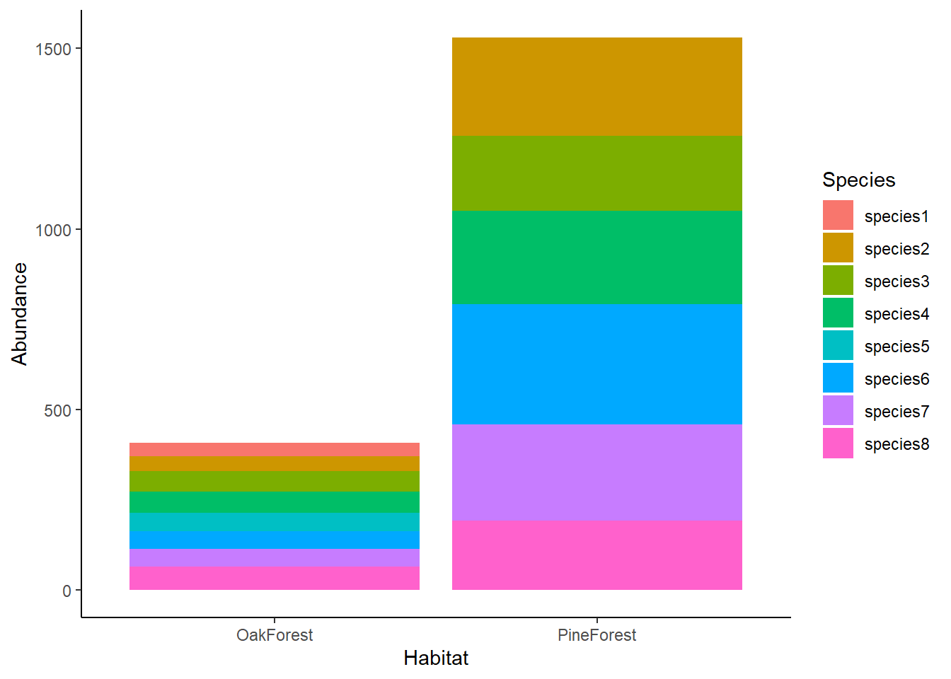
We can see in our barplot that the abundance of species in the Oak Forest is lower than the Pine Forest. We can also see that species1 and species5 are not present in the Pine Forest community but are present in the Oak Forest. Visually, we see that there are differences between our Oak and Pine forest sites, but it is still difficult to compare the communities across sites. For this, we are going use NMDS.
Community matrix & distance index
To run NMDS using the vegan package, we will need to first do some data cleaning and turn our data frame into a community matrix where our species are the row names, sites are column names, and our values are species abundances. Essentially, we are going to pivot the data frame from a long format to a wide format.
We will first create factors of our Sites, Species, and Habitat columns. Then, we will create a community matrix using pivot_wider() before finally changing the column df$Site to a rowname with column_to_rownames().
com_matrix <- df %>%

  # Turn our Site, Species, and Forest columns into factors
  mutate_at(vars(Site), as.factor) %>%

  # pivot to wide format
  pivot_wider(names_from = Species,
              values_from = Abundance) %>%

  # change our column "site" to our rownames
  column_to_rownames(var = "Site")
head(com_matrix)
         Habitat species1 species2 species3 species4 species5 species6 species7
site1 PineForest        0       38        0       33        0       42       13
site2 PineForest        0       32       20       20        0       45        9
site3 PineForest        0       14       20       36        0       24       45
site4 PineForest        0       33       41       24        0       14       32
site5 PineForest        0        5        9       41        0       46       19
site6 PineForest        0       43       22        5        0       43       24
      species8
site1       17
site2        6
site3       36
site4       19
site5       27
site6        5
Now we have a community matrix that we can use to run our NMDS analysis. Since we have abundance data and want to look at community dissimilarity between our Pine Forest and Oak Forest habitats, we are going use the Bray-Curtis dissimilarity index as our distance measure to see how dissimilar sites are based on species found. Bray-Curtis ranges from 0-1. A score of 0 means that samples have no dissimilarity (the samples are the same) and a score of 1 means that samples are perfectly dissimilar (the samples do not share any of the same species).
Run NMDS
We are ready to run our NMDS ordination using the metaMDS() function in the vegan package. We will specify our community matrix data frame (com_matrix) calling the columns containing abundance data, the number of dimensions to use (k = 2), and the distance measure (Bray-Curtis).
nmds <-
  metaMDS(com_matrix[,2:9],
          distance = "bray",
          k = 2)
print(nmds)
Call:
metaMDS(comm = com_matrix[, 2:9], distance = "bray", k = 2)
global Multidimensional Scaling using monoMDS
Data:     wisconsin(com_matrix[, 2:9])
Distance: bray
Dimensions: 2
Stress:     0.09719682
Stress type 1, weak ties
Best solution was repeated 7 times in 20 tries
The best solution was from try 0 (metric scaling or null solution)
Scaling: centring, PC rotation, halfchange scaling
Species: expanded scores based on 'wisconsin(com_matrix[, 2:9])'
Notably, we have a stress value of 0.09 which tells us that our ordination is a good fit. Stress is how we can evaluate the fit of our ordination. Let’s take a closer look at what stress means.
Stress & scree plots
The stress value falls between 0-1 and essentially tells us how well the data ‘fits’. A lower stress value indicates a better fit. It is generally accepted that a stress value below 0.2 is a fair fit of the ordination, and the commonly accepted guidelines for stress interpretation are:
| Stress | Fit | Description |
|---|---|---|
| <0.05 | Excellent | considered best for NMDS interpretation |
| <0.1 | Good | good ordination with little risk of misinterpreation |
| <0.2 | Fair | usable but higher values approach poor interpretation |
| >0.2 | Poor | poorly represents the data |
Researchers have debated these general guidelines since stress values do not take into account the relationship between ordination stress and sample size (see Dexter & Bollens, 2018). So, how is stress calculated then? Stress is the residuals from points around an increasing monotonic regression line. We can visualize this using a Shepard diagram by calling the function stressplot().
stressplot(nmds)
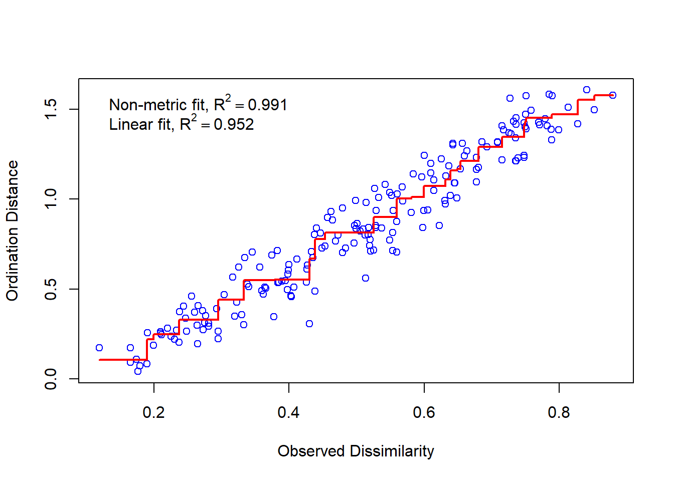
On our x axis we have the dissimilarity or distance in our full dataset (all dimensions or attributes considered) and the y axis shows the distance in ordination space (our reduced, 2-dimensional space since we set k = 2). If we had a perfect fit, all the points would fall along an increasing monotonic line, represented in this plot by the increasing red line. As we would increase the ordination distance, the observed distance would also increase.
The more dimensions (k) that you have, the lower the stress value will be. This is because having more dimensions reduces constraints on the distances of the data. In other words, a higher number of dimensions allows the data to be ‘projected’ closer to the original data. You might be thinking that if adding more dimensions gives us a better fit, why do we generally aim in practice to only use 2 or 3 dimensions in our NMDS ordination? Remember, the goal of our NMDS ordination is being able to increase interpretation which we do by reducing the number of dimensions—lower dimensions are easier to interpret.
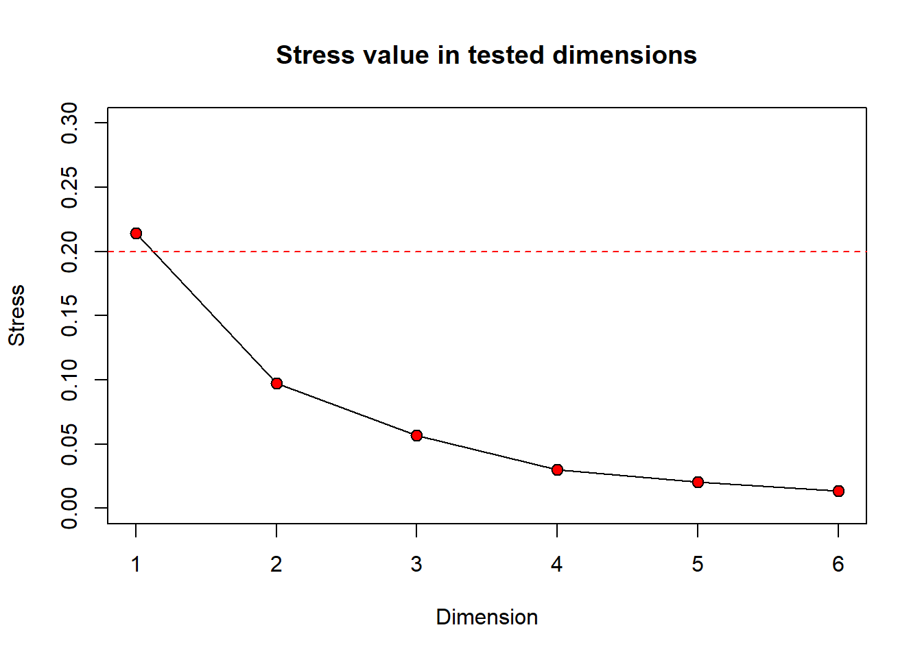
Still wondering how different numbers of dimensions will change your stress value? You can take a look at a scree plot which can be used to look at the number of dimensions (interpretability) versus the stress value. Generally, there is some point at which increasing the number of dimensions produces little return on lowering the stress value. We can look for a ‘bend’ or ‘breakpoint’ in the plot to see this. Let’s take a look at a scree plot using the dimcheckMDS() function from the goeveg package.
dimcheck_out <-
  dimcheckMDS(com_matrix[,2:9],
              distance = "bray",
              k = 6)
We will also print the output to obtain the stress values associated with each dimension by calling dimcheck_out.
print(dimcheck_out)
[1] 0.21409852 0.09719682 0.05687690 0.03020151 0.02054807 0.01334323
From the Shepard plot and stress values, we can see that as we increase the number of dimensions from 1 to 2, our stress value goes down by ~0.12. After this, increasing the number of dimensions does not return a large change on the stress value.
Create ordination
Now, let’s generate a plot of our NMDS ordination. Using the plot() command, each black circle represents one of our 20 sites while each red x represents one of our 8 species.
plot(nmds)
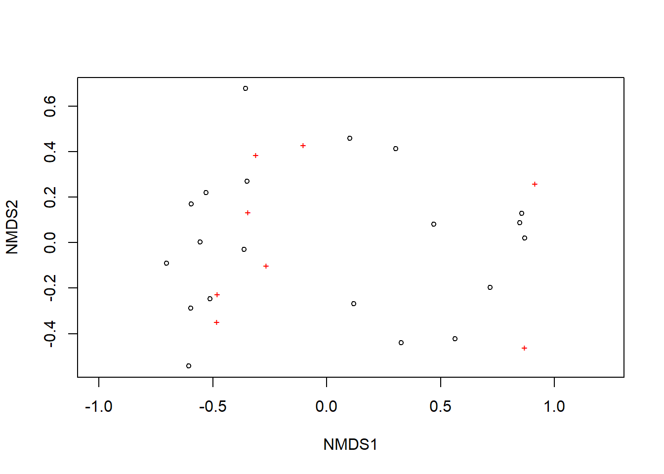
We can see there are two relatively distinct areas of points on our plot with one cluster on the left and one cluster on the right. Remember, we are looking at the relative distances of points or how close or far apart points on the ordination are. Let’s add more information to this plot so it is easier to interpret. We are going to do this with ggplot2. First, we need to gather a few components to create the ordination.
Since we want to look at our ordination by habitat, we need to know what sites are in the Pine Forest and what sites are in the Oak Forest. We are going to do this by going to our original data frame, df, and getting the habitats for each site.
# get habitat type
  habitat_type <- df %>%
    distinct(Site, Habitat)
We are now going to extract the NMDS scores so we that can plot them. We will also get the scores for each of the species that we collected.
# Extract NMDS scores for sites
  nmds_SiteScores <-
    # get nmds scores
    as.data.frame(scores(nmds)$sites) %>%
    # change rownames (site) to a column
    rownames_to_column(var = "Site") %>%
    # join our habitat type (grouping variable) to each site
    left_join(habitat_type)
# Extract NMDS scores for species
  nmds_SpeciesScores <-
    as.data.frame(scores(nmds, "species"))

# create a column of species, from the rownames of species.scores
  nmds_SpeciesScores$species <- rownames(nmds_SpeciesScores)
Let’s go ahead and plot this.
ggplot() +

  # add site scores
  geom_point(data = nmds_SiteScores,
             aes(x=NMDS1, y=NMDS2, colour = Habitat),
             size = 2) +

  # add species scores
  geom_text(data = nmds_SpeciesScores,
            aes(x=NMDS1, y=NMDS2, label = species)) +

  theme_classic()
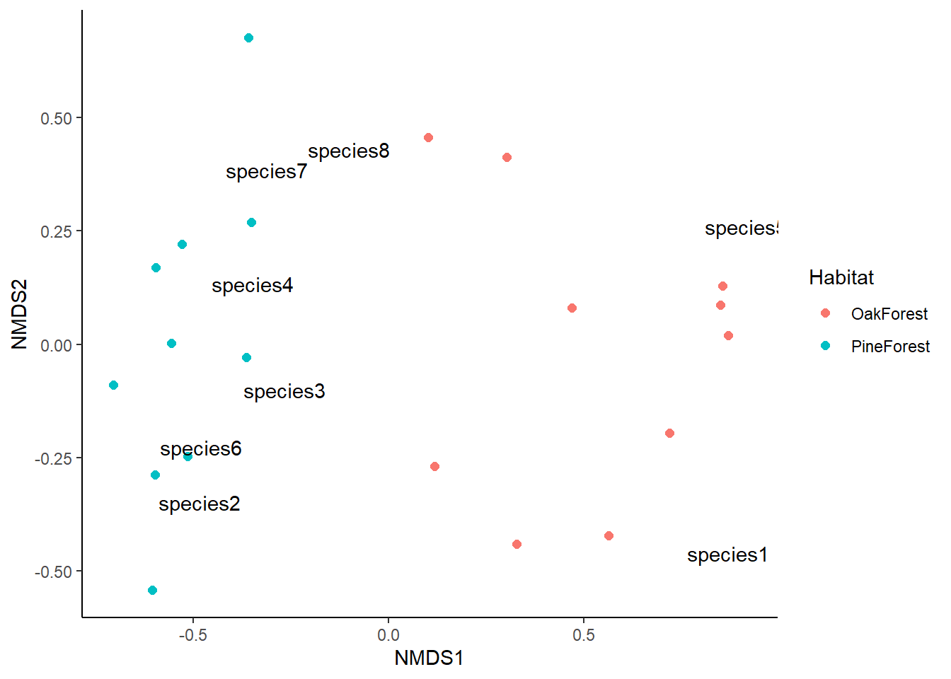
This looks great, but we can add more information to make it easier to visualize. We are going to plot the centroid or mean value for our grouping variable; in this case we will plot the mean of both the Pine Forest and Oak Forest.
# get centroid
Habitat_Centroid <-
  nmds_SiteScores %>%
  group_by(Habitat) %>%
    summarise(axis1 = mean(NMDS1),
              axis2 = mean(NMDS2)) %>%
  ungroup()
We will also plot a convex hull that intersects all points in each of our communities. We do this by calculating a convex hull with chull() for each of our Habitat types. First, we’ll group by Habitat type. We then use chull() to get the indices of points in nmds_SiteScores$NMDS1 and nmds_SiteScores$NMDS2 and slice() to subset rows obtained by chull().
# extract convex hull
  habitat.hull <-
    nmds_SiteScores %>%
    group_by(Habitat) %>%
    slice(chull(NMDS1, NMDS2))
Lastly, we are going to gather the stress value from nmds so that we can add it to our ordination.
nmds_stress <- nmds$stress
Now we have all the components for our ordination. Let’s go ahead and create the plot. Our axis labels are arbitrary so they can be removed. This is because NMDS does not use eigenanalysis, so the axes of the plot cannot be interpreted and we instead use the relative position of points on the plot. For this reason, the ordination can be rotated or inverted as long as the relative position of points is maintained.
# use ggplot to plot
  ggplot() +

  # add site scores
  geom_point(data = nmds_SiteScores,
             aes(x=NMDS1, y=NMDS2, colour = Habitat), size = 2) +

  # add species scores
  geom_text(data = nmds_SpeciesScores,
            aes(x=NMDS1, y=NMDS2, label = species)) +

  # add centroid
  geom_point(data = Habitat_Centroid,
             aes(x = axis1, y = axis2, color = Habitat),
             size = 5, shape = 17) +

  # add convex hull
  geom_polygon(data = habitat.hull,
               aes(x = NMDS1, y = NMDS2, fill = Habitat, group = Habitat),
               alpha = 0.30) +

  # add stress value
  annotate("text", x = 0.75, y = 0.65,
           label = paste("2d stress =", round(nmds_stress, 3))) +
  # edit theme
  labs(x = "NMDS1", y = "NMDS2") +
  theme(axis.text = element_blank(), axis.ticks = element_blank(),
        panel.background = element_rect(fill = "white"),
        panel.border = element_rect(color = "black",
                                    fill = NA, linewidth = .5),
        axis.line = element_line(color = "black"),
        plot.title = element_text(hjust = 0.5),
        legend.key.size = unit(.25, "cm"))
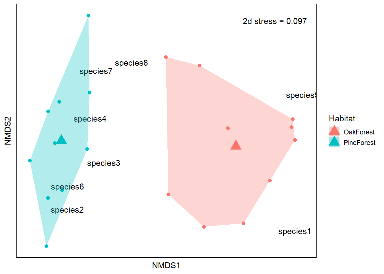
From our NMDS plot, we see that the community composition of our Pine Forest and Oak Forest habitats are dissimilar. We also see that species1 and species5 are more associated with the Oak forest habitat. If we remember from our data, species1 and species5 are only present in the Oak Forest while the abundance of species 2, 3, 4, 6, 7 and 8 is higher in our Pine Forest habitat. Finally, we visually observe that the Oak Forest has a higher spread of points.
R session details
The analysis was done using the R Statistical language (v4.5.1; R Core Team, 2025) on Windows 11 x64, using the packages lubridate (v1.9.4), tibble (v3.3.0), vegan (v2.7.1), permute (v0.9.8), goeveg (v0.7.6), ggplot2 (v3.5.2), forcats (v1.0.0), stringr (v1.5.1), tidyverse (v2.0.0), dplyr (v1.1.4), purrr (v1.1.0), readr (v2.1.5), tidyr (v1.3.1) and kableExtra (v1.4.0).
References
- Bakker, J. (2023). Applied multivariate statistics in R. Pressbooks.
- Clarke, K. R. (1993). Non‐parametric multivariate analyses of changes in community structure. Australian Journal of Ecology, 18(1), 117–143. https://doi.org/10.1111/j.1442-9993.1993.tb00438.x.
- Dexter, E., Rollwagen‐Bollens, G., & Bollens, S. M. (2018). The trouble with stress: A flexible method for the evaluation of nonmetric multidimensional scaling. Limnology and Oceanography: Methods, 16(7), 434–443. https://doi.org/10.1002/lom3.10257.
- Dubé, C. E., Ziegler, M., Mercière, A., Boissin, E., Planes, S., Bourmaud, C. A.-F., & Voolstra, C. R. (2021). Naturally occurring fire coral clones demonstrate a genetic and environmental basis of microbiome composition. Nature Communications, 12(1), 6402. https://doi.org/10.1038/s41467-021-26543-x.
- Everitt, B. S., & Dunn, G. (2001). Applied multivariate data analysis (1st ed.). Wiley. https://doi.org/10.1002/9781118887486.
- Legendre, L., & Legendre, P. (2012). Numerical ecology. Elsevier.
- Oksanen, J., Simpson, G., Blanchet, F., Kindt, R., Legendre, P., Minchin, P., O’Hara, R., Solymos, P., Stevens, M., Szoecs, E., Wagner, H., Barbour, M., Bedward M, Bolker B, Borcard D, Carvalho G, Chirico M, De Caceres M, Durand S, Evangelista H.,…Weedon, J. (2022). vegan: Community Ecology Package. https://CRAN.R-project.org/package=vegan.
- R Core Team (2022). R: A language and environment for statistical computing. R Foundation for Statistical Computing, Vienna, Austria. https://www.R-project.org/.
- Spoon, J., Gerkey, D., Chhetri, R. B., Rai, A., & Basnet, U. (2020). Navigating multidimensional household recoveries following the 2015 Nepal earthquakes. World Development, 135, 105041. https://doi.org/10.1016/j.worlddev.2020.105041.
- Wickham H, Averick M, Bryan J, Chang W, McGowan LD, François R, Grolemund G, Hayes A, Henry L, Hester J, Kuhn M, Pedersen TL, Miller E, Bache SM, Müller K, Ooms J, Robinson D, Seidel DP, Spinu V, Takahashi K, Vaughan D, Wilke C, Woo K, Yutani H (2019). “Welcome to the tidyverse.” Journal of Open Source Software, 4(43), 1686. https://doi.org/10.21105/joss.01686.
- von Lampe, F., Schellenberg, J. (2023). goeveg: Functions for Community Data and Ordinations. https://CRAN.R-project.org/package=goeveg.
Lauren Brideau
StatLab Associate
University of Virginia Library
November 20, 2023
For questions or clarifications regarding this article, contact statlab@virginia.edu.
View the entire collection of UVA Library StatLab articles, or learn how to cite.