
A count model is a linear model where the dependent variable is a count. For example, the number of times a car breaks down, the number of rats in a litter, the number of times a young student gets out of his seat, etc. Counts are either 0 or a positive whole number, which means we need to use special distributions to generate the data.
The Poisson Distribution
The most common count distribution is the Poisson distribution. It generates whole numbers greater than or equal to 0. It has one parameter, the mean, which is usually symbolized as \(\lambda\) (lambda). The Poisson distribution has the unique property that its mean and variance are equal. We can simulate values from a Poisson model in R using the rpois() function. Use the lambda argument to set the mean. Below we generate 500 values from a distribution with lambda = 4:
y <- rpois(n = 500, lambda = 4)
table(y)
y
  0   1   2   3   4   5   6   7   8   9  10
  7  34  76  86 110  85  54  28  11   6   3
barplot(table(y))
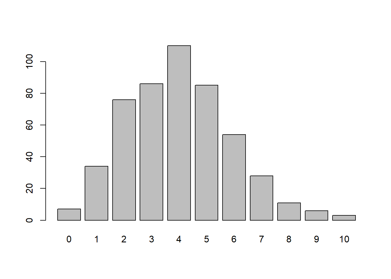
mean(y)
[1] 4.002
var(y)
[1] 3.59719
Notice the mean and variance are similar. With larger values of n we’ll see them grow closer and closer together.
Now let’s say we want to generate a simple model that generates different counts based on whether you’re a male or female. Here’s one way to accomplish that:
set.seed(3)
n <- 500
male <- sample(c(0,1), size = n, replace = TRUE)
y_sim <- rpois(n = n, lambda = exp(-2 + 0.5 * (male == 1)))
Notice we used rpois() again but this time the mean is conditional on whether or not you’re a male. If you’re female, lambda is exp(-2). If you’re male, lambda is exp(-1.5). Why use the exp() function? Because that ensures lambda is positive. We could have just used positive numbers to begin with, but as we’ll see, modeling count data with a generalized linear model will default to using log as the link function which assumes our original model was exponentiated.
Here’s a quick table of the counts we generated.
table(y_sim, male)
     male
y_sim   0   1
    0 218 196
    1  29  44
    2   2  10
    3   1   0
We can already see more instances of males having higher counts, as we would expect since we have a positive coefficient for males in the model.
Let’s fit a model to our count data using the glm() function. How close can we get to recovering the “true” values of -2 and 0.5? We have to specify family = poisson since we’re modeling count data.
m1 <- glm(y_sim ~ male, family = poisson)
summary(m1)
Call:
glm(formula = y_sim ~ male, family = poisson)

Coefficients:
            Estimate Std. Error z value Pr(>|z|)
(Intercept)  -1.9379     0.1667 -11.628  < 2e-16 ***
male          0.5754     0.2083   2.762  0.00575 **
---
Signif. codes:  0 '***' 0.001 '**' 0.01 '*' 0.05 '.' 0.1 ' ' 1

(Dispersion parameter for poisson family taken to be 1)

    Null deviance: 361.75  on 499  degrees of freedom
Residual deviance: 353.80  on 498  degrees of freedom
AIC: 538.16

Number of Fisher Scoring iterations: 6
Notice the coefficients in the summary are pretty close to what we specified in our model. We generated the data with a coefficient of 0.5 for males. The model estimated a coefficient of 0.57. The basic interpretation is that being male increases the log of expected counts by 0.57. That’s not easy to understand. If we exponentiate we get a multiplicative interpretation.
exp(0.57)
[1] 1.768267
The interpretation now is that the expected count is about 1.77 times greater for males, or a 77% increase.
What if we wanted to generate data in which the expected count was 2 times greater for males? Using some trial and error we find that exp(0.7) is about 2.
exp(0.7)
[1] 2.013753
Therefore we could do the following to simulate such data:
set.seed(4)
n <- 500
male <- sample(c(0,1), size = n, replace = TRUE)
y_sim <- rpois(n = n, lambda = exp(-2 + 0.7 * (male == 1)))
And as expected, the expected count is about twice as high for males.
m1 <- glm(y_sim ~ male, family = poisson)
exp(coef(m1)['male'])
    male
2.149378
What kind of counts does this model simulate? First let’s look at our original data:
dat <- data.frame(y_sim, male)
library(ggplot2)
ggplot(dat, aes(x = y_sim)) +
  geom_bar() +
  facet_wrap( ~male) +
  labs(title = "Original Data")
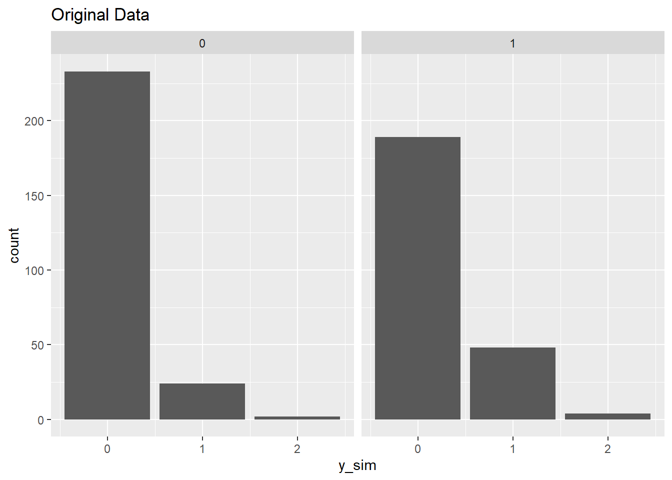
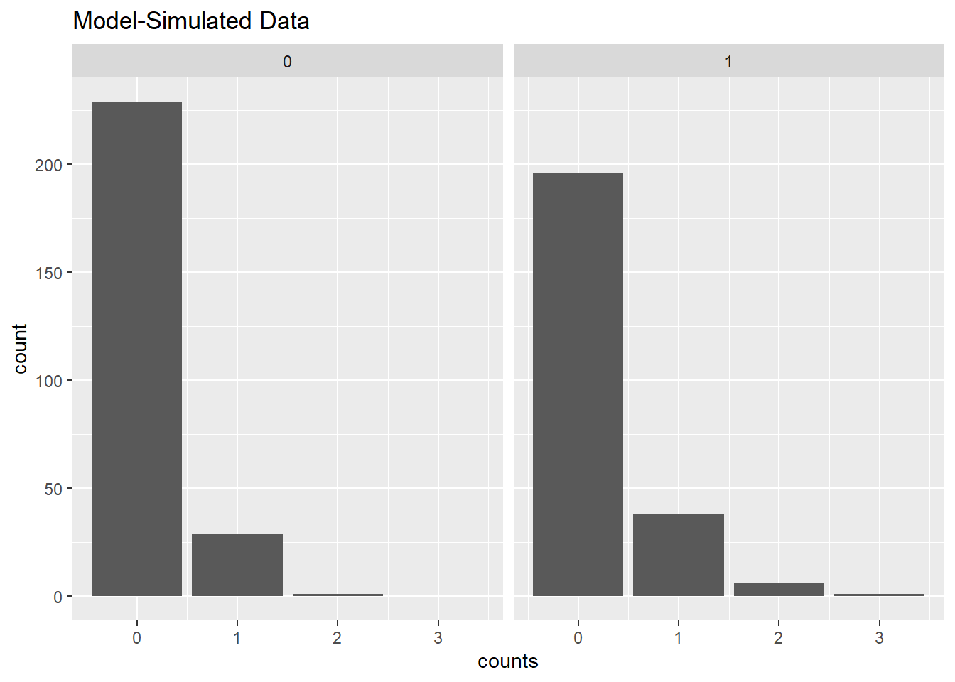
Now let’s generate counts using our model. There are two ways we can go about this. Recall that a count model returns the expected count. That would be the lambda in a Poisson model. Using the expected count for females and males, we can randomly generate counts. Notice our model-simulated counts include a few instances of 3s, which were not in our original data.
p.out <- predict(m1, type = "response")
counts <- rpois(n = n, lambda = p.out)
dat2 <- data.frame(counts, male)
ggplot(dat2, aes(x = counts)) +
  geom_bar() +
  facet_wrap(~ male)+
  labs(title = "Model-Simulated Data")
A second way to use the model to generate counts is to use the expected counts for males and females to generate probabilities for various counts, and then generate the counts by multiplying the probabilities by the original number of males and females. Below we use the dpois() function to calculate the expected probabilities of 0, 1, and 2 counts using the model generated male and female lambda values. We then multiply those probabilities by the number of females and males. That gives us expected number of 0, 1, and 2 counts for each gender. Since the expected counts have decimals, we use the round function to convert them to whole numbers when we create our data frame. We then make the plot using geom_col() instead of geom_bar() since we want the heights of the bars to represent values in the data frame.
# expected counts for females (0) and males (1)
p.out <- predict(m1, type = "response",
                 newdata = data.frame(male = c(0,1)))

# expected number of 0, 1, and 2 counts for females and males
female_fit <- dpois(0:2,lambda = p.out[1]) * sum(male == 0)
male_fit <- dpois(0:2,lambda = p.out[2]) * sum(male == 1)

# place in data frame
dat3 <- data.frame(male = rep(c(0,1), each = 3),
                   count = round(c(female_fit, male_fit)),
                   counts = rep(0:2, 2))

ggplot(dat3, aes(x = counts, y = count)) +
  geom_col() +
  facet_wrap(~ male) +
  labs(title = "Model-Simulated Data")

The result is almost indistinguishable from our original data. This is what we expect. We created the model to generate the data, and then fit the exact same model to the data we generated to recover the original parameters. This may seem like a pointless exercise, but it ensures we understand our count model. If we know how to generate data from a count model, then we know how to interpret a count model fit to data.
An easier way to check model fit is to create a rootogram. We can do this using the rootogram() function in the topmodels package. We specify plot = "base" to ensure the plot is created using base R graphics. The default is to use the ggplot2 package if available.
# Need to install from R-Forge instead of CRAN
# install.packages("topmodels", repos = "https://R-Forge.R-project.org")
topmodels::rootogram(m1, plot = "base")

The red dots at the tops of the bars are the expected frequencies of the counts given the model. The red line shows the fitted frequencies as a smooth curve. The bars "hanging" from the expected counts are the observed counts. If a bar touches the line at 0, that means the model-predicted count matches the observed count. Bars hanging above the line at 0 mean the model-predicted count is higher than the observed count, and the model is thus over-predicting those counts. Likewise, bars hanging below the line at 0 mean the model-predicted count is lower than the observed count, and the model is thus under-predicting those counts. The counts are plotted on the square-root scale to help visualize smaller frequencies. The dashed-line at -1 and +1 is a "rule of thumb" confidence interval due to John Tukey (Kleiber and Zeileis 2016). This helps us gauge how well our model is generating counts similar to what we observed. We feel good in this case since all of the bars are hanging within these confidence limits. In a moment we’ll see some rootograms that clearly identify an ill-fitting model.
The Negative-Binomial Distribution
The Poisson distribution assumes that the mean and variance are equal. This is a very strong assumption. A count distribution that allows the mean and variance to differ is the Negative Binomial distribution. Learning about the negative binomial distribution allows us to generate and model more general types of counts.
The variance of the negative binomial distribution is a function of its mean and a dispersion parameter, k:
\[var(Y) = \mu + \mu^{2}/k\] Sometimes k is referred to as \(\theta\) (theta). As k grows large, the second part of the equation approaches 0 and converges to a Poisson distribution.
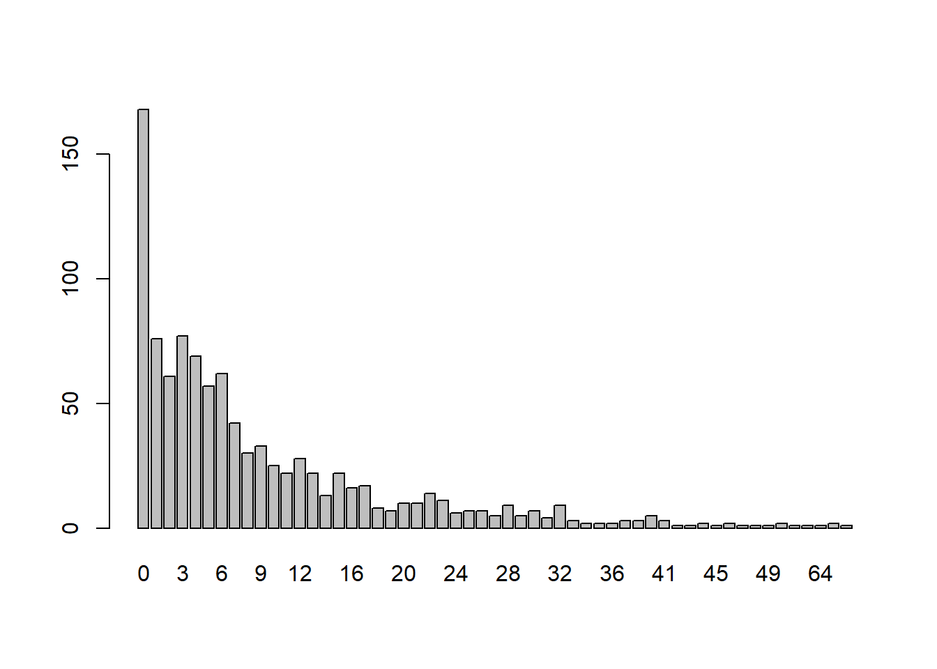
We can generate data from a negative binomial distribution using the rnbinom() function. Instead of lambda, it has a mu argument. The dispersion parameter, k, is specified with the size argument. Below we generate 500 values from a negative binomial distribution with mu = 4 and k = 5:
y <- rnbinom(n = 500, mu = 4, size = 5)
table(y)
y
 0  1  2  3  4  5  6  7  8  9 10 11 12 16
26 70 66 75 82 58 43 30 20 15  6  6  2  1
barplot(table(y))
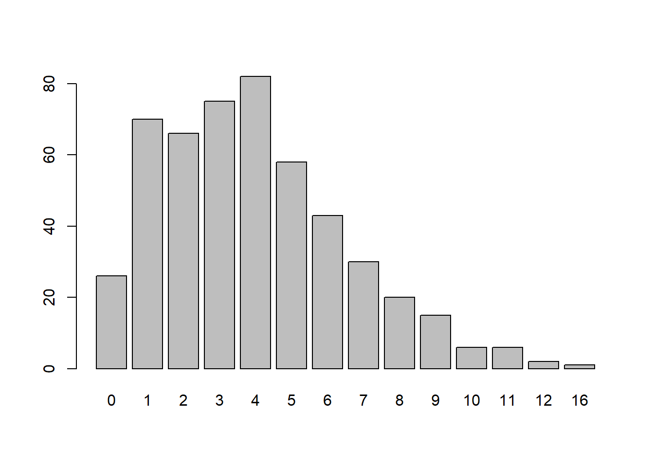
mean(y)
[1] 3.948
var(y)
[1] 6.734766
We see the variance is a good deal larger than the mean. Because of this we often say the distribution exhibits overdispersion.
Once again let’s generate a simple model that produces different counts based on whether you’re a male or female. Here’s one way to accomplish that using the same model as before, but this time with a dispersion parameter that we’ve set to 0.05. (Since the dispersion parameter is in the denominator, smaller values actually lead to more dispersion.)
set.seed(5)
n <- 500
male <- sample(c(0,1), size = n, replace = TRUE)
y_sim <- rnbinom(n = n,
                 mu = exp(-2 + 0.7 * (male == 1)),
                 size = 0.05)
A quick call to table shows us how the counts break down:
table(y_sim, male)
     male
y_sim   0   1
   0  236 222
   1   13   6
   2    4   4
   3    2   4
   4    1   1
   5    1   2
   6    0   3
   11   0   1
We know we generated the data using a negative binomial distribution, but let’s first fit it with a Poisson model and see what we get.
m2 <- glm(y_sim ~ male, family = poisson)
summary(m2)
Call:
glm(formula = y_sim ~ male, family = poisson)

Coefficients:
            Estimate Std. Error z value Pr(>|z|)
(Intercept)  -1.9656     0.1667 -11.793  < 2e-16 ***
male          0.7066     0.2056   3.437 0.000589 ***
---
Signif. codes:  0 '***' 0.001 '**' 0.01 '*' 0.05 '.' 0.1 ' ' 1

(Dispersion parameter for poisson family taken to be 1)

    Null deviance: 577.19  on 499  degrees of freedom
Residual deviance: 564.71  on 498  degrees of freedom
AIC: 677.76

Number of Fisher Scoring iterations: 7
The model certainly looks “significant”. The estimated coefficients are not too far off from the “true” values of -2 and 0.5. But how does this model fit? Let’s make a rootogram.
topmodels::rootogram(m2, plot = "base")
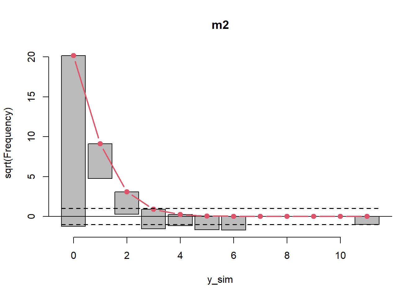
That doesn’t look good. The Poisson model underfits 0 and 3 counts and way overfits 1 counts.
Now let’s fit the appropriate model. For this we need to load the MASS package which provides the glm.nb() function for fitting negative binomial count models.
library(MASS)
m3 <- glm.nb(y_sim ~ male)
summary(m3)
Call:
glm.nb(formula = y_sim ~ male, init.theta = 0.06023302753, link = log)

Coefficients:
            Estimate Std. Error z value Pr(>|z|)
(Intercept)  -1.9656     0.3039  -6.467    1e-10 ***
male          0.7066     0.4186   1.688   0.0914 .
---
Signif. codes:  0 '***' 0.001 '**' 0.01 '*' 0.05 '.' 0.1 ' ' 1

(Dispersion parameter for Negative Binomial(0.0602) family taken to be 1)

    Null deviance: 120.69  on 499  degrees of freedom
Residual deviance: 117.84  on 498  degrees of freedom
AIC: 433.23

Number of Fisher Scoring iterations: 1

              Theta:  0.0602
          Std. Err.:  0.0137

 2 x log-likelihood:  -427.2270
Notice the coefficients are identical to the Poisson model but the standard errors are much larger. Also notice we get an estimate for “Theta”. That’s the model’s estimated dispersion parameter. It’s not too far off from the “true” value of 0.05. How does the rootogram look?
topmodels::rootogram(m3, plot = "base")

Much better! Not perfect but definitely better than what we saw with the Poisson model. The AIC for the negative binomial model is also much lower than the Poisson model (433 vs 677). It’s always a good idea to evaluate multiple pieces of information when comparing models.
The Zero-Inflated Negative-Binomial Model
The negative-binomial distribution allows us to model counts with overdispersion (i.e., variance is greater than the mean). But we often see another phenomenon with counts: excess zeros. This occurs in populations where some subjects will never perform or be observed experiencing the activity of interest. Think of modeling the number of servings of meat people eat in a day. There will likely be excess zeros because many people simply don’t eat meat. We have a mixture of populations: people who never eat meat, and those that do but will sometimes eat no meat in a given day. That leads to an inflation of zeros.
We can simulate such data by mixing distributions. Below we first simulate a series of ones and zeros from a binomial distribution. The probability is set to 0.9, which implies that about 0.1 of the data will be zeros. We then simulate data from a negative binomial distribution based on the binomial distribution. If the original data was 0 from the binomial distribution, it remains a 0. Otherwise we sample from a negative binomial distribution, which could also be a 0.1 Think of this distribution as the meat-eaters. Some of them will occasionally not eat meat in a given day. Finally we plot the data and note the spike of zeros.
set.seed(6)
n <- 1000
male <- sample(c(0,1), size = n, replace = TRUE)
z <- rbinom(n = n, size = 1, prob = 0.9)
# mean(z == 0)
y_sim <- ifelse(z == 0, 0,
                rnbinom(n = n,
                        mu = exp(1.3 + 1.5 * (male == 1)),
                        size = 2))
# table(y_sim, male)
barplot(table(y_sim))
Going the other direction, if we wanted to model such data (i.e., get some estimate of the process that generated the data) we would use a zero-inflated model. The pscl package provides a function that helps us do this called zeroinfl(). It works like the glm() and glm.nb() functions but the formula accommodates two specifications: one for the process generating counts (including possible zeros) and the other for the process generating just zeros. The latter is specified after the pipe symbol |. We also have to specify the count distribution we suspect models the data. Below would be the correct model since it matches how we simulated the data. The first half of the formula is the process for the counts. We include male because mu was conditional on male. After the pipe, we just include the number 1, which means fit an intercept only. That’s correct, because the probability of zero was not conditional on anything.
# install.packages("pscl")
library(pscl)
m4 <- zeroinfl(y_sim ~ male | 1, dist = "negbin")
summary(m4)
Call:
zeroinfl(formula = y_sim ~ male | 1, dist = "negbin")

Pearson residuals:
    Min      1Q  Median      3Q     Max
-1.1500 -0.7180 -0.1301  0.4628  5.8656

Count model coefficients (negbin with log link):
            Estimate Std. Error z value Pr(>|z|)
(Intercept)  1.35238    0.04551  29.714   <2e-16 ***
male         1.42124    0.05709  24.894   <2e-16 ***
Log(theta)   0.69064    0.07192   9.602   <2e-16 ***

Zero-inflation model coefficients (binomial with logit link):
            Estimate Std. Error z value Pr(>|z|)
(Intercept)  -2.0947     0.1334  -15.71   <2e-16 ***
---
Signif. codes:  0 '***' 0.001 '**' 0.01 '*' 0.05 '.' 0.1 ' ' 1

Theta = 1.995
Number of iterations in BFGS optimization: 9
Log-likelihood: -3007 on 4 Df
In the summary we see we came close to recovering the true parameters of 1.3 and 1.5 we used in the rnbinom() function. The summary returns a logged version of theta. If we exponentiate we see that we also came close to recovering the “true” dispersion parameter of 2. (Theta is also available at the bottom of the summary.)
exp(0.69065)
[1] 1.995012
The bottom half of the summary shows the estimated model for the zero generating process. This is a logistic regression model. The intercept is on the log-odds scale. To convert that to probability we can take the inverse logit, which we can do with the plogis() function. We see that it comes very close to recovering the “true” probability of a zero:
plogis(-2.0947)
[1] 0.109613
We can also use a rootogram to assess model fit:
topmodels::rootogram(m4, plot = "base")

The resulting plot looks pretty good. The red line is our mixture model. We see that our model accommodates the inflated zeros and then tapers down to accommodate the overdispersed count data.
What happens if we fit a zero-inflated model but misspecify the distribution? Let’s find out. Below we use zeroinfl() with a Poisson distribution.
m5 <- zeroinfl(y_sim ~ male | 1, dist = "poisson")
summary(m5)
Call:
zeroinfl(formula = y_sim ~ male | 1, dist = "poisson")

Pearson residuals:
    Min      1Q  Median      3Q     Max
-1.9408 -1.0843 -0.2559  0.9142 10.4785

Count model coefficients (poisson with log link):
            Estimate Std. Error z value Pr(>|z|)
(Intercept)  1.46640    0.02563   57.21   <2e-16 ***
male         1.31893    0.02814   46.88   <2e-16 ***

Zero-inflation model coefficients (binomial with logit link):
            Estimate Std. Error z value Pr(>|z|)
(Intercept) -1.65062    0.08837  -18.68   <2e-16 ***
---
Signif. codes:  0 '***' 0.001 '**' 0.01 '*' 0.05 '.' 0.1 ' ' 1

Number of iterations in BFGS optimization: 6
Log-likelihood: -4303 on 3 Df
The summary looks good if we go by stars. But there’s not much there to assess model fit. Again the rootogram is an invaluable visual aid.
topmodels::rootogram(m5, plot = "base")

Although we have a good model for the inflated zeros, our count model is lacking as indicated by the wavy pattern of alternating instances of over and underfitting.
We could also generate counts where both processes depend on being male. Below we use a logistic regression model to generate probabilities of zero. (See our post Simulating a Logistic Regression Model for more information.) If you’re female the probability of a 0 count is about 0.69. For males, the probability is about 0.27. Then we generate counts using a negative-binomial model as before.
set.seed(7)
n <- 1000
male <- sample(c(0,1), size = n, replace = TRUE)
z <- rbinom(n = n, size = 1,
            prob = 1/(1 + exp(-(-0.8 + 1.8 * (male == 1)))))
y_sim <- ifelse(z == 0, 0,
                rnbinom(n = n,
                        mu = exp(1.3 + 1.5 * (male == 1)),
                        size = 2))
The correct model to recover the “true” values needs to include male in both formulas, as demonstrated below:
m6 <- zeroinfl(y_sim ~ male | male, dist = "negbin")
summary(m6)
Call:
zeroinfl(formula = y_sim ~ male | male, dist = "negbin")

Pearson residuals:
    Min      1Q  Median      3Q     Max
-0.9378 -0.4626 -0.4626  0.3721  5.5882

Count model coefficients (negbin with log link):
            Estimate Std. Error z value Pr(>|z|)
(Intercept)  1.35609    0.08008  16.934  < 2e-16 ***
male         1.43752    0.08901  16.150  < 2e-16 ***
Log(theta)   0.63396    0.08589   7.381 1.57e-13 ***

Zero-inflation model coefficients (binomial with logit link):
            Estimate Std. Error z value Pr(>|z|)
(Intercept)   0.7761     0.1106   7.018 2.25e-12 ***
male         -1.8474     0.1507 -12.257  < 2e-16 ***
---
Signif. codes:  0 '***' 0.001 '**' 0.01 '*' 0.05 '.' 0.1 ' ' 1

Theta = 1.8851
Number of iterations in BFGS optimization: 9
Log-likelihood: -2310 on 5 Df
Once again we come close to getting back the “true” values we used to simulate the data. The bottom half of the summary says that females have about a 68% percent chance of always being 0.
plogis(0.7761)
[1] 0.684839
Adding the male coefficient allows us to get the expected probability that a male is always a 0 count, about 26%.
plogis(0.7761 + -1.8474)
[1] 0.2551559
These are close to the “true” probabilities we assigned in the logistic regression model:
# female
1 - 1/(1 + exp(-(-0.8)))
[1] 0.6899745
# male
1 - 1/(1 + exp(-(-0.8 + 1.8)))
[1] 0.2689414
Try fitting some “wrong” models to the data and review the rootograms to see the lack of fit.
Hopefully you now have a little better understanding of how to simulate and model count data. For additional reading, see our other blog posts, Getting Started with Negative Binomial Regression Modeling and Getting Started with Hurdle Models.
R session details
The analysis was done using the R Statistical language (v4.5.1; R Core Team, 2025) on Windows 11 x64, using the packages pscl (v1.5.9), MASS (v7.3.65), ggplot2 (v4.0.0) and topmodels (v0.3.0).
References
- Kleiber C, Zeileis A (2016). “Visualizing Count Data Regressions Using Rootograms.” The American Statistician, 70(3), 296-303. doi:10.1080/00031305.2016.1173590 https://doi.org/10.1080/00031305.2016.1173590.
- R Core Team (2019). R: A Language and Environment for Statistical Computing. R Foundation for Statistical Computing, Vienna, Austria. https://www.R-project.org/.
- Venables W & Ripley B (2002) Modern Applied Statistics with S. Fourth Edition. Springer, New York. ISBN 0-387-95457-0
- Zeileis A, Kleiber C, Jackman S (2008). Regression Models for Count Data in R. Journal of Statistical Software 27(8). URL http://www.jstatsoft.org/v27/i08/.
- Zeileis A, Lang MN, Stauffer R (2024). topmodels: Infrastructure for Forecasting and Assessment of Probabilistic Models. R package version 0.3-0/r1791, https://R-Forge.R-project.org/projects/topmodels/.
Clay Ford
Statistical Research Consultant
University of Virginia Library
August 29, 2019
Updated May 24, 2024; September 30, 2025
- The VGAM package provides a function called
rzinegbin()to generate data from a zero-inflated negative-binomial distribution. To replicate what we did “by hand”:rzinegbin(n = n, munb = exp(1.3 + 1.5 * (male == 1)), size = 2, pstr0 = 0.1)↩︎
For questions or clarifications regarding this article, contact statlab@virginia.edu.
View the entire collection of UVA Library StatLab articles, or learn how to cite.