
Plotting with color in R is kind of like painting a room in your house: You have to pick some colors. R has some default colors ready to go, but it's only natural to want to play around and try some different combinations. In this article, we'll look at some ways you can define new color palettes for plotting in R.
To begin, let's use the palette() function to see what colors are currently available:
palette()
[1] "black"   "#DF536B" "#61D04F" "#2297E6" "#28E2E5" "#CD0BBC" "#F5C710"
[8] "gray62"
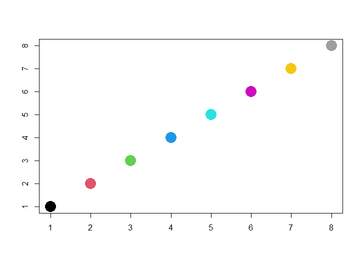
We have 8 colors currently in the palette. That doesn't mean we can't use other colors. It just means these are the colors we can refer to by position. "black" is the first color, so the argument col=1 in a plot() function will return black. Likewise, col=2 produces "#DF536B" (a type of red) and so on. Let's demonstrate by plotting 8 dots with the 8 different colors. Setting cex=3 makes the dots 3 times their normal size, and pch=19 makes solid dots instead of the default open circles:
plot(1:8, 1:8, col=1:8, pch=19, cex=3, xlab="", ylab="")
The palette() function can also be used to change the color palette. For example we could add "purple" and "brown". Below we first save the current color palette to an object called cc, and we then use the c() function to concatenate cc with "purple" and "brown":
cc <- palette()
palette(c(cc,"purple","brown"))
palette()
 [1] "black"   "#DF536B" "#61D04F" "#2297E6" "#28E2E5" "#CD0BBC" "#F5C710"
 [8] "gray62"  "purple"  "brown"
If we want to revert back to the default palette, we can call palette() with the keyword "default":
palette("default")
How do we know what colors are available for our palette? We can use the colors() function to see. Try it! It will list all 657 colors. Below we show the first 20:
length(colors()) # 657 colors
[1] 657
colors()[1:20]
 [1] "white"         "aliceblue"     "antiquewhite"  "antiquewhite1"
 [5] "antiquewhite2" "antiquewhite3" "antiquewhite4" "aquamarine"
 [9] "aquamarine1"   "aquamarine2"   "aquamarine3"   "aquamarine4"
[13] "azure"         "azure1"        "azure2"        "azure3"
[17] "azure4"        "beige"         "bisque"        "bisque1"
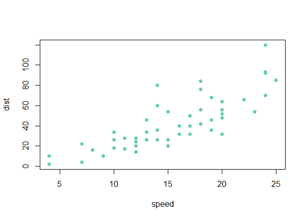
We can use these colors by name if we like. For example, here's a scatterplot of the cars data that come with R using the color "aquamarine3":
plot(dist ~ speed, data=cars, col="aquamarine3", pch=19)
Dr. Ying Wei at Columbia University created this handy cheat-sheet that shows all available R colors: http://www.stat.columbia.edu/~tzheng/files/Rcolor.pdf
Trying to choose good colors out of 657 choices can be overwhelming and lead to a lot of trial and error. Fortunately, a great deal of research has been done on plotting and color combinations, and there are several tried-and-tested color palettes to choose from. One R package that provides some of these palettes is RColorBrewer. Named for the creator of these color schemes, Cynthia Brewer, the RColorBrewer package makes it easy to quickly load sensible color palettes.
The RColorBrewer package does not come with R and needs to be installed if you don't already have it. Once loaded, it provides functions for viewing and creating color palettes.
# install.packages("RColorBrewer")
library(RColorBrewer)
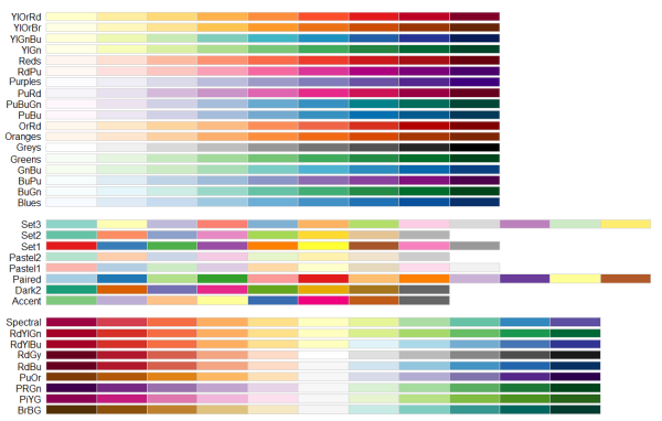
RColorBrewer provides three types of palettes: sequential, diverging and qualitative.
- Sequential palettes are suited to ordered data that progress from low to high.
- Qualitative palettes are suited to nominal or categorical data.
- Diverging palettes are suited to centered data with extremes in either direction.
The available palettes are listed in the documentation. However, the display.brewer.all() function will plot all of them along with their names. In the graph below, we see the sequential palettes, then the qualitative palettes, and finally the diverging palettes.
display.brewer.all()
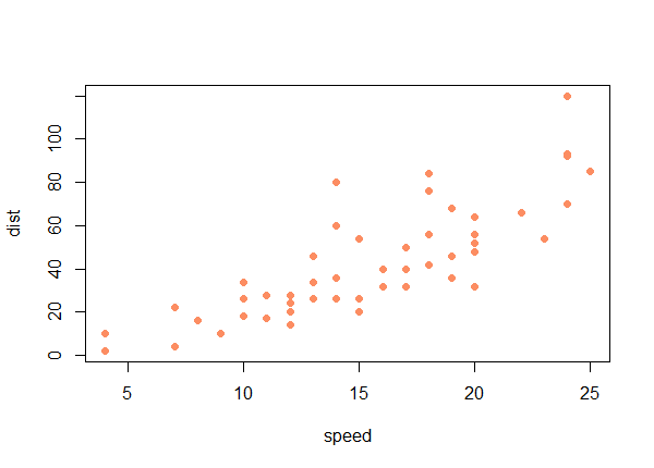
To create a RColorBrewer palette, use the brewer.pal() function. It takes two arguments: n, the number of colors in the palette; and name, the name of the palette. Let's make a palette of 8 colors from the qualitative palette "Set2".
brewer.pal(n = 8, name = "Set2")
[1] "#66C2A5" "#FC8D62" "#8DA0CB" "#E78AC3" "#A6D854" "#FFD92F" "#E5C494" "#B3B3B3"
palette(brewer.pal(n = 8, name = "Set2"))
Notice the brewer.pal() function by itself just displays the palette. Also notice the colors are expressed in "hexadecimal triplets" instead of color names. To load the palette, we needed to use the palette() function. These are now the colors R will use when referencing color by number. For example:
plot(dist ~ speed, data=cars, pch=19, col=2)
What about ggplot2? Changing color palettes works differently for ggplot2. Let's make a quick plot in ggplot2 using the iris data that come with R and see what the default colors look like.
# install.packages("ggplot2")
library(ggplot2)
ggplot(iris, aes(x=Sepal.Length, y=Petal.Length, color=Species)) + geom_point()
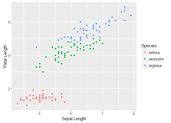
Clearly these are not the colors in our current color palette. It turns out ggplot2 generates its own color palettes depending on the scale of the variable that color is mapped to. In the above example, color is mapped to a discrete variable, Species, that takes on 3 values. We would call this a qualitative palette and it works well for these data. Let's map color to a continuous variable, Sepal.Width:
ggplot(iris, aes(x=Sepal.Length, y=Petal.Length, color=Sepal.Width)) + geom_point()
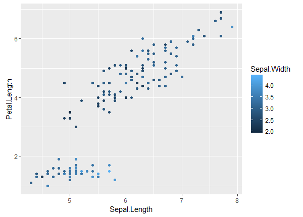
Notice the palette changed to a blue palette that gets progressively lighter as values increase. This is actually a smooth gradient between two shades of blue.
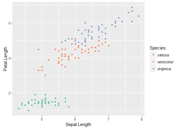
To change these palettes we use one of the scale_color_*() functions that come with ggplot2. For example, to use the RColorBrewer palette "Set2", we use the scale_color_brewer() function like so:
ggplot(iris, aes(x=Sepal.Length, y=Petal.Length, color=Species)) +
    geom_point() +
    scale_color_brewer(palette = "Set2")
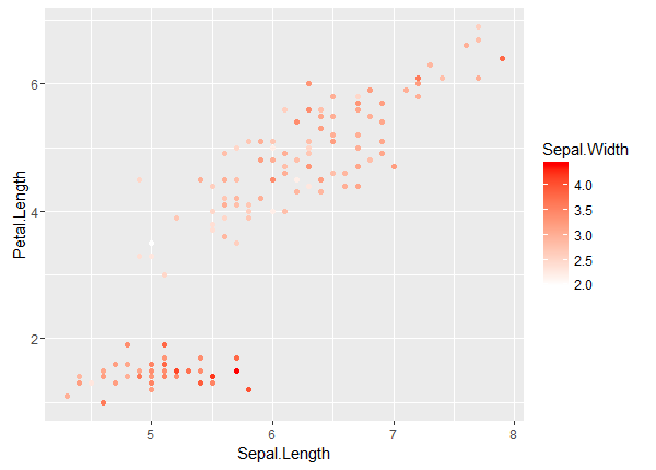
To change the smooth gradient color palette, we use the scale_color_gradient() function with low and high color values. For example, we can set the low value to white and the high value to red:
ggplot(iris, aes(x=Sepal.Length, y=Petal.Length, color=Sepal.Width)) +
    geom_point() +
    scale_color_gradient(low = "white", high = "red")
Now what if there's a color palette in ggplot2 that we would like to use in base R graphics? How can we figure out what those colors are? For example, let's say we like ggplot2's red, green, and blue colors it used in the first plot above. They're not simply "red", "green", and "blue". They're a bit lighter and softer.
It turns out ggplot2 automatically generates discrete colors by automatically picking evenly spaced hues around something called the hcl color wheel. If a color is mapped to a variable with two groups, the colors for those groups will come from opposite sides of the color wheel, or 180 degrees apart (360/2 = 180). If a color is mapped to a variable with three groups, the colors will come from three evenly spaced points around the wheel, or 120 degrees apart (360/3 = 120). And so on.
Looking at the documentation for the scale_color_discrete() function tells us where on the hcl color wheel ggplot2 starts picking colors: 15. This is known as the h value, which stands for hue. The c and l values, which stand for chroma and luminance, are set to 100 and 65. For three groups, this means the h values are 15, 135 (15 + 120), and 255 (15 + 120 + 120). Now we can use the hcl() function that comes with R to get the associated hexadecimal triplets:
hcl(h = c(15,135,255), c = 100, l = 65)
[1] "#F8766D" "#00BA38" "#619CFF"
And we can use the palette() function to add these colors to the color palette:
palette(hcl(h = c(15,135,255), c = 100, l = 65))
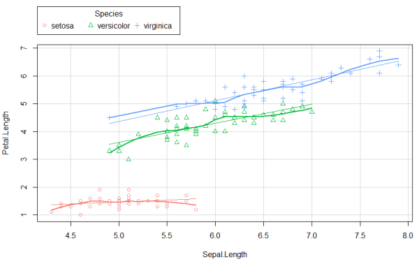
Now we can make a base R plot with ggplot2 colors. For example, here's the scatterplot() function from the car package plotting the iris data with ggplot2 colors. Notice we add the argument col = palette().
# install.packages("car")
library(car)
scatterplot(Petal.Length ~ Sepal.Length | Species, data=iris, col = palette())
Finally, it's relatively straightforward to write a function to generate ggplot2 colors based on the number of groups. Below we first determine the distance between points by dividing 360 by g, the number of groups. Next we determine the actual points on the circle by starting with 15 and cumulatively adding the distance. Finally we call the hcl() function to get our colors. Of course, the function could be made more robust by allowing the c and l values and the starting point on the color wheel to be varied. But this function works fine if you're happy with the default ggplot2 colors for discrete variables.
ggplotColors <- function(g){
  d <- 360/g
  h <- cumsum(c(15, rep(d,g - 1)))
  hcl(h = h, c = 100, l = 65)
}
Clay Ford
Statistical Research Consultant
University of Virginia Library
June 10, 2016
For questions or clarifications regarding this article, contact statlab@virginia.edu.
View the entire collection of UVA Library StatLab articles, or learn how to cite.