
Regression to the mean refers to a phenomena where natural variation within an individual can mistakenly appear as meaningful change over time. To illustrate, imagine a patient who comes in for a regular check-up and is found to have high blood sugar levels. This may be cause for concern, and the doctor recommends several dietary adjustments and schedules a follow-up for the next week. During the follow-up visit, the patient’s blood sugar levels have seemingly returned to a normal range. Both the doctor and the patient attribute this reduction in blood sugar to the new diet.
However, the true explanation for these values lies in their statistical nature. Both values actually came from the same distribution, as shown in the Blood Sugar Measurements plot below. The first measurement, “Baseline”, is two standard deviations above the true mean blood sugar for this individual (99). The second value, “Follow-Up”, was much closer to the mean blood sugar level for this patient. The first value is an extremely rare value for this patient and was not representative of their average blood sugar before going on the diet. Therefore, the apparent improvement during the follow-up was not caused by the dietary change but was a result of regression to the mean - the return of a more typical measurement.
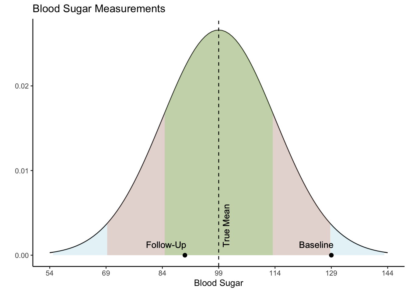
When variability is both random and nonsystematic, it results in rare occurrences of extreme values for an individual, making it more probable for them to eventually regress to a normal range over time. Understanding regression to the mean could help avoid misinterpretations and ensure a more accurate assessment of changes in values.
In their 2011 article entitled “Francis Galton and Regression to the Mean”, Stephen Senn delves into the history of the concept of regression to the mean and gives a real world example of its effect on research. In this study, they simulate values of diastolic blood pressure (DBP) for 1,000 people measured at two distinct time points, baseline and follow-up. DBP is categorized as either high DBP (hypertensive; \(\geq\) 95 mmHg) or normal DBP (normotensive; \(<\) 95 mmHg). In their simulation, the measurements have a correlation of about 0.80 and both measurements have a true mean of 90 mmHg and an interquartile range of 11 mmHg.
Let’s recreate their simulation with these parameters. We need to create two variables representing two measurements within 1,000 individuals. We will use the mvrnorm() function from the MASS package (Venables & Ripley, 2002) to simulate correlated variables from normal distributions and set the correlation between them to be 0.80. Both variables will be simulated to have a mean of 90. In order to use the mvrnorm() function, we need to convert interquartile range into units of standard deviation. Since a normal distribution’s interquartile range is approximately 1.35 standard deviations, we divide 11 by 1.35, giving us an approximate standard deviation of 8.
# Defining parameters
n <- 1000
mean <- 90
sd <- 8
corr <- 0.8
Sigma <- matrix(c(sd^2, sd*sd*corr,
                  sd*sd*corr, sd^2), nrow = 2, ncol = 2)
# Creating variables
library(MASS)
set.seed(1024)
df <- as.data.frame(mvrnorm(n = n,
                    mu = c(mean, mean),
                    Sigma = Sigma))
colnames(df) <- c("Baseline","FollowUp")
summary(df)
    Baseline         FollowUp
 Min.   : 63.15   Min.   : 61.08
 1st Qu.: 84.44   1st Qu.: 84.79
 Median : 90.38   Median : 90.21
 Mean   : 90.18   Mean   : 90.00
 3rd Qu.: 95.45   3rd Qu.: 95.57
 Max.   :114.50   Max.   :113.21
cor(df)
          Baseline  FollowUp
Baseline 1.0000000 0.7995769
FollowUp 0.7995769 1.0000000
Now we have a data frame called df which contains two variables, “Baseline” and “FollowUp” that are correlated at 0.80 and each have a mean of around 90. Let’s look at a basic scatter plot of the two variables using the ggplot2 package (Wickham, 2016).
# Plotting
library(ggplot2)
ggplot(df, aes(x = Baseline, y = FollowUp)) +
  geom_point() +
  theme_classic()
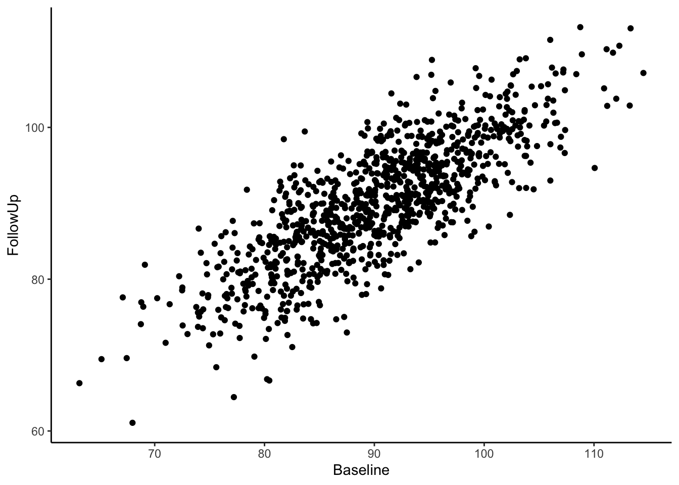
Visually we can see that these two variables are positively, linearly related to one another with some variation since they are not perfectly correlated with one another. In the Senn (2011) article they show a scatter plot grouping individuals by whether or not they were hypertensive at both time points, normotensive at both time points, or inconsistent (i.e., hypertensive at one time point and normotensive at the other). We will reproduce these below. First, let’s create a variable called “Trend” which contains the labels “Both Hypertensive”, “Both Normotensive”, and “Inconsistent” to represent each individual’s category. Then, we can add this to the previous scatter plot and change the shape and color of the points based on which category the individual falls in. We’ll also use geom_vline() and geom_hline() to add vertical and horizontal lines to the plot representing the true mean of the population the samples came from. Finally, we use geom_abline() to add a line with a slope of 1, as was done in Senn (2011).
# Categorizing the trend from baseline to follow-up
df$Trend <- ifelse(df$Baseline >= 95 & df$FollowUp >= 95, "Both Hypertensive",
                   ifelse(df$Baseline < 95 & df$FollowUp < 95, "Both Normotensive",
                          "Inconsistent"))
table(df$Trend)
Both Hypertensive Both Normotensive      Inconsistent
              181               625               194
# Plotting
ggplot(df, aes(x=Baseline, y=FollowUp, shape=Trend, color=Trend)) +
  geom_point() +
  theme_classic() +
  geom_vline(xintercept = 95) +
  geom_hline(yintercept = 95) +
  xlim(60,130) +
  ylim(60,130) +
  geom_abline(intercept = 0) +
  xlab("DBP at Baseline") +
  ylab("DBP at Follow-Up") +
  ggtitle("Diastolic Blood Pressure")
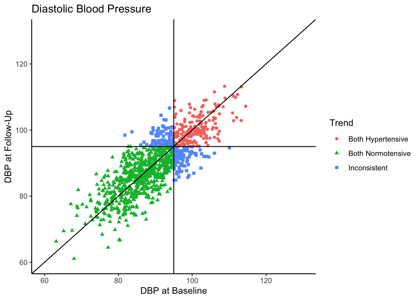
Most of the sample (62.5%) was normotensive at both measurements, 18.1% of the sample is hypertensive at both measurements, and 19.4% of the sample were in different categories across the two time points. Since the true correlation between the variables is 0.80, there will be variation over time within individuals, but it is most probable for individuals to fall into a normotensive range at both time points.
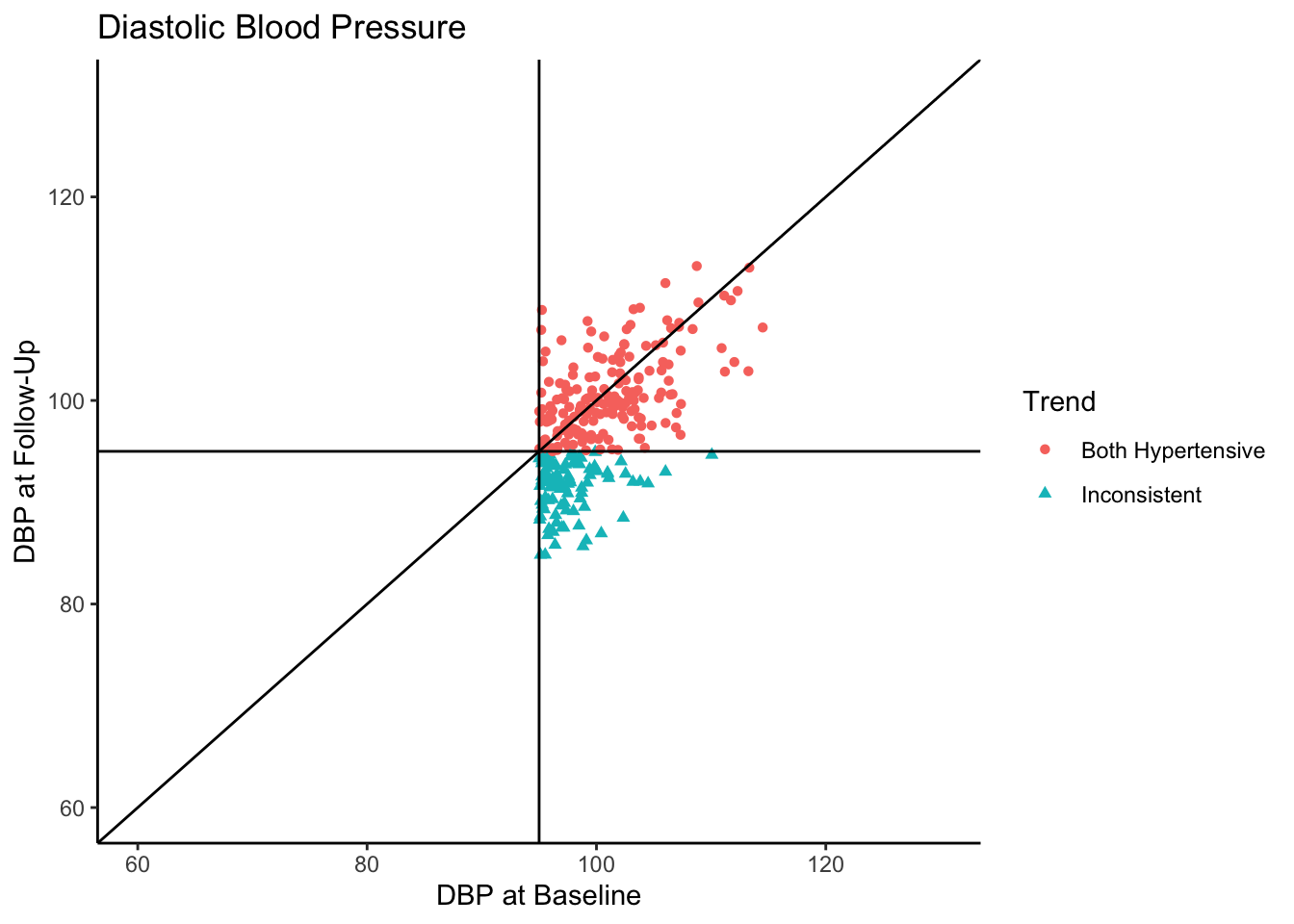
Senn (2011) states that in reality, what we see in the above plot would not be the sample collected in most clinical trials. They state that in most clinical trials, follow-ups would not be conducted with individuals who present as normotensive at baseline. Instead, only individuals presenting as hypertensive would be asked to come back. In the following plot we use all the same settings as the above plot except that we subset the data set to contain only those individuals who are hypertensive-at-baseline.
ggplot(df[df$Baseline >= 95,], aes(x=Baseline, y=FollowUp, shape=Trend, color=Trend)) +
  geom_point() +
  theme_classic() +
  geom_vline(xintercept = 95) +
  geom_hline(yintercept = 95) +
  xlim(60,130) +
  ylim(60,130) +
  geom_abline(intercept = 0) +
  xlab("DBP at Baseline") +
  ylab("DBP at Follow-Up") +
  ggtitle("Diastolic Blood Pressure")
Let’s say this data came from a clinical trial where participants were given some sort of manipulation (e.g., trial blood pressure medication) between baseline and follow-up. What would happen if we conducted a statistical analysis to test if DBP was reduced at follow-up? To see how many individuals did have a reduction in DBP, let’s change the color coding in the above plot to represent direction of change in DBP from baseline to follow-up.
df$Change <- ifelse(df$Baseline - df$FollowUp > 0, "Decrease", "Increase")
table(df[df$Baseline >= 95,"Change"])
Decrease Increase
     198       79
ggplot(df[df$Baseline >= 95,], aes(x=Baseline, y=FollowUp, shape=Change, color=Change)) +
  geom_point() +
  theme_classic() +
  geom_vline(xintercept = 95) +
  geom_hline(yintercept = 95) +
  xlim(60,130) +
  ylim(60,130) +
  geom_abline(intercept = 0) +
  xlab("DBP at Baseline") +
  ylab("DBP at Follow-Up") +
  ggtitle("Diastolic Blood Pressure")
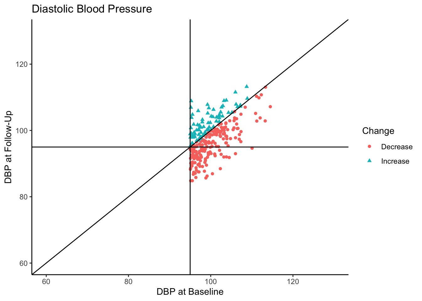
Of the individuals with hypertension at baseline, a majority of them exhibited a decrease in blood pressure. In fact, for hypertensive-at-baseline individuals, the mean DBP at follow-up is 97.85, which is 2.35 mmHg lower than the mean baseline value (100.24). This change is attributable to regression to the mean rather than a meaningful reduction in DBP.
Senn (2011) provides some solutions to the problem of misattributing this change as meaningful:
- Include a control group,
- Investigate the differences between groups at the follow-up,
- Conduct a three-arm trial including an active (experimental) group, a placebo group, and a group given no manipulation (control group).
They favor the third approach since regression to the mean would appear in each group, then causal statements in the experimental and placebo groups would be more strongly supported.
Participants can get assigned into experimental groups in two general ways: random assignment or nonrandom assignment. Random assignment into experimental groups is considered the gold standard in experimental design; participants have an equal probability of being placed in experimental groups, thereby removing as many potential confounding variable effects as possible. Nonrandom assignment, however, means that participants are being placed into experimental groups based on some criteria. Within experimental groups, participants are more related to one another based on the assignment criteria, and between experimental groups participants are less related to one another based on the assignment criteria. This introduces differences in the experimental groups beyond just the experimental manipulation, (i.e., confounding variable(s)).
In the current example of blood pressure, it is possible that researchers believe it is unethical to withhold treatment from hypertensive individuals. Therefore, participants with higher DBP at baseline will be prioritized for the experimental group above participants with lower DBP. For the purposes of the present example, we will investigate the impact of both random and nonrandom assignment.
There are three common analyses used to assess experimental manipulation with baseline and follow-up values: dependent means t-test, change score analysis, and analysis of covariance (ANCOVA). The dependent means t-test tests whether there is a difference in the mean values between follow-up and baseline. We specifically use the dependent means t-test (rather than the independent means t-test) because we are comparing values within individuals.
Change score analysis tests the effect of treatment on the change in score from baseline to follow-up. The difference between baseline and follow-up values (change score) is calculated and the mean change score between experimental groups is compared. For change score analysis, we will use an independent means t-test when there are two experimental groups and an analysis of variance (ANOVA) when there are three experimental groups.
The ANCOVA method tests the mean difference in follow-up values between experimental groups, after adjusting for baseline value. It models follow-up values as the dependent variable and the experimental group as an independent variable, with baseline value as a covariate. Simply put, the ANCOVA method tests the effect of the experimental group on the follow-up values that is not explained by the baseline values.
Simulation
Let’s run a simulation to compare the results of these analyses. Per the suggestions in Senn (2011) we will look at the impact of having a two-arm (experimental and control group) and a three-arm (experimental, control, and placebo group) design and compare this to the results of looking at change within individuals. We can look at the results of these analytic approaches across two types of samples, one with only individuals presenting as hypertensive-at-baseline, and one where all-baseline-DBP-levels are included. Additionally, let’s consider scenarios where random assignment and nonrandom assignment to experimental groups take place.
Because the scores at baseline and follow-up come from the same population, each analysis should not find significant differences. We will simulate 500 datasets of 1000 cases each, then sample from them to create a hypertensive-at-baseline sample and an all-baseline-DBP-levels sample. Then, we will conduct each statistical analysis on each sample. The p-value from each analysis will be recorded and then we can investigate any patterns in detecting significance based on sampling approach and experimental design. We will simulate 500 datasets in the same manner as above using the mvrnorm() function, also with the same parameters as above. Each dataset will be saved into a list of data frames called df.list.
# Create 500 datasets
df.list <- vector("list") # Creating empty list for dataframes
reps <- 500 # Number of dataframes to create
# Defining parameters
n <- 1000
mean <- 90
sd <- 8
corr <- 0.8
Sigma <- matrix(c(sd^2, sd*sd*corr,
                  sd*sd*corr, sd^2), nrow = 2, ncol = 2)
set.seed(2048)
# Creating 500 unique dataframes from the sample population
for(i in 1:reps){
  df.list[[i]] <- as.data.frame(mvrnorm(n = n,
                                        mu = c(mean, mean),
                                        Sigma = Sigma))
  colnames(df.list[[i]]) <- c("Baseline","FollowUp")
}
Now we will sample from these data frames to create two types of samples: hypertensive-at-baseline and all-baseline-DBP-levels. In order to avoid any conflating effects of power, each sample will have a sample size of 250. Each new data frame will have seven variables:
- “Baseline” is the DBP value at baseline,
- “FollowUp” is the DBP value at follow-up,
- “ChangeScore” is calculated as the baseline value minus the follow-up value,
- “two.arm_random” represents random assignment to groups in a two-arm experimental design,
- “two.arm_nonrandom” represents nonrandom assignment to groups in a two-arm experimental design, where participants with higher baseline DBP are assigned to the experimental group and participants with lower baseline DBP are assigned to the control group,
- “three.arm_random” represents random assignment to groups in a three-arm experimental design,
- “three.arm_nonrandom” represents nonrandom assignment to groups in a three-arm experimental design where participants with higher baseline DBP are assigned to the experimental group and participants with lower baseline DBP are assigned to either the control group or placebo group.
Each new data frame will get stored in a list of data frames. Hypertensive-at-baseline samples will get stored into a list called hyper.list and samples with all-baseline-DBP-levels will get stored into a list called all.list. Both lists have length 500 since there are 500 samples.
sim.n = 250 # Sample size
# Two-arm and three-arm groups
# Creating vectors containing 250 values assigning individuals
# into two and three-arm experimental design groups
two.arm <- c(rep("Control", sim.n/2), rep("Experimental", sim.n/2))
three.arm <- c(rep("Control", round(sim.n/3)),
               rep("Placebo", round(sim.n/3)),
               rep("Experimental", round(sim.n/3) + 1))
# Hypertensive at baseline samples
hyper.list <- vector("list") # Empty list for dataframes from hypertensive at baseline
set.seed(1210)
for(i in 1:reps){
  # Randomly sampling hypertensive at baseline cases. If there are less than 250 hypertensive
  # at baseline cases, then all hypertensive at baseline cases are selected and the
  # sample size for that data frame will be less than 250.
  hyper.list[[i]] <- df.list[[i]][sample(which(df.list[[i]]$Baseline >= 95),
                                         size = ifelse(sum(df.list[[i]]$Baseline >= 95) < sim.n,
                                                       sum(df.list[[i]]$Baseline >= 95), sim.n)),]
  # Computing change score
  hyper.list[[i]]$ChangeScore <- hyper.list[[i]]$Baseline - hyper.list[[i]]$FollowUp
  # Randomly reordering the two.arm vector for random assignment
  hyper.list[[i]]$two.arm_random <- sample(two.arm, sim.n, replace = FALSE)[1:nrow(hyper.list[[i]])]
  # Reordering the data frame from lowest to highest baseline values
  hyper.list[[i]] <- hyper.list[[i]][order(hyper.list[[i]]$Baseline, decreasing = FALSE), ]
  # Adding the two.arm vector in as nonrandom assignment. Since the data frame was reordered,
  # the control group will get paired with lower baseline values and experimental will get
  # paired with higher baseline values
  hyper.list[[i]]$two.arm_nonrandom <- two.arm[1:nrow(hyper.list[[i]])]
  # Randomly reordering the three.arm vector for random assignment
  hyper.list[[i]]$three.arm_random <- sample(three.arm, size = sim.n, replace = FALSE)[1:nrow(hyper.list[[i]])]
  # Adding the three.arm vector in as nonrandom assignment. Since the data frame was reordered,
  # the control and placebo groups will get paired with lower baseline values and experimental
  # will get paired with higher baseline values
  hyper.list[[i]]$three.arm_nonrandom <- three.arm[1:nrow(hyper.list[[i]])]
}
# All baseline levels samples
all.list <- vector("list") # Empty list for dataframes for all baseline levels
set.seed(212)
for(i in 1:reps){
  # Randomly sampling all cases.
  all.list[[i]] <- df.list[[i]][sample(1:nrow(df.list[[i]]), size = sim.n),]
  # Computing change score
  all.list[[i]]$ChangeScore <- all.list[[i]]$Baseline - all.list[[i]]$FollowUp
  # Randomly reordering the two.arm vector for random assignment
  all.list[[i]]$two.arm_random <- sample(two.arm, sim.n, replace = FALSE)
  # Reordering the data frame from lowest to highest baseline values
  all.list[[i]] <- all.list[[i]][order(all.list[[i]]$Baseline, decreasing = FALSE), ]
  # Adding the three.arm vector in as nonrandom assignment. Since the data frame was reordered,
  # the control and placebo groups will get paired with lower baseline values and experimental
  # will get paired with higher baseline values
  all.list[[i]]$two.arm_nonrandom <- two.arm
  # Randomly reordering the three.arm vector for random assignment
  all.list[[i]]$three.arm_random <- sample(three.arm, size = sim.n, replace = FALSE)
  # Adding the three.arm vector in as nonrandom assignment. Since the data frame was reordered,
  # the control and placebo groups will get paired with lower baseline values and experimental
  # will get paired with higher baseline values
  all.list[[i]]$three.arm_nonrandom <- three.arm
}
On each data frame, we will conduct a dependent means t-test using the t.test() function comparing baseline to follow-up, making sure to set “paired = TRUE” (since the values across variables are dependent). As shown below, from the output of each t-test we can extract the p-value using $p.value.
# Dependent means t-test
t.test(hyper.list[[1]]$Baseline, hyper.list[[1]]$FollowUp, paired = TRUE)
    Paired t-test
data:  hyper.list[[1]]$Baseline and hyper.list[[1]]$FollowUp
t = 6.5985, df = 236, p-value = 2.707e-10
alternative hypothesis: true mean difference is not equal to 0
95 percent confidence interval:
 1.432110 2.651241
sample estimates:
mean difference
       2.041675
t.test(hyper.list[[1]]$Baseline, hyper.list[[1]]$FollowUp, paired = TRUE)$p.value
[1] 2.707226e-10
The end goal of this simulation is to compare the proportion of times statistical significance is found across analytic technique, experimental design, and sampling approach. The easiest way to investigate this is to save all of the results into a single data frame, which we will call sim.df. We will iterate through both hyper.list and all.list conducting dependent means t-tests on each simulation condition, adding labels for the conditions, and merging this data into the sim.df object.
# Creating empty data frame to store results
sim.df <- data.frame()
# Saving the results of each dependent t-test into sim.df
for(i in 1:reps){
  # Saving the p.values from both hyper and all samples
  p.values <- c(t.test(hyper.list[[i]]$Baseline, hyper.list[[i]]$FollowUp,
                       paired = TRUE)$p.value,
                t.test(all.list[[i]]$Baseline, all.list[[i]]$FollowUp,
                       paired = TRUE)$p.value)
  # Assigning the type of analysis for both hyper and all samples
  Analysis <- rep("Dependent Means t-test",2)
  # Two or three arm approach does not impact the results of this test
  Arm <- rep("Not Applicable",2)
  # Random assignment into experimental groups does not impact the results of this test
  Randomization <- rep("Not Applicable",2)
  # Assigning the sample type for both hyper and all samples
  Sample <- c("Hypertensive at \nBaseline","All Baseline Levels")
  # Merging all of this data into sim.df, creating a data frame with 5 variables
  sim.df <- rbind(sim.df,data.frame(p.values,Analysis,Arm,Randomization,Sample))
}
head(sim.df)
      p.values               Analysis            Arm  Randomization
1 2.707226e-10 Dependent Means t-test Not Applicable Not Applicable
2 9.535688e-01 Dependent Means t-test Not Applicable Not Applicable
3 6.193763e-07 Dependent Means t-test Not Applicable Not Applicable
4 3.531716e-01 Dependent Means t-test Not Applicable Not Applicable
5 4.014204e-07 Dependent Means t-test Not Applicable Not Applicable
6 1.869657e-02 Dependent Means t-test Not Applicable Not Applicable
                      Sample
1 Hypertensive at \nBaseline
2        All Baseline Levels
3 Hypertensive at \nBaseline
4        All Baseline Levels
5 Hypertensive at \nBaseline
6        All Baseline Levels
We now have a data frame called sim.df which contains the results of 1,000 dependent means t-tests (500 for hypertensive-at-baseline samples, and 500 for all-baseline-DBP-levels samples).
Next, let’s merge in the results of change score analyses. For the two-arm experimental design, we will run an independent means t-test comparing the change score across experimental groups.
For the three-arm experimental design, we will run an ANOVA comparing the change score means across the three experimental groups. We will use the Anova() function from the car package (Fox, 2019). The output of the Anova() function is structured such that we can attach $`Pr(>F)`[1] to the end of the function to extract the p-value.
# Change Score Analysis
## Two Arm
t.test(ChangeScore ~ two.arm_random, data = hyper.list[[1]])
    Welch Two Sample t-test
data:  ChangeScore by two.arm_random
t = -0.43163, df = 235, p-value = 0.6664
alternative hypothesis: true difference in means between group Control and group Experimental is not equal to 0
95 percent confidence interval:
 -1.4888210  0.9536897
sample estimates:
     mean in group Control mean in group Experimental
                  1.908457                   2.176023
t.test(ChangeScore ~ two.arm_random, data = hyper.list[[1]])$p.value
[1] 0.6664041
## Three Arm
library(car)
Anova(lm(ChangeScore ~ three.arm_random, data = hyper.list[[1]]))
Anova Table (Type II tests)
Response: ChangeScore
                 Sum Sq  Df F value Pr(>F)
three.arm_random   55.6   2  1.2276 0.2949
Residuals        5299.1 234
Anova(lm(ChangeScore ~ three.arm_random, data = hyper.list[[1]]))$`Pr(>F)`[1]
[1] 0.2948842
We can iterate through hyper.list and all.list as before, conducting change score analyses on each simulation condition, adding labels for the conditions, and merging this data into the sim.df object.
## Two Arm
for(i in 1:reps){
  # Conducting t-tests in both hyper and all samples on both random and nonrandom groups
  p.values <- c(t.test(ChangeScore ~ two.arm_random,
                       data = hyper.list[[i]])$p.value,
                t.test(ChangeScore ~ two.arm_nonrandom,
                       data = hyper.list[[i]])$p.value,
                t.test(ChangeScore ~ two.arm_random,
                       data = all.list[[i]])$p.value,
                t.test(ChangeScore ~ two.arm_nonrandom,
                       data = all.list[[i]])$p.value)
  # Assigning the type of analysis
  Analysis <- rep("Change \nScore",4)
  # Assigning the experimental design
  Arm <- c(rep("Two Arm",4))
  # Assigning the type of randomization
  Randomization <- c("Random","Nonrandom","Random","Nonrandom")
  # Assigning the sampling method
  Sample <- c(rep("Hypertensive at \nBaseline",2),rep("All Baseline Levels",2))
  # Merging into sim.df
  sim.df <- rbind(sim.df,data.frame(p.values,Analysis,Arm,Randomization,Sample))
}
## Three Arm
for(i in 1:reps){
  # Conducting ANOVAs in both hyper and all samples on both random and nonrandom groups
  p.values <- c(Anova(lm(ChangeScore ~ three.arm_random,
                         data = hyper.list[[i]]))$`Pr(>F)`[1],
                Anova(lm(ChangeScore ~ three.arm_nonrandom,
                         data = hyper.list[[i]]))$`Pr(>F)`[1],
                Anova(lm(ChangeScore ~ three.arm_random,
                         data = all.list[[i]]))$`Pr(>F)`[1],
                Anova(lm(ChangeScore ~ three.arm_nonrandom,
                         data = all.list[[i]]))$`Pr(>F)`[1])
  # Assigning the type of analysis
  Analysis <- rep("Change \nScore",4)
  # Assigning the experimental design
  Arm <- c(rep("Three Arm",4))
  # Assigning the type of randomization
  Randomization <- c("Random","Nonrandom","Random","Nonrandom")
  # Assigning the sampling method
  Sample <- c(rep("Hypertensive at \nBaseline",2),rep("All Baseline Levels",2))
  # Merging into sim.df
  sim.df <- rbind(sim.df,data.frame(p.values,Analysis,Arm,Randomization,Sample))
}
Finally, let’s merge in the results of conducting an ANCOVA. For the ANCOVA, we will again use the Anova() function, modeling follow-up values by the experimental groups after controlling for baseline values. In this case, we’re interested in whether or not there are significant differences between experimental groups. Therefore, because of the way the model is specified, we want the second p-value from the “Pr(>F)” values and will attach $`Pr(>F)`[2] to the end of the function to extract this.
# ANCOVA
Anova(lm(FollowUp ~ Baseline + two.arm_random, data = hyper.list[[1]]))
Anova Table (Type II tests)
Response: FollowUp
               Sum Sq  Df  F value Pr(>F)
Baseline       3190.6   1 141.3639 <2e-16 ***
two.arm_random    5.5   1   0.2438 0.6219
Residuals      5281.3 234
---
Signif. codes:  0 '***' 0.001 '**' 0.01 '*' 0.05 '.' 0.1 ' ' 1
Anova(lm(FollowUp ~ Baseline + two.arm_random, data = hyper.list[[1]]))$`Pr(>F)`[2]
[1] 0.6219174
Now let’s iterate through both the hyper.list and all.list, assign the experimental design and sampling labels, and merge the results into sim.df.
## Two Arm
for(i in 1:reps){
  # Conducting ANCOVAs in both hyper and all samples on both random and nonrandom groups
  p.values <- c(Anova(lm(FollowUp ~ Baseline + two.arm_random,
                         data = hyper.list[[i]]))$`Pr(>F)`[2],
                Anova(lm(FollowUp ~ Baseline + two.arm_nonrandom,
                         data = hyper.list[[i]]))$`Pr(>F)`[2],
                Anova(lm(FollowUp ~ Baseline + two.arm_random,
                         data = all.list[[i]]))$`Pr(>F)`[2],
                Anova(lm(FollowUp ~ Baseline + two.arm_nonrandom,
                         data = all.list[[i]]))$`Pr(>F)`[2])
  # Assigning the type of analysis
  Analysis <- rep("ANCOVA",4)
  # Assigning the experimental design
  Arm <- c(rep("Two Arm",4))
  # Assigning the type of randomization
  Randomization <- c("Random","Nonrandom","Random","Nonrandom")
  # Assigning the sampling method
  Sample <- c(rep("Hypertensive at \nBaseline",2),rep("All Baseline Levels",2))
  # Merging into sim.df
  sim.df <- rbind(sim.df,data.frame(p.values,Analysis,Arm,Randomization,Sample))
}
## Three Arm
for(i in 1:reps){
  # Conducting ANCOVAs in both hyper and all samples on both random and nonrandom groups
  p.values <- c(Anova(lm(FollowUp ~ Baseline + three.arm_random,
                         data = hyper.list[[i]]))$`Pr(>F)`[2],
                Anova(lm(FollowUp ~ Baseline + three.arm_nonrandom,
                         data = hyper.list[[i]]))$`Pr(>F)`[2],
                Anova(lm(FollowUp ~ Baseline + three.arm_random,
                         data = all.list[[i]]))$`Pr(>F)`[2],
                Anova(lm(FollowUp ~ Baseline + three.arm_nonrandom,
                         data = all.list[[i]]))$`Pr(>F)`[2])
  # Assigning the type of analysis
  Analysis <- rep("ANCOVA",4)
  # Assigning the experimental design
  Arm <- c(rep("Three Arm",4))
  # Assigning the type of randomization
  Randomization <- c("Random","Nonrandom","Random","Nonrandom")
  # Assigning the sampling method
  Sample <- c(rep("Hypertensive at \nBaseline",2),rep("All Baseline Levels",2))
  # Merging into sim.df
  sim.df <- rbind(sim.df,data.frame(p.values,Analysis,Arm,Randomization,Sample))
}
summary(sim.df)
    p.values        Analysis             Arm            Randomization
 Min.   :0.0000   Length:9000        Length:9000        Length:9000
 1st Qu.:0.0430   Class :character   Class :character   Class :character
 Median :0.3306   Mode  :character   Mode  :character   Mode  :character
 Mean   :0.3766
 3rd Qu.:0.6553
 Max.   :1.0000
    Sample
 Length:9000
 Class :character
 Mode  :character
Simulation Results
Now, let’s compare the results of these analyses across simulation conditions. First, we’ll add a variable to sim.df called “Significance” which will take on the value “Significant” if the “p.value” variable is less than .05 and “Non-Significant” otherwise.
# Recoding p-values into significant or non-significant
sim.df$Significance <- ifelse(sim.df$p.values < .05, "Significant","Non-Significant")
Since the dependent means t-test comparing baseline and follow-up values was only run split by sampling method and not either experimental design methods, we will look at the results of it separately. Using a combination of the dplyr and ggplot2 packages, we will create a bar plot split by sampling method. The bars will be stacked to represent the proportion of times within 500 samples the dependent means t-test was significant or non-significant.
library(dplyr)
sim.df[sim.df$Analysis == "Dependent Means t-test",] %>%
  group_by(Analysis, Sample) %>%
  count(Significance) %>%
  mutate(lab = paste0(round(prop.table(n) * 100, 2), '%')) %>%
  ggplot(aes(Analysis, n, fill=Significance)) +
  geom_col() +
  geom_text(aes(label=lab),position='stack',vjust=1) +
  facet_grid(. ~ Sample) +
  theme_classic() +
  ylab("Count") +
  ggtitle("Dependent Means t-test")
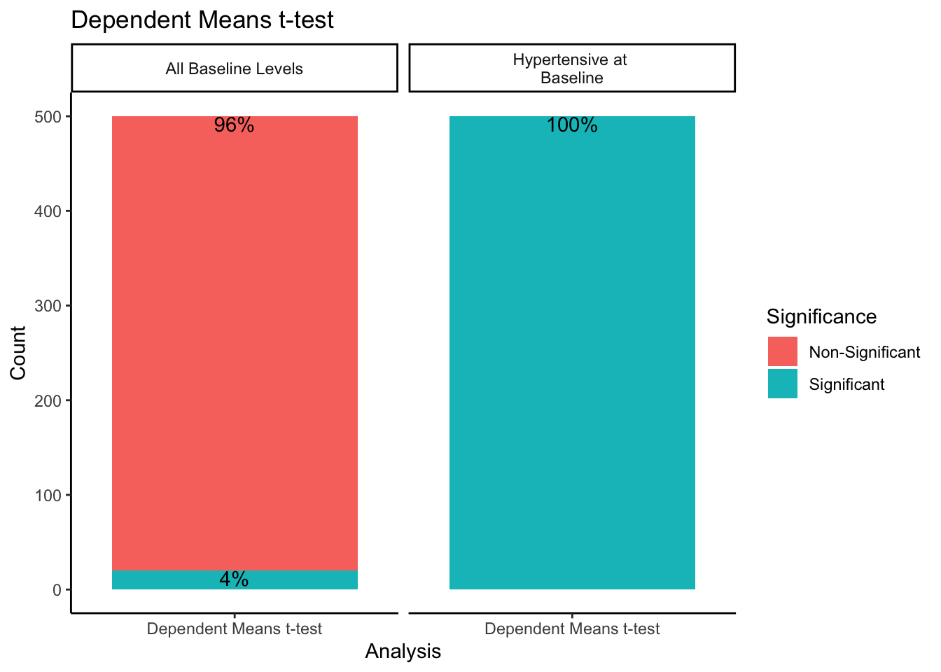
When sampling from all-baseline-DBP-levels, 4% of the 500 samples showed significant differences between mean baseline and mean follow-up scores. However, when only sampling from those individuals presenting as hypertensive-at-baseline, 100% of the 500 samples showed significant differences. Recall we simulated this data with no treatment effect. By restricting our sample to those with DBP > 95 at baseline, we get statistically significant differences between baseline and follow-up 100% of the time despite there being no intervention when using a dependent means t-test.
For the change score analysis and ANCOVA methods, we can create a similar plot just looking at the proportion of significant/non-significant results across sampling methods.
sim.df[sim.df$Analysis != "Dependent Means t-test",] %>%
  group_by(Analysis, Sample) %>%
  count(Significance) %>%
  mutate(lab = paste0(round(prop.table(n) * 100, 2), '%')) %>%
  ggplot(aes(Analysis, n, fill=Significance)) +
  geom_col() +
  geom_text(aes(label=lab),position='stack',vjust=1) +
  facet_grid(. ~ Sample) +
  theme_classic() +
  ylab("Count") +
  ggtitle("ANCOVA and Change Score: Overall")
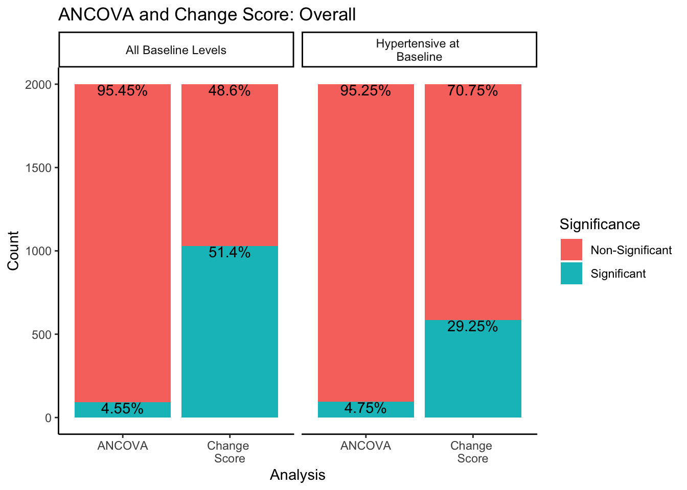
In both sampling methods, the ANCOVA method finds significance about 5% of the time, which is the expected \(\alpha\) level of .05. However, change score analysis has a higher rate of significance than the ANCOVA within both sampling methods. Change score analysis finds significant differences between experimental groups 51.4% of the time when sampling from all-baseline-DBP-levels, and 29.25% of the time when sampling from only hypertensive-at-baseline individuals.
What would happen if we split this down further by experimental design methods?
sim.df[sim.df$Analysis != "Dependent Means t-test",] %>%
  group_by(Analysis, Sample, Arm, Randomization) %>%
  count(Significance) %>%
  mutate(lab = paste0(round(prop.table(n) * 100, 2), '%')) %>%
  ggplot(aes(Analysis, n, fill=Significance)) +
  geom_col() +
  geom_text(aes(label=lab),position='stack',vjust=.5, size = 3, check_overlap = TRUE) +
  facet_grid(Arm  ~ Sample + Randomization) +
  theme_classic() +
  ylab("Count") +
  ggtitle("ANCOVA and Change Score by Experimental Design")
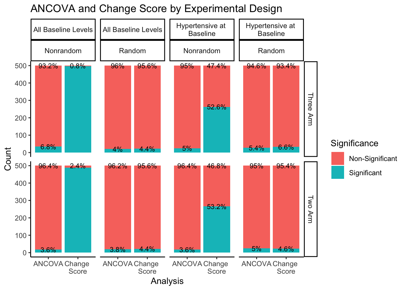
The right hand portion of this plot indicates how many experimental groups were included, three-arm being the first row and two-arm being the second row. The top portion of the plot indicates the sampling approach and randomization method. Sampling from all-baseline-DBP-levels is represented in the first two columns, split by nonrandom assignment in the first column and random assignment in the second column. Sampling from hypertensive-at-baseline individuals is represented in the last two columns, split by nonrandom assignment in the third column, and random assignment in the fourth column.
Even when split by experimental design methods, the ANCOVA method maintains around a 5% rate of significance while the change score analysis has a much higher proportion of significant findings. The number of experimental groups appears to have no effect on the proportion of significant and non-significant findings. However, for change score analysis, nonrandom assignment has a much higher proportion of significant results than random assignment for both sampling methods. Nonrandom assignment produces significant results almost 100% of the time when sampling from all-baseline-DBP-levels and a little over 50% of the time when sampling from hypertensive-at-baseline individuals. Random assignment, in both sampling methods, produces significant results about 5% of the time (again, in line with the expected \(\alpha\) level of .05).
These results highlight the impact of misattributing natural variation as meaningful change. Based on the results of this small simulation, regression to the mean has particular influence on the results of dependent means t-tests and change score analyses, especially when sampling is not representative of the population and participants are not randomly assigned to experimental groups. Using an ANCOVA to analyze these data seems to be the best approach, still keeping in mind best practice for sampling methods and experimental design. Without proper sampling methods, experimental design, and analytic techniques, regression to the mean can impact the results of any study, mistaking natural variation within individuals for meaningful change.
R session details
The analysis was done using the R Statistical language (v4.5.1; R Core Team, 2025) on Windows 11 x64, using the packages car (v3.1.3), carData (v3.0.5), MASS (v7.3.65), ggplot2 (v3.5.2) and dplyr (v1.1.4).
References
- Fox J, Weisberg S (2019). An R Companion to Applied Regression, Third edition. Sage, Thousand Oaks CA. https://socialsciences.mcmaster.ca/jfox/Books/Companion/.
- Galton, F. (1886) Regression towards mediocrity in hereditary stature. Journal of the Anthropological Institute of Great Britain and Ireland, 15, 246–263.
- Senn, S. (2011). Francis Galton and regression to the mean. Significance, 8(3), 124-126.
- Venables, W. N. & Ripley, B. D. (2002) Modern Applied Statistics with S. Fourth Edition. Springer, New York. ISBN 0-387-95457-0
- H. Wickham. ggplot2: Elegant Graphics for Data Analysis. Springer-Verlag New York, 2016.
- Wickham H, François R, Henry L, Müller K, Vaughan D (2023). dplyr: A Grammar of Data Manipulation. https://CRAN.R-project.org/package=dplyr.
Laura Jamison
StatLab Associate
University of Virginia Library
September 15, 2023
For questions or clarifications regarding this article, contact statlab@virginia.edu.
View the entire collection of UVA Library StatLab articles, or learn how to cite.