
Shiny is an R package that facilitates the creation of interactive web apps using R code, which can be hosted locally, on the shinyapps server, or on your own server. Shiny apps can range from extremely simple to incredibly sophisticated. They can be written purely with R code or supplemented with HTML, CSS, or JavaScript. Visit R studio’s shiny gallery to view some examples. Among its many uses, shiny apps are a great way for researchers to engage others with their work and collected data.
In this article we walk you through the steps of building a shiny app for visualizing disease occurrence in the United States from 1928-2011. The finished app is available at the following link. Take a look at the app, play with it, and then come back and build it yourself!
https://uvastatlab.shinyapps.io/US_Contagious_Diseases/
To get started, you’ll need to install the shiny package in R. In this example, we’ll also be using the shinyWidgets package, which offers additional user inputs to use in your app, dslabs, which contains the example dataset we will use, plotly, for interactive graphs, and tidyverse, for data manipulation.
Getting started and the basic framework
To get started creating your app, create a new file by going to “New file” -> “Shiny Web App”, enter the name of your app, and select “Single File”. With this option, you will keep all of your app’s code in a single R script, which is easiest for new users and for building relatively simple apps. Alternatively, you can also create separate ui.R and server.R files (“Multiple Files” option) in a dedicated directory, which you can then run using the runApp() function. The multiple files set up may be easier to navigate for more complicated apps with many lines of code.
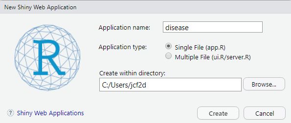
When you create this new file, RStudio will create a new folder with the name of your app that contains the app.R file. It comes with a very simple example app of an interactive histogram of Old Faithful data already loaded that you can experiment with. Just click the Run App button to see what it does. Do not change the name of the app.R file. For this tutorial, you can edit the preloaded template to follow along with the example app we will go through.
Code for a Shiny app has two structural components, the user interface (ui) and server, which are passed to the shinyApp() function. The ui component generates the app’s structure that users see and interact with, while the server component converts the inputs from the user into the reactive output.
This framework is represented as follows:
ui <- fluidPage()

server <- function(input, output) {}


shinyApp(ui=ui, server=server)
Inputs and outputs
Inputs and outputs are the key components of the ui. Inputs are the features of the app that users interact with, such as a numeric slider bar, date range, check boxes, text input, or a drop down menu. You can see all the options included in the standard shiny package at https://shiny.posit.co/r/gallery/widgets/widget-gallery/.
Outputs are the resulting R objects - for example, a graph, table, image, map, text, or summary statistics - that are either predetermined by you or generated in response to user inputs.
Various inputs and outputs have their own arguments, so check the help pages to see what needs to be included in your code; however, some arguments are shared across functions.
For example, selectInput() allows the user to choose an option (or options) from a drop down menu. You will give each of your inputs a unique inputId that you will use to access the associated values selected or contributed by the user. If you choose, you can also assign the input a label that will be displayed in the app. For the drop down menu, choices is the argument for the various options available to the user, while selected sets the default option. multiple, if TRUE, allows the user to select more than one option.
selectInput(inputId="YourInputName",
            label="DisplayedLabel",
            choices = c("Choice1", "Choice2",
                        "Choice3", "Choice4"),
            selected = "Choice2",
            multiple=FALSE)
If you have multiple inputs, as we will in our example, separate them with commas in your code.
Reactive outputs are created with an *Output() function in the ui and a render*() function in the server. The *Output() function creates a placeholder for the output in the app that you want to generate for the user. You then tell R how to build that object using the render*() function, often using the data collected from the user inputs.
For example, we can take the input from our drop down menu in the input example to generate a data table. Say in our data, “Choice1”, “Choice2”, “Choice3”, and “Choice4” are different variables in our dataset. We want to generate a data table that displays the values of the variable selected by the user.
Within the ui object, we include the data table output function to tell the app what output to display and where:
DT::dataTableOutput(outputId="MyDTname")
The code DT::dataTableOutput allows us to use the dataTableOutput function from the DT package without explictly loading the package. As before with the inputs, multiple outputs are separated by commas in the ui object.
Within the server object, we build that data table with a render function, filtering it with the user’s selection (input$YourInputName), and assigning it to output$MyDTname. This results in a table that displays the data for the variable they selected.
output$MyDTname <- DT::renderDataTable({
    DT::datatable(my_dataset[, input$YourInputName,
                             drop = FALSE])
  })
Unlike the ui elements, in the server object, we do not separate different components by commas.
Layout
Although adding panels or another type of layout isn’t necessary to build a simple app, it will often be useful for organization.
A sidebar and main panel is the default layout provided by R studio, where you place your user inputs in the sidebar and the outputs in the larger main section. You’ll see this used in the pre-loaded example Old Faithful app. This layout is generated using the following code:
ui <- fluidPage(

    titlePanel("Your title here!"),

    sidebarLayout(
        sidebarPanel(
            # inputs go here
        ),

        mainPanel(
           # outputs here
        )
    )
)
Some alternative layouts and example code are available here: https://shiny.posit.co/r/articles/build/layout-guide/. You can, for example, use tabsetPanel() to create multiple tabs of the main panel, or you can use navbar*() functions to create a navigation bar with drop down menus.
Reactive data
Often when building a shiny app, you will be working with a dataset that you will want to change in some way to reflect user inputs. To do this, you can create a reactive expression in the server object that will make those changes to the data while the app is running.
In the example below, the original data is filtered to be equal to a particular value of two different variables. Those values are set by the user. For example, your app has a drop down menu (“firstInput”) with categories A, B, and C. The reactive data will then be filtered to only contain the category the user selects. You can then use that reactive data when building your outputs.
reactive_data <- reactive({
    original_data %>%
      filter(variable1 == input$firstInput,
             variable2 == input$secondInput)

  })
When you call reactive data, you must use parentheses (for example, reactive_data()), because the reactive expression creates a function.
Example: US disease occurrence by state, 1928-2011
We’ll be using the us_contagious_diseases dataset that comes pre-loaded in the dslabs package. This dataset contains yearly counts of 7 different diseases for each state plus DC, from 1928 to 2011.
In this example app, we will create interactive visualizations for our data, allowing the user to control the date range, state, select multiple diseases to display, and display frequencies in either raw counts or per capita.
To make more clear the changes to the code for each additional element we add, the sections below will be only snippets of the larger code. The full code for the example app is available at the bottom of this article, where all of these snippets are put together. It may be helpful to load the finished app in advance and then read through the step-by-step descriptions of building it. Otherwise, clear the example app loaded by R studio and add or alter each element as we go through it. If you get stuck, refer to the full code.
To get started, we will add our libraries. If you don’t already have them installed, run the following code in R. Do not place this code into the app.R file!
install.packages(c("shiny", "shinyWidgets", "dslabs",
                   "tidyverse", "plotly"))
Before beginning our app, we also need to create an additional variable in the data, a per capita measure. Copy and paste the following into your app.R file, overwriting the preloaded example code.
library(shiny)
library(shinyWidgets)
library(dslabs)
library(tidyverse)
library(plotly)


data("us_contagious_diseases")
disease <- us_contagious_diseases
disease <- mutate(disease, percapita = count/(population/100000))
Next, below the libraries and data, we’ll add in the basic shiny framework and the sidebar + main panel layout structure discussed above. Again copy-and-paste the following code into the app.r file, just below the previous code.
ui <- fluidPage(

    titlePanel("Your title here!"),

    sidebarLayout(
        sidebarPanel(
            # inputs go here
        ),

        mainPanel(
           # outputs here
        )
    )
)

server <- function(input, output) {}


shinyApp(ui=ui, server=server)
Graph over time
Before we add the interactive customizations to the app, we will add a line graph plotting disease frequencies over time in the main panel. As we add our customizations, the user will be able to manipulate the data displayed in this graph.
Here we put a place holder for the graph output in the main panel of the ui: plotOutput("diseaseplot"). Within the server object, we write the code that creates “diseaseplot” using ggplot2. We will put all the user inputs in the sidebar panel, with the outputs going in the main panel. Notice we also add a title for the app in the titlePanel function.
At this point your app.R file should match the code below. If you run the app as is, you get a very busy graph, with the aggregated frequencies across all states displayed for every disease. (Try it!) Allowing the user to select the data they are most interested in will result in a much more visually appealing and readable graph.
library(shiny)
library(shinyWidgets)
library(dslabs)
library(tidyverse)
library(plotly)


data("us_contagious_diseases")
disease <- us_contagious_diseases
disease <- mutate(disease, percapita = count/(population/100000))

ui <- fluidPage(

  titlePanel("Diseases in the US 1928-2011"),
  sidebarLayout(
    sidebarPanel(
      # inputs
    ),

    mainPanel(
      # outputs
      plotOutput("diseaseplot")

    )
  )
)

server <- function(input, output) {

  output$diseaseplot <- renderPlot({

    ggplot(disease, aes(x=year, y=count, color=disease)) +
      geom_line() +
      theme_bw() +
      xlab("Year") +
      ylab("Number of cases") +
      ggtitle("Cases over time")
  })

}

shinyApp(ui=ui, server=server)
Clicking the “Run App” button should produce the following. Clearly we have much work to do! 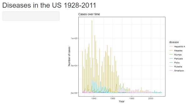
After each section, try running the app to see how the additions or alterations we make change the app. To return to editing your code after running your app, either click the STOP sign icon in RStudio above the console or close the app window.
Select state
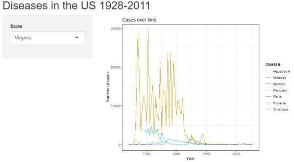
Our first customization is to allow the user to select which state they would like to display disease data for. For this input, we’ll use selectizeInput() to create a drop down menu with all of the state names. We will internally name this input “stateInput”. The label displayed on the app is “State”. Because we have many states, instead of writing out each state name individually (choices = c("Alabama", "Alaska", "Arizona" ....)), we can set the choices to the different categories of the variable state with choices = unique(disease$state). The selected argument allows us to choose the default state to use without user input (Virginia in this case). The multiple=FALSE argument only allows the user to select one option from the drop down list.
In the larger code framework, the selectizeInput() function will go in the sidebar panel, along with the other inputs we will add.
# within ui, inputs (in the sidebar panel)

 selectizeInput("stateInput", "State",
                     choices = unique(disease$state),
                selected="Virginia", multiple =FALSE)
In order to translate the user’s input into the displayed graph, first we need to create a reactive dataset within the app. We will continue to add conditions to this dataset as we add more user inputs. For our first input, we add a filtering condition that will filter the disease data based on the user’s input. To call a user’s input, we use the syntax input$inputname, so in this case input$stateInput to select whatever state the user selected.
The reactive dataset is the first code chunk we will add to the server object. The output render functions will go below the reactive data, not separated by commas.
server <- function(input, output) {
 d <- reactive({
    filtered <-
      disease %>%
      filter(state == input$stateInput)

  })

 # output render functions, including the line graph,
 # go below the reactive data

}
To integrate the reactive data into the plot, we need to change the data in the ggplot function from disease to d(). We now use a set of parentheses after the name of our data since we have created a function.
# within server, below the reactive data

output$diseaseplot <- renderPlot({

    ggplot(d(), aes(x=year, y=count, color=disease)) +
      geom_line() +
      theme_bw() +
      xlab("Year") +
      ylab("Number of cases") +
      ggtitle("Cases over time")

  })
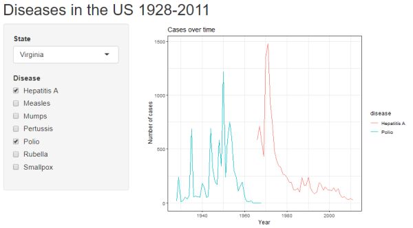
Click the "Run App" button to see what you have. Hopefully you get the following. Notice we have a pull down menu for selecting which state's data to plot.
Filter by disease(s)
Our next customization is allowing the user to select which diseases they want to display in the graph. Here we use the input checkboxGroupInput() to create checkboxes for the user to choose which disease they want to appear on the graph. We will give it the internal name “diseaseInput” and the outward label “Disease”. Hepatitis A and Polio are selected as the default choices to display.
In our code framework, the checkboxGroupInput() function can go directly below our previous selectizeInput() function, separated by a comma.
# within ui, inputs

checkboxGroupInput("diseaseInput", "Disease",
                         choices = c("Hepatitis A",
                                     "Measles",
                                     "Mumps", "Pertussis",
                                     "Polio", "Rubella",
                                     "Smallpox"),
                         selected = c("Hepatitis A", "Polio"))
In the server object, the only change is to add a disease filter to our reactive data, with the argument disease %in% input$diseaseInput. The ggplot function does not change.
d <- reactive({
    filtered <-
      disease %>%
      filter(state == input$stateInput,
             disease %in% input$diseaseInput)

  })
Click the "Run App" button to see the updated user interface. Hopefully you get the following. Notice we now have a series of checkboxes to select which diseases to plot.
Filter by date range
Next, we add a customizable date range to the ui. The sliderInput() function creates a sliding bar scale that can be adjusted on either end. min and max arguments let you set the range of the slider, and value is the default range. sep is a separator for the thousands place in the numbers on the slider, which we will leave empty so that dates follow the format “1945” over “1,945”.
The sliderInput() function goes below our previous two inputs, separated by a comma.
# within ui, inputs

sliderInput("yearInput", "Year", min=1928, max=2011,
            value=c(1928, 2011), sep="")
Like before, year filters are then added to the reactive data in the server object and the ggplot function remains unchanged.
 d <- reactive({
    filtered <-
      disease %>%
      filter(state == input$stateInput,
             disease %in% input$diseaseInput,
             year >= input$yearInput[1],
             year <= input$yearInput[2])

  })
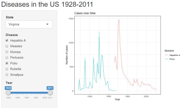
Click the "Run App" button to see the updates. Notice we have a slider bar for customizing the date range displayed on the plot's x-axis.
Count data vs. per capita
Our final customizable input will be allowing the user to select whether the graph displays disease raw counts or per capita data. Here, we’ll use the radioGroupButtons() input, which is part of the shinyWidgets package. The arguments for this input are similar to others we’ve used already, and the function goes below the previous three inputs (separated by a comma).
# within ui, inputs

radioGroupButtons("dataInput", "Data",
                   choiceNames = list("Count", "Per capita"),
                   choiceValues = list("count", "percapita"))
Before we can change the reactive data, we need to make an alteration to how our original dataset is organized, reshaping it so that we have a single column for count and percapita values. We do this by adding the pivot_longer function below the percapita variable we created (at the beginning of the code, just below libraries). At the time of this writing, pivot_longer is a relatively new function, so make sure your tidyverse (or tidyr) package is up to date with the most recent version.
data("us_contagious_diseases")
disease <- us_contagious_diseases
disease <- mutate(disease,
                  percapita = count/(population/100000)) %>%
  pivot_longer(cols = c(count, percapita),
               names_to = "data",
               values_to = "value")
Now that we’ve changed our dataset structure, we can add an additional filtering condition in the reactive data for the data type to reflect the user’s choice of count data vs. per capita data.
d <- reactive({
    disease %>%
      filter(state == input$stateInput,
             disease %in% input$diseaseInput,
             year >= input$yearInput[1],
             year <= input$yearInput[2],
             data == input$dataInput)

  })
We now need to make some alterations to the ggplot function. The y axis is changed from count to value to reflect the user’s choice of data type. We also need to change the y-axis label from ylab("Number of cases") to ylab(input$dataInput) in order to get the axis labels to change on the graph when the user changes the data type.
output$diseaseplot <- renderPlot({

     ggplot(d(), aes(x=year, y = value, color=disease)) +
      geom_line() +
      theme_bw() +
      xlab("Year") +
      ylab(input$dataInput) +
      ggtitle("Cases over time")
})
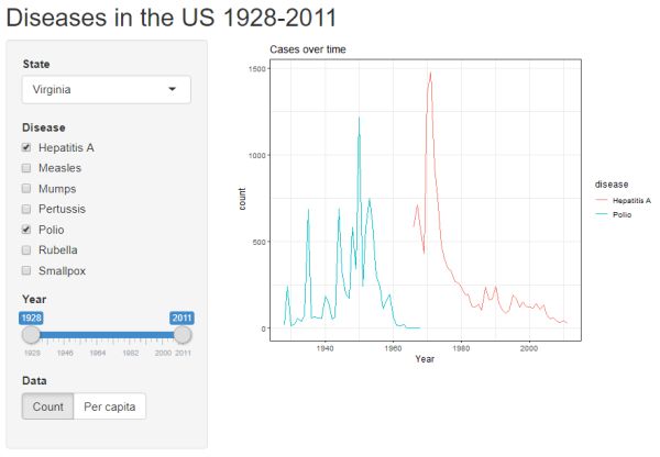
Click the "Run App" button to see the lastest update. Now we have buttons to choose what is displayed on the y-axis: count or per capita.
Frequency table
Now that we’ve finished adding all of our user inputs, we can add a few extra outputs. We can add a frequency table that will display the number of cases or cases per capita of the selected disease(s) for the selected state in the selected time period.
First, we put the place holder for our output (internally called “stats”) in the ui object. Like before, we want this output to be displayed in the main panel of the app, so we will put it beneath the first graph. br() creates a line break to space things out. The output function we want here is verbatimTextOutput, which will verbatim print the text output from the aggregate() function we will use on our data.
# ui, main panel, outputs

mainPanel(
      plotOutput("diseaseplot"),
      br(), br(),
      verbatimTextOutput("stats")
    )
Within the server object, but beneath the output$diseaseplot object, we will add a new output$stats object using the renderPrint({}) function. No comma separation is needed between the disease plot and the frequency table.
We create a frequency table with the aggregate() function. Because we’ve already created the reactive data when we built our line graph, nothing more needs to be done for the frequency table to change based on the user’s input. We call the reactive data with data = d().
# server

 output$stats <- renderPrint({

    aggregate(value ~ disease, data = d(), sum)

  })
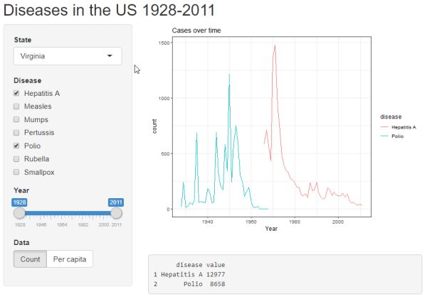
Clicking the "Run App" button reveals a simple output box with disease totals for a given time span.
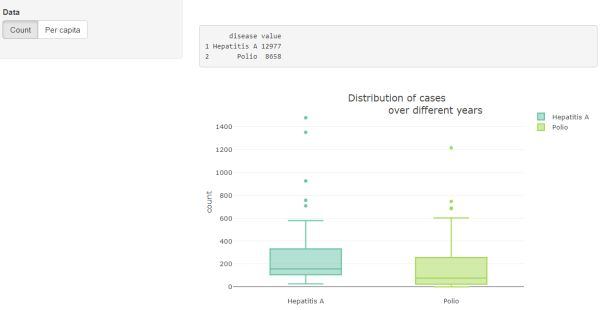
Box plot
Finally, our last output will be a second graph, a box plot, this time using plotly instead of ggplot. Because plotly graphs are interactive, we need to use different output and render functions. Instead of the plotOutput() and renderPlot() functions we used to create the line graph, we will use plotlyOutput() and renderPlotly().
Add a plotlyOutput() function to the UI to create a place holder for our second graph.
# ui, main panel, outputs

plotOutput("diseaseplot"),
br(), br(),
verbatimTextOutput("stats"),
br(), br(),
plotlyOutput("distplot")
In the server object, below the output$stats, we will render our box plot. Set the data equal to the reactive data: data=d(). Set y equal to value (the name of the column containing the count and per capita data), in order to reflect the user’s choice of data type. And set the y-axis label to reflect the user’s input with yaxis = list(title=input$dataInput).
# server, below frequency table

output$distplot <- renderPlotly({

    box <- plot_ly(d(),
                   y = ~value,
                   color = ~disease,
                   type = "box")  %>%
      layout(title = "Distribution of cases
                      over different years",
             yaxis = list(title=input$dataInput))

  })
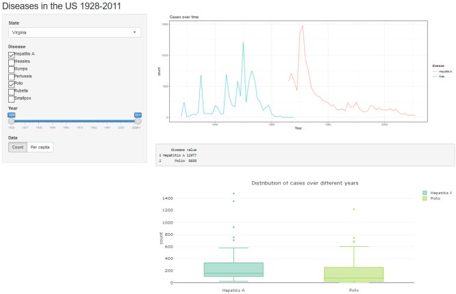
Click the "Run App" button one last time to see the box plots of diseases under the frequency table. Hovering your mouse pointer over the box plots will produce pop-ups of the boxplot statistics.
Full code for this example
To run the finished app, copy and paste the full code below into your app.R file and click the “Run App” button:
library(shiny)
library(shinyWidgets)
library(dslabs)
library(tidyverse)
library(plotly)


data("us_contagious_diseases")
disease <- us_contagious_diseases
disease <- mutate(disease, percapita = count/(population/100000)) %>%
    pivot_longer(cols = c(count, percapita),
                 names_to = "data", values_to = "value")

ui <- fluidPage(

    titlePanel("Diseases in the US 1928-2011"),
    sidebarLayout(
        sidebarPanel(
            # inputs
            selectizeInput("stateInput", "State",
                           choices = unique(disease$state),
                           selected="Virginia", multiple =FALSE),
            checkboxGroupInput("diseaseInput", "Disease",
                               choices = c("Hepatitis A",
                                           "Measles",
                                           "Mumps", "Pertussis",
                                           "Polio", "Rubella",
                                           "Smallpox"),
                               selected = c("Hepatitis A", "Polio")),
            sliderInput("yearInput", "Year", min=1928, max=2011,
                        value=c(1928, 2011), sep=""),
            radioGroupButtons("dataInput", "Data",
                              choiceNames = list("Count", "Per capita"),
                              choiceValues = list("count", "percapita"))
        ),

        mainPanel(
            plotOutput("diseaseplot"),
            br(), br(),
            verbatimTextOutput("stats"),
            br(), br(),
            plotlyOutput("distplot")
        )
    )
)

server <- function(input, output) {

    d <- reactive({
        disease %>%
            filter(state == input$stateInput,
                   disease %in% input$diseaseInput,
                   year >= input$yearInput[1],
                   year <= input$yearInput[2],
                   data == input$dataInput)
    })


    output$diseaseplot <- renderPlot({

        ggplot(d(), aes(x=year, y = value, color=disease)) +
            geom_line() +
            theme_bw() +
            xlab("Year") +
            ylab(input$dataInput) +
            ggtitle("Cases over time")
    })

    output$stats <- renderPrint({

        aggregate(value ~ disease, data = d(), sum)

    })

    output$distplot <- renderPlotly({

        box <- plot_ly(d(), y = ~value,
                       color = ~disease, type = "box")  %>%
            layout(title = "Distribution of cases over different years",
                   yaxis = list(title=input$dataInput))

    })

}

shinyApp(ui=ui, server=server)
References
- The official Shiny cheat sheet: https://shiny.posit.co/r/articles/start/cheatsheet/
- The official Get Started with Shiny guide: https://shiny.posit.co/r/getstarted/shiny-basics/lesson1/index.html
- Chang W, Cheng J, Allaire J, Sievert C,Schloerke B, Xie Y, Allen J, McPherson J, Dipert A, Borges B (2022). shiny: Web Application Framework for R. R package version 1.7.4, https://CRAN.R-project.org/package=shiny.
- Irizarry RA, Gill A (2023). dslabs: Data Science Labs. R package version 0.7.5, https://CRAN.R-project.org/package=dslabs.
- Perrier V, Meyer F, Granjon D (2023). shinyWidgets: Custom Inputs Widgets for Shiny. R package version 0.7.6, https://CRAN.R-project.org/package=shinyWidgets.
- Sievert C (2020). Interactive Web-Based Data Visualization with R, plotly, and shiny. Chapman and Hall/CRC Florida.
Laura White
StatLab Associate
University of Virginia Library
May 7, 2020
For questions or clarifications regarding this article, contact statlab@virginia.edu.
View the entire collection of UVA Library StatLab articles, or learn how to cite.