
The pandas package is an open-source software library written for data analysis in Python. Pandas allows users to import data from various file formats (comma-separated values, JSON, SQL, fits, etc.) and perform data manipulation operations, including cleaning and reshaping the data, summarizing observations, grouping data, and merging multiple datasets. In this article, we’ll explore briefly some of the most commonly used functions and methods for understanding, formatting, and visualizing data with the pandas package.
This package has already been elaborately documented, but so much information can easily become overwhelming. This article is meant to provide a brief introduction to the pandas package, to ease you into its use with an example dataset. We assume that you have already installed pandas as part of your Anaconda/Python 3.6.1+ installation, but if not, you can find some quick install instructions here.
We’ll be using the Virginia Department of Health (VDH) COVID-19 Public Use Dataset in the working example presented here, but the methods used to understand and format these data are applicable to any dataset. From the linked VDH website, you should download the data as a comma-separated values (CSV) file. The figures shown in this article are based on the available VDH data, as of November 10, 2020.
Reading the data into pandas
We’ll start by simply importing pandas and reading in the relevant data using the read_csv() function. Like we said in the intro, pandas is capable of reading in data from various file formats, so you certainly aren’t limited to formatting all of your data into CSVs, even though it’s the format that we’re using in this example. The data are stored in a data structure called a DataFrame, which we define by the variable name df.
import pandas as pd

df = pd.read_csv('https://static.lib.virginia.edu/statlab/materials/data/VDH-COVID-19-PublicUseDataset-EventDate.csv')
Understanding the data format
Let’s get a quick look at the data. To do this, we’re going to use the head() function, which will show us the first 5 rows of the DataFrame:
df.head()
   Event Date  ... Number of Deaths
0  02/16/2020  ...                0
1  02/16/2020  ...                0
2  02/17/2020  ...                0
3  02/18/2020  ...                0
4  02/18/2020  ...                0

[5 rows x 6 columns]
Notice it reports we have six columns but only shows the first and last columns. To see all columns we need to set the “display.max_columns” to a higher value using the set_option() function. Below we set it to 6 and run head() again.
pd.set_option("display.max_columns", 6)
df.head()
   Event Date Health Planning Region Case Status  Number of Cases  \
0  02/16/2020                Central   Confirmed                1
1  02/16/2020               Northern   Confirmed                1
2  02/17/2020               Northern   Confirmed                2
3  02/18/2020                Central   Confirmed                1
4  02/18/2020               Northern   Confirmed                1

   Number of Hospitalizations  Number of Deaths
0                           0                 0
1                           1                 0
2                           1                 0
3                           1                 0
4                           0                 0
Similarly, the tail() function will show us the last 5 rows of the DataFrame:
df.tail()
      Event Date Health Planning Region Case Status  Number of Cases  \
2333  11/09/2020               Northern    Probable                2
2334  11/09/2020              Northwest   Confirmed                4
2335  11/09/2020              Northwest    Probable                5
2336  11/09/2020              Southwest   Confirmed                3
2337  11/09/2020              Southwest    Probable                6

      Number of Hospitalizations  Number of Deaths
2333                           0                 0
2334                           0                 0
2335                           0                 0
2336                           1                 0
2337                           0                 0
Let’s also use the describe() function to get a brief statistical summary of the numeric columns in the data, including descriptive statistics of the central tendency and dispersion.
df.describe()
       Number of Cases  Number of Hospitalizations  Number of Deaths
count      2338.000000                 2338.000000       2338.000000
mean         83.350727                    5.302395          1.569718
std         102.344520                    8.942770          2.876367
min           0.000000                    0.000000          0.000000
25%          11.000000                    0.000000          0.000000
50%          39.000000                    2.000000          0.000000
75%         129.000000                    8.000000          2.000000
max         741.000000                   84.000000         28.000000
Based on this quick look, we can tell that these are a set of time-series data giving the number of probable and confirmed COVID-19 cases, hospitalizations, and deaths in the various health regions of Virginia, beginning in February 2020 and ending in November 2020. The statistical summary tells us that there are 2338 rows (or data points) in the DataFrame, and a mean of about 83 cases reported per day. Note, this number is a measure of the central tendency of the entire DataFrame and does not take into account possible subsets of interest (e.g., mean number of confirmed cases per day or cases per health planning region). We’ll talk about subsetting the data later in this article.
Changing or reshaping the data format
We also need to choose which data are relevant and make sure that the DataFrame is in a format that can be easily understood by the user.
First, let’s make sure that the data contained in each column are in a usable format. We can check this using dtpyes:
df.dtypes
Event Date                    object
Health Planning Region        object
Case Status                   object
Number of Cases                int64
Number of Hospitalizations     int64
Number of Deaths               int64
dtype: object
The first three columns—Event Date, Health Planning Region, and Case Status—are currently formatted as object types (meaning they can be strings or mixed numeric and non-numeric values), and the last three columns—Number of Cases, Hospitalizations, and Deaths—are formatted as 64-bit integers (int64). Having integer numbers of cases, etc. makes sense intuitively, so we’ll leave these columns alone. However, because these are time-series data and we’re probably going to want to look at how each of these parameters varies as a function of time (i.e., Event Date), we want to change the data type so that the Event Date column is in a usable format. The pandas package has a nice helper function, to_datetime(), which can interpret a string or object as a date-time value. Applying this function, we now see that the dtype of the Event Date column has been changed to datetime64:
df['Event Date'] = pd.to_datetime(df['Event Date'])
df.dtypes
Event Date                    datetime64[ns]
Health Planning Region                object
Case Status                           object
Number of Cases                        int64
Number of Hospitalizations             int64
Number of Deaths                       int64
dtype: object
If we look at the last five rows of the DataFrame now, we see that the Event Date column appears a little different, but now the values in this column can be easily interpreted by any plotting function we might use later on.
df.tail()
     Event Date Health Planning Region Case Status  Number of Cases  \
2333 2020-11-09               Northern    Probable                2
2334 2020-11-09              Northwest   Confirmed                4
2335 2020-11-09              Northwest    Probable                5
2336 2020-11-09              Southwest   Confirmed                3
2337 2020-11-09              Southwest    Probable                6

      Number of Hospitalizations  Number of Deaths
2333                           0                 0
2334                           0                 0
2335                           0                 0
2336                           1                 0
2337                           0                 0
Next, let’s reshape the data.
Let’s say, for example, that we aren’t really interested in which health planning region cases were reported from, and we’d like to see the DataFrame without that column.
This is easily done using the drop() function. If you are certain that you don’t want to use this column in any of your analysis, you can save the reshaped DataFrame with the same variable name (i.e., df = df.drop(...)) and continue to use the variable name that we picked when we read the data into pandas.
df = df.drop(columns=['Health Planning Region'])
Some of the column names are also a little wordy, so we might want to rename them to be more concise using the rename() function:
df = df.rename(columns={'Event Date':'Date',
                        'Case Status':'Status',
                        'Number of Cases':'Cases',
                        'Number of Hospitalizations':'Hospitalizations',
                        'Number of Deaths':'Deaths'})
Finally, we only want to look at the data for confirmed cases, hospitalizations, and deaths caused by COVID-19. To extract only those rows containing confirmed cases (i.e., subset the data), we’ll use a mask:
df_confirmed = df[df['Status'] == 'Confirmed']
And then sum over the event date, since there are multiple inputs for each date (from each health planning region):
df_confirmed = df_confirmed.groupby('Date').sum()
df_confirmed.tail()
            Cases  Hospitalizations  Deaths
Date
2020-11-05    692                35       4
2020-11-06    427                29       3
2020-11-07    141                17       1
2020-11-08     83                12       2
2020-11-09     13                 3       0
Note, that groupby() has changed the indexing of the DataFrame. Previously, each row was indexed by an integer (i.e., values from 0 to 2337), but now each row is indexed by a date-time value.
There are many other ways to reshape data, including merging and concatenating multiple DataFrames or pivoting the DataFrame, and several ways to handle missing or NaN data (e.g., dropping rows that contain null data or filling the null data with a value) that aren’t necessary to apply to this dataset but may be applicable for other datasets. See the pandas documentation for details on each of these processes.
Working with the data
Now we’re ready to start working with the data!
Let’s start with just a simple scatter plot of the number of cases as a function of time. Remember that the DataFrame is now indexed by a date-time value, so we can just use the index for plotting as a function of time. We’ll import a python library called matplotlib and use the pyplot collection of functions that make the returned plots look similar to those generated by MATLAB.
Each line of code has been commented to explain what portion of the plot is produced by that line of code.
import matplotlib.pyplot as plt

fig, ax = plt.subplots(figsize=(7,5)) # define a subplot, and set the size of the figure

# Generate the plot
ax.scatter(df_confirmed.index, # x values for each data point
            df_confirmed['Cases'], # y values for each data point
            color='blue', # color of each data point
            marker='^' # shape of each data point, see scatter documentation for other marker options
           )

ax.set_xlabel('Date', fontsize=12) # set x axis label and fontsize
ax.set_ylabel('Number of Cases', fontsize=12) # set y axis label and fontsize

plt.xticks(rotation=60) # rotate the x tick labels to avoid crowding
plt.tight_layout() # formats margins for saving figure to file
plt.savefig('cases_vs_time.jpg', dpi=300) # save figure

Similar plots could be made for number of hospitalizations or number of deaths as a function of time, but let’s try something a little more interesting!
What if we wanted to make a plot of the number of hospitalizations per case as a function of time? Here we have two options: (1) Add a new column to the DataFrame dividing the Hospitalizations column by the Cases column, or (2) set the y-axis data equal to Hospitalizations divided by Cases.
If we wanted to make a new column, we could just use:
df_confirmed['Hospitalization Rate'] = df_confirmed['Hospitalizations']/df_confirmed['Cases']
If we don’t necessarily want to add this new parameter to the existing DataFrame, we could also do this calculation during the plotting step:
fig, ax = plt.subplots(figsize=(7,5)) # define a subplot, and set the size of the figure

# Generate the plot
ax.scatter(df_confirmed.index, # x values for each data point
            df_confirmed['Hospitalizations']/df_confirmed['Cases'], # y values for each data point
            color='blue', # color of each data point
            marker='^' # shape of each data point, see scatter documentation for other marker options
           )

# Set axis labels
ax.set_xlabel('Date', fontsize=12) # set x axis label and fontsize
ax.set_ylabel('Number of Hospitalizations per Case', fontsize=12) # set y axis label and fontsize

plt.xticks(rotation=60) # rotate the x tick labels to avoid crowding
# Save the plot
plt.tight_layout() # formats margins for saving figure to file
plt.savefig('hospitalization_rate_vs_time.jpg', dpi=300) # save figure

Another metric of interest specific to this dataset is the average number of new COVID-19 cases measured over 3, 7, or 14 days. The pandas library has a nice function for calculating moving (or rolling) statistics—including mean, sum, standard deviation, etc.—which applies the selected summary function to data blocks of a given length (called a “window”). For our example, let’s say we want to calculate the 14-day moving average (i.e., mean) number of cases. We will add this calculated parameter to the DataFrame in a new column called Case MA (for “moving average”) using:
df_confirmed['Case MA'] = df_confirmed['Cases'].rolling(window=14).mean()
We can now also plot this parameter on top of our plot showing the number of confirmed cases per day:
fig, ax = plt.subplots(figsize=(7,5)) # define a subplot, and set the size of the figure

# Generate the plot
ax.scatter(df_confirmed.index, # x values for each data point
            df_confirmed['Cases'], # y values for each data point
            color='blue', # color of each data point
            marker='^' # shape of each data point, see scatter documentation for other marker options
           )

ax.plot(df_confirmed.index, # x values for the line
            df_confirmed['Case MA'], # y values for the line
            color='red' # color of the line
           )

ax.set_xlabel('Date', fontsize=12) # set x axis label and fontsize
ax.set_ylabel('Number of Cases', fontsize=12) # set y axis label and fontsize

plt.xticks(rotation=60) # rotate the x tick labels to avoid crowding
plt.tight_layout() # formats margins for saving figure to file
plt.savefig('cases_MA_vs_time.jpg', dpi=300) # save figure
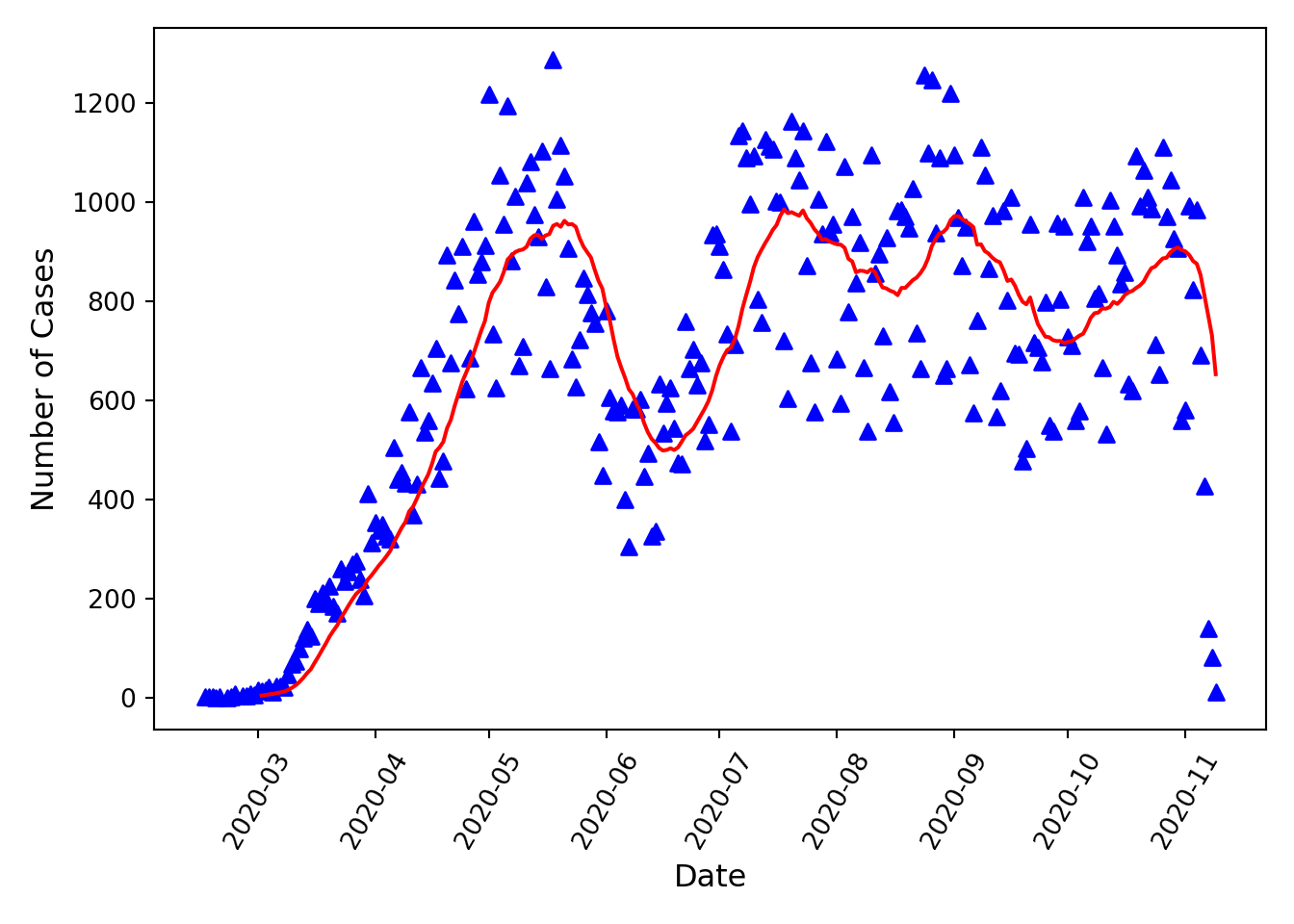
Note that the rolling summary function cannot be calculated for the first window-1 data points. Note also, this particular dataset is likely not complete (i.e., not all cases reported) for the last (approximately) 7 days that data are available for, so the sharp decrease in case counts shown in the last week should not be assumed to be a real trend.
Summary
In this article, we’ve briefly gone over some of the most important tools that pandas provides for reading, reshaping, formatting, and grouping/subsetting datasets. Hopefully the tools provided here will get you started working with any dataset using the pandas library, but you will almost certainly need to read some parts of the pandas documentation to complete any data analysis or data visualization project.
Python session details
Python version: 3.9.6
pandas version: 1.4.0
matplotlib version: 3.5.1
Hannah Lewis
StatLab Associate
University of Virginia Library
November 10, 2020
Updated December 17, 2025
For questions or clarifications regarding this article, contact statlab@virginia.edu.
View the entire collection of UVA Library StatLab articles, or learn how to cite.