
Binomial generalized linear mixed models, or binomial GLMMs, are useful for modeling binary outcomes for repeated or clustered measures. For example, let’s say we design a study that tracks what college students eat over the course of 2 weeks, and we’re interested in whether or not they eat vegetables each day. For each student, we’ll have 14 binary events: eat vegetables or not. Using a binomial GLMM, we could model the probability of eating vegetables daily given various predictors such as sex of the student, race of the student, and/or some “treatment” we applied to a subset of the students, such as a nutrition class. Since each student is observed over the course of multiple days, we have repeated measures and thus the need for a mixed-effects model.
Before we show how to implement and interpret a binomial GLMM, we’ll first simulate some data that is appropriate for a binomial GLMM. If we know how to simulate data for a given model, then we have a better understanding of the model’s assumptions and coefficients. We’ll use R to simulate the data and perform the modeling.
To begin we simulate data for four predictor variables:
id(identifying number of subject)day(day of observation)trt(treatment status: control or treat)sex(male or female)
We set n to 250 which means we’ll have 250 subjects in our data. Then we use seq(n) to generate a vector of integers ranging 1 to 250 and assign them to id. These will be our subject ids. We assign to day the integers 1--14 and then use expand.grid() to create all combinations of id and day and assign the result to d, which is a data frame. To simulate the trt and sex variables, we simply sample 250 times from the possible values with replacement. The set.seed(1) function ensures we always simulate the same values, which you’ll need to run if you want to replicate the results of this article. After we simulate the trt and sex values, we need to repeat them 14 times each for each subject id. We do that by using subsetting brackets and assigning the result to the data frame d. Finally we sort the data by id and day, reset the row numbers, and look at the first 15 records.
n <- 250
id <- seq(n)
day <- 1:14
d <- expand.grid(id = id, day = day)
set.seed(1)
trt <- sample(c("control", "treat"), size = n, replace = TRUE)
sex <- sample(c("female", "male"), size = n, replace = TRUE)
d$trt <- trt[d$id]
d$sex <- sex[d$id]
d <- d[order(d$id, d$day),]
rownames(d) <- NULL
head(d, n = 15)
     id day     trt    sex
  1   1   1 control female
  2   1   2 control female
  3   1   3 control female
  4   1   4 control female
  5   1   5 control female
  6   1   6 control female
  7   1   7 control female
  8   1   8 control female
  9   1   9 control female
  10  1  10 control female
  11  1  11 control female
  12  1  12 control female
  13  1  13 control female
  14  1  14 control female
  15  2   1   treat   male
We see that subject 1 is a female in the control group, with 14 observations over 14 days.
Now we’re ready to use these data to simulate zeroes and ones for the event of eating vegetables or not, where a 0 means “did not eat vegetables” and a 1 means “ate vegetables.” We want to simulate the zeroes and ones using probabilities. We’ll use the rbinom() function to do this, which generates zeroes or ones from a binomial distribution. For example, to generate 5 flips of a single coin with a probability of success (say, heads) of 0.5, we can do the following:
rbinom(n = 5, size = 1, prob = 0.5)
[1] 1 1 1 1 0
But we don’t have a constant probability. We’ll have a probability that changes based on the sex of the subject and whether they were in the treatment group or not. Since we’re simulating the data, we get to pick the probabilities.
- female, control: p = 0.40
- female, treated: p = 0.85
- male, control: p = 0.30
- male, treated: p = 0.50
These are what we might call fixed effects. We’re saying the effects of treatment and sex are fixed, no matter who you are, where you’re from, how old you are, etc. This may not be a plausible assumption in real life, but that’s what we’re assuming when we simulate this particular data set. Also notice these effects interact. The effect of treatment increases the female probability by 0.45 but only increases the male probability by 0.20. The effect of treatment depends on sex, which implies they interact.
But recall we’re observing the same person 14 days in a row. This means we won’t have independent observations. Those 14 observations on the same person may be correlated in some way. The simplest way to induce this correlation is to add a random effect for each person. For example, maybe a male student grew up in a family that had a garden in the backyard and was raised eating homegrown vegetables. His random effect might be an additional 0.10 probability. So if he was in the control group, his probability might be 0.30 (fixed) + 0.10 (random) = 0.40. So now we have a mix of fixed effects and random effects.
Let’s add our fixed effect probabilities to the data frame. We use the interaction() function to create a 4-level factor called trtsex that indicates whether a subject is male/female and treated/control. Then we create a vector of probabilities and name the vector using the level names of the trtsex variable. This becomes a lookup table which we can use with trtsex to quickly determine a subject’s fixed effect probability.
d$trtsex <- interaction(d$trt, d$sex)
probs <- c(0.40, 0.85, 0.30, 0.50)
names(probs) <- levels(d$trtsex)
d$p <- probs[d$trtsex]
Now let’s add random effect probabilities. We’ll do this by drawing n random samples from a normal distribution with a mean 0 and a standard deviation of 0.03. This will create random amounts of probability that we add or subtract from a subject’s fixed effect probability. Again we use r_probs as a lookup table and use subsetting brackets to pick the random probability according to subject id. Notice it gets repeated 14 times for each subject.
set.seed(3)
r_probs <- rnorm(n = n, mean = 0, sd = 0.03)
d$random_p <- r_probs[d$id]
d$p <- d$p + d$random_p
And now we can use the probabilities to generate zeroes and ones with the binom() function.
d$y <- rbinom(n = nrow(d), size = 1, prob = d$p)
With that our data is simulated. Let’s inspect the first few records.
head(d[c("id", "day", "trt", "sex", "p", "y")])
    id day     trt    sex        p y
  1  1   1 control female 0.371142 0
  2  1   2 control female 0.371142 0
  3  1   3 control female 0.371142 1
  4  1   4 control female 0.371142 0
  5  1   5 control female 0.371142 0
  6  1   6 control female 0.371142 0
Subject 1 (female/control) reported eating vegetables 1 time in the first 6 days. And we see her probability is 0.37. Her random effect is about 0.37 - 0.40 = -0.03.
Let’s look at subject 5.
head(d[d$id == 5, c("id", "day", "trt", "sex", "p", "y")])
     id day   trt    sex         p y
  57  5   1 treat female 0.8558735 1
  58  5   2 treat female 0.8558735 1
  59  5   3 treat female 0.8558735 1
  60  5   4 treat female 0.8558735 1
  61  5   5 treat female 0.8558735 1
  62  5   6 treat female 0.8558735 1
Subject 5 (female/treat) reported eating vegetables every day in the first 6 days. And we see her probability is about 0.86. Her random effect is around 0.86 - 0.85 = 0.01.
Full disclosure: The way we just simulated our data is not technically correct! We could have easily generated a random effect that pushed a subject’s probability beyond 1 or below 0! However, we thought this approach was a good place to start because it allows us to think in terms of probabilities. The correct way is demonstrated later in the article and, as we’ll see, involves log-odds, which are less intuitive.
Now let’s work backwards and pretend we don’t know the probabilities we defined above. We just have id, day, trt, sex and y. We want to fit a binomial GLMM model to see how sex and trt affect the probability of eating vegetables. In real life, we won’t know if or how they affect the probability. We may have a hunch, but all we can really do is propose a model and see how well it fits the data. To do this, we’ll use the glmer() function in the lme4 package.
Let’s make life easy for us and propose the “correct” model, which we know since we simulated the data. We model y as a function of sex, trt, and their interaction: y ~ trt * sex. We also include a random effect for each subject with + (1|id), which is also known as a random intercept since the model estimates a different intercept for each subject. We can read 1|id as “the intercept is conditional on subject id.” (In R model syntax, 1 represents the intercept.) We also specify family = binomial to indicate we assume the response was drawn from a binomial distribution, which is correct in this case.
library(lme4)
m <- glmer(y ~ trt * sex + (1|id), data = d, family = binomial)
summary(m, corr = FALSE)
  Generalized linear mixed model fit by maximum likelihood (Laplace
    Approximation) [glmerMod]
   Family: binomial  ( logit )
  Formula: y ~ trt * sex + (1 | id)
     Data: d

       AIC      BIC   logLik deviance df.resid
    4132.4   4163.3  -2061.2   4122.4     3495

  Scaled residuals:
      Min      1Q  Median      3Q     Max
  -2.6008 -0.8434  0.3774  0.9704  1.6878

  Random effects:
   Groups Name        Variance Std.Dev.
   id     (Intercept) 0.03944  0.1986
  Number of obs: 3500, groups:  id, 250

  Fixed effects:
                   Estimate Std. Error z value Pr(>|z|)
  (Intercept)      -0.30840    0.07127  -4.327 1.51e-05 ***
  trttreat          2.18835    0.12423  17.615  < 2e-16 ***
  sexmale          -0.63440    0.10859  -5.842 5.16e-09 ***
  trttreat:sexmale -1.21669    0.16556  -7.349 2.00e-13 ***
  ---
  Signif. codes:  0 '***' 0.001 '**' 0.01 '*' 0.05 '.' 0.1 ' ' 1
In the summary we see random effects and fixed effects. The fixed effect coefficients are not on the probability scale but on the log-odds, or logit, scale. The logit transformation takes values ranging from 0 to 1 (probabilities) and transforms them to values ranging from \(-\infty\) to \(+\infty\). This allows us to create additive linear models without worrying about going above 1 or below 0. To get probabilities out of our model, we need to use the inverse logit. There is function for this in base R called plogis(). For example, the predicted log-odds a female in the control group eats vegetables is the intercept: -0.30840. The inverse logit of that is:
plogis(-0.30840)
[1] 0.4235053
The predicted probability of 0.42 is pretty close to the 0.40 value we used to generate the data.
The predicted log-odds a female in the treatment group eats vegetables is the intercept plus the coefficient for trttreat: -0.30840 + 2.18835 = 1.87995. The inverse logit is:
plogis(1.87995)
[1] 0.8676054
The predicted probability of 0.87 is close to the 0.85 value we used to generate the data.
The predicted log-odds a male in the control group eats vegetables is the intercept plus the coefficient for sexmale: -0.30840 + -0.63440 = -0.9428. The inverse logit is:
plogis(-0.9428)
[1] 0.2803351
The predicted probability of 0.28 is close to the 0.30 value we used to generate the data.
Finally the predicted log-odds a male in the treatment group eats vegetables is the sum of all the coefficients: -0.30840 + 2.18835 + -0.63440 + -1.21669 = 0.02886. The inverse logit is:
plogis(0.02886)
[1] 0.5072145
The predicted probability of 0.51 is very close to the 0.50 value we used to generate the data.
Instead of using plogis(), we can simply use the predict() function. The re.form = NA argument says to only estimate the fixed effects. The data frame given to the newdata argument represents all possible combinations of subject type.
predict(m, type = "response",
        re.form = NA,
        newdata = data.frame(sex = c("female", "female",
                                     "male", "male"),
                             trt = c("control", "treat",
                                     "control", "treat"))
        )
          1         2         3         4
  0.4235043 0.8676050 0.2803350 0.5072137
The predicted probabilities are the same as we calculated “by hand” above (minus some rounding error).
We could also interpret the model coefficients. To do this, we exponentiate them to get an odds ratio. For example, exponentiating the treat coefficient yields 8.92.
exp(2.18835)
[1] 8.920482
That says the odds of “success” (i.e., eating vegetables) for a female in the treatment group is about 8.9 times higher than the odds of success for a female in the control group.
We could also exponentiate the confidence interval to get a lower and upper bound on the odds ratio:
exp(confint(m, parm = "trttreat"))
  Computing profile confidence intervals ...
              2.5 %   97.5 %
  trttreat 7.023558 11.44831
So we might conclude the odds of “success” are at least 7 times higher for the female treated versus the female control.
But odds ratios are relative and can sometimes sound alarmist. For example, let’s say the effect of treat caused the probability of success to increase from 0.001 to 0.009. Neither probability is very likely, but the odds ratio is about 9.
odds1 <- 0.001/(1 - 0.001)
odds2 <- 0.009/(1 - 0.009)
odds2/odds1
[1] 9.072654
In this case, describing the treatment effect as making the odds of success 9 times more likely may suggest to an unsuspecting reader that it’s more efficacious than it really is. That’s why it’s a good idea to examine expected probabilities in addition to odds ratios.
In the "Random Effects:" section, we see the estimated standard deviation of the intercept random effect, which we can extract from the model object with the VarCorr() function.
VarCorr(m)
   Groups Name        Std.Dev.
   id     (Intercept) 0.1986
0.20 is the estimate of 0.03, the standard deviation we used to simulate our random probability effects. This seems to be a rather poor estimate. However, if we calculate a 95% confidence interval on this estimate, we see that 0.03 falls well within the interval. To do this we call the confint() function and specify parm = "theta_" to indicate we want a confidence interval for the estimated standard deviation of the intercept random effect. Setting oldNames = FALSE provides more informative output.
confint(m, parm = "theta_", oldNames = FALSE)
   Computing profile confidence intervals ...
                     2.5 %    97.5 %
   sd_(Intercept)|id     0 0.3453926
This confidence interval extends to 0, suggesting there may be no random variability between subjects. However, we know we have variability because we generated the data. Plus the structure of the data dictates we should accommodate variance between subjects as well as within subjects. In other words, we don’t have independent observations. So in real life we wouldn’t seriously entertain dropping the random effect.
If we were to report this model using mathematical notation, we might write it in this form:
$${Prob}(y_{j} = 1) = \text{logit}^{-1}(-0.31 + 2.19 \times \text{Treat} - 0.63 \times \text{Male} - 1.22 \times \text{Treat} \times \text{Male} + u_j)$$
where \(j\) represents the subject id and
$$u_j \sim N(0, 0.04)$$
The \(u_j\) is the random effect for each person. This says each subject’s random effect is assumed to be drawn from a normal distribution with mean 0 and standard deviation 0.20 (variance = 0.04).
\(\text{logit}^{-1}\) is the inverse logit function, and it corresponds to the plogis() function we used to transform log-odds into probability. In the language of generalized linear models, this is the link function. The logit is the link between an additive linear model and a probability outcome.
Side note: Previously, we mentioned that we had generated our fake data incorrectly because we ran the risk of simulating probabilities outside the range of [0,1]. The correct way would have been to use the logit transformation as just described. However, that means working with log-odds instead of probabilities, which are less intuitive. It’s not impossible to do, just inconvenient. Here’s how we could have simulated our response probabilities using log-odds and a logit transformation. See this page for how we derived the log-odds.
d$p2 <- plogis(-0.4054651 +
                 2.140066*(d$trt == "treat") +
                 -0.4418328*(d$sex == "male") +
                 -1.292768*(d$trt == "treat")*(d$sex == "male") +
                 rnorm(n = n, mean = 0, sd = 0.03)[d$id])
d$y2 <- rbinom(n = nrow(d), size = 1, prob = d$p2)
Returning to our estimated model, m, we can use it to simulate response data with the simulate() function. If our model is “good,” it should simulate response data similar to what we observed. Here we use it to simulate 100 different data sets. It essentially takes our 3500 observed predictors, feeds them into the model, and generates a new series of ones and zeroes to indicate whether someone ate a vegetable or not. The result is a 100 column data frame which we save to an object called sim.
sim <- simulate(m, nsim = 100)
So what can we do with this data frame? One application is to use it to visualize how our estimated model performs compared to our observed data. We can look at our observed data by simply taking the mean of y by trt and sex using the aggregate() function. (Recall the means of zeroes and ones is the proportion of ones.)
obs <- aggregate(d$y, by = list(trt = d$trt, sex = d$sex), mean)
obs
        trt    sex         x
  1 control female 0.4242424
  2   treat female 0.8659341
  3 control   male 0.2820823
  4   treat   male 0.5071429
Notice the observed probabilities are very close to our model predicted probabilities.
Now let’s do the same thing to all the columns in the sim data frame. We apply the aggregate() function to each column, passing to aggregate() the same arguments we used for the observed data. Then we combine the results into one data frame using the do.call() and rbind() functions.
s_p <- lapply(sim, aggregate,
              by = list(trt = d$trt,sex = d$sex),
              mean)
s_df <- do.call(rbind, s_p)
Now we can plot the observed and simulated data to see how close the model-simulated data comes to the observed data. We use ggplot2 to create this plot. First we use geom_point() to plot the obs data frame, making the observed proportions appear with a bigger blue point. Then we plot the simulated data in the s_df data frame using geom_jitter(), which “jitters” the points sideways. The alpha = 1/2 argument makes the points transparent and the shape = 1 argument turns the points into open circles.
library(ggplot2)
ggplot() +
  geom_point(aes(y = x, x = trt), data = obs,
             size = 4, color = "blue") +
  geom_jitter(aes(y = x, x = trt), data = s_df,
              width = 0.2, height = 0, shape = 1, alpha = 1/2) +
  facet_wrap(~sex) +
  labs(x = "Treatment", y = "Predicted Probability",
       title = "Model with interaction")
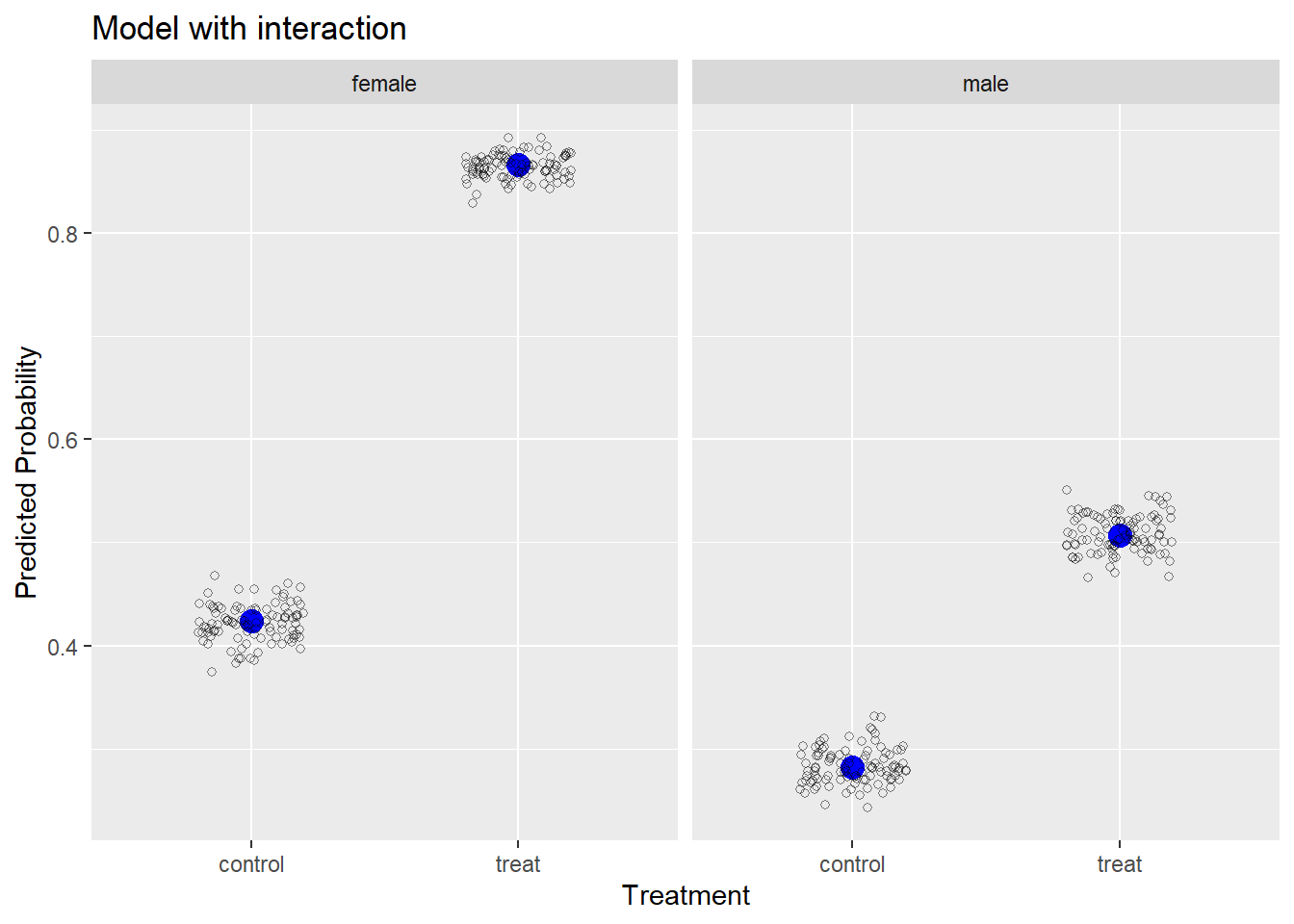
We can see our model-simulated data hovers very closely to the observed data, which is not surprising since we fit the “correct” model to the data.
Let’s fit a wrong model and recreate the plot. Below we fit a model without an interaction of trt and sex. This is not how we simulated the data, so we know the model is wrong. After we fit the model, we rerun the same code above to simulate responses from our model 100 times and plot them with the observed data.
m2 <- glmer(y ~ trt + sex + (1|id), data = d, family = binomial)
sim2 <- simulate(m2, nsim = 100)
s_p2 <- lapply(sim2, aggregate,
              by = list(trt = d$trt, sex = d$sex),
              mean)
s_df2 <- do.call(rbind, s_p2)
ggplot() +
  geom_point(aes(y = x, x = trt), data = obs,
             size = 4, color = "blue") +
  geom_jitter(aes(y = x, x = trt), data = s_df2,
              width = 0.2, height = 0, shape = 1, alpha = 1/2) +
  facet_wrap(~sex) +
  labs(x = "Treatment", y = "Predicted Probability",
       title = "Wrong model: without interaction")
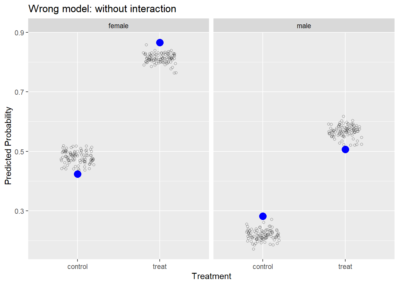
Our model is systematically under-predicting and over-predicting probabilities of success. If our model was “good,” we would expect it to generate data similar to what we observed.
Logistic regression and mixed-effects modeling are massive topics and we have just touched on the basics. But hopefully you now have a better idea of how the two can be combined to allow us to model the probability of binary events when we have clustered or repeated measures.
R session details
The analysis was done using the R Statistical language (v4.5.1; R Core Team, 2025) on Windows 11 x64, using the packages lme4 (v1.1.37), Matrix (v1.7.4) and ggplot2 (v3.5.2).
References
- Bates D, Maechler M, Bolker B, Walker S (2015). Fitting Linear Mixed-Effects Models Using lme4. Journal of Statistical Software, 67(1), 1-48. doi:10.18637/jss.v067.i01.
- R Core Team (2025). R: A Language and Environment for Statistical Computing. R Foundation for Statistical Computing, Vienna, Austria. https://www.R-project.org/.
- Wickham, H. (2016). ggplot2: Elegant Graphics for Data Analysis. Springer-Verlag New York.
Clay Ford
Statistical Research Consultant
University of Virginia Library
March 19, 2021
For questions or clarifications regarding this article, contact statlab@virginia.edu.
View the entire collection of UVA Library StatLab articles, or learn how to cite.