
Loglinear models model cell counts in contingency tables. They're a little different from other modeling methods in that they don't distinguish between response and explanatory variables. All variables in a loglinear model are essentially "responses."
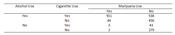
To learn more about loglinear models, we'll explore the following data from Agresti (1996, Table 6.3). It summarizes responses from a survey that asked high school seniors in a particular city whether they had ever used alcohol, cigarettes, or marijuana.
We're interested in how the cell counts in this table depend on the levels of the categorical variables. If we were interested in modeling, say, marijuana use as a function of alcohol and cigarette use, then we might perform logistic regression. But if we're interested in understanding the relationship between all three variables without one necessarily being the "response," then we might want to try a loglinear model.
First, let's get the data into R. We usually import data from an external file, but since the data set is relatively small, we can type it in.
seniors <- array(data = c(911, 44, 538, 456, 3, 2, 43, 279),
                         dim = c(2,2,2),
                         dimnames = list("cigarette" = c("yes","no"),
                                         "marijuana" = c("yes","no"),
                                         "alcohol" = c("yes","no")))
We use the array() function when we want to create a table with more than two dimensions. The dim argument says we want to create a table with 2 rows, 2 columns, and 2 layers. In other words, we want to create two 2 x 2 tables: cigarette versus marijuana use for each level of alcohol use. The dimnames argument provides names for the dimensions. It requires a list object, so we wrap the argument's input in the list() function. The order is rows, columns, and then layers. The data argument provides the cell counts. Notice the order of entry. We fill the columns starting at the top left for each layer and work our way down. Finally we assign it to an object called seniors.
Notice when we print the object, it produces two 2 x 2 tables:
seniors
, , alcohol = yes

         marijuana
cigarette yes  no
      yes 911 538
      no   44 456

, , alcohol = no

         marijuana
cigarette yes  no
      yes   3  43
      no    2 279
If we want to print the table to look like our data source, we need to flatten it. We can do with the ftable() function. The row.vars argument specifies which variables we want in the rows, and the order we want them in. Notice we use the names we specified in the dimnames argument when we created the table.
ftable(seniors, row.vars = c("alcohol","cigarette"))
                  marijuana yes  no
alcohol cigarette
yes     yes                 911 538
        no                   44 456
no      yes                   3  43
        no                    2 279
Before proceeding to modeling, we may want to explore the data. The addmargins() function provides marginal totals. We see that 2276 students participated in the survey, and most of them tried alcohol.
addmargins(seniors)
, , alcohol = yes

         marijuana
cigarette yes  no  Sum
      yes 911 538 1449
      no   44 456  500
      Sum 955 994 1949

, , alcohol = no

         marijuana
cigarette yes  no Sum
      yes   3  43  46
      no    2 279 281
      Sum   5 322 327

, , alcohol = Sum

         marijuana
cigarette yes   no  Sum
      yes 914  581 1495
      no   46  735  781
      Sum 960 1316 2276
The prop.table() function allows us to calculate cell proportions. It has a margin argument that allows us to specify which margin we want to work across. 1 means rows; 2 means columns, and 3 and above refer to the layers. Below we calculate proportions across the columns along the rows for each layer. Hence the argument margin = c(1,3):
prop.table(seniors, margin = c(1,3))
, , alcohol = yes

         marijuana
cigarette       yes        no
      yes 0.6287095 0.3712905
      no  0.0880000 0.9120000

, , alcohol = no

         marijuana
cigarette         yes        no
      yes 0.065217391 0.9347826
      no  0.007117438 0.9928826
We see that of those students who tried cigarettes and alcohol, 62% also tried marijuana. Likewise, of those students who did not try cigarettes or alcohol, 99% also did not try marijuana. There definitely appears to be some sort of relationship here.
Now we're ready to try some loglinear modeling. For this article we'll use the glm() function, which means we need to transform our data into a different format. While there is a function, loglin(), that works directly with contingency tables, we find it easier to work with the formula-based glm() function.
We can easily transform our data by converting it to a data frame. Calling as.data.frame() on a table object in R returns a data frame with a column for cell frequencies where each row represents a unique combination of variables. But we also need to convert our array into a table. We can do that with as.table(). Below we do it with one line. After that we set the reference level for our three variables to "no." This means the model coefficients will be expressed in terms of "yes" answers, which would seem to be more interesting given the age of our subjects.
seniors.df <- as.data.frame(as.table(seniors))
seniors.df[,-4] <- lapply(seniors.df[,-4], relevel, ref = "no")
seniors.df
  cigarette marijuana alcohol Freq
1       yes       yes     yes  911
2        no       yes     yes   44
3       yes        no     yes  538
4        no        no     yes  456
5       yes       yes      no    3
6        no       yes      no    2
7       yes        no      no   43
8        no        no      no  279
Now our data is ready for loglinear modeling using the glm() function. Before we get started, let's think about why we call it "loglinear." Let's say I flip a quarter 40 times; you flip a nickel 40 times, and we record the results in a 2 x 2 contingency table. Here's a quick simulation:
set.seed(1)
qtr <- sample(c("H","T"),40,replace = T)
nik <- sample(c("H","T"),40,replace = T)
table(qtr,nik)
   nik
qtr  H  T
  H 11 10
  T  9 10
Since the coins are fair and independent of one another, we'd guess that the cell counts would be roughly equal (about 10 in each cell). In fact, when two categorical variables are independent, we can use their marginal probabilities to calculate their joint probabilities. In our example, the marginal probabilities are 0.5 for the heads and tails of each coin. The joint probabilities are the probabilities of a particular result in the table. For example, the probability of both coins landing heads is 0.5 * 0.5 = 0.25. To get an expected cell count, we multiply that probability by the number of trials. In our case that's 40 * 0.25 = 10. In our simulation, we got 11.
We can generalize this with symbols: \(\mu_{ij} = n\pi_{i}\pi_{j}\). This says the cell count in row i and column j is equal to the product of the marginal probabilities and the number of observations. What we have here is a nice little model that describes how a cell count depends on row and column variables, provided the row and column variables are independent. If we take the log of each side it becomes additive (i.e., linear):
$$\log \mu_{ij} = \log n + \log \pi_{i} + \log \pi_{j}$$
Thus we have a "loglinear" model. This particular model is called the loglinear model of independence for two-way contingency tables. If our two variables are not independent, this model does not work well. We would need an additional parameter in our model to allow the two variables to interact. We often call this an interaction term or higher-order term. In loglinear models, those are usually what we're interested in. They allow us to determine if two variables are associated and in what way.
Let's work with our survey data, which is a three-way contingency table. To start, we model Freq as a function of the three variables using the glm() function. Notice we set the family argument to poisson since we're modeling counts. This is known as the independence model. It assumes the three variables are independent of one another, which seems very unlikely.
mod0 <- glm(Freq ~ cigarette + marijuana + alcohol,
            data = seniors.df, family = poisson)
summary(mod0)
Coefficients:
             Estimate Std. Error z value Pr(>|z|)
(Intercept)   4.17254    0.06496  64.234  < 2e-16 ***
cigaretteyes  0.64931    0.04415  14.707  < 2e-16 ***
marijuanayes -0.31542    0.04244  -7.431 1.08e-13 ***
alcoholyes    1.78511    0.05976  29.872  < 2e-16 ***
---
Signif. codes:  0 ‘***’ 0.001 ‘**’ 0.01 ‘*’ 0.05 ‘.’ 0.1 ‘ ’ 1

(Dispersion parameter for poisson family taken to be 1)

    Null deviance: 2851.5  on 7  degrees of freedom
Residual deviance: 1286.0  on 4  degrees of freedom
Looking at the summary, it appears this is a great model. We see highly significant coefficients and p-values near 0. But for loglinear models, we want to check the residual deviance. As a rule of thumb, we'd like it to be close in value to the degrees of freedom. Here we have 1286 on 4 degrees of freedom. This indicates a poor fit. We can calculate a p-value if we like. The deviance statistic has an approximate chi-squared distribution, so we use the pchisq() function. The df.residual() function extracts the degrees of freedom. Setting lower.tail = F means we get the probability of seeing a deviance as large or larger than what we observed.
pchisq(deviance(mod0), df = df.residual(mod0), lower.tail = F)
[1] 3.574437e-277
The null of this test is that the expected frequencies satisfy the given loglinear model. Clearly they do not!
A more intuitive way to investigate fit is to compare the fitted values to the observed values. One way we can do that is to combine the original data with the fitted values, like so:
cbind(mod0$data, fitted(mod0))
  cigarette marijuana alcohol Freq fitted(mod0)
1       yes       yes     yes  911    539.98258
2        no       yes     yes   44    282.09123
3       yes        no     yes  538    740.22612
4        no        no     yes  456    386.70007
5       yes       yes      no    3     90.59739
6        no       yes      no    2     47.32880
7       yes        no      no   43    124.19392
8        no        no      no  279     64.87990
The fitted model is way off from the observed data. For example, we observed 3 students who tried cigarettes and marijuana but not alcohol. Our model predicts about 90.
The coefficients in this model can be interpreted as odds if we exponentiate them. For example, if we exponentiate the coefficient for marijuana, we get the following:
exp(coef(mod0)[3])
marijuanayes
   0.7294833
Those are the odds of using marijuana because "no" is the baseline. We can check this manually by calculating the odds directly:
margin.table(seniors, margin = 2)/sum(margin.table(seniors, margin = 2))
marijuana
      yes        no
0.4217926 0.5782074
0.4217926 / 0.5782074
[1] 0.7294832
According to this model, the odds of using marijuana are about 0.73 to 1, regardless of whether you tried alcohol or cigarettes. However we know that's probably not a good estimate. We can just look at the raw data and see there were many more people who tried marijuana when they also tried cigarettes and alcohol.
Let's fit a more complex model that allows variables to be associated with one another, but maintains the same association regardless of the level of the third variable. We call this homogeneous association. This says that, for example, alcohol and marijuana use have some sort of relationship, but that relationship is the same regardless of whether or not they tried cigarettes. Fitting this model means we add interactions for each pairwise combination of variables. R makes this easy with its formula notation. Simply put parentheses around your variables and add an exponent of 2. This translates to "all variables and all pairwise interactions":
mod1 <- glm(Freq ~ (cigarette + marijuana + alcohol)^2,
            data = seniors.df, family = poisson)
summary(mod1)
Coefficients:
                          Estimate Std. Error z value Pr(>|z|)
(Intercept)                5.63342    0.05970  94.361  < 2e-16 ***
cigaretteyes              -1.88667    0.16270 -11.596  < 2e-16 ***
marijuanayes              -5.30904    0.47520 -11.172  < 2e-16 ***
alcoholyes                 0.48772    0.07577   6.437 1.22e-10 ***
cigaretteyes:marijuanayes  2.84789    0.16384  17.382  < 2e-16 ***
cigaretteyes:alcoholyes    2.05453    0.17406  11.803  < 2e-16 ***
marijuanayes:alcoholyes    2.98601    0.46468   6.426 1.31e-10 ***
---
Signif. codes:  0 ‘***’ 0.001 ‘**’ 0.01 ‘*’ 0.05 ‘.’ 0.1 ‘ ’ 1

(Dispersion parameter for poisson family taken to be 1)

    Null deviance: 2851.46098  on 7  degrees of freedom
Residual deviance:    0.37399  on 1  degrees of freedom
This model fits much better. Notice the residual deviance (0.37399) compared to the degrees of freedom (1). We can calculate a p-value if we like:
pchisq(deviance(mod1), df = df.residual(mod1), lower.tail = F)
[1] 0.5408396
The high p-value says we have insufficient evidence to reject the null hypothesis that the expected frequencies satisfy our model. Once again we can compare the fitted and observed values and see how well they match up:
cbind(mod1$data, fitted(mod1))
  cigarette marijuana alcohol Freq fitted(mod1)
1       yes       yes     yes  911    910.38317
2        no       yes     yes   44     44.61683
3       yes        no     yes  538    538.61683
4        no        no     yes  456    455.38317
5       yes       yes      no    3      3.61683
6        no       yes      no    2      1.38317
7       yes        no      no   43     42.38317
8        no        no      no  279    279.61683
So the model seems to fit (very well), but how do we describe the association between the variables? What effect do the variables have on one another? To answer this we look at the coefficients of the interactions. By exponentiating the coefficients, we get odds ratios. For example, let's look at the coefficient for "marijuanayes:alcoholyes".
exp(coef(mod1)["marijuanayes:alcoholyes"])
marijuanayes:alcoholyes
               19.80658
Students who tried marijuana have estimated odds of having tried alcohol that are 19 times the estimated odds for students who did not try marijuana. Because we fit a homogeneous association model, the odds ratio is the same regardless of whether they tried cigarettes.
It's a good idea to calculate a confidence interval for these odds ratio estimates. We can do that with confint() function:
exp(confint(mod1, parm = c("cigaretteyes:marijuanayes",
                                "cigaretteyes:alcoholyes",
                                "marijuanayes:alcoholyes")))
                              2.5 %   97.5 %
cigaretteyes:marijuanayes 12.645760 24.06925
cigaretteyes:alcoholyes    5.601452 11.09715
marijuanayes:alcoholyes    8.814046 56.64360
The associations are all pretty strong. We see that the odds of trying marijuana if you tried cigarettes is at least 12 times higher than the odds of trying marijuana if you hadn't tried cigarettes, and vice versa.
What happens if we fit a model with a three-way interaction? This allows the pairwise associations to change according the level of the third variable. This is the saturated model since it has as many coefficients as cells in our table: 8. It perfectly fits the data. The formula "cigarette * marijuana * alcohol" means fit all interactions.
mod2 <- glm(Freq ~ cigarette * marijuana * alcohol,
            data = seniors.df, family = poisson)
The deviance of this model is basically 0 on 0 degrees of freedom. The fitted counts match the observed counts:
deviance(mod2)
[1] -2.609024e-13
cbind(mod2$data, fitted(mod2))
  cigarette marijuana alcohol Freq fitted(mod2)
1       yes       yes     yes  911          911
2        no       yes     yes   44           44
3       yes        no     yes  538          538
4        no        no     yes  456          456
5       yes       yes      no    3            3
6        no       yes      no    2            2
7       yes        no      no   43           43
8        no        no      no  279          279
All things being equal, we prefer a simpler model. We usually don't want to finish with a saturated model that perfectly fits our data. However it's useful to fit a saturated model to verify the higher-order interaction is statistically not significant. We can verify that the homogeneous association model fits just as well as the saturated model by performing a likelihood ratio test. One way to do this is with the anova() function:
anova(mod1, mod2)
Analysis of Deviance Table

Model 1: Freq ~ (cigarette + marijuana + alcohol)^2
Model 2: Freq ~ cigarette * marijuana * alcohol
  Resid. Df Resid. Dev Df Deviance
1         1    0.37399
2         0    0.00000  1  0.37399
pchisq(0.373, df = 1, lower.tail = F)
[1] 0.5413735
This says we fail to reject the null hypothesis that mod1 fits just as well as mod2.
We could try models with only certain interactions. For example, look at the following model:
mod3 <- glm(Freq ~ (cigarette * marijuana) + (alcohol * marijuana),
            data = seniors.df, family = poisson)
This fits interactions for cigarette and marijuana, and alcohol and marijuana, but not cigarette and alcohol. The implication is that alcohol and cigarette use is independent of one another, controlling for marijuana use. Is this a suitable model? Once again we can perform a likelihood ratio test:
anova(mod3, mod1)
Analysis of Deviance Table

Model 1: Freq ~ (cigarette * marijuana) + (alcohol * marijuana)
Model 2: Freq ~ (cigarette + marijuana + alcohol)^2
  Resid. Df Resid. Dev Df Deviance
1         2    187.754
2         1      0.374  1   187.38
> pchisq(187.38, df = 1, lower.tail = F)
[1] 1.186427e-42
The p-value is tiny. The probability of seeing such a big change in deviance (187.38) if the models really were no different is remote. There appears to be good evidence that the homogeneous association model provides a much better fit than the model that assumes conditional independence between alcohol and cigarette use.
Loglinear models work for larger tables that extend into 4 or more dimensions. Obviously the interpretation of interactions becomes much more complicated when they involve 3 or more variables.
To learn more about loglinear models, see the references below. The example for this blog post comes from Chapter 6 of An Introduction to Categorical Data Analysis (Agresti, 1996).
References
- Agresti, A. (1996). An introduction to categorical data analysis. Wiley. Ch. 6.
- Faraway, J. (2006). Extending the linear model with R. Chapman & Hall. Ch. 4.
- Venables, W. N., & Ripley, B. D. (2002). Modern applied statistics with S (4th ed.). Springer. Ch. 7.
Clay Ford
Statistical Research Consultant
University of Virginia Library
July 12, 2016
For questions or clarifications regarding this article, contact statlab@virginia.edu.
View the entire collection of UVA Library StatLab articles, or learn how to cite.